
- ApiPractical example – How to add a new Block and Module
- Apitd_api_top_bar_template::delete
- Apitd_api_top_bar_template::update_key
- Apitd_api_top_bar_template::update
- Apitd_api_top_bar_template::add
- Apitd_api_single_template::delete
- Apitd_api_single_template::update_key
- Apitd_api_single_template::update
- Apitd_api_single_template::add
- Apitd_api_footer_template::delete
- Apitd_api_footer_template::update_key
- Apitd_api_footer_template::update
- Apitd_api_footer_template::add
- Apitd_api_smart_list::delete
- Apitd_api_smart_list::update_key
- Apitd_api_smart_list::update
- Apitd_api_smart_list::add
- Apitd_api_thumb::delete
- Apitd_api_thumb::update_key
- Apitd_api_thumb::update
 DocDigit
I have created a _page_ on which I would like to display a Big Grid Flex (x) on.
Not in front or at the end but in between the text itself.
Can you tell us how we can do that?
Thinking of an example when in Tagdiv Composer:
— start —
Lorem ipsum dolor sit amet, consectetur adipiscing elit. Nullam nec pretium leo, ut faucibus lorem. Etiam sit amet euismod erat, ac faucibus libero. Phasellus ac nunc feugiat purus hendrerit vulputate. Sed vel tortor tincidunt, aliquet nulla sed, viverra urna. Morbi vitae elementum odio. Proin imperdiet, nulla eget rutrum
[tagdiv ‘Big Grid Flex 5’ ‘cat id:11’]
Mauris sit amet porta velit. Curabitur efficitur quam et quam varius vulputate. Phasellus urna quam, pretium ac felis commodo, laoreet tincidunt est. Ut mattis tortor dolor, eget finibus dolor condimentum ut. Quisque aliquet
— eot —
Thanks.
 Roman
RomanHi,
Please advise me on the following question…
On the site gif2you.com advertising is loading slowly. This is confirmed by Adsense statistics.
On the Adsense forum, there is an explanation from an expert: “Then the problem is in your site or hosters, for example, loading third-party scripts is blocked when rendering your layout and scripts.”
On the other two sites, ads load faster:
sunshinepic.com
en.sunshinepic.com
I moved a site with slow loading ads to the same hosting where two other sites are located. The problem has not been solved.
At the moment, the sites have everything set up identically:
– Hosting
– Geolocation – Dallas
– NewsPaper 12.6.8
– WordPress 6.6.2
– PHP Version 7.4.33
– WP Memory Limit 256 MB
– PHP Execution Time 240
– PHP Max Input Vars 10000
– The same set of plugins
– The same CloudLinux hosting support system
The difference is that the site gif2you.com is 6 years old, and the other two sites are young, both of them are no more than a year old.
Is it possible that using NewsPaper on gif2you.com 6 years old, after numerous updates, there are settings left that conflict with Adsense.
Please help me understand the issue.
Thank you.
 spearth
Hi there! I am trying to change the post title font as well as the sub category filter font but i cannot find it anywhere in the theme font settings. Could you please guide me where to find this?
Please see the image ( the blue line boxes) to see what i mean: https://ibb.co/2F2wK9v
 Paata
Paata Good evening Bettina!
The file you sent me (acf-export-2024-10-22.json), I uploaded it and it turned out to be “course field”. Accordingly, it appeared in the “field groups” section after uploading. The “post type” section is still empty 🙁
Please see Link: https://we.tl/t-19J3dnJB0n
I’m thinking to myself, shouldn’t you have sent a “post type” file instead of a “course field” file? I don’t know.
Please help me how can I see in the “Post type” section, post type – “course” so that I can activate the “video fromat” that you suggested in the beginning?
P.S. I downloaded and updated ACF from this link: https://www.advancedcustomfields.com/resources/getting-started-with-acf/?utm_source=ACF+Free&utm_medium=insideplugin&utm_campaign=docs&utm_content=help-tab, clicking the “download” button.
 bmrajib001
I have 2 domains. I want to active only (https://techexprees.com) and I want to remove other one domain license key. Please Inactive & Unassign this domain (https://techexpresses.com).
 Horticulture
Hi
The icons are not displaying on our site horticultureconnected.ie.
Also regularly the tagDiv Cloud Library plugin deactivates automatically so I have to manually reactivate it to avoid code appearing, I am not sure what is causing this to happen.
Please see screenshot attached.
Thanks Tanya
 Anamaria
 Hello,
When the mobile theme plugin is used, you need to set for pages the page content in the mobile editor using only the options from that editor – https://i.imgur.com/p8EqE1b.png. also, there is an option to disable the mobile theme from a page/post – https://i.imgur.com/d3kTBRf.png. This option appears in the Gutenberg editor. After you disable the mobile theme on the page, you can use the responsive version.
Using our theme, you can choose from 3 mobile versions
-> mobile responsive => https://www.screencast.com/t/oJ2ShOp47
-> mobile theme plugin => https://forum.tagdiv.com/the-mobile-theme/
-> mobile page => https://tagdiv.com/newspaper-10-3-7-update-brings-customizable-and-fast-mobile-pages/ The option that you need to use.
Suppose you created the mobile pages with tagDiv Composer. In that case, when you install the Mobile Theme plugin, your pages will be overwritten by the plugin (the mobile theme comes with its templates for page, post, category, etc, so your current templates from the desktop theme will get converted to the mobile theme layout, the page content is made without builders in mobile editor => https://www.screencast.com/t/xbgZG8kH also, the options that are provided to edit the mobile theme version are limited (this keeps the things simple)).
This is a video about Responsive Newspaper Theme, AMP & Mobile Theme, Mobile Pages & Templates -> https://www.youtube.com/watch?v=SpGkOnJeNZY.
So, the mobile responsive is what you see when that you select the viewport on phone => https://www.screencast.com/t/matV17hH, so some settings may apply for each viewport(where is the border blue), and others are not(where the border is black).
The mobile page has the mobile templates from Cloud Library => https://www.screencast.com/t/YCcZ8rL8
The Mobile responsive version of the theme and the mobile page editor can be edit with tagDiv Composer, the mobile theme plugin cannot.
For example, you can have the mobile theme plugin activated and use the mobile page/mobile responsive version for the homepage/pages, but for the categories pages/404 page, you can’t use the mobile page/mobile responsive version if you have the mobile theme plugin activated.
So, if you want to design the pages with tagDiv Composer, you can use the mobile page or mobile responsive version.
Thank you!
Anamaria Hello,
You can create those pages as you want with tagdiv Composer. If you want us to do those pages, this request is custom work, so please contact us here: https://tagdiv.com/submit-a-request/ and provide examples of the design as you want those pages.
Thank you!
 Phil Creighton
 I’ve had a play about and it appears to be linked to the SVG setting in the header.
I edit and HIDE the SVG, but when I save it, it goes back to showing it again, while the logos are deleted.
It doesn’t matter if I clear the cache, turn mobile/AMP on or off, it is just stubbornly resetting itself and displaying the SVG logo.
Have tried some custom CSS to remove it – same result.
I think it’s the span.tdb-logo-svg-wrap and span.tdb-logo-text-wrap elements that need to be hidden. If I delete their lines from Google’s code inspector panel, the logo displays as it should do.
My knowledge of CSS is very, very small, so I cannot figure out how to make the changes stick.
Adding
{

    display: none !important;

}
to the classes makes no difference.

 pvaradero
I installed this template for the single post. It channels the NY Times, which is what I was looking for. But it has some BIG (HUGE) bugs. It looks good once you insert an image inside the post without a caption. But if you add a caption, the template looks awful, and it seems like there’s a CSS style issue there. Please look at the attached images and try it out on your theme so you can realize it. Let me know when a fix will be released.
Also, is it possible for the ads in the post to be stretched? The way they look now, it is cropped. One of the images is a sample of how the NY Times does it.
Link to the images (safe and secured): https://www.dropbox.com/scl/fo/uflfba7g69nu0bkp9qgay/AObyHIrXscMGZGEfLrHqQLE?rlkey=jalgbvz6n6c8rfde8hhgxa137&st=m2nt20y6&dl=0
 intmedia.adm
 Thanks, but I have over 100,000 posts on my site and I need to display the icon depending on the content of the post itself.
If the post contains a video, add the Video icon before the title, and if the post contains a photo, then the Image icon.
Are there any other options? For example, rewrite the function for displaying the title?
Can you tell me where to find it?
Anamaria Hello,
You have the mobile theme plugin activated; please deactivate it and clear the cache.
Using our theme, you can choose from 3 mobile versions
-> mobile responsive => https://www.screencast.com/t/oJ2ShOp47
-> mobile theme plugin => https://forum.tagdiv.com/the-mobile-theme/
-> mobile page => https://tagdiv.com/newspaper-10-3-7-update-brings-customizable-and-fast-mobile-pages/ The option that you need to use.
Suppose you created the mobile pages with tagDiv Composer. In that case, when you install the Mobile Theme plugin, your pages will be overwritten by the plugin (the mobile theme comes with its templates for page, post, category, etc, so your current templates from the desktop theme will get converted to the mobile theme layout, the page content is made without builders in mobile editor => https://www.screencast.com/t/xbgZG8kH also, the options that are provided to edit the mobile theme version are limited (this keeps the things simple)).
This is a video about Responsive Newspaper Theme, AMP & Mobile Theme, Mobile Pages & Templates -> https://www.youtube.com/watch?v=SpGkOnJeNZY.
So, the mobile responsive is what you see when that you select the viewport on phone => https://www.screencast.com/t/matV17hH, so some settings may apply for each viewport(where is the border blue), and others are not(where the border is black).
The mobile page has the mobile templates from Cloud Library => https://www.screencast.com/t/YCcZ8rL8
The Mobile responsive version of the theme and the mobile page editor can be edit with tagDiv Composer, the mobile theme plugin cannot.
For example, you can have the mobile theme plugin activated and use the mobile page/mobile responsive version for the homepage/pages, but for the categories pages/404 page, you can’t use the mobile page/mobile responsive version if you have the mobile theme plugin activated.
So, if you want to design the pages with tagDiv Composer, you can use the mobile page or mobile responsive version.
Thank you!
Anamaria Hello,
The logo image can be blurry when the image is smaller and need to be stretched or when you have set a smaller thumb for that image, make sure that you set the full size for the image that you have set as logo, for example-> https://www.screencast.com/t/jpRewXcCd -> https://i.imgur.com/WpVAHuW.png
Thank you!
Anamaria Hello,
Please do a test using only tagdiv plugins and disable the extra plugins like for cache and so on.
Did you use the amp plugin?
Thank you!
Anamaria Hello,
For each category, on the flex block there is a special filter for the current category, which dynamically displays the posts from that category within each category.
The Posts Loop automatically filters the posts depending on the cloud template you set (for example, on the category page, there will be posted posts from that category) https://forum.tagdiv.com/posts-loop/
If there is an offset set, please check the block with “No posts” and delete it. Leave it empty with no space or value: https://app.screencast.com/Gh9jDf6t0XtLS
You can find the documentation here: https://forum.tagdiv.com/offset-feature/
Thank you!
Anamaria Hello,
Can you please provide an example about what you want to achieve?
Thank you!
 akisitor3
Want to know, why something post for example on politics it apears in lifestyle. Want to solve that plus translate te menus
 Babawomba
Hi,
I have a problem with the mobile page layout on my site winbuzzer.com which does not show well on all screen sizes.
please see these images for two different phones:
https://winbuzzer.com/files/Samsung_Galaxy_S22_Chrome_Mobile.jpg
https://winbuzzer.com/files/Samsung_Galaxy_S23_Chrome_Mobile.jpg
How can I make it work for any mobile device?
Thanks!
 mattemkadia
Hi Guys, I’m having trouble adding a custom style class to the body class using the following code.
I’ve tried various versions but can’t seem to get anything to register to the body_class.
+++++++++++++++++++++++++++++++++++++++++++++++++++++++
++++++++++++++++ START CODE SNIPPET +++++++++++++++++++
+++++++++++++++++++++++++++++++++++++++++++++++++++++++
function mk_body_class_stakeholder_articles($classes) {
if (is_singular(‘stakeholder’) && has_term(”, ‘stakeholder_rel_tag’)) {
global $post;
$mk_sh_rel_tag_terms_obj_list = get_the_terms($post->ID, ‘stakeholder_rel_tag’);
if ($mk_sh_rel_tag_terms_obj_list && !is_wp_error($mk_sh_rel_tag_terms_obj_list)) {
$mk_sh_rel_tag_terms_id_string = join(‘,’, wp_list_pluck($mk_sh_rel_tag_terms_obj_list, ‘term_id’));
$mk_sh_articles_args = array(
‘post_type’ => ‘article’,
‘tax_query’ => array(
array(
‘taxonomy’ => ‘stakeholder_rel_tag’,
‘field’ => ‘term_id’,
‘terms’ => explode(‘,’, $mk_sh_rel_tag_terms_id_string),
),
),
‘posts_per_page’ => 1,
);
$mk_sh_articles_query = new WP_Query($mk_sh_articles_args);
if ($mk_sh_articles_query->have_posts()) {
$classes[] = ‘mk-stakeholder-article-row-show’;
} else {
$classes[] = ‘mk-stakeholder-article-row-hide’;
}
}
}
return $classes;
}
add_filter(‘body_class’, ‘mk_body_class_stakeholder_articles’);
+++++++++++++++++++++++++++++++++++++++++++++++++++++++
++++++++++++++++ START CODE SNIPPET +++++++++++++++++++
+++++++++++++++++++++++++++++++++++++++++++++++++++++++
I’m trying to add a new style class to the body if there are related ‘Articles’ with the same ‘Stakeholder Relationship Tag’ (stakeholder_rel_tag). If there are rows it should add the ‘mk-stakeholder-article-row-show’, if there aren’t rows it should add the ‘mk-stakeholder-article-row-hide’ class.
Is there anything about how the tagDiv theme pack that would stop this from working?
Thanks
Matt
 Mark Gilbert
 Hi Bettina – I can’t make this work. Can you take a look at this Guardian page – https://www.theguardian.com/uk – and reduce your browser size through tablet viewports to see how the time line (for example, “5m ago”) always sticks to a bottom line no matter what viewport is used? Can Newspaper do this?
If your “border-bottom of each element/row/column (CSS tab) or the separator shortcode” can work, can you give me a graphic example?
Many thanks
Mark
 jspringer2350
something is going on with our search.
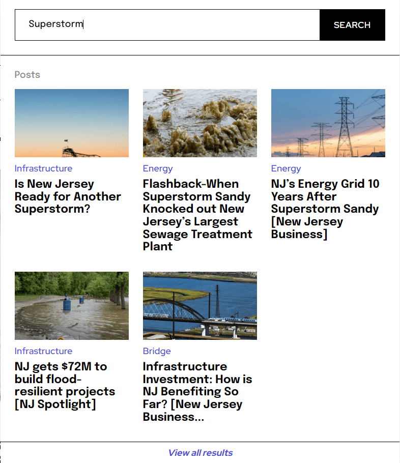
Here is an example on a search for “Superstorm”
When I type in Superstorm and the quick results pop up, this is what I get:
But if I click on the search button or hit Return to get to the results page, this is what I get:
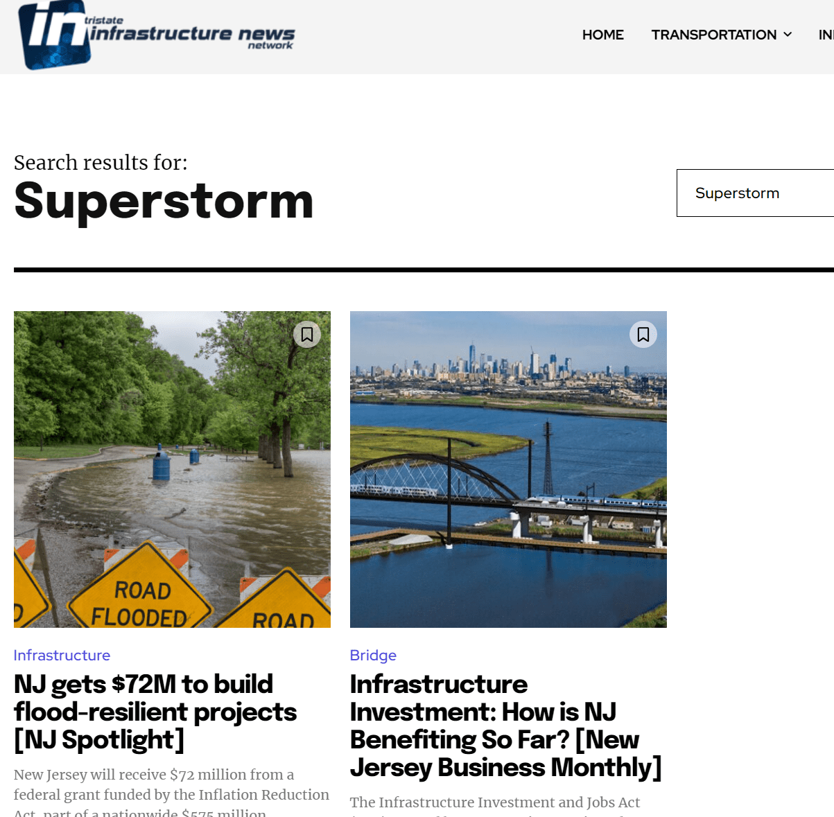
The results on the results page are incomplete and i’m not sure why.
 digicom
Hello,
I inserted the link to another internal article in the content of my article and the result was as you can see from the following link : https://magazine.pagesjaunes.online/forum-des-pme-du-gecam-la-problematique-du-financement-au-coeur-des-debats/
I’d like to be able to customise the presentation or layout of these internal articles, but I don’t know where to do it. For example, I’d like to remove the left and right borders, and remove the footer from the presentation where the name of our site, the comment icon and the share icon are located.
I tried to get into “Theme Panel —> Custom Code —> Custom CSS” and I placed this code:
.wp-embed {
background: #f6f6f6;
border-top: 1px solid #dcdcde;
border-bottom: 1px solid #dcdcde;
}
.wp-embed-footer, .wp-embed-site-title {
display: none;
}
But I don’t see any changes when I save and refresh.
Please guide me on how to customise this presentation.
 divyayogahealing
 Hi,
I have cleared cache & cookies multiple times and even tried different mobile phones but the issue remains the same. Kindly provide a relevant & working solution to permanently fix this issue. This is impacting my business.
If you need, I can provide you the admin login credentials so that you can check from your end.
Thank You,
divyayogahealing Hi,
I have deactivated the tagdiv mobile theme plugin, but the issue persists. Still, the pages don’t appear properly in mobile version.
Please find the links for attached screenshots for your reference-
https://ibb.co/m6QQbp1
https://ibb.co/s9cmLnW
Example of a Page Link from our website: https://mantravidya.com/online-deeksha-booking/
None of the pages wprk correctly. You may check the link on website as well as mobile to know the difference in how the page displays.
Thank You
 ioannisch
I have problem from yesterday night untill now. Every link a share in Facebook i get problem with 403 forbidden noninage preview no title preview. Only show this . Any issue? I didn’t install ot change something. https://developers.facebook.com/tools/debug/?q=https%3A%2F%2Fe-agrotis.gr%2F2024%2F10%2F%25ce%25b5%25ce%25bb%25ce%25b1%25ce%25b9%25ce%25bf%25ce%25ba%25ce%25bf%25ce%25bc%25ce%25af%25ce%25b1%2Felaiolado-ti-simainei-parthno-exairetika-partheno.html%3Futm_source%3Dfacebook%26utm_medium%3Dsocial%26utm_campaign%3Ddlvrit how i fix it



