
- TutorialsWhat is Ajax preloading?
 Calin
Calin Hi,
I just checked your homepage and this is displaying the mobile theme on desktop -> https://i.imgur.com/y9aOQp6.jpg usuallly this is a cache plugin conflict, please deactivate ALL plugins except tagDiv plugins, also if you are using child theme or cache plugin, deactivate them, clear all cache and try again.
Also, in this moment with the mobile version on homepage I can not checked your menu.
Thank you for your understanding!
 notionmotion
 That is not what I meant. I need to know: how do I change the background for the mobile menu??? See the attached image.

 ludyma
 Thanks for the reply, but it turns out that I uploaded the file by ftp and the floor I was on, but now it generates a failure in the AMP pluing, I have made a copy or backup with WP migration, because your therme does not make a backup, right? .
I will erase the old therme and I will upload it again I hope it works but see what happens to me with the AMP. It charges me at 50%, there are pages that load or adapt mobile deposits and others, I do not think its pluing or mobile platform fails, I attach some screenshots and if you can, between your phone and load those articles or several for you to see.
in this, the article does not load correctly the AMP and if its mobile pad but does not adapt the article to the device.
https://i.gyazo.com/f9ee47656720a9e40585cd2b40869ce9.png
In this see also from that article if I want to see the menu load the menu of the mobile display and not the amp.
https://i.gyazo.com/f27c50ff9a9bf8b5ce3de9aabc10cd5d.png
It does not always do it but I know that something is not right, as I show it now it is how it has to be loaded according to what has been modified in the therme movile, main page.
https://i.gyazo.com/892b1e5ab0de4a52e954c1c5379f2ba2.png
Look, now I load the page that I attached to the first one finished in c09, now look at the load.
https://i.gyazo.com/a67de82802fa6db0cd2708271510e10e.png
Look at the menu the TagDiv mobile theme is loaded and activated and the AMP is not allowed to activate, remove it and reinstall it and nothing, since the pluig by itself mobile theme does not make the articles adapt to the mobile devices.
https://i.gyazo.com/bc062b9f9e58174d9df38dabd0a205ba.png
As you can see in this screenshot, the AMP plugin options are not available in the menu on the left or in the plugin list.
https://i.gyazo.com/0bb1eedc38052b68123da6eff3e93f97.png
I hope now undo the periodic theme 10 and upload it again this all ok, I would also appreciate it and it will guide me since I cannot find documentation on this theme to know its capacity and also with the tagDiv composer
We are a group of Colombian journalists who are leading this portal. We need a more timely communication to be able to resolve doubts about the template. Could you send me a contact or a group of wasapp where we can write to you and answer us right there?
Keep in mind that I am not a system engineer or graphic designer, I am a self-taught person and who would like to learn more about this template to be able to get ahead with my project, I would appreciate all the information that you could provide me about tagdiv composer and others.
Thank you.
Calin Hi,
The background image can be change from theme panel -> https://i.imgur.com/1VgpHJj.png or if you are using the mobile theme plugin from here -> https://i.imgur.com/dxjz5o7.png if you are using the responsive version of the theme you can use a cloud header from tagDiv Cloud Library, you can edit it with tagDiv Composer and set the mobile elements where you want -> https://i.imgur.com/KWIqX8X.png
If you ware using the mobile theme plugin, then you need to use a custom css -> https://i.imgur.com/ERijDBY.png
#td-top-mobile-toggle {

    float: right;

    margin-right: -15px;

}

.td-search-icon {

    float: left;

    position: unset;

    right: -3px;

    top: 0;

    margin-left: -15px;

}

.td-main-menu-logo img {

    top: 52px;

}
The code need to be set in Theme Panel> Mobile theme > Custom code> css.
Hope this will help you!
Thank you!
 Jose
JoseHi guys,
I’ve changed some parts of my menu. Now I don’t use categories, I use pages created with the tagdiv editor (similar to cloud templates).
On mobile the menu looks good. On pc, the menu appears in white.
Can you help me to make the menu visible on pc?
This is the web: https://cutt.ly/Zt1zky5

 GinsCorp
 Thank you very much, Kalin!
Automattic Jetpack plugin crashes mobile menu!
I also increase wp_memory_limit to 512 MB.
 chip303
 Thx – i’ve found. Disable seperate caching for mobile phones – the menu work.
Calin Hi,
Unfortunately the Polylang was not tested with our theme, therefore we can not say what settings you’ll need to make in order to make the mobile theme menu to work with Polylang, maybe you can use the responsive version of the theme, is possible to be no problems with that menu.
Thank you or your understanding!
 Md. Abu Naser
Dear, in my mobile Menu icon showing on the left side and Search icon showing right side- https://www.screencast.com/t/fQTutQwn47
now I need Menu icon on the right side and Search icon on the left side. as like as- https://www.screencast.com/t/Fc9SrzTZ
I have another problem, how can I change the mobile menu background? – https://www.screencast.com/t/pCquo34jIWe
Please give me some suggestions.
notionmotionHow do I modify the mobile menu in Newspaper 10?
Thanks,
Whitney
 IslandJim
Hi I would like to have the mobile search available inside the menu and not visible in the header until someone opens the menu. Is that possible? Not using the mobile them.
thanks
GinsCorpHello!
I just bought and configured WMPL, and after that the mobile menu stopped working in both variants (mobile, mobile+amp, amp). At first I thought that this was due to WMPL, but I deactivated it, deleted the cache, but the mobile menu still does not work, although everything worked fine before installing WMPL.
Although I can see mobile menu, when try to configure it through theme web interface in appearance menu…
 DeRev
DeRevHi, we installed the template with the Fashion demo (you can check pbricherasio.com) but we cannot change the violet color that appears when you go on the images in the homepage. We can’t find it in the div composer.
In the same way, we can’t understand how to change colors and images that appears in the mobile version in the hamuburger menu and in search results.
Could you please help us to understand how to change them?
Thank you, best
 BuddhaNET777
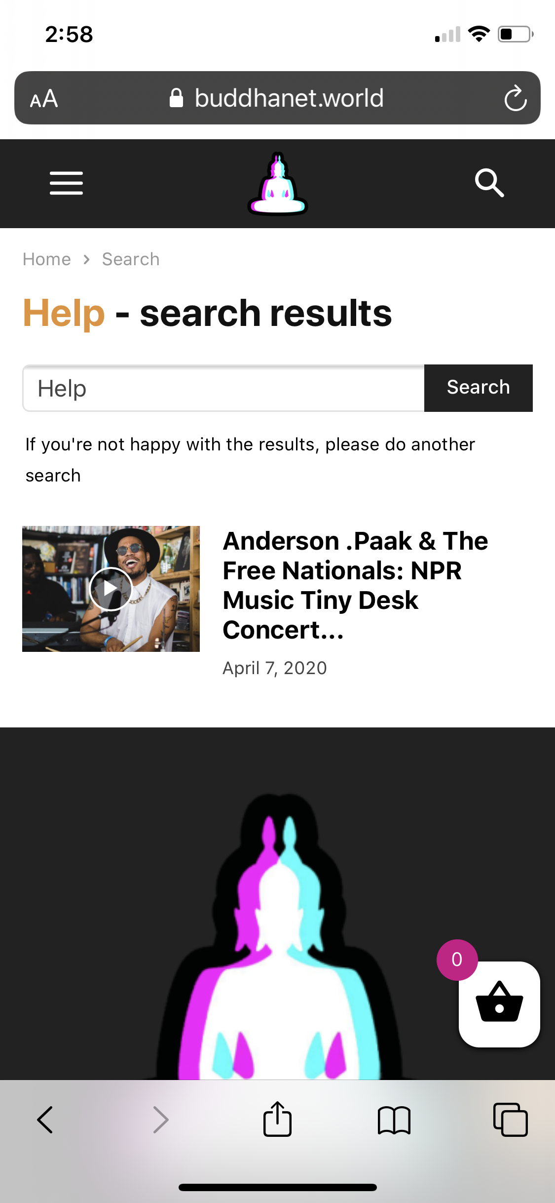
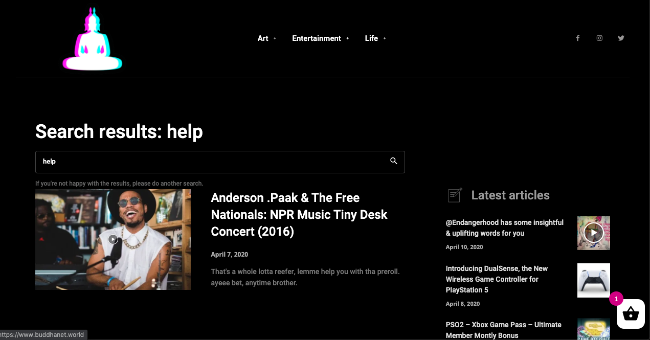
I have applied the black pro search template via theme panel, it works for the desktop version of theme but does not apply to the mobile version resulting in an ugly white block. please advise. both screenshots are below.
website: https://buddhanet.world
chip303 What I noticed:
As soon as I have called up an article, the search is superimposed on top, the menu and the mobile header (inside still no function) are displayed in a reduced size.
By the way, both in Chrome, Firefox, Safari (each mobile on the phone)
chip303Hi there,
apparently my burger menu of the mobile theme has a problem with WP Rocket plugin.
I have created a smaller menu for the page for the mobile view, which does not include all pages. I also entered this in the theme panel under the mobile menu.
Also in the theme itself, I have approved the mobile sticky menu with the tagdiv composer.
But instead of opening, the mobile view (on the phone / mobile view on the PC) only shrinks to the start page, the menu or the search itself cannot be opened.
I have read a lot here before, somehow all the proposed solutions here do not seem to apply to me or ultimately ignore the matter.
I am now a bit baffled – what exactly can I do to make the mobile + amp view work as usual again?
 JuanValFlauta
Hi!
On the menu of my website’s mobile version, when I select the english version the pages on the menu don’t change, only changes the page where I was. The main language is spanish. I can change for every page to english, but the menu doesn’t change completely to the english version. I use Polylang plugin and I don’t have budget to pay a translation plugin. How can I solve that?
My website: https://www.juanvalflauta.com
Thanks!
 ericfantich
 I’m not sure if it’s the mobile-menu.jpg time out? I don’t even know what the file is, or where to find it/remove it?
https://192.168.0.208/wp_011_sound_radar/wp-content/uploads/2017/04/mobile-menu.jpg
Calin Hi,
Thank you for your kind words!
You can achieve that only if you are not using the mobile menu plugin, you’ll need to use a cloud header from tagDiv Cloud Library, edit the homepage with tagDiv Composer -> https://i.imgur.com/NmLWAdt.png set the mobile version like this -> https://i.imgur.com/DhNhK6M.png if you do not want to use the mobile menu you need to remove it like this -> https://i.imgur.com/eE6Ikdm.png and add an icon -> https://i.imgur.com/SyL8fsN.png set the icon color -> https://i.imgur.com/Nr4gA6R.png change the icon or set a svg and set a link -> https://i.imgur.com/8pKFp1y.png
Hope this will help you!
Thank you!
 DavidJV
hi there,
Thanks for the past help here. The theme is great.
I would like to
1. change the burger icon (-mobile to -house) on the mobile menu
2. and put a hyperlink on this icon.
please advise on how I can go about this.
appreciate the support.
 Topfgartenwelt
 Ok, the code of this document is:
<div id=”td-header-menu”>
<div id=”td-top-mobile-toggle”><i class=”td-icon-font td-icon-mobile”></i></div>
<div class=”td-main-menu-logo”>
<?php
locate_template(‘parts/logo.php’, true, false);
?>
</div>
<!– Search –>
<div class=”td-search-icon”>
<i class=”td-icon-search”></i>
</div>
</div>
What and where I should put the code snippet that “Topfgartenwelt – Gartenblog | Foodblog | Familienblog” is a H1 and what kind of code I have to add that after clicking on an article the title tag of the article gets an H1 and not the title of the homepage?
Would one of this codes be a solution? Or do you have another one?
<?php $headertag = ( is_front_page() ) ? ‘h1’ : ‘h6’; ?>
<hgroup>
<<?php echo $headertag; ?> class=”site-title”>” title=”<?php echo esc_attr( get_bloginfo( ‘name’, ‘display’ ) ); ?>” rel=”home”><?php bloginfo( ‘name’ ); ?></<?php echo $headertag; ?>>
<h2 class=”site-description”><?php bloginfo( ‘description’ ); ?></h2>
</hgroup>
or
<?php
is_front_page() ? $title_tag = ‘h1’ : $title_tag = ‘div’;
?>
<<?php echo $title_tag; ?> id=”site-title”>
/”><?php bloginfo( ‘name’ ); ?>
</<?php echo $title_tag; ?>>
Thank you
Greetings Kathrin
-
This reply was modified 6 years by
Topfgartenwelt.
-
This reply was modified 6 years by
Calin Hi,
Indeed on mobile theme plugin there is no h1 on homepage, if you want you can add it on this file wp-content/plugins/td-composer/mobile/parts/header-menu.php
Hope this will help you!
Thank you!
 Axtudo
Hello when does the new update come out? The mobile video is expanded when loading the page and after 2 seconds it is correct (without cache) or (with cache) the slow loading for video on the mobile has an error with the AMP theme The visitor experience is low
hello see here – https://prnt.sc/rw4emk – and after 2 seconds – https://prnt.sc/rw4hza
I will send the credentials to the email
On the desktop the video is short after + -1 second is correct
when the admin or visitor side page is loaded
a white stripe appears above the menu
I think it’s this character ( ^ )
has how to make this work for me https://prnt.sc/rw4uj2
when i call
There is an error in (iframe) – /? AMP- the video is hidden
But on mobile is perfect
only – /? AMP – displays an error after connecting
Login:
https://www.axtudo.com/entrar-com-uniao/
Bogdan B contact@tagdiv.com
 safanizamoglu
 When you opened menu there is no problem but when you tap middle of the empty area this menu is coming. All of users and visitors seems that problem. Please try it. Open menu and start to tap emtpy areas at mobile menu.
Calin Hi,
If you do not want to have the hamburger menu on mobile and you are using the responsive version you can remove it with tagDiv Composer -> https://i.imgur.com/LRx44dv.png
If you are using the mobile theme plugin you need to use this custom css:
#td-top-mobile-toggle {

display: none;

}
The code need to be set here -> https://i.imgur.com/851lw7x.png
Thank you!



