
- TutorialsWhat is Ajax preloading?
 lighterside
Hi guys, I’m using one of your icons (the mail icon, [menu-contact]) for a menu entry. No written text for the entry, just the icon, which links to a opt-in form page.
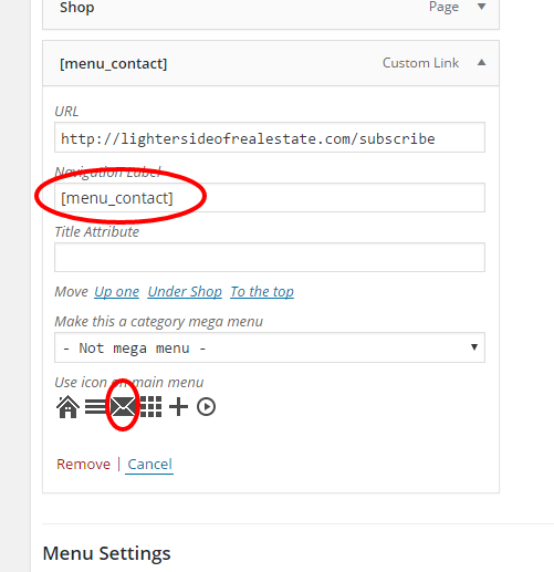
It displays and works correctly on desktop and tablet menus…But on mobile, it shows up as “CONTACT” with no mail icon.
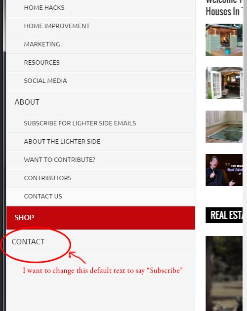
How can I modify the text that appears on mobile menu. I want it to say SUBSCRIBE.
Thanks!
 Bogdan B.
 Hi,
Unfortunately the theme has no such option to change the position of the header ad on mobile, but different header styles provide different layouts. For example a header styles 2, 5, 6, 7, 8, 9, 10, 11 and 12 show the ad below the menu on mobile.
Thank you!
 Catalin
 Hello erikbaseball2,
So, do you have some customization through code or some custom CSS added by you in the theme, which could affect the mobile menu? If not, please send us an email at contact@tagdiv.com with your log-in information (wp-admin) so I can further inspect your setup page. Also, please provide the link of this topic so we can know who you are and what the issue is.
Thank you for the message!
 medeiros7
How can I have the Header Ad showing below the Main Menu on Mobile Devices? Right now it is coming up above the Main Menu
Tks
Marcelo
 miroslavkulich
 But there is another issue.
https://drive.google.com/folderview?id=0B1vAJdtrla0TNld3QlkxX0F2cW8
After opening and scrolling mobile menu, it will show up an background image from baner. Thanks for your patience
 INSPIRELLE
Hi,
We recently noticed that some of our subcategories are not showing up when we hover over the category menus. For example, we have 6 subcategories under our main menu category for FAMILY: Children, Guy Talk, Parenting, Schools & Eduction, Seniors, and Teen Scene. It also doesn’t show on our responsive mobile menu. 
If we hover our mouse over the FAMILY category on the main menu, the subcategory “Teen Scene” is not shown. BUT if we CLICK on the FAMILY category, then we see all of the subcategories. 
My question is, can we increase the number of subcategories shown on the mobile menu and when we hover over a category in the main menu bar?
If so how, please?
Thanks for your help
Catalin Hello kapunas,
Please notice that is not a simple task to change this functionality. You need to alter the code from tagdiv_theme.js and menu-mobile.php, like this -> http://screencast.com/t/5qjye5jYehu -> http://screencast.com/t/355wCqLaeJfu
Hope this helps!
Thank you for your understanding!
 erikbaseball2
For some reason my mobile menu is loading behind content on the page so you cant see any of the menu items
 simchris
 Just as an aside — what another theme did, which was “sort of” clever, but also a tad confusing, is they made down arrow prominent next to each item, and then on mobile the down arrow (chevron, whatever) would trigger the drop down menu, but “main” item would function as on desktop as a “click location”
So, desktop would work as TagDiv menu does now.
iPad, the behavior would change so that only down arrow would trigger drop down, but the “main” menu item would work when clicked directly and would not trigger drop down menu.
Took me a bit to figure out and was intially annoyed the drop down menu didn’t work, and I’d keep going to the actual page — which is the situation TagDiv trying to address, and the way most “mega menus” work … but once I figured it out, I went “oooooh…. hey, that’s kind of clever” ….
Not sure this would be solution here; but I suppose on mobile people might be more likely when not using hamburger menu to want to go to main item vs drop down.
Of course, also note many theme devs just default to hamburger menu/slide out, to solve this issue entirely.
Andrei’s explanation is correct and logical for how the menu works, so not a bug… but simply no other way for it to work on mobile as you can’t have a button be a link and a drop down trigger ‘on tap/touch’ as there is no hover.
Anyway… the down arrow = trigger dropdown menu would be ONE solution, and it’s clever. Of course people complain about that solution too 🙂
-
This reply was modified 10 years by
simchris.
 bowman9991
 I’ve had the same thing. Appears to be a bug. The quick fix is simply go back into the theme panel and change the font again. Especially the font on the main menus (desktop and mobile). Fonts can change randomly when you change other fonts. It’s been mentioned before, but it’s very random and very hard to document for support purposes…
 kapunas
Hi,
How can I prevent the page in mobile view from scrolling to the top when I click the mobile menu toggle icon? I have tried #/ and “javascript:void(0);” but the page still scroll to the top before the mobile menu opens.
<div id=”td-top-mobile-toggle”>
<i class=”td-icon-font td-icon-mobile”></i>
</div>
Thank You
Bogdan B. Hi,
The top menu is deactivated with css on mobile. Please provide a link to your site so I can inspect it and provide the proper css.
Than you!
Bogdan B. Hi,
I have checked your site but could not find any missing images. I did however see a js error in your console. This usually causes images to appear transparent because of plugin conflicts mostly. In this case you can either try to identify the plugin causing the issue or you can deactivate the lazyload option but you need to keep an eye open for other issues related to JS namely pagination, the search widget, the mobile menu and so on. If these will not work as well when the images break, then you definitely need to remove the problematic plugin.
Thank you!
 nekoilove
hi tagDiv..
i want make top-menu in mobile menu.
please. See the image below :
http://me2.do/xIumMg1U
How Can I solve this problem?
-site. : http://www.localier.co.kr
 robineyre
 Hi Andrei,
I have to agree with @kognitoweb. Your theme is mobile friendly but it’s certainly not mobile ready. This is terrible.
My main page is the Bank Holidays page, and the menu is critical to any website. The fact is it doesn’t work. While pages are also available on other elements of the site, e.g. sidebar, it will render differently on different devices.
I’m going to give it a slating on Envato. It is bad.
Will be happy to change my review when the problem is resolved.
Robin
 alphaifel
 Hi Andrei L.
How can I enlarge the social icons size in the mobile menu.
http://i.imgur.com/thBCaxp.jpg?1
Thx
Bogdan B. Hi,
In order to target only the mobile version you can use the media queries. For example, the code above would look like this:
@media (max-width:767px){

.td-icon-menu-down:before {

content: '\e80f'!important;

}

}
If you want to have individual icons, you can target each menu item using the unique menu item ID:
http://screencast.com/t/64WrVlhrM. You can use your browser inspector to get the individual menu item ID and use it like so:
@media (max-width:767px){

#menu-item-226 .td-icon-menu-down:before {

content: '\e80f'!important;

}

}
Thanks.
 orbofdarkness
 Hi there,
I tried the above code. The Top Menu is coming in the center only if the social icons are hidden. I decided to reduce my social buttons to 6. So now the Social Icons are coming in the center when enabled. Can you give me the setting by which the Top Menu could come in the Center on the mobile when seen in landscape mode? Kindly check URL on mobile.
Thanks,
Prasenjit.
-
This reply was modified 10 years by
orbofdarkness. Reason: Added Website URL
kapunas Hello,
Thank you for the follow up. Perhaps I was not clear enough. I’m hoping to add icons for the mobile menu only. The above code would add them on the desktop view as well. Also is it possible to have a different icon for each mobile menu item?
Thank You
 Andrei L.
 Hi
The mobile menu icon appear on your site but its color is white, that’s why is not visible. Try this css in theme panel > custom code > custom css, it shout correct that: http://screencast.com/t/eFn1MW7Lv
#td-top-mobile-toggle i{

    padding-left: 4px;

    color: black;

}
Thanks!
 newmantraining
Hi guys, the menu on mobile is not showing on my website.
I’ve looked searched into the documentation but I was not able to find a solution, this is my website: http://diodelsesso.net/
Catalin Hello travisnw,
Please notice that the mega menu is only for desktop/iPad and for the mobile version it was thought another style for the menu. If you want to change the mobile menu, you have to do some additional customizations through code that involve custom work. If you want to change the structure of the theme in this case and you are not aware of the steps in this regard, please consider hiring a freelancer/developer to help you because we cannot provide customization services at the moment, sorry!
Thank you for the message!
 DaneOLeary
I’m having an odd problem. In the Newsmag theme panel, I can’t seem to save any changes I make to the theme. Just for an example, under “Header” I tried to change the logo used in my sticky menu from the header logo to mobile logo. Clicked “Save Settings”, and then the ‘loading’ animation that pops up to indicate that it’s saving just spins and spins and spins. If I let it, it’ll spin forever until I refresh the page, at which point none of my changes have been saved.
So how do I go about fixing this? It’s been a while since I’ve made any theme changes so I can’t really say how long this has been happening. No idea if the recent WordPress update triggered this or if maybe it was something else.
 Glitched
Hi TagDiv,
I wanted to find out if it was possible to import an entire mobile menu from another theme into Newsmag?
Will this affect the rest of theme quite a lot i.e. break it?
If not, a suggestion for the next update could definitely be to make the mobile menu more animated. At the moment, when you click it, it just pushes the content and loads. Perhaps it would be nice if there was an animation as it opened as more of a slide effect.
Just a thought.
 travisnw
 What happens on mobile to the Mega Menu? I’d love to have MegaMenu on desktop view but not on mobile. Is that possible?

