
- NewsmagMain menu
- NewsmagIntroduction
- NewsmagLogo & Favicon
- NewsmagBackground introduction
- NewsmagTheme colors introduction
 bgo
bgo Its works, thanx BUT, When i change it to white (which i need) my mobile menu and search icon are not visible anymore, cause they are also white … Any solution for that?
 Alin [tagDiv]
 Hi,
@Carel and @neakriti I have added this on our list and we will try to find a solution for login widget to appear on mobile. We will see if it will be added somewhere else…
You can try this custom css to display only sign in widget in top menu – http://screencast.com/t/brzKHghs3
@media (max-width: 767px){
.td-header-top-menu-full {
display: block !important;
}
.td-header-sp-top-menu {
display: block!important;
}
.menu-top-container {
display: none !important;
}
.td-header-sp-top-widget {
display: none !important;
}
}
2. If you use SEO by Yoast and bbpress activate you can handle it – http://screencast.com/t/9u6h6LGbwrzI Also you have in Theme Panel bbpress template to add a custom sidebar and set position for it – http://screencast.com/t/lEsL9kkVK I was referred to the page template of bbpress – http://screencast.com/t/HJPkL1ztavSa we use now full plugin without any customizations.
Thanks!
-
This reply was modified 11 years by Alin [tagDiv].
 lighterside
 Thanks a ton Alin. It worked like a charm.
There’s one problem tho. I’m noticing that inserting the ad right there creates a gap between the nav menu and the main article block. The blue part (in the screenshot) is actually our background image showing through.
Is there a different place I can insert the “echo do_shortcode(‘[td_ad_box spot_id=”custom_ad_1″]’);” code so that it shows up in the (top) of the main body section?

Thanks again Alin.
-
This reply was modified 11 years by
lighterside.
-
This reply was modified 11 years by
Alin [tagDiv] Hi,
@Crabouille I have added this issue with top menu on our to do list and it will be fixed as soon as possible.
Unfortunately theme doesn’t have an option to change mobile menu background but you can do it using custom css – http://screencast.com/t/7YBJ8ESckz9
@media(max-width: 767px) {

.td-header-wrap.td-header-style-12 .td-header-main-menu {

background-color: #4db2ec !important;

}

}
@bestofbristol Do you refer to the mobile menu color?
Please try this custom css in Theme Panel > Custom Css this it will apply only on header style 5(just remove .td-header-style-5 if you want to apply this on all header styles mobile menu): http://screencast.com/t/tAiO4CbO1Q6
@media(max-width: 767px) {

.td-header-wrap.td-header-style-5 .td-header-main-menu {

background-color: #4db2ec !important;

}

}
Thanks!
 Crabouille
Hi,
Like many i’ve just moved to v6 and here is a little low priority issue i found.
I’m using menu 12 with the default blue color, when switching from desktop to mobile the header becomes black.
The Enable Top Bar doesnt seem to work (the bar is always displayed), there again, no big deal as it can easily be hidden via css.
ps : the new content blocks & footer are pretty cool
 Rony123456
Hello,
I updated to v5 and most of the things are fine. I have a few issues though.
1. I want to change module 5 resolution from 324 x 235 to 314 x 160. Where is the file which contains the needed code?
2. My old featured images inside articles have bad resolutions. I want to force all them to appear on 16;9 ratio or just like all normal thumbnails with resolution of 696 x 392 pixels.
Here’s a good featured image: http://www.naldotech.com/flash-android-5-1-1-firmware-on-t-mobile-galaxy-s6-sm-g920t/
And bad featured image: http://www.naldotech.com/how-to-check-galaxy-s4-battery-temperature/
Basically, I want to limit the height of that tall image to 392 pixels.
3. When I use a mega menu with 3 sub categories, It doesn’t do anything when I click on the subcategories.
4. I have a cateofry with 2 sub menus. When I click the big category, it drops down and shows the two other categories. Any way to make the menu drop down with mouse hover instead of clicking, so users can click on the main category too?
Also, I don’t want parent categories to appear on articles, only sub categories. Basically, when I select a sub category, the parent category automatically shows up. I disabled this on v4 by commenting a line but it has changed on this version.
Well that is all I need. Have a great day!
Site: http://www.naldotech.com
 p1mag
p1magHi guys,
The Mega Menu under the ‘Ultra’ section of my website only shows the first 5 sub categories/drop downs on both desktop and mobile. Any ideas why 4 are not showing? Below is a quick menu guide to show you what’s visible and what currently isn’t.
Ultra
Air (visible)
Concierge (visible)
Connoisseur (visible)
Covet (visible)
Land (visible)
Sea (not visible)
Style (not visible)
Tech (not visible)
Time (not visible)
Website: http://p1-mag.com/
 abarrell
Hey guys,
On my site – http://tweetperth.com.au/ when viewed on mobile and the mobile icon in the top left is pressed it doesn’t open.
Also I have noticed that on the desktop version that the search icon doesn’t work when pressed either.
Cheers
Adam
 PLANEALIA
 Hi, I´ve made the change in menu-header.php, but now in the mobile version shown both, two logos.
Thank you very much!
Alin [tagDiv] Hi,
Unfortunately theme doesn’t have an option to change header ad position on mobile. A solution could be to disable header ad on mobile, use a custom ad bellow the menu for header style that you use(edit header.php file and use do_shortcode function) – http://screencast.com/t/PpSNXg2mbCII off course enable this custom ad for mobile from Theme Panel.
echo do_shortcode('[td_ad_box spot_id="custom_ad_1"]');
Result: http://screencast.com/t/ySMAR0Jp78IF
Thanks!
lightersideHi guys,
Is there a way to change the position of the 320×50 mobile leaderboard ad? My concern is ad-blindness vs click through rates. At the moment the mobile leaderboard loads “above the menu”. I hardly notice it. My eye-pattern recognizes “top menu” then I look down to get started on the content.
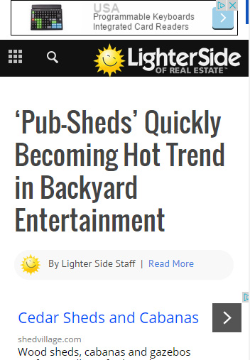
I’d like to position the mobile leaderboard ad BELOW the nav menu, just not sure how to do it without messing anything else up.
Appreciate any help!
Alin [tagDiv] Hi,
Please make sure that you set a category as megamenu properly – http://screencast.com/t/7d0cGgO5 it will display subcategories automatically on desktop and also on mobile menu – http://screencast.com/t/6a1QyzZ68IL – http://screencast.com/t/unabdNatx3Yy
Thanks!
Alin [tagDiv] Hi,
Unfortunately the header style 3(also header 6) use the same logo image also on mobile, you don’t have to upload a mobile logo. All header styles will be changed in Newspaper 5.
Until then you can try to make this change in menu-header.php file – http://screencast.com/t/2S3dTDOoo8u and now you can upload mobile logo – http://screencast.com/t/tMwGGtAbIOh this will be used on mobile devices.
You can activate the theme also when it will be moved on final domain. If you want to use it on multiple sites/domains you’d have to buy a license for each project.
Thanks!
-
This reply was modified 11 years by Alin [tagDiv].
 BrendaSarg
HI there, I have version 1.7.1 and when viewed on a mobile, the categories do not open to show articles?
Have I set something up wrong or what is the problem?
PLANEALIAHello, I´m working in a new wordpress web with your newspaper theme and I have used The Header Style 3 – (full width logo) + menu; all is ok but I have a problem with the version of the logo for mobile. I’ve uploaded another file to use like logo in the mobile version but this does not work and continue with the normal logo instead of the mobile version.
This is the url http://palmvit.net/vitaepalm.htm
Another question, to develop the web I am using a provisional domain “palmvit.net”, when the web is finished will be another domain “palmvit.com”. I hope there is no problem with the registration and activation code, Now I have activated the theme in the domain “palmvit.net” but the final domain will be “palmvit.com”.
Best regards!
Alin [tagDiv] Hi,
You can add your homepage to the menu and use the default icon for it – http://screencast.com/t/5tkETAtx
Now use this custom css to change that icon position – http://screencast.com/t/V8rzUa9FeRGC
As you can see on mobile menu it will appear Home – http://screencast.com/t/hivnKeqL0Ajd
Thanks!
 VAtheist
When you view my site on a mobile device,
the side scrolling menu shows “Categories” as the home button. How do I change this to say “Home”?
Alin [tagDiv] Hi,
You are right it seems that the menu icon and search are still not visible on mobiles. Please check your custom css as this code overwrite the icons css – http://screencast.com/t/CkbT9zn1 – http://screencast.com/t/DdOpK2P0iaC
We recommended W3TC in the past but now we also made some tests and WP Super Cache seems faster and we will recommend it also in our documentation for Newspaper 5.
Thanks!
Alin [tagDiv] Hi,
Sorry I forgot to attach the screenshot with errors – http://screencast.com/t/Vcj8jvjfIu and yes those error are related to cache plugin minifications. I don’t know exactly what settings you have on this plugin. but we recommend to use only page cache – https://forum.tagdiv.com/w3-total-cache-configuration/
I have checked your site again and the search is working properly and it is displayed on mobiles, also the mobile menu.
Thanks!
 juncan347
 Hi Alin:
thanks, I did diable all plugins except visual composer. Now, still the icon not show on mobile phone but the canvas menu now working.
I think the menu not wokring related to W3 cache but still why the icon not showing?
Thanks
 Lucian
 Hi,
The menu bar uses the logo you set for the mobiles, here: http://screencast.com/t/6H7JFc3JXvXk so make sure you add your menu logo there.
Thanks
Alin [tagDiv] Hi,
The top menu was not designed to work on mobile, that’s why it is hidden. But you can use custom css in Theme Panel > Custom Css to show it on mobile but you may need additional customizations for menu items that may drop on more rows – http://screencast.com/t/TT9KZLijK7fK
@media (max-width: 767px){

.td-header-top-menu {

display: block;

}

}
And also for mobile screen theme has a special menu designed for it – http://screencast.com/t/x18VmP2cg
Thanks!
Alin [tagDiv] Hi,
I have removed your site credential and you should not posted here as this is a public forum. Please send us an email email for this.
You have an answer here – https://forum.tagdiv.com/topic/mobile-menu-appearing-on-home-page/page/2/#post-49361
Thanks!
Alin [tagDiv] Hi,
Please deactivate all plugins leave just Visual Composer active, empty cache and check if you still have this issue with mobile menu. Also if the issue disappeared please activate your plugins one by one and see which one caused that issue. If you use child theme please also switch to the main theme and check this.
Also please make sure that you use the latest theme version 4.6.3 and update using this guide(FTP method) – https://forum.tagdiv.com/how-to-update-the-theme/ and also update the plugins that come with the theme files from the /plugins folder.
Thanks!
-
This reply was modified 10 years by Alin [tagDiv].
 shark
sharkHi, I purchased Newsmag in early March, 2015, and have been pleased with it. Today, I upgraded to the latest version and now the mobile slide-in menu doesn’t work properly. When clicked, it slides too far in so there is a big gap (roughly 75% of the screen) of blank space to the left of it. Naturally, the menu doesn’t fit and is barely visible on the far right due to this.
Has this happened before, and do you have any suggestions for fixing it?
Thanks.
