No search results were found in Documentation!
 Anamaria
 Hi,
You need to set the menu with tagDiv Composer, not using the Customize Option.
You can add the menu, in the main header, sticky header, mobile header and sticky mobile header
-> https://forum.tagdiv.com/mega-menu/
-> https://forum.tagdiv.com/main-menu/
Also, you can add the element for the menu with the tagDiv Composer, where you want to have it on the page (for example, in the footer).
Thank you!
 Calin
Calin Hi,
Unfortunately, the file can not be set in child theme and for the moment it is the only why you can edit the mobile menu, sorry!
Now, if will be to set the code in the theme header.php file, I think that will be triger this file wp-content/plugins/td-composer/legacy/Newspaper/header.php (our theme has 3 header.php files, but if the tagDiv Standard Pack is not installed and you use a cloud header, the above one will be use). Just copy the file from there in child theme (Newspaper-child/header.php) and set the code in that file, it should work properly.
Thank you for your understanding!
 dimmisel
 I asked you if I can overrdie this template in child theme.
We want to add more data in mobile menu, such as logo and a html block.
Can we do this with a cloud header?
Thanks!
 desirevp
The black top bar (with a menu, social icons..etc) in the Newspaper Pro default template disappears in mobile. Is there any way to maintain at least part of the bar with the menu in mobile in the header?
Calin Hi,
I just checked your website and now the mobile menu is working -> https://i.imgur.com/wYm6WC7.png but this will be available only after the website page will be loaded.
I see that you have images that it takes a long time until are loaded ->https://i.imgur.com/EBm5sDk.png and I think that if you solve that problem the mobile problem will be solved.
Thank you!
Calin Hi dimmisel,
If you are using a cloud header, then the menu can be assigned using tagDiv Composer -> https://i.imgur.com/ACfP50w.png then the socials from the open menu can be set from the theme panel -> https://i.imgur.com/RilGStr.png
Also, the file path for this -> https://i.imgur.com/YzOy26P.png is this one wp-content/plugins/td-composer/legacy/Newspaper/parts/menu-mobile.php
Thnak you!
Calin Hi columbusunderground, if when you click on the mobile menu and there is nothing happens, most probably something it is interfering with the theme option. Please make a test using only the tagDiv plugins and see if the problem persist.
If the problem is still there, then, please make a full backup and contact us via email at contact@tagdiv.com and provide as many details and screenshot you can and wp-admin access. We’ll check it as soon as possible.
Thank you!
 andreabacci7
 I know about the “more” option, but the problem is that when “more” is unchecked the menu is in 3 row all on the left. Basically, with the “more” option checked, the menu occupies a 10% the the row, all on the lest; and on the right, next to the menu, there is only the lens icon (for the search).
Maybe I did something wrong on row or column settings? It’s strange because desktop and mobile look fine.
dimmiselHello team.
How can we edit mobile menu (we need to add Logo, socials links and some html) with Cloud Library?
I cannot find out how.
I also tried to override header.php file, but I cannot find out how to do this from Cloud Library file.
Please give a solution, thanks
 columbusunderground
 When you click on the “Mobile menu” box so you can actually edit the mobile menu, nothing happens.
That is the issue.
https://tagdiv.com/how-to-use-the-header-builder-and-tagdiv-cloud-header-templates/
 meri
meri Hi @anamaria,
Thanks for your reply but on the responsive mobile version, the colors I specified in the Theme panel don’t apply. I chose blue and I still see black on the menu and the search. Can you help?
Thanks
Anamaria Hello,
The background image and color for the mobile menu are set in the Theme Panel -> Theme Colors -> Mobile Menu -> https://i.imgur.com/9eYp5W9.png -> https://i.imgur.com/Ednt2zW.png
-> https://forum.tagdiv.com/background-introduction/
Thank you!
andreabacci7I’m using the mobile plugin and everything work fine on desktop and mobile.
My only problem is on tablet device (iPad), where instead of the regular menu, it displays a short version with just “home” and “more”. Inside more there is the rest of the menu.
How can I turn it into a regular menu (all visible) link it is on desktop?
meriHi,
On standard mobile menu & search (not AMP), how can I change the background color?
Also, how can I change the font colors of the items in the mobile menu (atm active is blue on black background)?
Thanks
 michaeldef
 Thank you, but I still don’t understand why the header is acting this way? COrrection: Misalignment happens in CHrome and Safari? I’m not exactly sure sure what to do to fix it as I don’t understand why it’s wrapping instead of not converting to the hamburger menu until it reaches mobile size.
-
This reply was modified 4 years by
michaeldef.
Anamaria Hello,
Did you add the element Mobile horizontal menu -> https://i.imgur.com/v8CrXpT.png in the top bar for header and set the menu?
I think you referring to the mega menu with categories and subcategories and page menu.
A mega menu with categories this can be with categories and subcategories like in this article https://forum.tagdiv.com/mega-menu/ for page menu please check this https://forum.tagdiv.com/page-menu/
Yes, you can edit the page with the tagDiv Composer and modify or delete the top bar: https://www.screencast.com/t/JombsN0wAIp
Thank you!
 Tomasz Trasztok
I am very sad because the theme pannel in version: 11.4 does not have the same functions as in tutorial on YT (9.4).
Features such as:
– !!!! Header Style
– TOP BAR
– MAIN MENU
– LOGO FOR MOBILES
And much more…
Is it ok? is there any other way to change eg the header style?
michaeldefSite – https://bayarearegistry.com/
Pre-Built – Magazine Pro
Header – Living Pro
——————
My Main header doesn’t convert to the hamburger style when i reduce the size of the window until it reaches mobile (tablet?) size. Instead it adds a second line to the menu. I notice that Living Pro pre-built, which is the header I’m using, goes from single line to hamburger. Mine is single line to double line to hamburger. How can I make it go from single line to hamburger?
Note:
• It functions fine on the safari browser, problem is with Chrome.
• On Chrome, Top Header is a little cut off on both sides. Search barely accessible.
 Jose
Jose Thanks, I understand, thank you for the video.
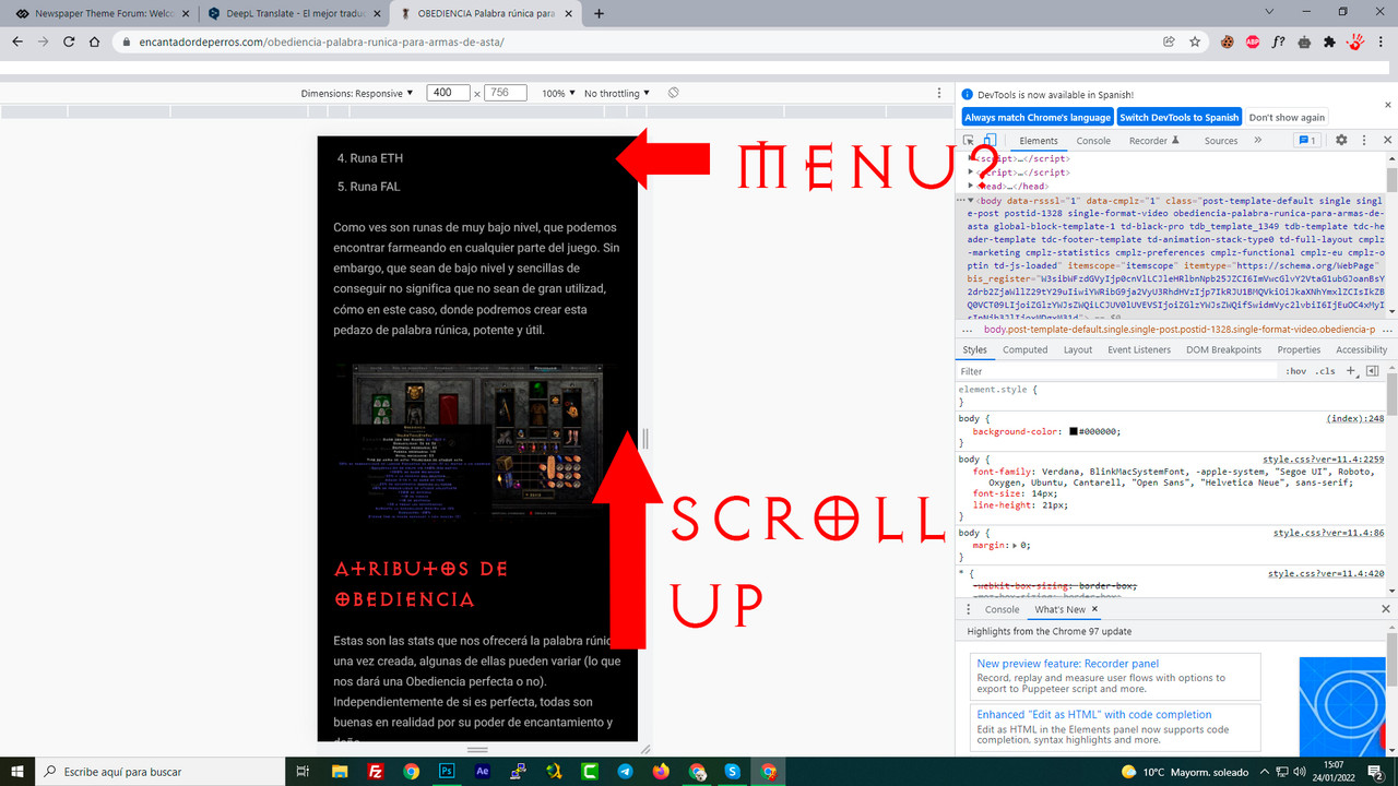
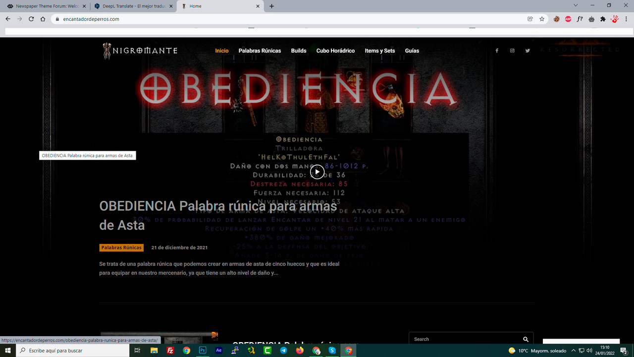
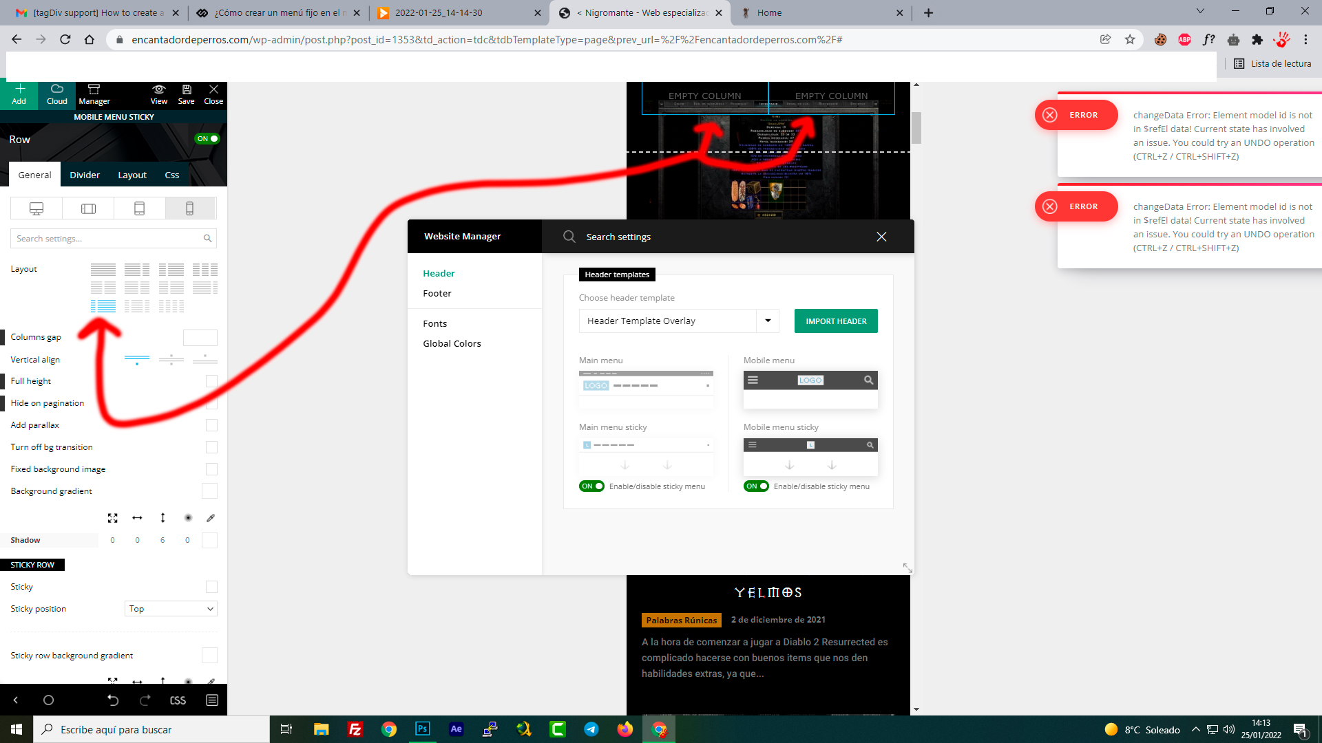
However, something is not right. I am trying to emulate the top menu (column in two, with mobile menu and logo). But it is impossible, there is no way to do it, what am I doing wrong?
The column always gives me 50%+50%, but I want 25% + 75%, just like the original mobile menu. Is it possible?
-
This reply was modified 4 years by
Jose.
 Sheraz91121
Pakistan Sahulat
please help me.
Anamaria Hello,
Please make sure you don’t have to activate the mobile theme plugin, also, you can set the menu in Theme Panel -> Mobile Theme -> Header https://i.imgur.com/7bL47MT.png if you want to use the mobile theme plugin.
Also, please check this topic where I explained each mobile version -> https://forum.tagdiv.com/topic/mobile-version-not-working-properly-2/ and choose what mobile version you want.
Thank you!
 kabbolig
Hi,
We are trying to figure out where we can edit the number of boxes shown in our menu on our mobile view (kabnyt.dk). The mobile view isn’t the responsive version, so changing anything in tagdiv doesn’t work, and I cannot find anything in mobile theme to expand the number of boxes.
We haven’t set the site up to have mobile templates (except one or two pages). Can you please help?
We want to keep the way it is showing on mobile, but we would like to change the number of boxes to show all of the categories/menus: https://imgur.com/a/wzD2mqN
Best regards,
Karen
 glorianino
Hi. After installing the Newspaper Magazine Pro prebuilt website, I realized that the mobile version on the demo is different from the one displaying on my website. How do I fix this.
Additional issues that I’m having is there is a “Sign in” and “Click here – to use the wp menu builder” displaying on the menu on mobile instead of the categories. How do I fix this too?
JoseHello team,
I’m using the “Black pro” design, it’s great. I have modified the menu in the mobile version, now instead of being horizontal, it is classic mobile.
But I can’t get the menu to have a sticky effect, that is, when you scroll up, the menu appears. Right now, the menu is only at the beginning and you have to scroll up the whole post to access it.
1. How can I change it and make it appear when scrolling up?
https://i.postimg.cc/QtDVxQXp/aaa1.jpg
2. On the main page, the menu is above the content. The same is true on PC and mobile, how can I make the content display below the menu? That is, that below the menu there is only a black fill, not content.
https://i.postimg.cc/Ghtt2h1S/aaa2.jpg
website where I am testing: https://cutt.ly/dI19Iwx
Thanks
Calin Hi hfrevolution, if I’m right it is possible that the mobile theme plugin to be enabled and this do not have a menu set. The mobile theme plugin is using different settings then the responsive version -> https://i.imgur.com/9jFpVMg.png if you do use it and you want only the responsive version, then just disable the plugin, or if you are using it with amp, then set it only for amp version.
Thank you!