
No search results were found in Documentation!
 Calin
Calin Hi navindesigns, for me it does!
This also deepens on the internet connection that you have and how fast your website it is the loading (here is a screen record https://we.tl/t-nw8ydJXNhd ). I have 500M/s so for my it take around of 3 seconds, but this don’t means that for you is not take longer or less.
Also, did you try my above suggestions? Did you try to see how is working the mobile menu using the mobile theme plugin and mobile page ?
From our tests those are faster then responsive version.
Thank you!
 navindesigns
 That is not true. Please stop goving false information. It DOES NOT open after 3 seconds. I need the mobile menu to be open AT ANY TIME.
Calin Hi,
I just checked your website and the mobile menu and for @navindesigns the mobile menu seems to work quite good it take like 3s it looks that in that time all needed data is loaded. So for you to make the website mobile menu faster is if you can make your website to load faster. Another solution will be to use the mobile theme plugin or the mobile page.
For @brianlamb looks that the mobile menu is not working at all, is just like something is interfering with the theme js https://i.imgur.com/Bsqv4nA.png in this case it can be a plugin conflict, so please make a test using only the theme plugins.
Thank you for your understanding!
navindesignsThe mobile menu is NOT opening on my site – https://www.winnmediaskn.com/
I have already disabled all the plugin and tested it so it is not a plugin issue. Also, it seem like if you leave the site on for a long time and then try to open the mobile menu it works. I need the mobile menu to be open AT ANY TIME. Not until everything is fully loaded or user have to wait a long time. This is a standard feature on all websites to be able to open mobile menu at any time.
Please help ASAP.
 yonish3
Lazy load not showing images at all.
On mobile, after scrolling down images will pop in.
Even the menu images don’t how.
https://prnt.sc/25ql6kh
After scrolling down images pop in.
Setting:
https://prnt.sc/25qlnkk
I tried all 3 options.
 Anamaria
 Hello,
1. This issue can be caused by a plugin conflict, or, did you use any plugins to optimize your images?
Did you use WP Bakery? If yes, we strongly recommend using only one of those plugins with our theme (WP Bakery or tagDiv Cloud Library, but not both).
2. You can change the background color for mobile header from Theme Panel -> Theme Colors -> Mobile Menu => https://i.imgur.com/mbGT1D5.png
Thank you!
Anamaria Hello,
You need to change the background color for mobile header from Theme Panel -> Theme Colors -> Mobile Menu => https://www.screencast.com/t/Ou8CBHm25
If this is not what you mean, please provide some more details, screenshots.
Thank you!
 Bettina
 Hello @nwnuyhs!
Here you can remove/set a picture for mobile menu background: https://www.screencast.com/t/x3Xrln2b88x
And the background color here: https://www.screencast.com/t/PbU3hQpDqHh
Thank you!
 cfasencio
Hi my site displays way different on mobile phones, i’ve used the tools available on wordpress and my theme to change it but it doesn’t work. When i try to preview how the site will look on mobile through my desktop (by using the responsiveness of my browser for example) it displays fine, as it should.
Here is how it displays mobile on my desktop (correct or intended way)
https://imgur.com/u6X4LwW
https://imgur.com/tvqeSRj
Here is how it looks on mobile phones (not correctly), nav menu is empty and colored wrong, header is grey, footer is on the wrong place, areas of the front page not showing.
https://imgur.com/nsY6O7S
https://imgur.com/j0gaWnl
 nwnuyhs
Can anyone tell me how to modify it?
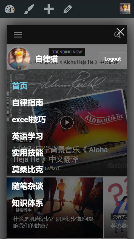
I don’t want this background to be transparent, I want to change it to another color, help
 Simone Ferrara
Hi, I wish to showcase some tips I’d like to have in the tagDiv Newspaper theme.
Advice:
- Specify, for those who use other cache plugins, such as js not to minify or exclude from the cache
- Add a function that excludes the display of the WordPress bar for subscribers (or even for others)
- Enable the login on mobile synchronized with the page created with the tagDiv Opt-In plugin (author name must not lead to author template)
- Ability to generate PDF for the invoice or maybe be able to connect to external services for generating the PDF
many of these tips would avoid installing a child theme to add code to function.php
Bugs:
- tagDiv Opt-In – currency in EURO € absent (and others)
- Inability to translate or edit new entries (TagDiv Opt-In) on tagdiv composer or theme panel
- The login menu block (tagDiv Composer) lacks the ability to translate items “Account details” – “Subscription”
- Password reset not working (it works if I force it from the user panel)
- Some blocks (block 23) do not have the possibility to modify some parameters such as: hide comments, author name, in block 23 not even the modification of characters works
- Fix Background video self-hosted 100% with and heigh
- Google Tag Manager does not work on the Hero block, on normal button yes; add the possibility to set GTM differently in the two buttons on the Hero block
Will tagDiv Opt-In become paid?
This is not meant to be a criticism, but I would love to have these options
Regards,
Simone
Anamaria Hello,
To remove the ad box, please edit with tagDiv Composer, select the viewport on the phone and select element and delete it with right-click.
Also, if you have a mobile page, then you need to edit the mobile page and delete the ad box https://i.imgur.com/ETLC3qR.png
Thank you!
 bishar
hello , i have updated to 11.4 and mobile templates that have been created couldn’t be opened or modified also there is big mobile menu appeared on my site but the most important things are mobile templates I cant even open them to edit .. both AMP and MOBILE THEME tAG DIV PLUGINS ARE DELETED I DONT USE THEM.
Bettina Hello @spenxx!
Here you can remove/set a picture for mobile menu background: https://www.screencast.com/t/x3Xrln2b88x
Thank you!
 spenxx
 Hello,
Thanks. I’ve manage to fix it. It’s more or less a bug on your theme.
Anyway, please can you help with how I can remove this mobile background (please see the attached image)?
http://e.pc.cd/Tr1otalK
I have check everywhere in the theme and i can’t find how to customise that side. Basically, on mobile, the homepage is showing a different menu from the other pages. The other pages are showing customization from the theme mobile settings.
Please can you help?
Calin Hi,
Yes, using the mobile theme plugin, you’ll need to set per each page a content using the mobile editor, also you can disable the mobile theme individual per page.
The top bar is hidden for mobile, but if you want to have it, you can display that section using a css code.
For this you’ll need a custom css like this one
.td-top-menu-full {

    display: block;

    text-align: center;

}
You need to set this css in the theme panel > custom code> custom css.
Thank you!
 kimstipguide
 On mobile everything else is fine.
but
Only mobile header menu Swipe is an error.
 trebol30
Hello,
I was having trouble loading visible images and have gone to the Wp Rocket guide. I understood that I had to exclude JavaScript files to fix problem https://docs.wp-rocket.me/article/1560-delay-javascript-execution-compatibility-exclusions/?utm_source=wp_plugin&utm_medium=wp_rocket I took the corresponding code for your template:
/jquery-?[0-9. :)(.*)(.min|.slim|.slim.min)?.js
/jquery-migrate(.min)?.js
/wp-content/plugins/td-composer/legacy/Newspaper/js/tagdiv_theme.min.js
tdBlocksArray
But, although everything works fine, the menu of the desktop version does not show the sub tabs since I activated it (in the mobile version they do work). I leave you a video so you can see how I see it logged in (which does work) and how it looks from an incognito visit. https://www.loom.com/share/6b87ec572cea487182db342cd8547571
kimstipguideHi..
header menu on mobile screen
Finger dragging doesn’t work.(Swipe)
Below is the URL of the question content…
https://kimstipguide.com/wp-content/uploads/2021/12/21-12-19-100.jpg
In the end, the menu that appears on the PC screen is not visible on the mobile.
—-
Thank you.
 estcos
Good afternoon. I bought the Newspaper template, chose the La Mode Pro theme, adapting it to my needs. Now, after it’s practically done (https://novo.tendenciasonline.com.pt/), I need help on the following points:
– When viewing the site on a mobile phone, the first image of the homepage is left with the title unformatted.
– All over the site, and in the margins (left and rigth), I need to add 50px but as much as I try I can’t.
– In all images (see homepage BEAUTY) the prevailing color is purple. I can’t put the red I have on the titles.
– I want to create a mega menu, but the instructions are not very precise. Also, I can’t create subcategories.
I want to put the site online before Christmas (currently http://www.tendenciasonline.com.pt) so I need your help. In case it is necessary, these are the access codes:
Thanks
Paulo Costa
kimstipguideHello.
The URL below is the content of the question.
https://kimstipguide.com/wp-content/uploads/2021/12/21-12-15.jpg
It is currently set to ‘Mobile horizontal menu’.
this part..
I want to remove the mobile horizontal menu and put a text input block.
please tell me how
thank you.
 candersonnm
Problem Overview:
*On posts on mobile devices (and in our app based on WPsite), the header doesn’t display the image or menu. Instead it displays the text of the site title and header and click here to use wpmenu builder.
*In the cloud template for the header, everything shows fine at each size
Site: discovermuscatine.com
Dropbox folder with screenshots: https://www.dropbox.com/sh/nzjkq0v4hlbfl3z/AADS_Y3QhBexEOMYIDkHU7uPa?dl=0
Bettina Hello!
1. I can not see any black line at the top on the homepage in your website. Did you mean the sticky header or the top bar menu?
2. This demo uses the responsive version for mobile. A responsive version of your website is looking similar like on desktop, edit the page with TagDiv Composer, click on the mobile viewport: https://www.screencast.com/t/XDQJedlggSB ; there you can see your mobile version and you can edit the elements there.
Yes, you can import other templates and use mobile pages which are fully customizable and could be so different than desktop version, so you should build and assign them to each desktop page you need. If you do not build for every page, then for the rest of the pages you’ll have the responsive version of your desktop automatically. For more information about mobile pages, please check our article here: https://tagdiv.com/newspaper-10-3-7-update-brings-customizable-and-fast-mobile-pages/
OR if you do not want to build every page style, but you need different style too, then you can install the Mobile theme plugin. The Mobile Theme is a performance optimized theme included in the Newspaper main theme and it loads only for mobile devices. It comes with its own templates/design for page, post, category, etc so your current templates from the desktop theme will get converted to the mobile theme layout. For more details, please take a look here: https://forum.tagdiv.com/the-mobile-theme/ and https://forum.tagdiv.com/mobile-theme-introduction/
You can use which one is suitable for your needs.
Thank you!
 zaporo
Hi tagdiv team, im editing the mobile template for article page, however the gap below the menu header cannot be removed. ive tried to look into the css settings but didnt find any solution. please guide me to solve this problem. thank you
my website is https://techlagi.my

 PeteMason
I want to reduce the right margin as shown in the picture, extending right beyond the header and body.
I want to achieve what https://www.screencast.com/t/AplrIm3zs5 shows in the thread, https://forum.tagdiv.com/topic/menu-problem-12/. It says “you need to set the margin left and right on the row to -20”. But this has no effect on the right margin for me.
I can force the content into the middle of the screen by increasing the left margin to, say, 20, but I can’t reduce the right margin.
I have switched off background color/image in the Theme Panel as per the thread, and tried the other things.
It looks bad the smaller the screen and mostly on the mobile phone.
It varies as I adjust the the row “stretch row and 1200px content” to “default”, etc, but I want to stay with “stretch row and 1200px content” as it matches the header.
Hope you can help!
Thanks.



