- TutorialsFrom WPBakery to tagDiv Composer
- TutorialsWhat is Ajax preloading?
 pabucketlist
I’m contemplating installing the Mobile Theme and AMP plug-ins on my live site and have set up a staging version of my site to test this out. On my posts in the AMP version, everything looks good except for the photo captions – they are displaying vertically instead of horizontally. Any idea why? Example here: https://snipboard.io/6lhkbL.jpg
 partha
I am facing a peculiar issue. I have disabled mobile theme and my home page/other pages are rendering fine. However, the Sign in/Join is not showing the Login username/password on a mobile. I am using android. The login appears if I activate the mobile theme! However, I do not wish to use the mobile theme.
Website URL: https://labinmotion.com
When I click on “Sign in”, a “Welcome” message appears. When I click on the left on the left arrow on the top, the login boxes appear for a fraction of a second and then disappears!!
The screenshot is here – https://labinmotion.com/wp-content/uploads/2021/04/screenshot-LIM.pdf
Would appreciate early resolution
Partha
 dcaceres
 <quote>1. If you want to use AMP, you can use the Mobile theme plugin with AMP, and set the mobile theme template on AMP version</quote>
I activate the option AMP but I still see all this info on my homepage logged as Admin:
https://imgur.com/3gSHC3q
For 2 and 4 seems that the box is not from our theme, but from the GDPR plugin used.
Ok. I change to WP GDPR Compliance plugin. It’s solved
3. Please make sure if these titles are translated in Theme Panel -> Translation -> Translations =>
I already made it, but don’t work: https://imgur.com/QTD0BxU
-
This reply was modified 5 years by
dcaceres.
 Anamaria
 Hello,
I checked your website and seems you have set a text logo, not an image => https://www.screencast.com/t/z2aSuyvwur6
So, please make sure you don’t have set a logo in mobile header on the viewport on phone, also, you can check if you don’t have set the logo text in Theme Panel -> Header -> logo => https://www.screencast.com/t/jt6I4pVV -> https://www.screencast.com/t/2fjJAlTYThhD
If the problem isn’t solve after that, please contact us via email at contact@tagdiv.com and provide the following:
– admin url and credentials
– a link to this topic in order to identify you
Our team will take a look!
Thank you!
 sparkspill
Hi,
I pasted the same SVG logo for the gadgets pro theme but it doesn’t appear when it’s on mobile. It’s the same SVG code I pasted in the other tabs and it’s only on mobile that is not working.
https://imgur.com/5NgzepS
https://imgur.com/yWSqcyu
https://suroy.ph/home/
Thank you for your support.
 Paweł Rzepecki
Hello,
I activated mobile theme plugin, but I see a mobile version of the mobile theme once and the correct version from the plugin. Sometimes the mobile version of the theme is on the home page and the version generated by the plugin is already generated on the subpage. What’s wrong?
Anamaria Hello,
1. If you want to use AMP, you can use the Mobile theme plugin with AMP, and set the mobile theme template on AMP version => https://www.screencast.com/t/NcZEyCf9 in this way for the mobile version you’ll use the mobile page created with tagDiv Composer and for AMP it will be using the mobile theme design.
For 2 and 4 seems that the box is not from our theme, but from the GDPR plugin used.
3. Please make sure if these titles are translated in Theme Panel -> Translation -> Translations => https://www.screencast.com/t/dnwyvyIaoJzk
Thank you!
Anamaria Hello,
Using our theme you can choose from 3 mobile versions
-> mobile responsive => https://www.screencast.com/t/oJ2ShOp47
-> mobile theme plugin => https://forum.tagdiv.com/the-mobile-theme/
-> mobile page => https://tagdiv.com/newspaper-10-3-7-update-brings-customizable-and-fast-mobile-pages/
This is a video about Responsive Newspaper Theme, AMP & Mobile Theme, Mobile Pages & Templates -> https://www.youtube.com/watch?v=SpGkOnJeNZY
I understood you created the mobile page, you need to assign that page like this => https://www.screencast.com/t/olI1bW8Cg92
Hope this helps you!
Thank you!
Anamaria Hello,
If you use a mobile page, not responsive then it will be a different mobile page.
Only if you use responsive and mobile theme then the same page will be used for the mobile version and the same SEO will be used for the page => https://yoast.com/on-serp-seo/
Both mobile page and mobile theme plugin are SEO friendly.
Thank you!
 Calin
Calin Hi,
1. The thumbs that are use for mobile theme grids are 741×486 or if you want to make the mobile grids bigger in height, it can be done with some custom css.
2. For flex block you can set the thumbs size from layout tab -> https://i.imgur.com/MUp5vuj.jpg also on flex (the thumbs used are 681×0, 300×194, 1024×580) you can change the height and width -> https://i.imgur.com/IWOKeIv.jpg -> https://i.imgur.com/A3PsMCY.png
Hope this will help you!
Thank you!
 fabioweb90
 Ok great. Everything works fine now. 2 last info
1) How can i manage resize crop into mobile theme “GRIDS” section?
https://ibb.co/3ztjR5T – https://ibb.co/jH1D4FR
2) How can i manage crop also for a flex block like this one? https://ibb.co/hHkP0Px
Regards
 loslunes
Hi, I’m noticing that search console is saying that urls are not optimized for mobiles since I updated yesterday. This was not happening before (only for a few pages) but now all the ones which google spiders ask to show the error. I have changed nothing, just updated to 10.4. Search console says my fonts are too little to read it, content with more width than screen, clickable elements to close one from another. As I said, this problem has appeared since the update. Urls still showed in google result but I´m worried this advertise / error could have any serious consequence to my SEO.
Any idea? My website is: http://www.loslunesseriefilos.com (not using mobile theme and no amp, one more time NO PROBLEM WITH THIS BEFORE UPDATE)
 osamahalari
Hello there,
My website https://techelucidations.com/
is loading very slow even when I am using newspaper theme prebuilt pro demo and also after that customising it.I am using very less plugins too as compared to other competitors like beebom.com who also uses Newspaper theme.
I am using Hostinger’s WordPress Hosting which has Litespeed cache preinstalled and the hosting is based on litespeed and I also got the premium features with it on using litespeed cache on my website.But when I try to minify js or css or html the website doesn’t load properly as customised.The header messes up or anything which is not ideal.The page optimization don’t work the way it is supposed to.
SO PLEASE HELP ME IN THIS.My pagespeed insights score is very very low even though I am using Mobile theme with AMP.And I am also serving images in Webp and in the lowest size possible and Also using the Low quality image placeholder in the Litespeed console.
I want to know how should I speed up my website?Should I change the caching plugin because I have premium access to this litespeed plugin but when I will switch I will have to use the Basic free version of that new plugin.Or is there any way to use both at the same time?
please get back to me.
 nycinsider
hi – the font on a mobile on a pro template is incorrect. I don’t use the mobile theme – I just want to be able to change some settings on mobile for a template. The font is too small. How?
 stringbenderb5
The mobile header background is black. However, in the theme panel the color is set to white.
How can I get the header to be white on mobile device?
dcaceresHi! I recently change my site from NewsMag to NewsPaper Theme. I found some problems that I don’t understand how fix:
1: https://imgur.com/jms6JKN
I don’t know if I need delete de Mobile version. I see your tutorial video and see that maybe isn’t compatible have AMP and create an mobile version.
2: https://imgur.com/NJmuj9Z
I see this box and I don’t know what it is and how manage.
3: https://imgur.com/vMIrGQr
In NewsMag I downloaded the Spanish Language Translation and work fine. With NewsPaper don’t work.
4: https://imgur.com/x53MuFz
On mobile version I see in the bottom the same grey box that the point 2
loslunesHi, I updated yesterday to the new version of the theme. Since then I have noticed some 404 errors (not to much) related with your plugins.
This one is the most common, its seems it comes from mobile chrome 90.0 visits (still appearing):
Url: /wp-content/plugins/td-cloud-library/assets/css/tdb_less_front.css?ver=a50385a2d79d6600973a7e697f735

Agent User: Mozilla/5.0 (Linux; Android 10; SM-A217M) AppleWebKit/537.36 (KHTML, like Gecko) Chrome/90.0.4430.66 Mobile Safari/537.36
More, this ones appears just after the update, not seen again:
/wp-content/plugins/td-composer/td-multi-purpose/style.css?ver=c784b8db3e66cd68082f3ff7aa2d70e6

/wp-content/plugins/td-composer/assets/fonts/font-awesome/font-awesome.css?ver=c784b8db3e66cd68082f3

/wp-content/plugins/td-standard-pack/Newspaper/assets/css/td_standard_pack_main.css?ver=6b62588d3347

/wp-content/plugins/td-cloud-library/assets/js/js_posts_autoload.min.js?ver=a50385a2d79d6600973a7e69

/wp-content/plugins/td-cloud-library/assets/js/js_files_for_front.min.js?ver=a50385a2d79d6600973a7e6
Any idea? The first one has appeared 13 times. Any problem, or nothing important. I vist my web site and it seems to work perfectly in mobile or desktop version but I prefer to ask you.
Anamaria Hello,
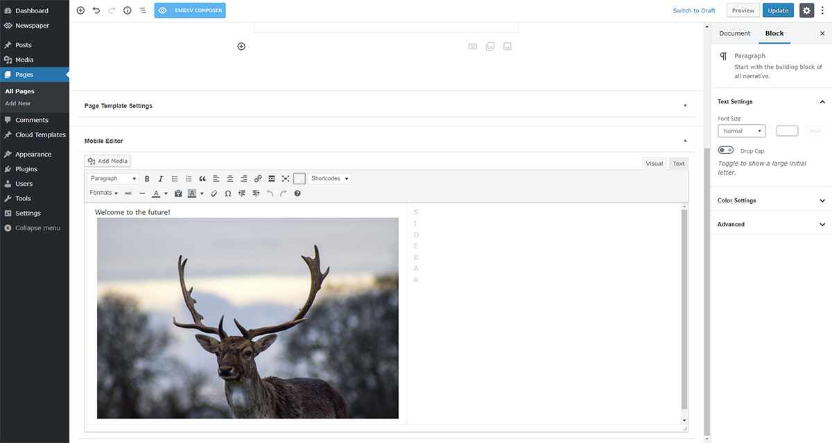
The page content is made without builders in mobile editor => https://www.screencast.com/t/xbgZG8kH so you can only add the elements that are present in the toolbar, without shortcodes(blocks).
Also, you can apply a filter for grids on the front page from Theme Panel -> Mobile Theme.
Thank you!
 Bettina
 Hello!
If you have Mobile Theme plugin installed and active, then you can not customize it because it has its own design templates.
You can have just some setting for it and those can be found in Newspaper -> Theme panel -> Mobile theme.
A full explanation you can find here: https://www.youtube.com/watch?v=SpGkOnJeNZY
When you deactivate Mobile Theme plugin, then your responsive mobile version will be on which is similar with the desktop version and all should be alright.
Thank you!
Anamaria Hello,
To change the background image for the menu on mobile, please access Newspaper -> Theme panel -> Background -> Mobile menu/search background and change the image from here https://www.screencast.com/t/ATV1Jr7s
Hope that helps you!
Thank you!
fabioweb90 Ok great. Everything works fine now. Only last info
How can i manage resize into mobile theme “GRIDS” section?
https://ibb.co/3ztjR5T – https://ibb.co/jH1D4FR
Regards
Anamaria Hello,
Usually, the problem is from a cache plugin, because you are using the mobile theme plugin => https://www.screencast.com/t/mpbsqaVtX2kL, the mobile layout will have a different design and most of the cache plugins do not recognize this and provide the mobile version for desktop (or vice versa). We recommend using WP Super Cache plugin with the settings from our guide -> https://forum.tagdiv.com/cache-plugin-install-and-configure/
Thank you!
 jbminc
Hello Support,
When we access our site via a desktop many times it displays the mobile version of the site/theme.. any ideas how this is occurring?
https://www.awesomescreenshot.com/image/7551828?key=b34fced2622a34132d0832affe420ef7
Our website is at https://amazinghealthsecrets.com
Thanks!
Cheers
James
 carlodap
Hi there,
I’d like to set up a mobile theme, but there is something I can’t sort out.
– The logo, the size is set as you advise, is not displayed properly https://imgur.com/nG6kvku
– There are some blocks at the end of the mobile page I can’t modify or remove https://imgur.com/szeFFzH
Can you help me?
Many thanks in advance
 imdarshanpetkar
When the mobile theme plugin is active, how can I show my some particular category’s posts on them? Let’s say for example I have a Page Of Health Tips and on that page, I want to show only Health Tips category posts. I am unable to do it with the mobile editor option—-> https://tagdiv.com/wp-content/uploads/2018/11/gutenberg-welcome-to-the-future.jpg
How can I do that?