- ApiPractical example – How to add a new Block and Module
- ApiAPI – Smart Lists – Introduction
- ApiAPI – Category top section style – Introduction
- ApiAPI – Category top section template – Introduction
- Apitd_api_module::update
- Apitd_api_module::add
- ApiAPI – Modules – Introduction
- ApiUsing the Theme API in plugins
 Calin
Calin hi,
That will happen on low resolution, to resolve your problem you need to add a custom CSS
go in Newspaper > Theme panel > Custom cod >custom css and paste this code there :
@media (max-width: 600px){
.td_block_single_image .tdm-mobile-full{
height: 125px!Important;
}
}
You can change the height and max-width on your desire.
I hope this will help you.
Thank you.
 Simion C.
 So that error appears when you access AMP versions of posts? Did you maybe add any code in the theme files or theme panel, or maybe by a child theme? Or maybe modified the AMP plugin? Temporarily remove theme if you did and test again.
Regarding the mobile theme plugin, once activated plugins don’t deactivate themselves. Unless this is defined in their code maybe. Our mobile theme plugin doesn’t have an auto deactivation function.
Could be insufficient resources maybe, you could check that
– https://forum.tagdiv.com/requirements-for-newspaper/
Or maybe a server problem. You could also ask your hosting to check if there are any errors in the server error log, that might indicate why plugins deactivate themselves.
 Max Mile
HI! We are using Newspaper theme version 8.
Is there a way to select whether a content (for example an article or a category) can be published on the mobile version only?
That is, we would like to be able to choose that post A is visible only on the desktop version, while post B is visible on both versions.
Thanks for your help.
Simion C. Default Adsense ads were used I believe, such as this ad example
– https://support.google.com/adsense/answer/181950?hl=en
Page level ads from what I can find have a different implementation. They seem to only require a one time entering of the ad code in the theme header, then they should automatically appear
– https://wpism.com/page-level-ads-adsense-wordpress/
– https://adsense.googleblog.com/2016/04/AdSense-page-level-ads.html
– http://tipsarea.com/2016/04/30/how-to-add-google-page-level-ads-to-your-wordpress-site/
– https://www.shoutmeloud.com/adsense-page-level-ads-monetize-mobile-site.html
I don’t know much about adsense ads, only what I can find online. So I could be wrong.
 heedozz
I installed the AMP through the tutorial.
AMP tutorial:(https://forum.tagdiv.com/tagdiv-amp-plugin-tutorial/)
In fact, I added / amp at the end of my homepage url, so the /amp screen appeared.
Is not this automatically seen on mobile devices?
It does not make sense to put / amp at the end of the url address whenever i want to use the amp function.
I do not know much about amp yet.
Please answer some of these questions.
 Arafat
 Code didn’t work please check.
maybe switch them? – https://www.screencast.com/t/EWt7fDFfEWc
#td-top-mobile-toggle {

position: absolute;

right: 0;

}

.header-search-wrap {

right: auto;

}
 Bogdan B.
 Hello,
Most likely you are using the mobile theme plugin. Please read this guide: https://forum.tagdiv.com/the-mobile-theme/
The mobile theme has it;s own ads section.
Thank you!
 alexcamarillo
Hi,
I’m using the Big Grid Full 10 for my website home page and the sliding function on the last 3 posts is not working on the mobile… when I test i on the TD Composer it works ok, but not on the mobile phone… I’ve tried it on different devices and browsers, but none work… Can you help me figuring out what can it be?
My URL: https://soyhomosensual.com
Thanks very much!
Cheers,
Alex C
 NickDeBaerdemaeker
 I have found the culprit, the theme keeps looking for this
“http://192.168.0.208/wp_011_sound_radar/wp-content/uploads/2017/04/mobile-menu.jpg”
The site has been developped offline with wamp64 and it looks like a left over from when I was starting to build with the sound radar theme. Any thoughts on where this specific link might be referenced ? I’ve looked but can’t seem to pinpoint it’s location. It takes a whopping 21 seconds to load…
I might uninstall the sound radar demo but I fear it will mess up the design.
 adrian_van_hal
Hi,
I put the setting of a row to stretch row and content, then I add a column text, as content a screenwide image. However. The row looks like it is shown as settings are stretch with paddings. I would like to add an screen wide image on the top of the homepage. Unfortunately I cannot work with herobox or single image element because they are not responsive. IN case of using a hero box the image, which is a background, is only shown as part on a mobile view.
What can I do to create a screen wide image?
htps://europahypotheek.nl/frankrijkhypotheek > image is shown with paddings, while settings are row: stretch row and content; image is 2000 px wide.
Thank you.
Ad
 deliciousthemes
Hey guys,
I’m wondering what you would recommend, from an SEO POV: the mobile theme, AMP or both?
Are there any issues if using both of them? How the mobile theme interfere with the AMP protoco?
Thanks!
 Najeyalafary
 I have a problem adding tagDiv Mobile Theme when I activate it and after an hour or more I find that the addition has been deactivated automatically
 deanysus
Hi tagDiv team,
I’ve just updated the Newsmag theme to its latest version, and we’re having a few issues. Could you possibly help?
1. “Sharing” social media icons are not displaying properly: https://i.gyazo.com/af00b0bc835c09dc1f36dddd781bc46a.png
2. On mobile, featured images on homepage are not displaying: https://i.gyazo.com/5e113038ef3f3e27f865e92d45ce7e8c.png
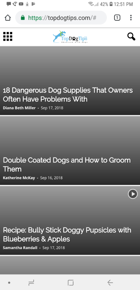
3. On mobile, “search” icon/function does not work. It only gives a “domain/#” (like in screenshot) link and doesn’t allow to search. We’ve had many people email us that they’re unable to search our site.
Any help on how to fix this would be appreciated!
Thank you.
Dean
 fgmotta
Hello people…
I noticed that in the last version of the theme the smoth scroll problem was solved in the dental studio template.
I would like to know which file I should replace and where it is.
thank you.
 temporary_saint
 Hi – sorry, I should have clarified – I’m referencing the Single Image element that I dragged into the TagDiv Composer.
You can see it here:
When you view on mobile, it retains the 250px height and creates a big blank
space below.
Thx!
-
This reply was modified 7 years by
 Alin [tagDiv].
 breetoplay
 Tried disabling RocketLoader, no effect.
I actually CAN get the gray bar effect on your live demo, but only by making the mobile preview unrealistically narrow, so it’s just an effect that’s kicking in at a larger width for us (theme loading too-wide thumbnails?)
One more clue: the featured image and the two images that are visible in the slider on first load have gray bars, but the three images that are NOT visible on first load have correct thumbnails. Does that help at all? Is there a difference between initial load thumbs and those that are hidden initially?
 Anonymous
Good Morning! All right?
I have a doubt. I can not display the ads on mobile devices. What am I doing wrong? In ads consigations everything is correct to be displayed on all devices.
When I open the phone no ad appears, either type or sidebar.
breetoplayHello! We’re really liking Newspaper as a theme, but I’m having a problem with the way the grid thumbnails are responding to being made “phone narrow” as seen here:
The gray bars appear on any resolution narrower than 480 px or so, at least on my 1920×1080 monitor’s mobile simulation.
I know I’ve seen this problem described on this forum many times, and the answer is usually to regenerate one’s thumbnails, which I have done (with careful attention to the grids and modules that we are using). In this case, the problem shows up when the page is viewed on a narrow mobile device (or in Chrome or Firefox mobile preview with the simulated device made very narrow). The images shrink properly until the aspect ratio matches the ratio present in the thumbnail, and from then on as the page gets narrower, they shrink to match the x-direction, leaving them too short to fill the box in the y-direction. I wouldn’t complain, but this isn’t some extreme, unrealistic aspect ratio, it’s what’s actually present on my Pixel 2 or my wife’s Pixel 2 XL.
(In a related behavior, if you use Chrome or FF to simulate mobile and then drag the device to be more than about 750px wide, the thumbnails snap back to the wrong aspect ratio once they stop filling to 100%, not to the correct aspect ratio thumbnails that get served to the real desktop site. That means that even if a mobile user clicks “request desktop site” the thumbnails will still come with gray bars! I’ve seen this behavior in Safari on iPad. It’s probably not a coincidence that this is the pixel width at which the “large tablet” CSS is supposed to come into effect.)
Is there some way to get the images to stop shrinking to match x and start cropping the y-axis once they get too narrow to resize correctly? And why are the thumbnails for the “large mobile” the wrong aspect ratio?
Thanks for your help! The theme is working great otherwise!
 Catalin
  hinonashi
Hello , I have many Link , Page and Category . Total 100 Link . So I need Mega Menu to Add all Link To Menu .
My Site is Blog Tiền Ảo
U can check it out and let me know if u have any plugin about mega menu Compatible With Newspaper on Mobile and Desktop
Simion C. Hi,
WhatsApp and other mobile socials will only be displayed on mobile. When used on a mobile the mobile WhatsApp application will launch and you can share the post.
If you want this social to appear as a sharing option on desktop as well, you could make it visible with a code like this
– https://www.screencast.com/t/sGA8pfmMuWb
@media (min-width: 767px) {

.td-social-whatsapp {

display: inline-block;

}}
Enter it in Theme panel->Custom CSS section if you want to use it.
Thanks
Calin Hi,
Please try to optimization your page ( https://www.screencast.com/t/ujzSFopuM8yS ), because same mobiles have
poor connection to internet/wifi and it take a while until it loads.
Try to use proper image, and for mobile remove image from background.
Thank you.
Catalin Hello avenlylane,
I have checked your website and it seems to work as expected. The mobile version does not come on the desktop version. Try to clear all of your caches, purge CDN files and check the results.
Thanks for the message!
Calin Hi,
If I understand correctly when you say “Single Image” you refer to logo, if is so there is a way to set different Logo for mobile; go in Newspaper > Theme panel > Header > Logo for mobile and set your mobile logo https://www.screencast.com/t/U1glxznAp
If is not that please put here your url site, so i can inspect the problem.
Thank you.
Calin Hi,
If I understand correctly you desire to switch between to logos, if is that than it’s possible, but you can chose only from tow option logo mobile and logo header this is the only way you can switch logo between your sticky menu and menu.
If is this, I will show you how to do it: go back to WP dashboard Newspaper > Theme panel > Header expand Logo & Favicon then put your logo for static menu ( https://www.screencast.com/t/H1lVAbuWj ) , then expand Logo for Mobile and chose upload your second logo to Logo Mobile ( https://www.screencast.com/t/vzqdtC9Q3nR )
See results: https://www.screencast.com/t/wwEqEISNJ https://www.screencast.com/t/CRoHjDzZm .
This is the only way to switch the logo for sticky menu and menu.
Thank you.