
- ApiPractical example – How to add a new Block and Module
- ApiAPI – Smart Lists – Introduction
- ApiAPI – Category top section style – Introduction
- ApiAPI – Category top section template – Introduction
- Apitd_api_module::update
- Apitd_api_module::add
- ApiAPI – Modules – Introduction
- ApiUsing the Theme API in plugins
 Simion C.
 Maybe like this – https://www.screencast.com/t/0bglaoD285r
.header-search-wrap {

right: 54px;

}

#td-top-mobile-toggle {

position: absolute;

right: 0;

}

.td-main-menu-logo img {

right:auto;

left: 20px;

}
 Arafat
 Need to shift mobile logo some more left side. Check this: https://prnt.sc/kqsf1u
Like this: https://prnt.sc/kqsgw7
 coachkriswatkins
 So I tried to remove the mobile logo then go look and now it seems as if there is not a mobile menu button
 Catalin
 Hello fgmotta,
Unfortunately, this functionality is more complicated and we cannot provide support for this, sorry! Do you have tested the smooth scroll on mobile for that demo? Notice that some changes have been made and now work better. Notice that with each theme update we are trying to do the best with our product.
Thanks for your understanding!
Catalin Hello coachkriswatkins,
I have tested your website on mobile and it seems to work as expected. Also, if you want to hide the category tag from the category you should check the following option from here -> https://www.screencast.com/t/XLwYuleY6DC
Thanks for your understanding!
Simion C. Hi,
But if you shift the menu to the right what about the search icon? Maybe like this
– https://forum.tagdiv.com/topic/how-to-change-mobile-icon-menu-to-the-right/
Or maybe switch them? – https://www.screencast.com/t/EWt7fDFfEWc
#td-top-mobile-toggle {

position: absolute;

right: 0;

}

.header-search-wrap {

right: auto;

}
Also with the menu to the right as you mention
– https://www.screencast.com/t/Iqp57AJP
#td-top-mobile-toggle {

position: absolute;

right: 0;

}

.header-search-wrap {

right: auto;

}

.td-main-menu-logo img {

left: auto;

right: 54px;

}
Modify the codes as you want, then enter them in the phones section in the Advanced CSS.
Thanks
 Mik3storm
Hi,
I’ve recently update to V9.0.1 but the search icon doesn’t work no more (in desktop version) and, in the mobile version of the theme, when you’re in any post, the search bar and the menù icon don’t work.
Can you pls check it?
Thanks
Simion C. Hi,
Can’t give you advice about that, we made no tests in the matter. You could check some online guides and free plugins if you want to do it
– https://www.wpbeginner.com/plugins/how-to-build-a-mobile-app-for-your-wordpress-based-business/
– https://www.godaddy.com/garage/5-best-plugins-turn-wordpress-website-mobile-app/
– https://www.designwall.com/blog/the-whys-and-hows-of-creating-a-mobile-app-for-your-wordpress-website/
Test with free or trial plugins if possible.
Maybe some users who tried something like this with the theme could share their experience.
Thanks
coachkriswatkinsHi,
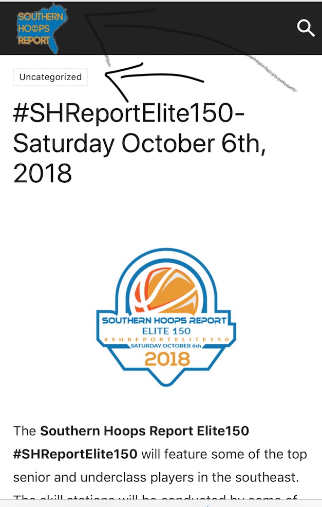
I am having some trouble with my site showing up correctly on mobile device when someone gets to it by clicking a link to the site (twitter, facebook, text message, etc) It shows the category (which I do not want) and it moves the logo over the menu button. This is not an issue if you go to the site directly on a mobile device, only when someone is directed to site via a link
ArafatHello, I want to shift Mobile menu left side to right side use custom CSS. How can I do that? Also, shift mobile logo center to the right side using custom CSS.
Thanks!
Catalin Hello johnmiao,
I have checked your website on my mobile and the menu seems to work as expected. Where is the problem? Provide some useful screenshots of the problem so I can identify the problem.
Thanks for your understanding!
Simion C. Hi,
That would be the compromise and also the main purpose of the mobile theme. When active a different and simpler variant of the whole website will be displayed on mobile.
Maybe there are ways to disable a specific plugin on specific pages, search a little online. Or maybe plugins that can deactivate other plugins by page. I did not try anything like this before.
Thanks
 vineetaggar
Hi,
On the post page the whatsapp sharing button is appearing on mobile but its not appearing on the desktop screen. My client wants it on the desktop screen as well.
Can you please guide how to enable it on desktop.
Thanks
 crazydiver
Hello,
I like the mobile plugin theme. It makes my site faster.
However, is it possible to have the mobile plugin theme ignore just the front page?
I like what it does to the posts and pages. I just don’t want the plugin to minimize the frontpage. That’sl all.
Thanks.
Simion C. Hi,
I know what you are referring to, but there would be nothing to do about that with a theme setting. The thumbnail used is bigger than what is visible, it is the same thumbnail as on desktop but reduced a little
– https://www.screencast.com/t/w2pG0RG39g
– https://www.screencast.com/t/tsf8MZmVAV9
So while the module is limited to a fixed value on mobile, the image will be larger. That creates the effect you mention when clicking on it.
I could give you some CSS solutions if this is required in this case. One would be to make the modules as big as the thumb on mobile
– https://www.screencast.com/t/trzr5LLz3t
For this, enter the code in here – https://www.screencast.com/t/4v5HtCAN
.td_block_big_grid_6 .td-big-grid-post-0 .td-module-thumb, .td_block_big_grid_6 .td-big-grid-post-1 .td-module-thumb {

height: 356px;

}
Thanks
Simion C. Hi,
So the problem is only on mobile? What exactly is happening? I browsed the website for a while on mobile, don’t see any problem with it
– https://www.screencast.com/t/KIdxcjxfDuJ
The website being http or https is not theme dependent if that is what you mean. You will need to acquire a SSL certificate
– https://www.wpbeginner.com/wp-tutorials/how-to-add-ssl-and-https-in-wordpress/
Thanks
 cucadigital
 I’ve already been deactivated for 30 minutes. And yet the problem persists. Your print is not displayed to me on my desktop or mobile phone.
And the chrome-only spacing problem occurs the same way, after deactivating the plugin.
Simion C. Hi,
Let’s try to clarify things here. The mobile theme plugin is optional, nobody is forced to use it since it will drastically change the appearance of the website. You can learn more about it’s functionality here
– https://forum.tagdiv.com/the-mobile-theme/
Then decide if you want to use it or not. If you don’t use it, exactly the same content from desktop will be displayed across all devices (responsive version).
You say you entered a block in a page. The block showed up on desktop, but not on mobile. A link to that page would have been very helpful, so we can see it and test for ourselves. Post it now if the same happens.
The theme does not have any inbuilt page or post cache, so if a modification you made is not reflected in the website, that is most likely a form of cache. Cache by a plugin, a server cache, browser cache maybe others.
Provide links to the pages with problems as well, I will let you know how we see them.
Thanks
Simion C. Hi,
I could take a look, please provide a link to your website. The mobile theme front page will display a top grid containing three of your featured posts
– https://forum.tagdiv.com/featured-posts-2/
At the bottom there will be a Latest articles section, containing a list of your posts ordered by latest
– https://forum.tagdiv.com/the-mobile-theme/
Thanks
 Bogdan B.
 Hi,
This is the implementation of the image box element. On mobile devices the images will go to the full width of the screen. If you need a different approach to the image implementation try a ‘single image’, or an ‘inline image’ or ad the image through a ‘column text’ element in the tiny mce editor. They all provide different results for responsiveness.
Thank you!
Simion C. The website looks like this at the moment – http://prntscr.com/kqctg0
Seems the mobile theme is displayed on desktop. In previous similar cases this was caused by the caching used. We recommend the WP super cache if possible, this will not cause problems with the mobile theme plugin.
To quickly fix it deactivate either the mobile theme or the caching.
Bogdan B. hello,
The theme on mobile devices provides a left and right padding.
You can alter this behavior by using this css code in the theme panel-> custom css section:
@media (max-width: 767px){

.td-container, .tdc-row {

    width: 100%;

    padding-left: 0;

    padding-right: 0;

}}
Thank you!
 Tibbar
 Not the Hover, but when i click on a post via mobile, the effect on my screenshot appears, try on a mobile, you’ll see
Simion C. Hi,
The image you can set is not per viewport. But there would be one way of doing it if required.
Create four single image elements in the page, instead of one. Then using the “Display” hidden setting in the CSS tab (this is per viewport) hide each one per the device you want
– https://www.screencast.com/t/53mrmljg
For example hiding the image in all these viewports will make it visible only on mobile
– https://www.screencast.com/t/BSRQpbSZz
This could be a solution if you should consider it and try it.
Thanks
Bogdan B. Hi,
For the moment there are no plans for adding typography for mobile devices.
As for the fonts, there are no setting to change the excerpts per block in particular as article titles can. The font settings title clearly specifies modules article title.
The excerpt font is handled for all blocks at once from here: https://www.screencast.com/t/zG8ZdKfB
Thank you!
