
- TutorialsFrom WPBakery to tagDiv Composer
- TutorialsWhat is Ajax preloading?
 great1212
 Brother, I have set up the menu, but I want to display the header menu in mobile devices. Thankyou for your understanding.
great1212 Dear, can we make the menu somewhat transparent in mobile device during sticky?
 Sebastian Escobar
 OK, I will create blocks for to show only in mobile. But Big Grid 1 I can see is no responsive, I checked the demo page and also is not responsive. Is it like that?
Thanks!
 vodol
vodol Edward, проблема решена, спасибо, но есть ещё одна. О ней ниже.
Bogdan B., the problem is solved, thanks, but there’s another one.
When I reload any page with cache refreshed (CTRL+F5), I see that blue semitransparent layer located over the page for a second or two.
Gif: https://imgur.com/a/rgNwk
It seems to be a background for mobile menu.
How can I get rid of it so that it does not appear when the page is reloaded?
 Bogdan B.
 Hello,
Please test big grid 1 here to see the responsiveness: https://demo.tagdiv.com/newspaper/big-grid-1/
As for the second request, yes it is possible if you use the different screen sizes in the tagdiv composer. Basically you create 2 blocks. One that is only shown on desktop/tablets and is hidden for mobile devices and the second one that is hidden on tablets and desktop and only shows up on mobile devices. Use these buttons to change settings based on device: https://www.screencast.com/t/7Dg5tS5bQBW
Thank you!
 bellendir
 For the mobile theme in the grid displays the last few posts, after the same posts are displayed in the last records. How to make a filter on them?
find a solution. It was necessary to create a category of Featured.
The question is still relevant
A smaller indentation at the bottom of the blocks can be adjusted in the themes panel, if it is a block. And if you use a sidebar, there is no CSS style in the panel
 hellonikoloz
 + Top menu’s not available in mobile view.
hellonikoloz Catalin, Thanks for your reply.
Let’s start from the logo, I am using text logo not the image logo, you could have noticed, if you have checked it, it is text logo, header style 10, on News Week theme demo.
So why theme is not resizing the logo for mobile devices?
Second, about the sign in / join buttons.
Of course i am aware that the styles are different for desktop and mobiles, and that is exactly why i opened this topic to get help to make it the same. I mean the theme is one, so why should i have different view on mobile devices? Just answer me. Styles are different is not the answer, because styles should not be different. I am just asking for help to either make 2 buttons in desktop view or 1 button on mobile view, so the website will be the same for any device. Just tell me how and what to edit in the theme editor.
Thanks.
 Jose
JoseHi all,
I use the td-mobile plugin for my mobile version of this theme.
It’s fast, and it’s effective. But I would like to know if there are more design options for this mobile version.
Can you share your website to see your mobile version of this theme?
This is mine:
First there are three fixed publications, then underneath the last entries.
Mobile pics:


It can be very interesting, and constructive, to share ideas about structure in a mobile version.
Remember that google, will release its new update in July, based exclusively on better positioning mobile searches.
bellendir For the mobile theme in the grid displays the last few posts, after the same posts are displayed in the last records. How to make a filter on them?
В мобильной теме в гриде отображаются несколько последних постов, после него эти же посты отображаются в последних записях. Как сделать на них фильтр?
 Catalin
 Hello,
Yes, please notice that the theme will auto resize the Text Logo on mobile devices if you will use the text logo, as you can see here -> https://www.screencast.com/t/OZ27ZVglCq Regarding on Sign in / Join buttons the style are different on mobile than the desktop version, sorry!
Thanks for your understanding!
bellendir Good day Simion again. Whether in the window to advertise the mobile theme to put some widget?
https://cloud.mail.ru/public/4KfP/tpdxKCi7m
For example default sidebar. How to do it?
Добрый день Simion еще раз. Можно ли в окно для рекламы мобильной темы поставить какой-нибудь виджет? Напимер default sidebar. Как это сделать?
Sebastian EscobarHi
I had my site without Mobile Theme in cell phone view because I needed to show some modules that Mobile theme don’t show, or really I think don’t show. My problem with template view is because have some problems: one of them is the first grid module (Big Grid 1) is no responsive. In phone there are a scroll for to see it. The second problem is the extension of Blocks. If I have 14 posts in computer view, I need only 4 in cell phone view and I can see this is not possible with only Newspaper template.
But also in Mobile Theme the possibilities are less. Is it possible to include another section in the Mobile Theme? For example, I have a block with post authors that I would like to see on the home page.
This is my problem. The template view has responsive and long-term problems, while Mobile theme is very, very restricted.
Anyway, I would prefer to restrict the extensions of the Blocks to the view in the cell phone, and don’t use Mobile Theme. Is this possible?
 Llapi
Llapi Hello Mr. Catalin,
Now in this domain, I installed all of them new, so wordpress, theme etc, but this is problem for us because we have many posts.
In our wordpress, all plugins are trusted.
When we open in mobile, sharing buttons are okay, just in desktop not showing.
Please help us,
Best regards,
Llapi
-
This reply was modified 8 years by
Llapi.
 Mucha K
I have upgraded the site with latest update and I am having problems with the mobile plugin. It will not upload- see attachment. 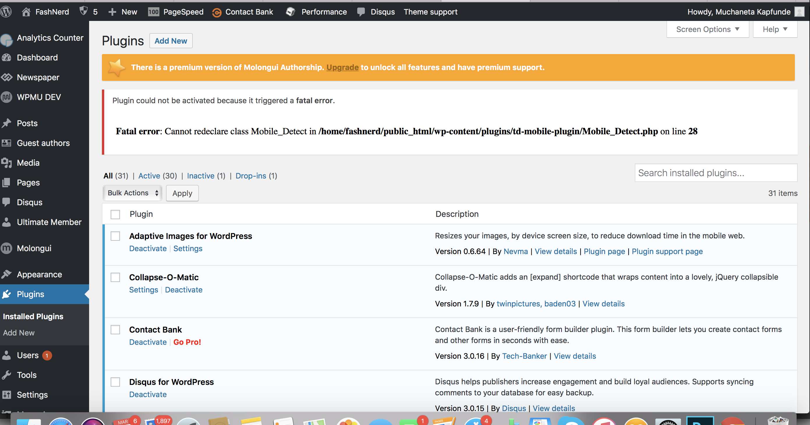
The mobile site on FashNerd.com is currently not responsive. I cant upload the plugin. I have no idea what the next step should be to recify the problem. Please help!
great1212 Dear, how can we show the header page menu as Disclaimer, Terms and Rules, etc in mobile device?
 Branstone
Hi there,
I installed the AMP plugin a few weeks ago, and just now got this message from Google Search Console saying it has identified that my site is affected by 1 new Accelerated Mobile Pages related issue.
The New issue found:
The inline ‘style’ attribute is not allowed in AMP documents, use ‘style amp-custom’ tag instead
Can you please advise how to fix?
Thanks!
hellonikoloz And about the logo size, I understand that it has many letters and that’s why it is not fully visible, however theme should be adjusting it for mobile, i mean theme should minimizing the logo text font for mobiles, isn’t it right?
hellonikoloz Not the social networks, I meant Sign in / Join buttons.
In desktop mode there is one button “sign in / join” button together and in mobile view the Sign in and Join buttons are separate.
Look at the screen:

Catalin Hello flo2paclegacy,
Try to update the theme to the latest version of it which is 8.7.2, clear all the caches and check the results. The theme should have to render your ads on mobile. If not, you should contact the Google Adsense department, tell the problem because they should be able to provide a more accurate response. Notice that the theme only takes the Ads and display it to the frontend.
Thanks for your understanding!
Catalin Hello hellonikoloz,
I have checked your mobile responsive version and it seems to work as expected. Notice that your mobile logo is not fully displayed because the size of it is too big. You should load another logo for mobile mode. The social networks are here -> https://www.screencast.com/t/0rYoc6NI Only two as you have it on the desktop view as well.
Thanks for your understanding!
Catalin Hello joep,
1)Please notice that the Block Header Styles does not have any such a hover effect, sorry! If you want to have such an effect, you should use a bit of CSS code in order to achieve this. Try the code below and place it in Theme panel -> Custom CSS area.
The code is ->
.td-block-title-wrap:hover{

background-color:green;

}
The result is here -> https://www.screencast.com/t/KYOJ4dnoKS
2)You can try the code below and add a margin top to your social sharing buttons.
The code is ->
@media (max-width: 767px){

.td-post-sharing-top {

margin-top: 20px;

}

}
The result is here -> https://www.screencast.com/t/wHSS4q9v39by
Also, if you have some additional customizations which can break the mobile theme layout you should optimize it. So, if you will check our demo on mobile, you will see good results.
3)Try the code below and place it in Theme panel -> Custom CSS area.
The code is ->
.widget_mc4wp_form_widget .td-block-title span {

color:red;

}
The result is here -> https://www.screencast.com/t/Pv20efchx
Thanks for the message!
Bogdan B.  shu2cool
All I am getting for visual composer is the optional button. How do we get the zip download for it? It did not come in the newspaper8 theme zip file. None of the optionals came with it. Not even mobile theme and revolution slider.
 Amit
Amit I have a Few Queries:
1. How to show Smart List Post Image Thumbnail in Mega-menu Without using featured Image in Smart List Post.
1b. Im asking about the thumbnails of the normal posts we see in Megamenu
2. Do I need to Insert Google AdSense Auto Ads Script
<script async src="//pagead2.googlesyndication.com/pagead/js/adsbygoogle.js"></script>
<script>
(adsbygoogle = window.adsbygoogle || []).push({
          google_ad_client: "################",
          enable_page_level_ads: true
     });
</script>
Into each Ads Section Field of Mobile theme to display Auto ads on mobile version.
