
- ApiPractical example – How to add a new Block and Module
- ApiAPI – Smart Lists – Introduction
- ApiAPI – Category top section style – Introduction
- ApiAPI – Category top section template – Introduction
- Apitd_api_module::update
- Apitd_api_module::add
- ApiAPI – Modules – Introduction
- ApiUsing the Theme API in plugins
 ntvweb
My website is using a plugin called “CM Ad Changer” by Creative Minds. Their plugin is great because all my ads are hosted in one place and then I can use shortcodes to show those ads on all 3 of my websites. HOWEVER, They seem to be conflicting with the Newsmag theme, specifically when viewing the theme on mobile/tablet mode.
Below is an image of the area where the adbox should be showing an ad. This screenshot was taken on an iPad Mini using Safari. I have activated the dev-tools for Safari to highlight the area. As you can see, the margin seems to be doing something very strange, and for some reason the ad isn’t showing up.

The next image is a dev site. It’s missing most of the images from this site, but the database, theme files and everything else are identical. On this site, the adboxes work perfectly, they show the ads and the margins aren’t messed up.

As you can see, eventhough everything is the same (minus the unattached images), the ads are working just fine. Anyone have any suggestions for how to troubleshoot this? or run into this kind of issue before?
Thanks,
Jordan
 misom
misom Hi. Yes, mobile plugin was active. I have deactivated it unfortunately, it was loading pages so fast…
Have one problem that I don’t know how to handle…how can I set some kind of sticky featured post on any grid? For example, on my home page, I am using Gig grid full 8 and one category to display posts. How can I stick a very important post from that category on the big image so that it does not move when I publish new posts in the same category? It is set so that I show latest posts. I want it to show that sticky post as long as I want, regardless of new post from the same category.
Kind regards,
Miso
 Bogdan B.
 Buna,
1) Article bottom ad are display:none pe mobile ca setare default: https://www.screencast.com/t/thTtGZuU
Poti reactiva acest ad cu urmatorul cod css:
@media (max-width: 1018px) and (min-width: 768px){

.td-visible-phone {

    display: block!important;

}
2)Acest lucru se intampla deoarece folosesti un block text with title. Acest element are nevoie de continut. Mesajul poate fi sters de aici: https://www.screencast.com/t/hAfE0Khbtp
3) Prin builder-ul nostru nu am incercat sa copiem visual composer si de aceea anumite elemente nu se vor regasi ca de exemplu, tab-uri, acorioane sau alte galerii si grid-uri specifice de visual composer. In viitor vom adauga propriile noastre elemente.
4) Modificarea elementelor predefinite din footer nu este posibila dar este posibila eliminarea lor si inlocuirea lor cu alte elemente. https://forum.tagdiv.com/footer-templates/
5) Depinde de cod. Daca codul este un css, atunci cel mai probabil o sa mearga. Daca sunt modificari in fisierele temei, atunci acestea vor trebui adaptate la noul cod daca este cazul.
6) “Ultimele articole” este un element predefinit ce vine din template-ul paginii: https://forum.tagdiv.com/page-templates-2/
Textul se poate traduce din sectiunea de translations din theme panel
7)Daca folosesti tema mobila, ea nu foloseste nici visual composer nici tagdvi composer. Aces aspect este prezentat aici: https://forum.tagdiv.com/the-mobile-theme/
8) Spatierea functioneaza fara probleme pe toate platfoirmele noastre de test: https://www.screencast.com/t/8ZKDDZXr – https://www.screencast.com/t/aZCiC9B4Xt4
9) Nu recomandam editarea continutuilui cu ambele builder-e. Probabil te refereai la tagdiv composer, nu la visual . Daca nu, ar fi bine ca o pagina sa foloseasca un singur builder. Aceasta optiune functioneaza fara probleme pe toate platformele noastre: https://www.screencast.com/t/Eqg6Zpb9
Pentru cele 2 probleme referitoare la spatierea pe text with title si culorile pe news ticker te rugam sa ne contactezi pe email la contact@tagdiv.com si sa ne oferi un link, username si parola sa putem sa investigam problema direct pe site.
Multumim
 Catalin
 Hello agrajewski,
The mobile theme plugin comes bundled with the theme core files as you can see here -> https://www.screencast.com/t/VIoCE8KPRX. For more information about this feature, please check here -> https://forum.tagdiv.com/the-mobile-theme/
Thanks for the message!
 Peperonikuchen
 Ok, i fixed the problem, i have deleted the empty categorie featured and the site is now runing will with the mobile theme!
Have a nice day,
best regards,
Jan Oliver Fricke
Peperonikuchen Thanks for the feedback, but i dont want have a post in two categories and on my other sites the mobil theme is runing well without the featured category?
https://developers.google.com/speed/pagespeed/insights/?hl=de&url=https%3A%2F%2Fwww.corporel.de
So what is wrong on the corporel site?
Bogdan B. Hello,
If you want a bigger logo, you will have to use a different header style. The logo is shrunk to the size of the container as the space is needed for the ad besides the logo. You cannot have a bigger logo and the ad on the same line as there is not enough space for both to fit. If you want to use a bigger logo please use header style 9, 10 or 11 which show the full logo without changing it’s size.
I have tested your page but it is visible in mobile devices. I cannot see the issue you mention.
You probably used the mobile theme plugin. Please read this guide on the mobile theme if you have it enabled to learn about how to use it with pages: https://forum.tagdiv.com/the-mobile-theme/
Thanks.
 fenomeno0chris
Hello,
I have a huge problem with the latest release of newspaper.
I always used the responsive Option as you can see here, to have one site individually looking for desktop and mobile. But with 8.0 there is no seperation between the contents. Everything is now visible on both platforms (desktop & mobile).
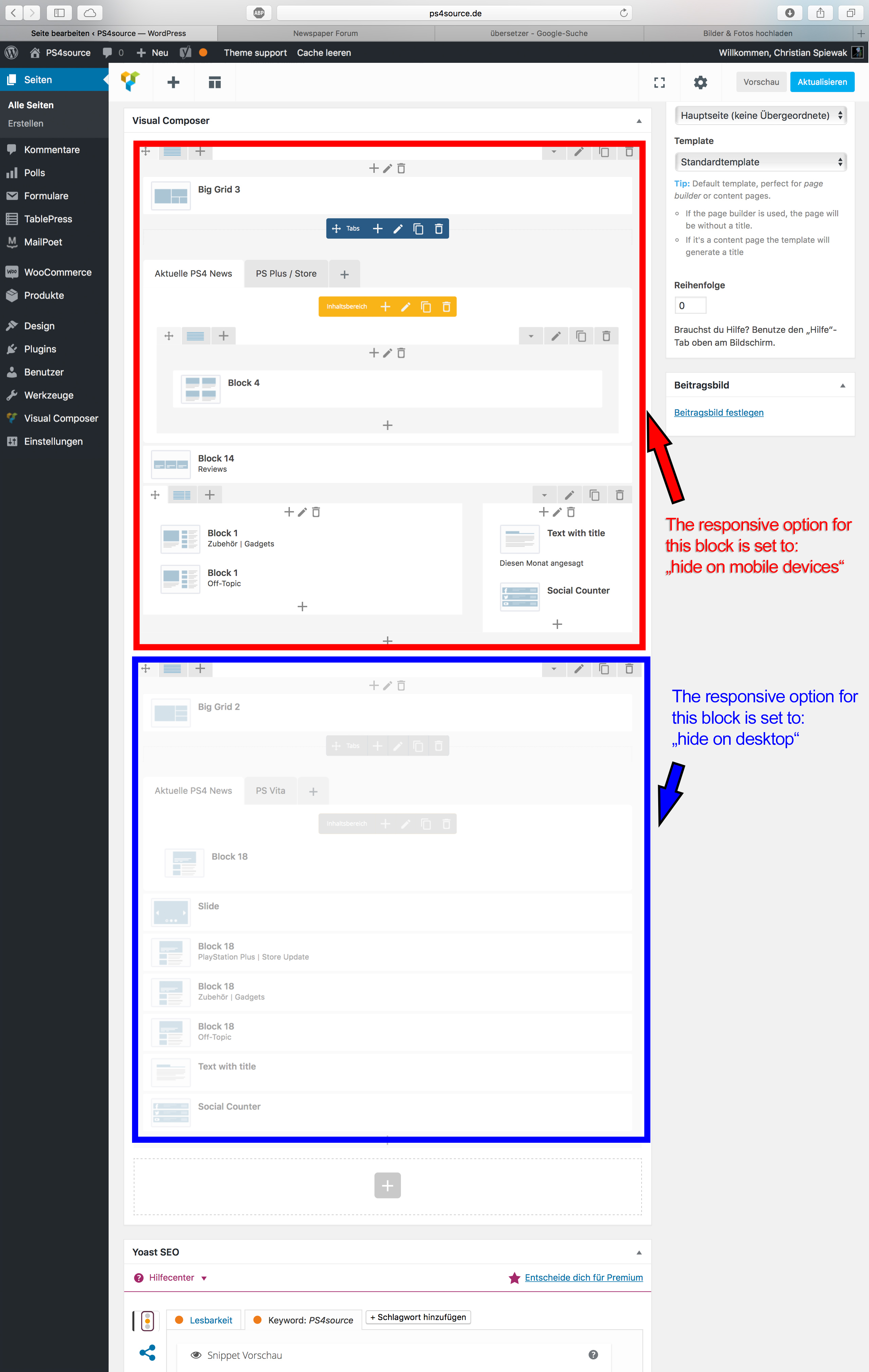
How can I solve this problem, or get back to my previous version?
 Alex
AlexBună seara,
Am realizat actualizarea la versiunea 8 a temei și aș avea câteva întrebări să vă adresez:
- Reclama de sub articol (Article buttom) nu apare dacă fereastra browserului este îngustă (suficient încât să fie interpretat ca mobil), chiar dacă nu am dezactivat afișarea ei nici pe desktop, nici pe tabletă, nici pe mobil. Menționez că nu este reclamă AdSense, ci un script personalizat, iar această problemă a apărut și în versiunea precedentă a temei. Articol exemplu: https://itutorial.ro/2017/05/youtube-activitate/ (de fapt, nu am găsit vreun articol în care să apară reclama respectivă pe fereastra îngustă); sistem de operare macOS 10.12.5, browser Safari 10.1.1 și/sau Chrome 58. https://www.screencast.com/t/8w6NyTaa
- Cum fac să scap de acest loc liber pe pagina principală? Menționez că atunci când selectez „Block Header 13” (și nu doar), apare automat un câmp de text intitulat „Insert Your HTML Code Here…” de care nu reușesc să scap decât dacă introduc ceva (în cazul de față o line orizontală). Deci, se poate face ceva să nu mai am câmpul acela ori să scot spațiul gol?
- În tagDIV Composer există posibilitatea de a adăuga meniuri care se extind la clic. Mai precis, în celălalt Visual Composer aveam o opțiune de genul
[vc_accordion collapsible="yes" disable_keyboard="" active_tab="false"][vc_accordion_tab title=x], dar aici nu găsesc nimic similar. - Cele trei elemente din subsol se pot modifica la stilul 1, astfel încât să nu mai apară Alegerile Editorului, Articole & Categorii Populare?
- În pagina de sursă s-au efectuat modificări importante, sau pot adăuga liniștit codul pentru sursa 2 pe care mi l-ați furnizat mai demult?
- Titlul „Ultimele Articole” de pe pagina principală poate fi personalizat că nu se potrivește deloc cu celelalte? Nu știu dacă are relevanță, dar eu am păstrat pagina principală de dinainte; am șters din ea toate elementele WPBackery Visual Composer și am creat unele noi în noul Composer.
- Cum fac ca întreg conținutul modificat cu tagDIV Composer să fie afișat corect și pe mobil. L-am copiat în Mobile Editor, dar pagina arată așa…: https://www.screencast.com/t/4OfCmdvxfK
- Block-ul Text with Title din Visual Composer nu respectă rândurile libere lăsate în WP Editor decât la inserarea unui alt format de paragraf. Astfel, dacă în WP Editor am aranjat textul cu rânduri libere, în pagina actualizată de pe site nu îl voi vedea sub această formă, toate rândurile fiind puse unul în continuarea celuilalt până la întreruperea de un text H3, de exemplu. Exemplu concret
- News Ticker-ul nu respectă culoarea de fundal / text pe care o specific în Visual Composer.
Aștept cu interes răspunsul vostru. Până atunci, felicitări pentru această actualizare și, în special, pentru tagDIV Composer!
Mulțumesc!
 m2hewitt
Dear guys,
I have some problems with the margin set:
Please check this on the Builder, shows margin OK:

But on the mobile screen:

any idea?
 agrajewski
My menu button is unresponsive on mobile. I thought I could fix it my installing the mobile theme, but I don’t see the file in the documents I downloaded from when I purchased Newspaper. Thank you for your help.
 cfasencio
Hi, i’m using the header ad for my own and adsense ads but nothing is displaying, i inspected the element and apparently the element has a ‘display:none!important’ attribute which is odd as i don’t remember adding it, already checked the Theme panel and i have everything set for the header ad to appear in desktop, tablet and mobile, but it’s not showing anywhere, please help.
misom Ok, thank you very much Bogdan.
Is there a way to increase main header logo icone size?
On my site for example, as you can see it here, the logo is not looking good small: http://drukciji.ba/najnovije/
Also, my the home page (which is in test more) is not visible on mobile devices…you can check it here: drukciji.ba/naslovna-test3vwve-2/
Can you tel me why it is happening and how to fix it? The page is build using VC, not you tD composer.
Sorry for all of this questions.
Regards,
Miso
 drvarun5179
 Be sure to submit your mobile friendliness- https://search.google.com/search-console/mobile-friendly
https://dynamicweb.com/admin/public/getimage.ashx?image=/Files/Images/News/MobielFriendly_news.jpg&crop=5&fix=br&Width=940
 hanakousuke
 Hi,
It was the setting below.
http://fightersspirits.sakura.ne.jp/045.jpg

However, the display is error with the site.
http://www.fighters-spirits.com/magazine_test/archives/2309
The following are installed and enabled now right.
tagDiv Composer
tagDiv Mobile Theme
tagDiv Social Counter
tagDiv Speed Booster
WPBakery Visual Composer
The following capacity was large and installation was impossible.
Revolution Slider
Thank you!
 Simion C.
 Hi,
On mobile there is a condition setting the height like this
– https://www.screencast.com/t/ykMLCdGadDT
You could enter the code provided above in Theme panel->Advanced Css in the desktop section and the one provided below in the phones section
– https://www.screencast.com/t/WgYV0c80Nr5V
.td-post-template-7 .td-post-header {

min-height: 300px;

}
Thanks
Bogdan B. Hello,
Page in the mobile theme have to be re-created using the mobile editor as this guide suggests: https://forum.tagdiv.com/the-mobile-theme/
Thank you!
 Scottseol
 Thanks for your replies.
I have a question.
The wordpress is linked with several URL. But the mobile version is working only 2 URL of 4.
Why?
Thanks,
Scott
 jaykuo
 hi Bogdan,
I tried but with no luck. the problem is I don’t use any CDN, not that I know of, and the error only occurs in the mobile version, the desktop version is absolutely fine.
Bogdan B. Hello Scott.
If you use the mobile theme plugin. then resizing the window will not work in seeing the mobile theme in action. In order to do so you will have to access the site using a mobile device. Please read this guide on the mobile theme to learn about the plugin;s functionality: https://forum.tagdiv.com/the-mobile-theme/
Thank you!
Catalin Hello cartu,
Do you have disabled all the untested plugins? Also, if you are using the Mobile theme and this will not work as properly, notice that issue happens due to WP Super Cache.
Try to refresh your page and check the results. Clear all your caches after this. Also, try to remove all the server caches and if you do not have any access to do this, you should consult the hosting provider and request this task.
Please notice that the mobile theme makes some troubles due to WP Super Cache plugin. Also, the WP Super Cache plugin is compatible with the mobile devices, but if you are using the Mobile Theme, please notice that you should make some changes for a better working. This could be a problem from wp super cache and not the browser. If you use the plugin, please use this method to fix the issue:
Use this link and add the customization as marked here: https://github.com/Automattic/wp-super-cache/pull/185/files
Edit wp-cache-phase1.php and add the green code from the right column as it shows there. Otherwise, if you do not want to make these changes you should simply disable the mobile theme until the WP Super Cache plugin will be updated.
For more information about our mobile theme, please check here -> https://forum.tagdiv.com/the-mobile-theme/
Hope this helps and let us know how it goes!
Thanks for your understanding!
Catalin Hello Scottseol,
Please keep in mind that our theme has two mobile design -> the mobile responsive and the mobile theme plugin. The mobile responsive will display the same desktop layout but it was optimized for tablets and mobile devices. The second one is Mobile Theme and for more information about this concept, please consult here -> https://forum.tagdiv.com/the-mobile-theme/
If you are using the Mobile theme and this will not work as properly, notice that issue happens due to WP Super Cache.
Try to refresh your page and check the results. Clear all your caches after this. Also, try to remove all the server caches and if you do not have any access to do this, you should consult the hosting provider and request this task.
Please notice that the mobile theme makes some troubles due to WP Super Cache plugin. Also, the WP Super Cache plugin is compatible with the mobile devices, but if you are using the Mobile Theme, please notice that you should make some changes for a better working. This could be a problem from wp super cache and not the browser. If you use the plugin, please use this method to fix the issue:
Use this link and add the customization as marked here: https://github.com/Automattic/wp-super-cache/pull/185/files
Edit wp-cache-phase1.php and add the green code from the right column as it shows there. Otherwise, if you do not want to make these changes you should simply disable the mobile theme until the WP Super Cache plugin will be updated.
Thanks for your understanding!
 mrtran
 Hi Simion,
But on the mobile screen, this does not effect. How can I change?
Thank you!
Simion C. Hi,
The mobile menu/search background image can be removed or replaced in the theme panel
– https://www.screencast.com/t/kEgRcAYXHTB
Same for the Sign in/Join background image
– https://www.screencast.com/t/abvohWCklH6
Thanks
 OS
OSHi,
I have activated the mobile theme, but now I can’t see my pages… How can I fix it?

