
- NewsmagSmart list ads
- NewsmagIntroduction
- NewsmagMain menu
- NewsmagLogo & Favicon
- NewsmagHeader ads
- NewsmagSmart sidebar
- NewsmagSharing buttons
- NewsmagCategory tag on modules/blocks
- NewsmagBackground introduction
- NewsmagTheme colors introduction
 Sali Crab
Hello,
Good evening, I have created the desired appearance for the mobile header and footer, but not in the mobile version they do not appear.
Custom appearances have been created for all pages for responsive devices.
Please for your help.
thank you
 dansteeby
Hi there,
I’ve got a client using the Newspaper theme at chicagoskooled.com, and they notified me that their site’s header and footer navigation menus had disappeared. I verified that this was the case and then switched the theme from the Newspaper child theme to the main Newspaper theme as a first step in fixing things. I updated the Newspaper theme and the site’s plugins, and then disabled the site plugins after finding the problem still persisted. At this point, I think I have a plugin-less site with the latest Newspaper theme, but I cannot get the menus to display. In my Dashboard > Appearance > Menus page I have 2 menus, a primary and a footer menu. The Primary menu is set to display in the “Header Menu” Display location, and the Footer menu is set to display in the Footer menu display location. I see that there is markup for a mobile nav that does include the menu, but it seems to be hidden (look for ul#mobile-menu), and there doesn’t seem to be any html markup at all for the footer nav. Can you help me get these menus to show?
 eximanshu
Mobile menu is not working . It is showing page title but not contents of page
 eCronik
 Hi,
I’m now having this under Theme Panel > Mobile Theme > AMP Ads:
<style>

.i-amphtml-element.i-amphtml-layout-fixed.i-amphtml-layout-size-defined.i-amphtml-built.i-amphtml-layout {

margin-top: 0;

}

</style>

<amp-auto-ads type="adsense"

        data-ad-client="ca-pub-xxx">

</amp-auto-ads>
It shows still a gap on the top-anchor ad when visiting via phone (e.g. https://yourgames.tv/2-player-ps5-games-multiplayer-hits-ranking-playstation-5/?amp=1 )
Thanks,
eC
 insumedical
 Bettina
For example, the page below!
There are no pages with in-article ads.
↓↓↓↓↓
However, using the other Newspaper demos, ads appear within the article at this URL.
Same for PC and mobile.
-
This reply was modified 3 years by
insumedical.
 jahangir khan
 Thanks for replying but i am not getting your Point, is there any code that i can put both in desktop and mobile version that can show featured image at bottom of post instead of Top of Post.
jahangir khanHello dear Team is there any way to show featured image at bottom of post rather than top of Post both on web and mobile theme versions?
Kind Regards.
 rfuentes
Hi friends,
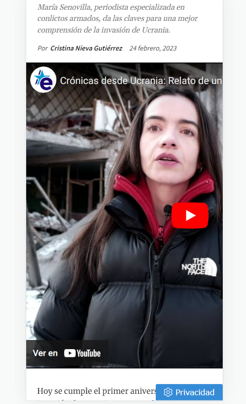
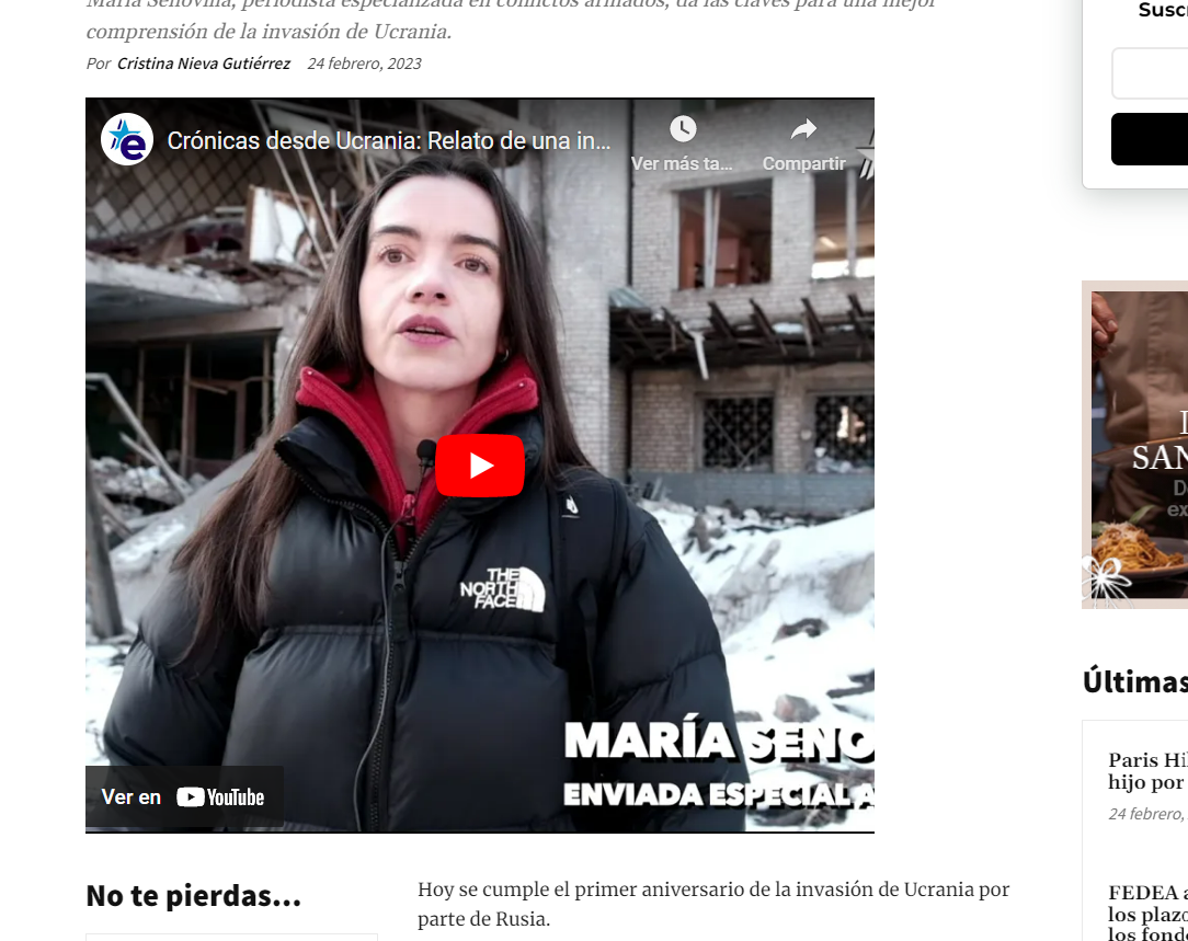
I’m having problems with the size of youtube featured videos. They don’t show in the right size in desktop nor mobile.
Could you give me any clue about this? I add some images… and this is the url: https://www.estrelladigital.es/mundo/20230224/cronicas-desde-ucrania-relato-de-una-invasion/
 Bettina
 Hello @KC !
You can make a child theme for mobile theme in order to customize it. The files for the Mobile theme can be found here: wp-content/plugins/td-composer/mobile/
https://forum.tagdiv.com/the-child-theme-support-tutorial/
Thank you!
 KC
KCHi,
Understand there are ready child theme folder for the root theme folder is td-standard-pack plugin folder. May I know is it possible to create child theme for the mobile theme which the root theme folder is td-composer/mobile?
Thanks.
 Anamaria
 Hi,
Seems you have the Mobile theme plugin activated, and it is disabled for the homepage. When you install and activate the Mobile Theme plugin, your pages will be overwritten by the plugin (the mobile theme comes with its own templates for page, post, category, etc so your current templates from the desktop theme will get converted to the mobile theme layout, the page content is made without builders in mobile editor => https://www.screencast.com/t/xbgZG8kH also, the options that are provided to edit the mobile theme version are limited (this keeps the things simple)).
Better deactivate the plugin and see the results
Also, if you create a mobile page, please make sure you assign it like this https://www.screencast.com/t/lektAhyjd
This is a video about Responsive Newspaper Theme, AMP & Mobile Theme, Mobile Pages & Templates -> https://www.youtube.com/watch?v=SpGkOnJeNZY
Please check this topic where I explained each mobile version -> https://forum.tagdiv.com/topic/mobile-version-not-working-properly-2/ and choose what mobile version you want.
Thank you!
 emreyilmaz34
Why does my website look like this on mobile? What settings am I doing wrong? Can you help me?
 pedromoliv
Is is possible to disable mobile theme? since im requesting pc website on phone and that’s what I what to should happen regularly
 bjpscott
Hello, I have just updated to 12.3 on staging.bjpenn.com.. but the footer on mobile and desktop is not working as it should. none of the menu links are clickable. or the email links.
jahangir khanHello Dear team, on our other websites on mobile theme we are having widget/posts with image behind the text and below those 3 posts we have Latest articles , but on one website we are just having Latest articles displaying on home page of mobile theme but above those Latest articles we dont have those three posts with images behind post titles.
We want to get those three posts above Latest article on mobile theme homepage for our this website as well, how is it possible to fix this problem. We are sharing the link of screenshot in which we have encircled those 3 posts/articles which we want for the website which doesnt show those 3 posts but just Latest Articles.
Kind Regards
Link: https://ibb.co/F3dMZM4
 Youngman
 I was in the same case, it was indeed a cache problem but I could never find a workaround. Moreover, I’m not good at coding or advanced settings. I don’t use cloudflare, I use the litespeed cache server, I asked for a ticket for support from litespeed, then they just said there was a problem with the tagDiv Mobile Theme and I decided not to use the plugin, even editing with a special mobile theme is the same. I can only edit the mobile theme via the standard responsive editing composer.
I just think the server will try to load the mobile view first and make desktop users or visitors always see the mobile view, because maybe it’s faster to access, that’s my logic.
I think this problem can be solved, because I or as a person cannot use the full power functions of this theme.
 Henrieta
 Cloudflare APO
When using Cloudflare APO at the same time as the “Separate Cache for Mobile Devices” option, make sure to enable Cloudflare APO’s caching by device type. Here is where you can find it:
– The setting from the Cloudflare dashboard’s APO card
– or from the WordPress plugin version 4.4.0 or later
This will force Cloudflare APO to cache and serve the right version of the page.
Henrieta This situation can appear from the cache, please make sure that the cache plugin you use can make a mobile cache that is delivered separately.
Cloudflare Cache Everything
When using Cloudflare Cache Everything page rule, Cloudflare will cache whichever device version will come first, and will serve it to all following visits.
It needs to be turned off if it is mandatory to have a different cache version for mobile and desktop.

 propagare
Hi
We are having a strange problem. We use Newspapper on several sites, with the same settings, but one in particular has a problem that we were unable to resolve.
When accessing the site, the mobile layout/page is displayed for the desktop and the mobile page/layout appears on the desktop.
We use the mobile themeplate for the home, title and category.
The strangest thing is that this doesn’t happen all the time. We disabled WP Rocket to see if the problem was the cache created by it, but it worked for a longer period, but the problem happens again.
– The mobile theme plugin is not activated
– Separate caching option for mobile was enabled in WP Rootet
– We used week pro and made some layout changes
– The problem does not appear for logged in users
– After editing the site, the layout is correct in incognito tabs for a while, but then returns
url: https://ocapixaba.com.br
Correct desktop layout: https://imgur.com/a/CK2mwnG
Mobile page being displayed on desktop: https://imgur.com/a/RNAkZrB
The only way to solve it was to deactivate the mobile version of the pages
How can we solve this problem?
 tenacemente
Salve, sito https://tenacemente.com/
Uso l’Header Template – Crypto News PRO, che su dispositivo mobile risulta bianco: https://imgur.com/a/qKzoHfc
Vorrei che fosse di colore nero anche su dispositivo mobile. Come fare? Grazie
 Ozgurunlu
 thank you Bettina for keeping up with me. 🙂 So will this below summary be correct?:
When Both Mobile Theme plugin and Amp Plugin installed & activated:
1. If we choose the “Mobile only” option in the theme panel Mobile theme settings -> Mobile phones will see the mobile template without the AMP benefits & without the ?amp=1 parameter.
2. If we choose the “Mobile + AMP” option in the theme panel Mobile theme settings -> Mobile phones will see the mobile template with the AMP benefits and with the ?amp=1 parameter.
3. If we choose the “AMP only” option in the theme panel Mobile theme settings -> Mobile phones will not see the mobile template but they will see the pages with the AMP benefits and with the ?amp=1 parameter?? (can you confirm this?)
Thank you!
Ozgur
Bettina Hello!
Unfortunately, you can not edit the posts with the tagDiv Composer, and there are no settings to change the size of the layout. This layout has some settings only in order to customize the design. These settings can be found in the Newspaper -> Theme panel -> Mobile theme. More information can be found at https://forum.tagdiv.com/the-mobile-theme/ and https://forum.tagdiv.com/mobile-theme-introduction/.
Thank you!
Ozgurunlu So if I use only mobile, you say “then you’ll never have amp on mobiles.” does that mean: I’ll have the mobile template on mobile phones but that will not be an AMP version of the mobile theme, am I understanding it correctly?
Bettina Hello Ozgur!
When you enable the mobile theme plugin with AMP, then it will overwrite the templates with their layout. If you use only Mobile, then you’ll never have amp on mobiles.
Thank you!
Bettina Hello!
We have settings to hide elements only on cloud templates, but unfortunately not for the default and mobile theme layout. There is a setting to hide featured images: https://prnt.sc/1DVCMrgailvK
Thank you!
