- TutorialsFrom WPBakery to tagDiv Composer
- TutorialsWhat is Ajax preloading?
 Fausto
 Hi Bettina.
I use the responsive version. Already tried mobile viewport, but image size cannot be changed only for mobile.
 Simion C.
 That is very unusual. The mobile viewport should be there, I checked now on my test install https://prnt.sc/JRmysG7T-8nl Please try to force refresh the page in the browser, should be Ctrl+Shift+R But if the problem remains, I can check this as well if you send us an email with the login details. Let me know.
Thank you!
Simion C. Are you sure you added content for mobile in the mobile editor for the About page? Because right now its is empty from what I see. You have to edit the page with the wordpress editor and then add some content in the mobile editor.
If there is a problem I will take a closer look at it. Please send us an email at contact@tagdiv.com and provide admin login for the website. Then I can check directly on the website to see where the problem is exactly.
Thank you!
Simion C. Hi,
Glad it works.
For mobile you could create a new menu, and create sub-menus to replicate this menu from desktop https://prnt.sc/sYKNIZR_1RPO But the thing is that a different menu for mobile can only be set if the mobile theme is active https://tagdiv.com/mobile-theme-get-mobile-ready-with-newsmag-theme/ like this https://imgur.com/b8zNx4T I see no other way unfortunately.
The Newsmag theme doesn’t have the same capabilities as our Newspaper theme. With the Newspaper theme you could have created a popup and use it instead of the mobile menu, and in the popup you could have displayed anything you wanted. Newsmag however doesn’t have such options.
Thank you!
 muktipolice
Mobile responsive editing tab is gone
muktipolice 
https://politicadeverdade.com/about/
This company introduction page is displayed well on PC, but it is not displayed on mobile. Is there any way to display this?
 Bettina
 Hello!
Which mobile version do you use?
We have three options available for mobile versions that you can use:
1. Responsive version: A responsive version of your website looks similar to the desktop version. TagDiv Composer is used to edit the page. Click on the mobile viewport: https://www.screencast.com/t/XDQJedlggSB. You can see your mobile version there and edit or adjust the elements to look better.
2. Mobile pages: https://tagdiv.com/newspaper-10-3-7-update-brings-customizable-and-fast-mobile-pages
3. Mobile theme plugin: The Mobile Theme is a performance-optimized theme included in the main Newspaper theme that only loads on mobile devices. It comes with its own templates and designs for pages, posts, categories, etc., so your current templates from the desktop theme will get converted to the mobile theme layout. Please see https://forum.tagdiv.com/the-mobile-theme/ and https://forum.tagdiv.com/mobile-theme-introduction/ for more information.
A full explanation is here: https://www.youtube.com/watch?v=SpGkOnJeNZY
If you need to use mobile version 1 or 2, then you need to uninstall the Mobile Theme plugin and AMP.
Thank you!
 victortrongvu
 Hi Simion,
Thanks very much! it works! Now I just need to have the sub-menus works on Mobile then that would be perfect! Any suggestion?
 Bakhti Roedarah
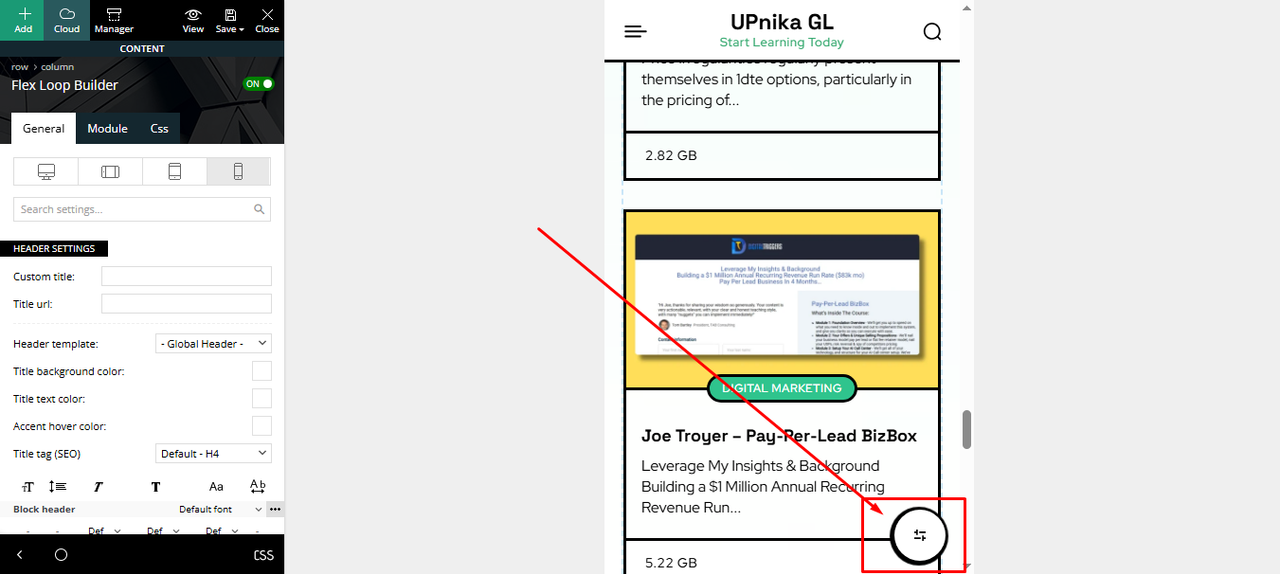
Image: https://i.postimg.cc/j21wHcxK/Filter-Button.png
Hello, I want to hide this filter button from the course’s page on the mobile version. How will I do this?
 cliving2017
https://consciousliving.net.au
Seedprod plugin: We used this plugin to hide the live site behind a “coming soon” message while building the website using Newspaper Pro Theme. The image has somehow become embedded in code and is showing up when we open every page on the live site before showing the actual page. We have tried all troubleshooting strategies, and our webmaster has suggested that we contact you as he could not find the code. It shows up on all devices – desktop, mobile, and tablet. This plugin has been deleted from our site.
You will see the issue when you click on the link https://consciousliving.net.au and when you click on any menu tab or article link.
Thanks Patricia Hamilton
FaustoHello,
I’m experiencing issues adjusting responsive image sizes for my posts.
For the “Single Post Featured Image” element, I set the size to 696×0 for desktop, and it loads correctly. However, I can’t define a smaller size for mobile devices, such as 300×0. The image isn’t automatically adjusting for mobile, which is negatively impacting my Core Web Vitals score.
The same issue occurs with images and galleries within the “Single Post Content” element.
All necessary image sizes are enabled on upload.
 nitrofox
 I understand what you’re saying, but I’ve done it all.
There is no way to delay Adsense Ads without delaying CMP at the same time, because both are linked to the same code.
On the other hand, I don’t understand why I have warned in pagespeed of lack of optimizations in css, when they are active in wp rocket.
Reduce unused CSS
…default/style.css?ver=174…&wpr_t=174
…block-library/style.min.css?ver=6.8
…mobile/style.css?ver=174…&wpr_t=174
Eliminate render-blocking resources Potential savings of 860 ms
…default/style.css?ver=174…&wpr_t=174
…block-library/style.min.css?ver=6.8
…mobile/style.css?ver=174…&wpr_t=174
Avoid large layout shifts 1 layout shift found
<div class=”td-container” style=”height: auto !important;”>
Simion C. As a note, that is the mobile theme accent color https://prnt.sc/Qr88zq2Pd3j- which applies to multiple elements across the website, including the links you mentioned. You could change the accent color to something different.
Or, if you just want to change the color of the author name in the modules then it can be done with some CSS https://prnt.sc/boPequHFP-yU -> https://pastebin.com/5sAzRPUr
Thank you!
Simion C. I don’t quite understand what you mean unfortunately. What is the sub-page exactly?
So if you want to use the mobile theme, the pages can be treated in 2 ways:
1. Add content for each page in the mobile editor. If you do not, the pages will be empty on mobile.
2. Exclude the pages you want from the mobile theme. The option is available in the Gutenberg editor.
Those are the only choices. But if there is a problem, or I am misunderstanding, please mention more details and I will help as much as I can.
Thank you!
Bettina Hello!
Please edit the homepage with the tagdiv Composer, access the mobile version, and edit the page from that modal: https://app.screencast.com/rX6iLJpheqPNg -> click on the blue button tagdiv Composer and customize the page as you want: https://app.screencast.com/oPm0o4UUzsj8s
Thank you!
 Bordesley
 The page is slow to load, but seems fine on my side. This is the problem on mobile devices: https://i.postimg.cc/xdpGSL42/MENU.jpg. It is not a pop up.
Bettina Hello!
@simchris Unfortunately, no.
@nitrofox Make sure you’ve tried all the optimization suggestions from here:
– https://forum.tagdiv.com/wp-rocket-and-newspaper-theme-optimization-guide/
– https://forum.tagdiv.com/autoptimize-install-configuration/
– https://forum.tagdiv.com/how-to-make-the-site-faster/
– https://forum.tagdiv.com/cloudflare-cdn/
Limit the number of backups: https://app.screencast.com/M5Wco6Td6nymr
Google AdSense and CMP scripts (especially Google’s own CMP) are notorious for slowing down mobile performance on tools like PageSpeed Insights. You mentioned trying a timeout or “run on scroll” for JavaScript. While that helps ads, it’s problematic for CMP. As advice: Let the CMP load first, but delay ad-related JavaScript. Delay ad scripts, improve First Contentful Paint (FCP), and still show ads. Another workaround here could be to use data-block-on-consent for Ads. Please eliminate Unused CSS with PurgeCSS or WP Rocket Add-ons. Enable “Remove Unused CSS” if not already on.
In the WP Rocket -> Delay Javascript execution, you can add:
adsbygoogle.js
gpt.js
googletagmanager.com
googlesyndication.com
Any js code can be added here: https://app.screencast.com/uDYjK7nL0vKG8
I hope that helps you!
Thank you!
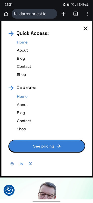
Bordesleydarrenpriest.ie is getting to a point that I am quite happy with, but I have a problem. The menu sandwich on a mobile device shows a menu I cannot edit. It has the same pages as the website menu but also has Quick Access and Courses as Headers as well as a See Pricing button. I have looked all over but cannot find a way to edit this. Please help.
nitrofoxHi,
I am facing several optimization issues, where I use everything that is recommended, such as Wp Rocket plugin for caching, etc.
The problem is that on mobile the score is always low where it is given reason for css problems, etc., and from what I see, the biggest problem is google ads and its cmp.
I don’t know how to solve it, I’ve tried timeout or no scroll, but that’s very negative, especially if you put java to run in the scroll, because I need google’s cmp to appear first. What to do?
Thanks,
 mrozangir
Hello,
When I use the Tagdiv mobile theme plugin, the h1 tag is not visible on mobile.
Thank you!
 Prateek
 Hello!
I did that once. Put a modal button and placed the tagDiv table of contents shortcode inside the modal. It looked alright but the the toc links did not work, they did not take me to the respective article section maybe due to different DOMs.
Also, I am not sure if the inner row has any sticky funcionality, only the column and inner column have. And, when you turn on the sticky, the column sticks compared to it’s sibling column next to it in desktop layout. Since the columns on mobile are stacked, they don’t stick.
The only place where sticky works on mobile devices is the sticky header. And I tried placing the table of contents in there but they did not work. You just click the link and nothing happens.
Thank you.
muktipolice I’ve seen the answers. I’m not decorating the page, but all I want is to say the text of the sub-page.
Can’t I see the body content of the page in the mobile theme?
Simion C. I forgot to mention. If you want to exclude some pages from the mobile theme, there is a way.
When you edit a page with the Gutenberg editor there will be an option here https://prnt.sc/rnQYrlCstm3W This option is available for each page or post and if you want you can use it to exclude specific pages from the mobile theme.
But if you do not exclude the pages, then it will require entering content in the mobile editor, or else the pages will be empty on mobile.
Thank you!
PrateekSticky table of contents for mobile devices like sticky menu that sticks to the top of the screen. The table of content button or text can be located below it.
For example, see this page on mobile device: https://fmhy.net/adblockvpnguide
muktipoliceIn mobile themes,
I can’t see all the information on the page.
Is there no way to display page content?