- TutorialsFrom WPBakery to tagDiv Composer
- TutorialsWhat is Ajax preloading?
 Vlad S
 Hello !
Sorry for misleading you !
If you’re using a Cloud library header you will have to import the header logo through tagDiv Composer, and the Logo section in theme panel is assigned to the mobile logo. So the logo you import in Theme Panel – Header – Logo and Favicon will be rendered on Mobile Theme.
I hope this was helpful !
Thank you !
 adrgrid
With Newspaper, how can I edit the expanded mobile menu (after clicking on the hamburger icon)? I’d like to change the background image and edit the social media icons.
Here’s an example of the mobile menu I’m referring to: https://imgur.com/a/LfDZXFm
Thanks,
Alex
 pierpaolocorso
Hello
I noticed that the mobile version is really fast and I congratulate you for this. I tried to activate it but I have some questions to ask you to solve some problems.
1- What are the measures of the thumbail to be activated for the mobile version? (it doesn’t let me see the images on the home page)
2- How to remove the footer logo?
3- How to remove the “about” inscription in the footer?
4- How to remove the word “follow” above the social icons in the footer?
5- How to remove the “contacts” message and the email from the footer?
6- At the end of the content can I add, after the related articles, some random articles?
I hope these changes are possible, I can’t wait to activate the version. Upload the site in less than 2 seconds, great.
 vv2005
Hello,
Here is the screen https://prnt.sc/pz6vug . I am using mobile theme. I would like to choose specific multiple categories(not all categories) in “Front Page Grid Category Filter” on mobile theme. How can I achieve this?
 trendspot
Hello,
i am using the Newspaper Theme X on my site and i have a Question regarding the Mobile Theme options.
So what i would like to have is the Mobile Theme on Mobile+AMP hence i set up the mobile theme to show that way (Theme Panel -> Mobile Theme -> Use Mobile Theme for Mobile + AMP)
My problem is that this setting shows me the mobile theme regardless of screen size. I get served the mobile view of my site on a full hd screen size and it is no caching issue and is the same on chrome, edge and mozilla. Other computers have the same problem.
But when i change the mobile theme Setting to AMP or Mobile i get the responsive version of my site on small screen devices and clearly want the Mobile and AMP version to look the same.
Is my understanding of this wrong? Some clarification would be helpful
Greetings
 MrAdler
I have installed the Mobile Theme and the offical AMP plugin. And I noticed that you provided an option to decide under what circumstance to use AMP.
Mobile – Displays content using the Mobile Theme on small screen devices
Mobile+Amp – Displays content using the Mobile Theme on both mobiles and AMP
AMP – Uses the responsive version on the small screen devices and Mobile Theme only on AMP
However, I can’t really understand the 2nd and 3rd option. Can you explain them more explicitly? Like giving me some examples of specific circumstances. Thanks a lot!
 imussin
 Hi there!
Is there a fix for this issue? Mine is not ‘loading more’ on mobile and desktop (two browsers, cleared caches, private/incognito modes).
Please visit townx.com, it’s at the ‘news and press releases’ section at the very bottom of the homepage.
 Decentralbox
Hi,
I can’t add a telegram icon to my header. I am using the Social Icons item.
In the mobile version it is displayed automatically, but not in the desktop. How do I add the Telegram icon? This is the most important icon for me.
I am using Newspaper 10.1 + Cloud Template Plugin without Standard Pack Plugin.
Best regards
 richardmeriveles2019
Hello again. First of all I want to thank for the awesome support you’ve given to us at DNX.news
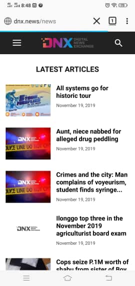
To further improve our site with the AMP+Mobile feature, I would like to correct also our homepage which displays only the posts from our Latest News category. Is there anything I can do to customize this? Our homepage now looks like this http://www.dnx.news/wp-content/uploads/2019/11/ss.jpg
Looks really sad. Waiting for your awesome replies. Thank you.
Vlad S Hello !
Please activate the standard pack plugin. You will have to edit the header using the tagDiv Composer, select the Sticky Mobile Menu and remove all the content from it: https://www.screencast.com/t/tgQTMVi76R9
Thank you !
 Calin
Calin Hi,
Indeed you can not customize the mobile theme plugin and amp, only a few tings can be customize.
Also the ads should work if the ads are approved and are working, the code for ads need to be set in Theme panel> Mobile theme >Ads.
Thank you!
Vlad S Hello !
For mobile logo you have will have to activate the standard pack plugin at the moment, set the logo and then you can deactivate it back. This issue will be fixed in the future updates.
We are sorry for the inconvenience !
Thank you !
 GuillaumeFRK
 This not my demand !
Design on mobile theme is good for me.
My problem is that i can’t see image, image are note visible on mobile theme.
Please go to blog.freelancerepublik.com you wil understand quickly.
Can you help me ?
Vlad S Hello !
The designs do not match because you are using the mobile theme. The Mobile theme was specially designed for optimization on mobile devices. Unfortunately on mobile theme you cannot do much changes of design. If you want to have the same design as on desktop mode you can achieve that by simply disabling the mobile theme.
You will have to recreate your pages into the Mobile editor.
Also you can disable mobile theme on certain pages or posts by following this setting: 
Please take a look here: https://forum.tagdiv.com/the-mobile-theme/
Thank you !
Vlad S Hello !
The Mobile theme was created and designed to improve page speed. Our team keeps the minimum of elements on mobile theme. If you deactivate the mobile theme and use the responsive version you can select the Mobile Viewport and add some Adboxes as you wish: https://www.screencast.com/t/Je46ogeM4p
I hope this was helpfull !
Thank you !
 Josef
JosefCan someone help where I can find option, how set for mobile main menu “logo in white color”?
When I open header 1, so here are only options for “normal logo” and “retina logo” but not exist field for “mobile logo”.
 Sibi Paul
 All The Screen Shots are Checked…
And Already i have tested them, before creating the previous post.
Now, My Site Not having AMP,
Not Having a Mobile Theme.
But, I still have ads in my posts…
I Used an Ads Inserter Plugin to show ads in the posts.
Why I not use AMP…
1 – When Install AMP, The Site Looks is NOT Good.
I can’t Customize Theme for AMP Pages.
2 – Mobile Theme from TagDiv Also Not Having Customization Options.
3 – Ads NOT Works, even if I Follow All the Tutorials…
So, I left the Idea to Implement AMP in My Site.
 rvtravel
 It’s a standard shortcode generated by the metaslider plugin.


If you visit the site https://rvtravel.eu in the header section there is an image, that should be sliding, as in mobile view (tested with firefox and chrome).
As I’ve said, if normal header is used (no template option), there is no problem.
GuillaumeFRKHello,
I activate Mobile theme and AMP but I can’t see the photo on the home page on mobile?
There is the grid and latest article but no photo 🙁
The url is : blog.freelancerepublik.com
Best
Guillaume
 viaggindia
 Only solution which i found is the following (it removes also all extra css for login).
IN
wp-content/plugins/td-composer/legacy/Newspaper/parts/header/td-login-modal.php
REMOVE EVERYTHING
********************************************************************************************
IN
plugins/td-composer/mobile/parts/menu-mobile.php
plugins/td-composer/legacy/Newspaper/parts/menu-mobile.php
REMOVE :
<!– login section –>
<?php if (td_util::get_option(‘tds_login_mobile’) != ‘hide’) { ?>
<div class=”td-menu-login-section”>
<?php
if ( is_user_logged_in() ) {
locate_template(‘parts/logged.php’, true);
} else {
locate_template(‘parts/login.php’, true);
}
?>
</div>
<?php } ?>
AND
<!– register/login section –>
<?php if (td_util::get_option(‘tds_login_mobile’) != ‘hide’) { ?>
<div id=”login-form” class=”td-register-section”>
<?php locate_template(‘parts/register.php’, true); ?>
</div>
<?php } ?>
Calin Hi,
That is because the image is covering the button on mobile -> http://prntscr.com/pyiv5g it should be without that margin and padding -> http://prntscr.com/pyivnv that is set on desktop. please check the image, on css tab and adjust it for mobile.
Thank you!
Calin Hi,
If you are not using the mobile theme plugin, then you should see the block 11 as on desktop -> http://prntscr.com/pyiqh4
Usually if you are using flex blocks then you can set the layout you wan on mobile an desktop -> http://prntscr.com/opf5vx -> http://prntscr.com/opf6lf
If you are using the responsive version, normal the first time is displayed the content and after that the sidebars, unfortunately we do not have a documentation only for this, sorry! if you want to achieve something and you can not find in our documentation, please just let us know!
-> https://tagdiv.com/category/documentation/
-> https://forum.tagdiv.com/newspaper-theme-documentation/
Thank you!
Vlad S Hello !
The designs do not match because you are using the mobile theme. The Mobile theme was specially designed for optimization on mobile devices. Unfortunately on mobile theme you cannot do much changes of design. If you want to have the same design as on desktop mode you can achieve that by simply disabling the mobile theme.
You will have to recreate your pages into the Mobile editor.
Also you can disable mobile theme on certain pages or posts by following this setting:
Please take a look here: https://forum.tagdiv.com/the-mobile-theme/
Thank you !
Calin Hi,
Lets start steep by steep,
this type of code will be display only if you are using the amp plugin, usually this code need to be set in head section of post/page, using only the amp plugin, you’ll need to use the “Transitional” option -> http://prntscr.com/pyf5d7, please check our documentation very carefully -> https://forum.tagdiv.com/tagdiv-amp-plugin-tutorial/ in this way you’ll have the classic amp, or you can use the mobile theme plugin and amp plugin and choose this option -> http://prntscr.com/pyf6e4 in this way you’ll have the mobile theme layout on amp and you’ll use only the amp without mobile theme, also you can set the auto amp ad in theme panel -> http://prntscr.com/pyf713 als if this is a new account then is possible to take some time until the ads will be approved for your website, until then these will not appear.
<amp-auto-ads type="adsense"

data-ad-client="ca-pub-#############">

</amp-auto-ads>
Also we recommend to use only flex elements and try to replace all the classic elements with flex elements and cloud elements, in this way you’ll achieve a better speed -> https://tagdiv.com/newspaper-theme-update-standard-pack-or-tagdiv-cloud-templates/
1. This can be possible only if you set an flex block with Auto Load for mobile and you hide it for the desktop and one with load more on desktop and hide on mobile theme.
2. If you want to have more control over the category page, then you can take a cloud category from tagDiv Cloud Library and edit it with tagDiv Composer
Yes, the Yoast SEO Plugin is compatible with our theme -> http://prntscr.com/pyfj2q
Thank you!
Calin Hi,
Please set in translations and empty space in “about us” field, this should solved the problem, or you can sue a custom css like this one
.td-mobile-footer-wrap .td-container{

  display: none;

}
The code need to be set in Theme Panel> Mobile Theme> Custom code> css
Thank you!