
- NewsmagMain menu
- NewsmagIntroduction
- NewsmagLogo & Favicon
- NewsmagBackground introduction
- NewsmagTheme colors introduction
 reloaded
 Hi, i’m still struggling with my issue but maybe i got some new things to work on…
at the moment i’ve created from the composer 2 MOBILE HOMEPAGES..
1. Mobile MT, which is the one i wanna use for real as mobile
2. Homepage Mobile – Magazine PRO … created just for tests
The thing i know for sure is that both are ignored, even if i select from my homepage topbar one of them… they just don’t work, browser are not loading them.
But the new thing i noticed is that if i go in Pages’s menu and edit the Mobile MT page, i see it points the link at “/mobile”
You can see here: https://ibb.co/ZKbstzR
so if with a mobile browser i go to:
https://www.mytechnology.eu/ mobile page will not load
https://www.mytechnology.eu/mobile mobile page will load perfectly
So where is the connection that i’m missing?
 thalesbrandao
 calin, thanks again for your attention and time to help.
Initially we decided to remove the mobile plugin – we will check and test to see if we will have greater relevance in the exposure of our content.
I need new help for this new configuration:
1) translate messages related to social media into Portuguese – and see the possibility of including our tiktok and spotify channel. how should I do it?
2) how should I include home in the menu as the first item – for accessibility reasons.
3) All my CidadeMarketing submenus are reporting to an image – I need it to open directly to the text page. How should I do it? As it is, the user will have to click twice to access the content.
4) in the “news” item I need to include all items that do not appear in the menu and are designated in the articles; Another relationship takes place in the item “articles” I need to know how to include everyone or exclude writers who are no longer part of our editorial space.
Thank you immensely for your help – as we are going through important adjustments and new tests of our content. Hugs,
 tagdivfan2016
Can you please provide guidance on how to style the overlay modal that displays when the responsive mobile menu is active?
I am trying to change the background overlay styling so that only the menu items show. (By default a zoomed out image of the website can be seen behind the menu items because the opacity is very high.)
Should this be done via the header Cloud template or custom CSS?
Thanks in advance for your help!
tagdivfan2016How do I get the normal responsive version of Newspaper to show instead of the mobile version?
When I view my site on mobile lots of content is missing including the logo, sidebar content and footer content.
The menus also don’t show and I see a message that says “Click here to use the WP menu builder”
Also, I want the big grid to display with the scrollable posts instead of the 3 featured posts.
I deactivated the Tagdiv Mobile Theme but all of the issues listed above are still happening.
 Phil Creighton
I am struggling to find the correct setting for the Mobile theme.
I have installed TownTalk theme at realreading.co.uk. The correct logo/menu displays for desktop displays, but once you get to mobile view, it switches to the EchoVerse header.
I cannot figure out how to change this.
Likewise, the MENU does not have a solid colour behind it.
Am sure there are easy fixes for both, but I cannot find them! Some pointers would be appreciated. Thank you.

 Anamaria
 Hi,
For menu, go to the mobile viewport, click on the menu icon and check if you choose a menu from this dropdown: https://app.screencast.com/kXblv69NkhU60
Thank you!
 lorandd
Hello,
Currently the after instalation of the newspaper theme the mobile navigation menu (after opening from the hamburger icon) doesn’t show the menu items configures. I saw that I can enable some mobile pages, but I don’t want to create a new mobile page I just want the same menu items to show up on mobile as after pressing the hamburger menu.
How can I achieve this?
Thanks
Lorand
 urishtaujjain
 And what about this code – @media (max-width: 767px) { .header-search-wrap .td-icon-search { font-size: 27px; padding-top: 8px; } #td-top-mobile-toggle i { font-size: 26px; line-height: 55px; padding-left: 13px; display: inline-table; vertical-align: middle; color: #efefef; } .td-main-menu-logo img { width: auto; } }
 Bettina
 Hello Samuel Soler!
You can add a simple mobile menu shortcode and choose the menu you want to display. You can also edit the modal and change the menu name to one created in Dashboard -> Appearance -> Menus.
Thank you!
 Calin
Calin Hi,
Ok, so FlyingPress provide separate cache for mobile is you are using this cache, this is recommended by the FlyingPress if you are not using the responsive version- https://docs.flyingpress.com/en/article/generate-separate-cache-for-mobile-p7a3vn/
Now in case that the problem is still persisting, please try this custom css (and remove ethe one prom previous reply)
@media (max-width: 767px) {
    .header-search-wrap .td-icon-search {
        font-size: 27px;
        padding-top: 8px;
    }
    #td-top-mobile-toggle i {
        font-size: 26px;
        line-height: 55px;
        padding-left: 13px;
        display: inline-table;
        vertical-align: middle;
        color: #efefef;
    }
    .td-main-menu-logo img {
        width: auto;
    }
}
The code needs to be set between style /style tags – https://we.tl/t-IxgVEt38Tr
-
This reply was modified 1 year by
 Calin.
reloaded Ok i got where it is picking my homepage and it is HERE: https://ibb.co/31v0QKs
How can i tell him to ignore the layout i see here in the wordpress appearance menù and consider instead my Mobile composer homepage?
 Samilyjones
 What we want is to display a different menu on mobile. And we haven’t quite figured out how to do it. We’ve tried all sorts of ways.
Best Regards
Samilyjones We want to add two more categories to the mobile menu. They should not appear in the desktop menu. They are different menus.
Best Regards
Samuel Soler
urishtaujjain https://we.tl/t-stmFlfR183
hey,Calin can you help me to solve this issue can you try opening my site on mobile once and the home page opens fine but when I go to any of my articles and scroll down then the menu bar layout is shifting can you tell me whether it is working properly or is there any issue
Bettina Hello Samuel Soler!
I can see that the mobile menu displays well and is the same as the desktop menu. Please check: https://app.screencast.com/8PKEaR5LqD3rY -> https://app.screencast.com/nmTMQVbaTAA1L
Do you mean anything else?
Thank you!
SamilyjonesHi, whenever we update the template the same thing happens. The mobile menu is not displayed correctly. And we don’t know how to change it, we have tried changing it from the layout designer but it doesn’t work. We added two more categories to the menu, but those two categories are not displayed.
https://www.diarioelcanal.com/
Best Regards
Samuel Soler
urishtaujjain https://we.tl/t-stmFlfR183
Calin can you help me to solve this issue can you try opening my site on mobile once and the home page opens fine but when I go to any of my articles and scroll down then the menu bar layout is shifting can you tell me whether it is working properly or is there any issue
 misadventuremedia
It works in a browser when emulating a mobile phone like in Chrome, but it will not work on any of the actual phones I have tried it on. All setting appear to be correct
 danirblanco
Hi, when I open tagDiv Composer I get the following code. I attach a photo: 
‘, footerTemplateId: ”, footerTemplateContent: ”, mobileMenuId: ’35’, tdbPInfiniteLoadStatus: ‘on’, tdbPInfiniteType: ”, tdbPInfiniteCount: ‘3’, isMobileTemplate: ‘0’, tdbTemplateSettings: [], }; // Set the local storage to show inline the iframe wrapper and the sidebar window.localStorage.setItem( ‘tdc_live_iframe_wrapper_inline’, 1 );
How can I fix this?
Thank you
 josemiguelsf
Instead just an X is shown
 Jerrypai
Hi there,
I just manage to build my website with liberty case theme from this tagdiv
But when I manage setup this theme for android version, I face problem with mobile menu
At mobile menu above the menu there is a part for login / join , how to delete this login / join element
You can see my website by at https://yslnews.com to see the mobile menu
 highratech
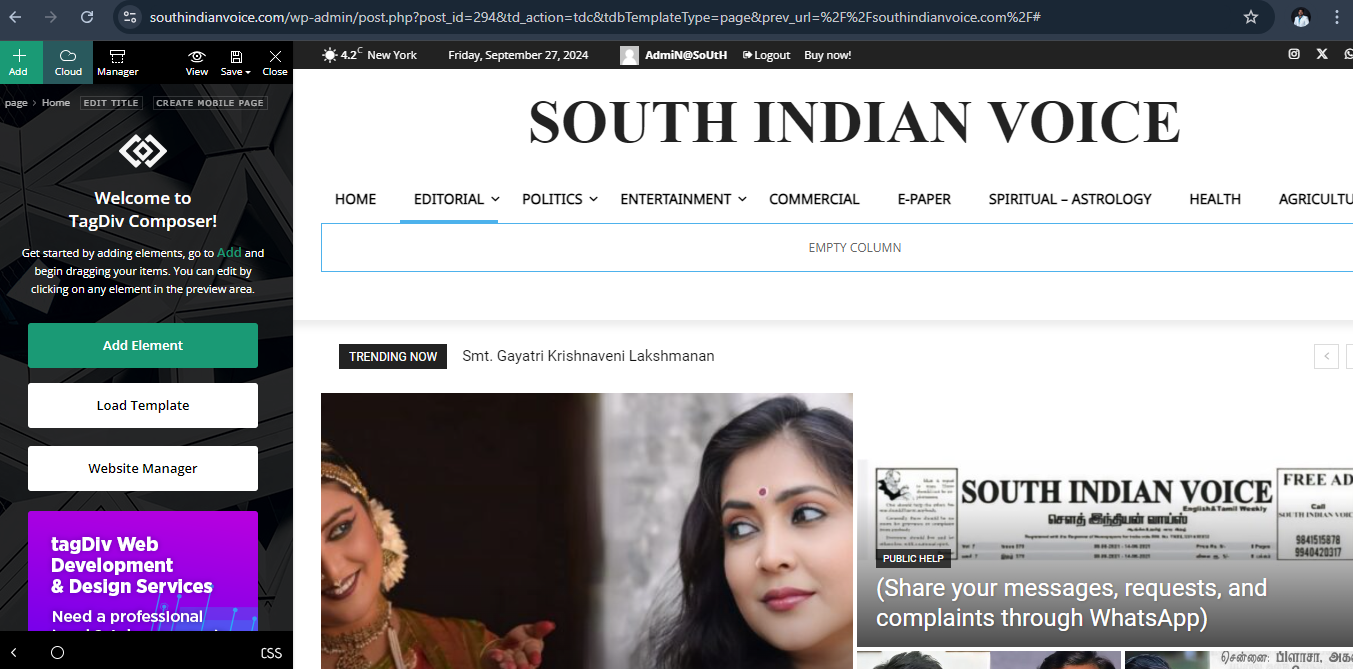
Hi.. Scrolling doesn’t work please have a look I’ll listed the where I faced the errors and please find the images too.
My website name is https://southindianvoice.com/
1. Page doesn’t scroll on edit with tagdiv composer. It works only on side scroll bar on screen scrolling doesn’t work.
2. Mobile view carousel doesn’t work.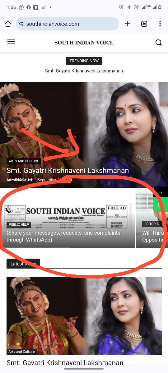
3. Mobile menu doesn’t scroll.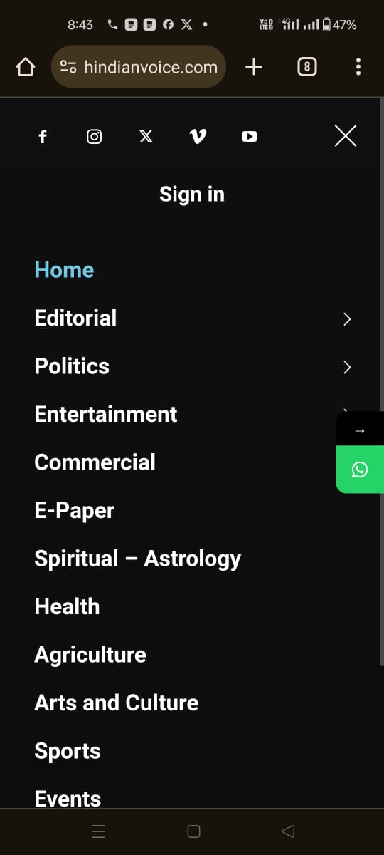
 SilvioTrisorio
Hi, the menu is no longer mobile, how can I fix it?
Thank you
 Ruteris
Hi, how can I customize my menu for mobile, I am after this style:https://prnt.sc/02n-V6-v_PCZ. but I have:https://prnt.sc/gUk3dweMwWtf. Thank you.
Anamaria Hello,
You have a single post template, so you need to edit the tagdiv Composer and add elements and edit -> https://forum.tagdiv.com/design-post-pages-using-cloud-library-templates/ -> https://forum.tagdiv.com/single-post-shortcodes/
Unfortunately, the like button is deprecated due to privacy policy.
You can try to add the code provided from this guide in the Theme Panel -> Analictycs/ Js Codes -> head https://www.hostinger.com/tutorials/wordpress/how-to-add-facebook-like-button-to-wordpress
https://support.mozilla.org/en-US/kb/third-party-cookies-firefox-tracking-protection
https://www.the-parallax.com/apple-safari-intelligent-tracking-prevention-facebook-share-like
You need to change the logo for the sticky menu and mobile menu -> https://forum.tagdiv.com/add-logo-newspaper/
Also, the post content needs to be done with Gutenberg or a classic editor. You can create the post template for posts, categories, pages and so on.
Please check this video about how can create a prebuilt website from scratch https://www.youtube.com/watch?v=SoGQ0d5kIBg
Thank you!

