
- TutorialsWhat is Ajax preloading?
 ialv
ialvHello,
I have a problem.
I have activated a template for the header (menu) from Cloud Library with a page that opens in modal.
On desktop and tablet it works fine, but on mobile the menu does not open.
Why is this?
The header is currently disabled because of this bug.
Pd. When I activate it and click on the menu in mobile, it tries to open but it stays blocked, as shown in the image below.
Thank you.
 Anamaria
 Hello,
To change the font and colour for the mobile menu please go in Theme Panel -> Theme Colors -> Mobile menu/mobile search => https://www.screencast.com/t/0CvSgXp9H to set a background image go in Theme Panel -> Background -> Mobile menu/mobile search => https://www.screencast.com/t/uvDejzbX to change the font from Theme Fonts => https://www.screencast.com/t/ANBQe7hQhJd
Hope this help you!
Thank you!
 anthonyblfc
Hello, I have created my mobile pages using the Tagdiv composer. So I have the mobile theme plugin disabled. I am happy with the way my pages look. My problem is I can’t see any way to change the background colour or change the font and colour of the writing of my mobile menu drop-down menu after I click on the 3-line burger. The only way I can see that I can do it is by activating the mobile theme and doing it from the theme panel. But if I do it this way, it changes the whole layout of my mobile pages. Is there a way for me to do this with the mobile theme deactivated? Thank you
Anamaria Hello,
You can create a custom modal popup for login, you need to create a page and add in that page the element header login -> https://forum.tagdiv.com/modal-popup/ and after set the trigger for a button. Set the modal popup in the phone viewport in mobile menu -> https://i.imgur.com/cuBYIrq.png
Thank you!
 Scholars
Hi, I would like to add a button (something like an apply now button) on the header of the mobile version layout. Is there any template layout/instruction on how to do so? I tried to add a button but it seems it cant fit with my logo, mobile menu icon and search icon.
 colehorman
 Thank you for the help. I tried it as you said, but there were two issues: 1. The login prompt appeared on my PC page, which I don’t want because that version already has a login button, and 2. The login prompt doesn’t appear on mobile even with those settings enables. Is there a way to manually add a link to a login page to my site’s menu as I mentioned before, or a way to edit the mobile version of the page without affecting the PC version? Keep in mind that I’m not using the dedicated Tagdiv Mobile Theme plugin because the theme options for that are very limited and didn’t match the theme I used for the PC version of the site.
Anamaria Hi,
Normal the Sign in / Join button should display if you enable it from theme panel -> https://i.imgur.com/vAX4MpU.png -> https://i.imgur.com/05VfALz.png then the login will be display in mobile menu.
Thank you!
 Bettina
 Hello!
There is a sticky header. Please follow the video to see where you can find and build your sticky header on mobile and desktop too: https://www.screencast.com/t/l6v2Belt
Make sure you have there the element called ” Header main menu “.
Thank you!
colehormanHello! Recently, I have been trying to implement the standard login function to my website (ScrollCentral.com), but am having trouble adding it to my mobile home page. On PC, I was able to add it no problem, but on mobile, it does not appear due to less available screen space. Because of this, I want to add a login/register function to the side menu for my site, and only have that available on mobile devices. The two problems I am having is that I can’t find a way to add a login link to my menu, and I can’t find a way to make it exclusive to the mobile page. Any help would be much appreciated!
 casprom
 Hi guys,
Just a follow up for future reference to whoever finds himself in the same situation and needs this:
After my last reply in here I decided to try contact the support through email and Tagdiv team was quick to help. Through access to the website back office we were able to find that Cloud Header and Cloud Footer were sending too many requests, specially as all of them were mega menus. So we switched the Cloud Footer one to a normal menu and on mobile we set them all to normal too, and it provided stability to the website.
Thank you all for the support.
 Guardado Rapdio
Hi,
We are running a website, Guardado Rápido, devoted to videogame news, articles, reviews and so. We are using Newspaper theme in our website and we are quite happy with it. Recently we added a special row at the beginning of the page where we show the hot topics of the day. We used a row with a raw html code inside. It works pretty well but for the case of the mobile version of the webpage. In this case, as we are using Mobile Theme of Newspaper, it does not allow us to put this kind of code before the header.
The shortcut that i have found is to put the code in the ads section of the mobile theme but, in this case, it puts the code below the header. Is there any way to put this code so the raw html code appears before the header?
You can check our website at http://www.guardadorapido.com. The part that we want to be before the header is the one that starts by “Hoy se habla de:”.
The other option could be to skip the mobile theme of newspaper and use the mobile view generated by tag div composer. In this case, is there any way to use a different template for the general and the mobile view of the page. In our case the problem is that some of the structures that look fine on the desktop version does not work that well in the mobile one (the big grid)
Sorry for the long text, i hope i explained myself well.
 fredredwoods
 Hello —
With all respect, I find your answer to not be helpful.
I understand that the iframe width works for you. I watched the video of you inserting the embed code directly as HTML. I already tried that — the problem is with that method too.
Previously it worked for me, and now it does not.
Disabling the plug-ins is not practical — it would shut down many pages of my site. But if that’s what I need to do to convince you that I have a problem here, then I’ll do it in the middle of the night some time.
But I sincerely doubt that one of these plug-ins is affecting the iframe width. The video width works on Pages — it does not work on Posts.
You have programmers there. Can’t someone look at this page and figure out what is wrong?
Please help.
Thank you.
—————————–
Here is a simple test page:
https://arcata1.com/?p=3044&preview=true
It consists of:
<p>Here the Youtube code is inserted directly as HTML.</p>

<p> </p>

<p>width = 315</p>

<p> </p>

<p><iframe title="YouTube video player" src="https://www.youtube.com/embed/612uI4Z7jsc?start=7065" width="315" height="177" frameborder="0" allowfullscreen="allowfullscreen"></iframe></p>
Here is a list of my Plug-ins. Many are back-end, and only affect the editing, or fixing thumbnnails, etc. The music players were added yesterday — the video width problem occurred before that.
A2 Optimized WP
Admin Menu Editor
Advanced Editor Tools (previously TinyMCE Advanced)
CP Media Player – Audio Player and Video Player
Duplicator
GTranslate
Jetpack
mb.miniAudioPlayer
PDF Embedder Premium
PDFjs Viewer – Embed PDFs
podcast player
Post Type Switcher
Regenerate Thumbnails
Regenerate Thumbnails Advanced
Relevanssi
Select Show modified Date in admin lists
tagDiv Cloud Library
tagDiv Composer
tagDiv Newsletter
UpdraftPlus – Backup/Restore
WP Downgrade | Specific Core Version
WPForms Lite
Yoast SEO
YYDevelopment – Show Pages ID
Here’s a description of the plug-ins:
A2 Optimized WP
A2 Optimized – WordPress Optimization Plugin
Admin Menu Editor
Lets you directly edit the WordPress admin menu. You can re-order, hide or rename existing menus, add custom menus and more.
Advanced Editor Tools (previously TinyMCE Advanced)
Extends and enhances the block editor (Gutenberg) and the classic editor (TinyMCE).
CP Media Player – Audio Player and Video Player
CP Media Player – Audio Player and Video Player allows you to post multimedia files on your website or blog in a simple way while providing compatibility with all major browsers such as IE, Firefox, Opera, Safari, Chrome and mobile devices: iPhone, iPad, Android.
Duplicator
Migrate and backup a copy of your WordPress files and database. Duplicate and move a site from one location to another quickly.
GTranslate
Translate your website and make it multilingual. For support visit GTranslate Support Forum.
Jetpack
Security, performance, and marketing tools made by WordPress experts. Jetpack keeps your site protected so you can focus on more important things.
mb.miniAudioPlayer
Transform your mp3 audio file link into a nice, small light player. ! IMPORTANT – if you customized the skin for the previous version you need to regenerate it from here.
PDF Embedder Premium
Embed mobile-friendly PDFs straight into your posts and pages. No third-party services required. Compatible With Gutenberg Editor WordPress
PDFjs Viewer – Embed PDFs
Embed PDFs with the gorgeous PDF.js viewer
podcast player
Host your podcast episodes anywhere, display them only using podcast feed url. Use custom widget or shortcode to display podcast player anywhere on your site.
Post Type Switcher
A simple way to change a post’s type in WordPress
Regenerate Thumbnails
Regenerate the thumbnails for one or more of your image uploads. Useful when changing their sizes or your theme.
Regenerate Thumbnails Advanced
Regenerate thumbnails fast and easy while removing unused thumbnails of existing images; very useful when changing a theme.
Relevanssi
This plugin replaces WordPress search with a relevance-sorting search.
Show modified Date in admin lists
Shows a new, sortable, column with the modified date in the lists of pages and posts in the WordPress admin panel. It also shows the username that did the last update.
tagDiv Cloud Library
Access a huge collection of pre-made templates you can import on your website and customize on the frontend using the tagDiv Composer plugin.
tagDiv Composer
tagDiv Composer – Create everything on your website right on the frontend with this drag and drop builder. Perfect for articles, pages, headers, and footers. No coding skills required.
tagDiv Newsletter
Easily add newsletter subscription fields for your visitors with the tagDiv Newsletter plugin for WordPress. It brings you 8 beautiful styles to choose from.
UpdraftPlus – Backup/Restore
Backup and restore: take backups locally, or backup to Amazon S3, Dropbox, Google Drive, Rackspace, (S)FTP, WebDAV & email, on automatic schedules.
WP Downgrade | Specific Core Version
WP Downgrade allows you to either downgrade or update WordPress Core to an arbitrary version of your choice. The version you choose is downloaded directly from wordpress.org and installed just like any regular release update. The target version WordPress allows you to update to remains constant until you enter a different one or deactivate the plugin either completely or by leaving the target version field empty.
WPForms Lite
Beginner friendly WordPress contact form plugin. Use our Drag & Drop form builder to create your WordPress forms.
Yoast SEO
The first true all-in-one SEO solution for WordPress, including on-page content analysis, XML sitemaps and much more.
YYDevelopment – Show Pages ID
Simple plugin that show you the pages and posts #id number
 Hispanic L.A.
For HispanicLA.com I am using Newspaper 11. One of the pages listed in the header’s menu is a List of authors (“Autores”).
For it I use the Authors Avatar widget in the “Widgets for Shortcodes” area.
It creates the shortcode
[do_widget id=td_block_authors_widget-3]
(I have the Classic Widgets plugin activated).
I inserted the shortcode in a Page.
https://hispanicla.com/lista-de-autores
It works nicely for the desktop version, even though I would prefer a more horizontal display.
Then I inserted the shortcode in the Mobile Editor area in the page so I could show the list in mobile with a link to the page in the footer.
But is does not work in the mobile version. The page is shown empty.
I also tried the shortcode
[do_widget "Author Avatars"]
with the same result. Thank you,
Gabriel
 pistacio
 Ok, I’ve found the viewport buttons, but I’d like to assign the mobile menu only to the tablet portrait and not to the tablet landscape and desktop.
As soon as I add the mobile menu button to the portrait viewport, it appears on all viewports.
My menu looks really ugly on tablets. Showing a mobile menu instead of the full menu would be nicer.
pistacio Where can I find the tablet viewport?
I would like to increase the phone resolution from 767px to 1279px, so that the horizontal non-mobile menu on higher resolutions still appears.
Thank you
Bettina Hello!
Yes. Select the tablet viewport and add the element called “Mobile menu”.
Or you can use a modal popup: https://forum.tagdiv.com/modal-popup/, like in this demo: https://demo.tagdiv.com/newspaper_chained_news_pro/
Thank you!
pistacioHello,
is it possible to display the mobile header menu (the button with 3 lines) also for tablets with 768×1024 resolution?
 xiona
xionaHello
I would like to customise the mobile menu, is it possible? I found only background changing. And I want for example add lines etc.
now it looks this way:

And I want to make these for example:


 nguyentuanxuyen
I can’t disable search bar on mobiletheme menu please help me disable it
 clemenza
 Yes, I do it and in Mobile, but not run. Menu is white all time
Bettina Hello!
Please click on the zone: https://prnt.sc/5LnJs4fhDqA2 of the mobile menu and see if there is not a background color set up.
Thank you!
clemenzaHello,
I am creating a website, on PC the menu is transparent, but on mobile the menu has a white background.
How can I make the mobile menu also transparent?
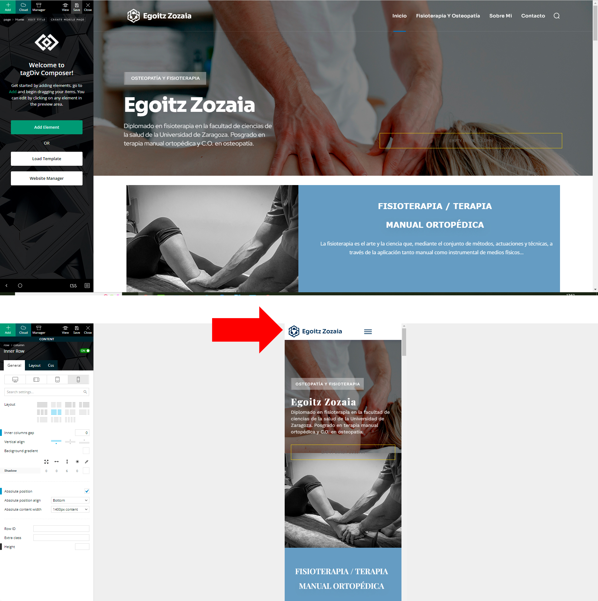
Bettina Hello!
The settings you applied to the mega menu from the desktop won’t be applied to the mobile menu. They can’t be changed there.
Thank you!
 grezako
Bonjour.
We are using “Newspaper The Rimont Pro” Theme (https://demo.tagdiv.com/newspaper_the_rimont_pro/).
In fact we try to do like exactly how the news site of “New York Times” (https://www.nytimes.com/) on Desktop and on Responsive Design (Mobile Device). So for this fact, we had already contacted you previously (via this link: ) on the Newspaper Forum:
TO ASK YOU THE FOLLOWING QUESTION: How to create a new Menu Bar located just above the Logo exactly like on the screenshot of the New York Times home page that we have “circled in RED” just above the Logo: https://imgur.com/a/yv7fFHK ???
AND YOU ANSWERED US BY SAYING: A workaround there could be this one: https://www.screencast.com/t/qJZARQex3.
So, it works well, but our problem is that it does not appear on small screens i.e. on mobiles as you can see in the following screenshot of our website on Mobile: https://imgur.com/a/e7QLWod.
How to display this Top Menu Bar on small screens (mobile screen) ???
In other words, how does this Top Menu Bar appear on Mobile phone screens as it already appears on computer screens since it does not currently appear on small screens as you can see in the screenshot? following screen: https://imgur.com/a/e7QLWod ???
Please help us step by step.
We are blocked on the use of “Newspaper The Rimont Pro”.
Please, answer us through sample demonstrations in screenshots because it will help us best to quickly understand and solve our problem.
Awaiting your reply.
 Zanardi87
Hi everyone,
the created website version is not the same in the mobile version, a lot of parts are missed. In the homepage it is possible to see only the articles, the mobile version doesn’t load the page with the logo in the top, images in the background, menu, ecc.
I use WordPress 6.0, theme Newspaper version 11.5.1
Thank you in advance for your help.
My website is : https://www.tiportoinmoto.it/



