- TutorialsWhat is Ajax preloading?
 thcp2020
 Hi there,
1. Sorry, please let me explain it more clearly. I would like to change the submenu width so that when the ‘Community’ tab is aligned to the right and underneath ‘My account they do not clash and I can get to the submenu (logout). But when I try to change the width using TD composer nothing changes. The white space for ‘Logout’ is too big!
Please see attached – https://paste.pics/C4PFT. https://paste.pics/C4PGE
2. Thank you so much, your video tutorial was very very helpful! Is there a way to customise the mobile menu?
All the best
Thomas
thcp2020Hi there,
I am making a header using the header manager, using a blank template and I have a couple issues.
1. I have made a header menu that has a sub menu but I can’t seem to make it smaller. I have set the width as auto and 15 but it does not change. Please see attached – https://paste.pics/C4F02 https://paste.pics/C4F08
2. How do I make a custom mobile header. I have tried to change the layout to 1/3 but TD composer changes it to 3 separate lines. There might be an issue with my TD composer as the portrait viewpoint is the same. Please see attached – https://paste.pics/C4F0B
All the best
Thomas
 Bettina
 Hello!
1. Edit the homepage with TagDiv Composer, access Website Manager click on Header -> Mobile Menu(you should be able to see your mobile version in Composer now), click on the header row and change the background color from the CSS tab of the row’s settings: https://www.screencast.com/t/DsMHjybIwX
2.1 Background image : https://www.screencast.com/t/x3Xrln2b88x
2.2 Check this screenshot: https://www.screencast.com/t/1YmnrJ9PB3eO
Hope that helps you!
Thank you!
Bettina Hello!
Make sure you did the right change. If you use the Mobile Theme plugin, then you are able to select the menu in Newspaper -> Theme panel -> Mobile Theme -> Header -> Main menu.
If you don’t use the Mobile Theme plugin, then please provide more information about your issue, also a screenshot or your website page.
Thank you!
Bettina Hello!
I already replied to you in this topic: https://forum.tagdiv.com/topic/disable-mobile-header-menu-transition-effect/
If you really want to change the theme code, then I recommend you to contact our custom work team here: https://tagdiv.com/premium-customization-services/ because this will require custom work which is not covered by the support team.
Thank you!
 hyperbros
 Hello…
Mobile menu background color OK on Home Page
https://drive.google.com/file/d/11SrzBHpPJzz8jmscFRTWgF1EBNjAMx2T/view?usp=sharing
Mobile menu background color NOT OK on any other pages
https://drive.google.com/file/d/1b4r8-q2lBxkvCMj2OHnVRHZqKp6amdAt/view?usp=sharing
Block don’t filter correctly
https://drive.google.com/file/d/1btsDjNd2fcJyg9jJi4A_vDc8hYkRBfWh/view?usp=sharing
Pagination don’t work on home page (in desktop mode)
https://drive.google.com/file/d/1kOlBOpg6slDXaZLG3QHiVCJUTWSwgPYf/view?usp=sharing
-
This reply was modified 5 years by
hyperbros.
 Anonymous
Hi,
In my mobile menu I have 5 items. The first two show the colors I changed in the Theme Colors of Mobile Theme configuration. But the the other 3 show the default colors.
I check all the configuration and I can not see this colors in my Mobile Theme configuration.
I deleted the cache every time I do some changes in my theme.
Can you help me to have the same colors always?
Many thanks,
Alex
 Calin
Calin Hi,
Normally, on Newsmag theme the login and register are set in mobile menu like this -> https://i.imgur.com/ZYVFQsq.png in this way it is easer for users to log or register also for desktop it is use a modal, that it is design in different way.
Thank you!
 alphacomics
When putting in a mobile menu on my mobile theme, I select my other menu (not the default one) and it a) doesn’t respect that setting after a save and b) when I move to another component and click back on the mobile menu I just added, the setting is gone (back to -Select Menu-). I tried clearing the cache to see if it as just a issue in the editor and that makes no difference.
I am on 10.4.
 nerdmuchcom
I have this weird mobile menu transition effect that loads on every single page on mobile before loading the page. It’s like a mobile menu animation affecting my CLS scores.
See screenshot:

How can I disable this animation entirely? Or, do you guys have another fix?
I do not have rocket loader enabled.
 ChandlerBing1985
Hi,
I create with div composer this header version (color white with menu black) but I don’t understand why doesn’t appear live on my site http://www.minutidirecupero.it. Which option I have not activated?
The pic: https://ibb.co/q0sXCnw
hyperbroshyperbros.com site
Hi, I would like some help in particular for the mobile version of my newspaper site (I did the Gossip pro installation).
On the home page I can correctly set both the background color of the menu and the display of the menu in the bottom.
But when I try to view any other page or post, the settings revert to the default settings on Gossip Pro.
Instead I have two problems in the “classic” version of the site. In the “Flex Block 2” at the top right of the header, I can’t correctly filter the article to show.
While below the pagination of the articles does not work.
Would you be kind enough to help me?
Thanks
 thorayork
I was so happy when I discovered your NewsMag theme, but now I am not so sure as it looks very difficult to customize.
But I keep trying. I wanted to start a brand new blog with it. My site only has 1 post. My idea was to install and start posting, but I am stuck on many aspects, and one is mobile menu/search background image. I uploaded but it looks all blurry and not like in the demos.
What size should the image be?
Thank you!
My blog is: teamusings.com
 mathew
 Hello,
AMP SETTINGS NOT AVAILABLE IN THEME PANEL AND DASHBOARD CONSOLE.
This has happened after theme update to 10.4
Amp menu also not working on mobile site ,
I tried installing an alternative for amp by automatic however, amp menu still not visible on site,
Site url theworldnews.live
amp: https://theworldnews.live/amp/
Now it is using ampforwp plugin however even with the amp official amp menu does not work
amp settings are completely absent from Wp dashboard console and even Theme panel
The update seems to have caused this issue , was working fine before
Kindly check
Mathew
mathew Hello,
Amp settings not available in theme panel and Dasboard console.
This has happened after theme update to 10.4
Amp menu also not working on mobile site ,
I tried installing an alternative for amp by automatic however, amp menustill not visible on site,
Site url theworldnews.live
amp: https://theworldnews.live/amp/
Now it is using ampforwp plugin however even with the amp official amp menu does not work
amp settings are completely absent from Wp dashboard console and even Theme panel
The update seems to have caused this issue , was working fine before
Kindly check
Mathew
 siteownser
 Hi,
The URL is https://bit.ly/2PoxxYs.
The tagdiv composer doesn’t give any options to modify the mobile activated menu and the search form. Or am I missing something
I reverted the changes made, so you can provide a better and more unified CSS solution.
-
This reply was modified 5 years by
siteownser.
 ivkoit79
 I see. This would be a great experience for many Newspaper theme users, and a very useful one. Hopefully TagDiv coders will enable customization in future Newspaper theme updates. Another thing to improve is to add different div positions and open/close effects for mobile menu because we have only one effect, it is very recognizable. Thank you.
Bettina Hello!
Unfortunately, for that mobile menu you can only have some settings there, so you can not add elements there or customize it with TagDiv Composer.
Thank you!
siteownserHi there,
I have two requests.
1. How to make the mobile menu to take only half the space instead of the entirety of the screen?
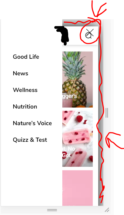
I already changed the (.td-menu-background class) width to 50% and the background to white. But the X button is still on the far right. How to put close icon closer, and also remove the animation of the page on the background, which becomes smaller when the menu is opened?
https://i.ibb.co/fHtP3Cf/image.png
2. The same thing for the search thingy. I want to completely remove the transparent white so it is completely transparent with no color.
 Santhiago Souza
 Hi Bettina,
when I click on the mobile to edit, it appears this menu:
https://www.screencast.com/t/5YQGVHGJL
…
when I access the site on a mobile, it appears in this menu:
https://www.screencast.com/t/BSupiAY7
…
I want to leave my mobile site with the mobile menu, but I can’t
ivkoit79Hello. I am trying to find out how to customize mobile menu. When I say ‘mobile menu’ I think about the menu that users’ get when they click on hamburger icon, not the main menu screen. I would like to customize the inside look completely. Is it possible to add elements and organize them? Any suggestions? Thanks.
siteownserHi all,
I have a footer which has a row with three columns. Inside one of these columns I have a menu list. On desktop, I want the menu list to be right aligned, while on mobile I want it to be center aligned.
When I click on the mobile icon and switch to center align, it switches for everything (desktop, tablet, mobile). This means I can either have one align for both mobile and desktop.
https://i.ibb.co/Wg47YgW/image.png
How can I achieve this?
Note that I do not want to use a mobile template.
 Anamaria
 Hello,
Using our theme you can choose from 3 mobile versions
-> mobile responsive => https://www.screencast.com/t/oJ2ShOp47
-> mobile theme plugin => https://forum.tagdiv.com/the-mobile-theme/
-> mobile page => https://tagdiv.com/newspaper-10-3-7-update-brings-customizable-and-fast-mobile-pages/
This is a video about Responsive Newspaper Theme, AMP & Mobile Theme, Mobile Pages & Templates -> https://www.youtube.com/watch?v=SpGkOnJeNZY
You can add the menu on the top, only if you use the mobile responsive and mobile page.
Add a new row on the top, and in that row, you can add a mobile horizontal menu => https://www.screencast.com/t/myGxLawpd0XT and assign the menu.
Hope this helps you!
Thank you!
 shubhamsharma7979
 Ok can u tell me how can i use csc analyzer tool
When i m uncheck all ( showing 0:0:0:0) mobile menu not working
 BowlingVision
 I’ve managed to change the footer using the method you suggested on the mobile page I’d created for CONTACT US. But it doesn’t change it site wide, just on that page. How do I get it to make a site wide change?
I also need to know how to give the mobile a different menu. On our desktop site we have a top menu and a header menu. On the mobile it only adds to the menu the items in the header menu. I’d like the mobile view to include both the header and top menu. How do I do that? (Or should I make a different topic in the forum?)
Thank you