
- ApiPractical example – How to add a new Block and Module
- ApiAPI – Smart Lists – Introduction
- ApiAPI – Category top section style – Introduction
- ApiAPI – Category top section template – Introduction
- Apitd_api_module::update
- Apitd_api_module::add
- ApiAPI – Modules – Introduction
- ApiUsing the Theme API in plugins
 allerenitalie
On wordpress 6.2 and theme 12.3 with mobile tagDiv plugin disabled I cannot see the menu only on real mobile smartphone (on chrome simulation is ok) when I click on hamburger menu and search button the menu.
If I make one inspect on debugging with real device I see there is the data but I cannot understand why it isn’t visible (css/js issues maybe).
I see on mobile isn’t loaded newspaper theme 12.3.1 as in desktop (but I don’t know if it ok).
The site is http://www.allerenitalie.com
Can you help me?
 Bettina
 Hello Boris!
Your score is 92 performance on mobile. Congrats!
I can see that your LCP is green and the CLS is the one affected that shows in orange color: https://web.dev/articles/optimize-cls?utm_source=lighthouse&utm_medium=lr. I can’t see anything regarding the logo image.
Please check the tutorials from Google Pagespeed Insights and I’m sure you can increase the page speed.
Please note that page speed is not covered by the support team: https://forum.tagdiv.com/newspaper-theme-support/
Thank you!
 jacopich31
 Thank you Bettina,
i record the problem by iphone via Safari, the same problem in android and chrome on mobile
This is the video
 tusaludguia
Hello,
I have the following problem: one of my sites with its Newspaper theme called http://www.imagenesyespecialistas.com has been presenting an issue for weeks where it only redirects to other advertising sites on the mobile version.
Before realizing that it was the TagDiv Composer, I used all the tools available to find the vulnerability. I debugged plugins one by one, but the problem persists.
I used Wordfence, Sucuri, Quttera Web Malware Scanner, and the tools provided by my hosting provider, but the problem still persists.
I consulted my hosting provider and this was their response:
“Hello,
We have been able to verify that the “td-composer” plugin is the cause of the problem.
You can disable the plugin and check again.
If the problem persists, please contact the corresponding plugin vendor.
Best regards,
Roshney P.
BanaHosting.com Inc.
Think Big, Think Bana!”
After receiving this message, I did the following:
I deleted the theme and reinstalled it, but the problem continues. I only installed the TagDiv Composer plugin after downloading it from https://themeforest.net/.
I would appreciate any help with this problem, as it would be very helpful for me and future individuals facing this issue. Thank you very much!
 Gutschein-Zeitung
Hello, we are happy users of your wonderful Newspaper Theme. But, sh.. happens, we have two issues we might need help with.
Both are related to Google PageSpeed and there only for “Mobile”.
Please use the following url for testing:
https://gutschein-zeitung.de/belantis-gutschein-2-fuer-1-mit-50-prozent-rabatt-von-kaufland/
1. Please check LCP value. We did a lot to reduce him, but no way. What are we missing? What can we do?
2. Google complains that the used Logo for Mobile has not the correct dimensions. But we used exactly the sizes suggested from your theme. Why is that?
Thanks for your time and kind regards,
Boris
jacopich31Hi guys,
i have an issue with a mobile view for the page on the site.
This is the site: https://imprenditorefacile.com/blog
I can’t see the page if i don’t scroll.
Do you have any solution for resolve this problem in mobile version?
Thanks a lot
 andrea.turco
Hello, I’d like to add my menu to Center Magazine Pro template. I correctly added the menu to the modal navigation box, but I’d like to insert it in the header as well, like a row of inline links. I’d like to put the menu right aligned under the “search, account, plan” links and it must be hidden on mobile devices.
Here’s the url of the website: https://nuovo.cronachedibirra.it/home-2-2/
Can you help me?
 Anamaria
 Hello,
Please select the port view on the phone, select the content zone and set the margin-left and right to -20 and set this code in width
calc(100% + 40px)
=> https://www.screencast.com/t/Ek89ppzTGldT You can use this method for both (mobile responsive version or mobile page)
Thank you!
 GEX
GEX Maybe this Instagram-like Story format would look cool for the mobile version. But how can I make it so that if someone wants to watch others, they can swipe their finger to see the rest? Because it’s currently stuck… they can’t swipe sideways.
 nolandolce
Hi All,
I’m trying to use/create a template for pages. If I add a new page, and click “load templates,” I get this message: Invalid reply from server endpoint.
Likewise, if I go to the Cloud Templates, within the “Page templates” section, it says, “No cloud templates. Please import one or more templates from Cloud Library.” But then if I click the “+” sign, I get the same message: Invalid reply from server endpoint.
When I go to the new page I created, at the top of the page, it says it’s a mobile template. It’s as though new pages are created with a default mobile template, and I’m unable to change it to a regular page. Nonetheless, it doesn’t make sense why I can’t download page templates from the cloud?
Please let me know.
Thanks!
Anamaria Hello,
Using our theme, you can choose from 3 mobile versions
-> mobile responsive => https://www.screencast.com/t/oJ2ShOp47
-> mobile theme plugin => https://forum.tagdiv.com/the-mobile-theme/
-> mobile page => https://tagdiv.com/newspaper-10-3-7-update-brings-customizable-and-fast-mobile-pages/ The option that you need to use.
Suppose you created the mobile pages with tagDiv Composer. In that case, when you install the Mobile Theme plugin, your pages will be overwritten by the plugin (the mobile theme comes with its templates for page, post, category, etc, so your current templates from the desktop theme will get converted to the mobile theme layout, the page content is made without builders in mobile editor => https://www.screencast.com/t/xbgZG8kH also, the options that are provided to edit the mobile theme version are limited (this keeps the things simple)).
This is a video about Responsive Newspaper Theme, AMP & Mobile Theme, Mobile Pages & Templates -> https://www.youtube.com/watch?v=SpGkOnJeNZY.
So, the mobile responsive is what you see when that you select the viewport on phone => https://www.screencast.com/t/matV17hH, so some settings may apply for each viewport(where is the border blue), and others are not(where the border is black).
The mobile page has the mobile templates from Cloud Library => https://www.screencast.com/t/YCcZ8rL8
The Mobile responsive version of the theme and the mobile page editor can be edit with tagDiv Composer, the mobile theme plugin cannot.
For example, you can have the mobile theme plugin activated and use the mobile page/mobile responsive version for the homepage/pages, but for the categories pages/404 page, you can’t use the mobile page/mobile responsive version if you have the mobile theme plugin activated.
Thank you!
 todaysnifty
How can i control Mobile Theme with NewsPaper Theme.I Mean Can i Use NewsPaper theme in Mobile or Not and from where i can access the mobile section.
 jayflyer
Hi all, does tagdiv have a “pros and cons” table creating tool?
Or any recommended plugins for it ? Preferably something that looks artsy and mobile friendly (responsive)
 ISAAC LAMA
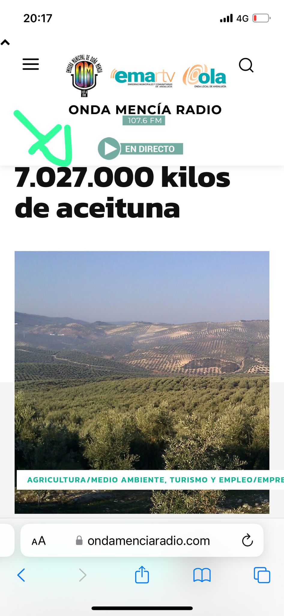
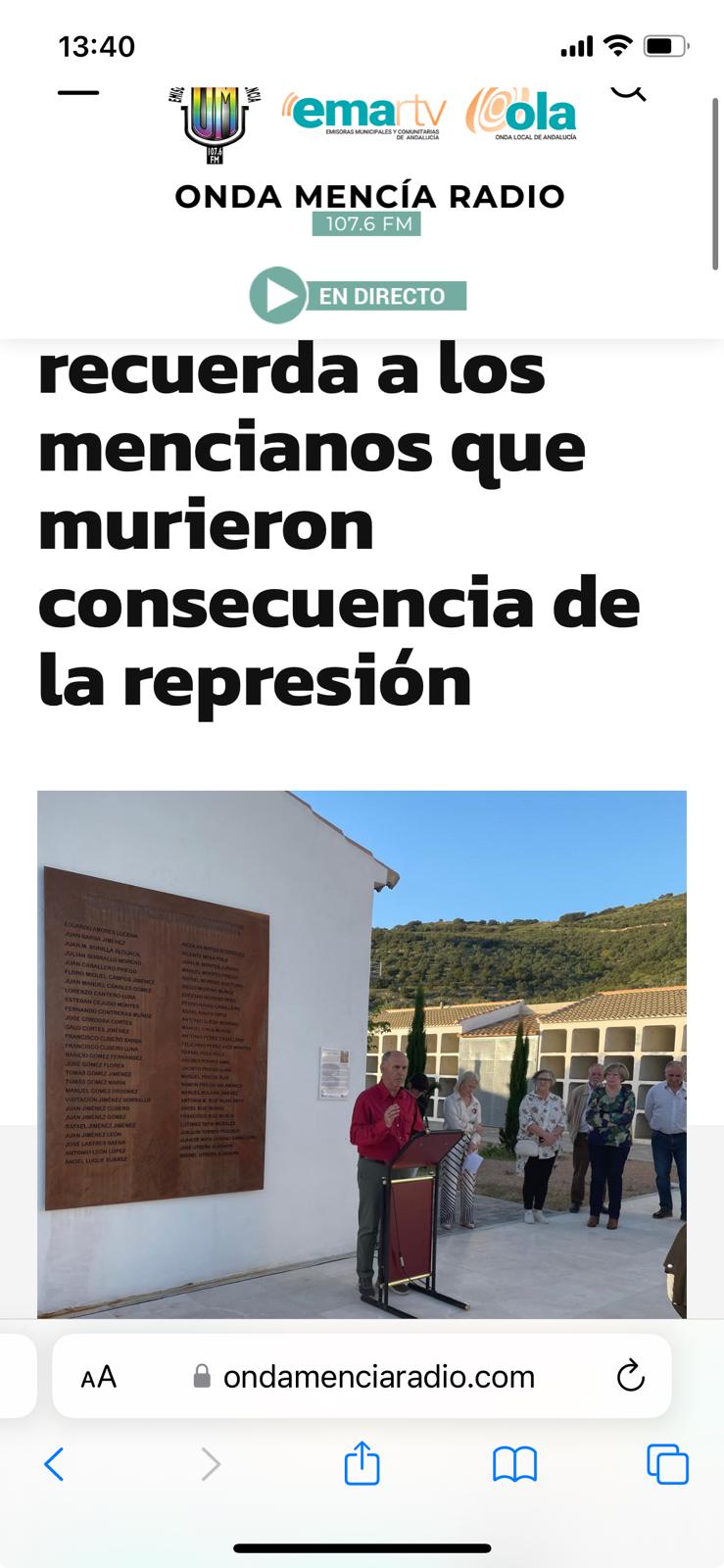
This is the url https://www.ondamenciaradio.com
The main titles of the Posts or entries do not look good in the mobile version and are cut off. Could you tell me where I can modify that?
I am looking forward to your response
thank you
 geniovi
Would it be possible to do something like this?
If my WordPress article is a video type, do not show advertising on mobile.
Example.
In article TOP AD in theme Config i have:
<div class=”td-visible-phone”>
MY ADS
</div>
Would it be possible to do something like this?
<div class=”td-visible-phone type-article”>
MY ADS
</div>
Clearly, I made up a code just to help you understand what I would like to do. I am open to any kind of suggestion
 juniordiscart
Hi
I’m running into the issue that I can’t edit the sticky mobile menu.
When editing a page, I select the sticky mobile menu in the Manager, the header title of the composer changes to ‘Mobile Menu Sticky’. On the mobile preview page, I scroll down so that I’m certain that I should be editing the sticky menu.
However, selecting any of the elements in the menu will switch it back to the regular mobile menu, so that I’m back at editing my main mobile menu again. Changing any element on the mobile menu will always apply changes to the main mobile menu.
Note: this time I deactivated all plugins before testing and writing a report. 🙂
Other data: WordPress 6.5.2
Newspaper theme: 12.6.5
Please advise, and thank you!
Kind regards,
Jan.
 haipo
haipo Hi Bettina,
I deactivated all plugins but I still get the same bad results in mobile.
I will send mail to the support inbox now.
Thank you
Yaron
 cidona
 The issue is that when I click the arrow, the mobile footer template does not show up. So there is no way to delete it, although it shows up in the theme panel. I am now using the mobile theme, but the “mobile footer template” that I created earlier is still showing up on mobile, in addition to the same footer template that shows up on desktop. So I have two footers, and I am unable to delete the one I do not want.
 petar777
 I uploaded around 50k posts (99.9% of them don’t have videos) via WP All Import.
For the ones that have a video I add this code before the content in order to show the video:
<div class="wpb_video_wrapper">
                    <video controls="">
                        <source src="https://eurocom.bg/show_videos/news/',max(video_directory),'/',max(video),'">
                        Your browser does not support the video tag.
                    </video>
                </div></div>
Basically I add my video url to the post. This is not an ideal way to import them I believe but that is the best idea I came up with. On desktop it works good – once you enter the post it shows a thumbnail of the video. On mobile however it just shows the play button. If I click the play button it works well and once I see the video – the thumbnail remains there.
https://ibb.co/MMVznxS
https://ibb.co/3cr9ZZH
Can you advise me on how to properly import posts with videos hosted on my server?

 GEORGI
hi,i have some problemem to swap mobile menu button from left to right, and logo from center to verry left (please see the screenshot

can you help me with that?
best regards
GEORGI
Bettina Hello @mtdas99!
Check the settings from here: https://forum.tagdiv.com/tagdiv-amp-plugin-tutorial/
From my point of view, if you don’t use the Mobile Theme plugin, then there is no reason or benefit to AMP. Unfortunately, AMP is not working with the cloud templates because the AMP’s layout is not fully customized.
The AMP version works best with default templates and not cloud templates. That’s why we integrated it with the Mobile theme plugin.
The feedback from our clients about AMP was negative and it is not used anymore, that’s why we didn’t add more customization options. We no longer recommend using AMP because it is deprecated https://developer.bigcommerce.com/docs/storefront/wordpress/platform-integration/enabling-amp
Thank you!
 mtdas99
 That I know but I couldn’t understand why the text formatting as per mobile editor is not showing in amp mobile pages
Bettina mtdas99 But I already created the content with mobile editor but the content is showing with text formatting in amp in mobiles. A link of my page is mentioned above.
Bettina Hello @mtdas99!
For customization and other services, you can contact our custom work team here: https://tagdiv.com/premium-customization-services/. They could help you to achieve this request.
Please note that if a page is made by Composer, than the content won’t be displayed on Mobile theme version. You should create the content with the Mobile Editor. Please see https://forum.tagdiv.com/the-mobile-theme/ and https://forum.tagdiv.com/mobile-theme-introduction/ for more information.
Thank you!
