
- TutorialsFrom WPBakery to tagDiv Composer
- TutorialsWhat is Ajax preloading?
 sheikhali191
I have added elements and created mobile homepage and save it but nothing is changed, same old default mobile layout is showing. How can i set it for homepage?
website: http://www.hairs.london
 Anamaria
 Hi,
To remove a background image, go in Theme Panel -> Background -> Mobile menu/mobile search => https://www.screencast.com/t/uvDejzbX and delete the image, because this no longer exists.
Thank you!
Anamaria Hello,
Unfortunately, there is no option because the amp works with mobile theme and has a different structure.
Using our theme, you can choose from 3 mobile versions
-> mobile responsive => https://www.screencast.com/t/oJ2ShOp47
-> mobile theme plugin => https://forum.tagdiv.com/the-mobile-theme/
-> mobile page => https://tagdiv.com/newspaper-10-3-7-update-brings-customizable-and-fast-mobile-pages/
If you created the mobile pages with tagDiv Composer, then when you install the Mobile Theme plugin, your pages will be overwritten by the plugin (the mobile theme comes with its templates for page, post, category, etc so your current templates from the desktop theme will get converted to the mobile theme layout, the page content is made without builders in mobile editor => https://www.screencast.com/t/xbgZG8kH also, the options that are provided to edit the mobile theme version are limited (this keeps the things simple)).
This is a video about Responsive Newspaper Theme, AMP & Mobile Theme, Mobile Pages & Templates -> https://www.youtube.com/watch?v=SpGkOnJeNZY
So, the mobile responsive is what you see when that you select the viewport on phone => https://www.screencast.com/t/matV17hH, so some settings may apply for each viewport(where is the border blue), and others are not(where the border is black).
The mobile page has the mobile templates from Cloud Library => https://www.screencast.com/t/YCcZ8rL8
The Mobile responsive version of the theme and the mobile page editor can be edit with tagDiv Composer, the mobile theme plugin cannot.
For example, you can have the mobile theme plugin activated and use the mobile page/mobile responsive version for the homepage/pages, but for the categories pages/404 page, you can’t use the mobile page/mobile responsive version if you have the mobile theme plugin activated.
So, if you want to design the pages with tagDiv Composer, you can use the mobile page or mobile responsive version.
Thank you!
 Calin
Calin Hello,
Are you referring that on mobile you see a different layout then desktop version? If so, this is because you have the mobile theme plugin enabled, this overwrites the responsive version and use a mobile theme standard layout to provide better performances on mobile. If you need the same layout and content on mobile like on desktop please disable the tagDiv mobile theme plugin.
Thank you!
Anamaria Hello,
Please let me know what version you use the mobile theme or mobile page.
Using our theme, you can choose from 3 mobile versions
-> mobile responsive => https://www.screencast.com/t/oJ2ShOp47
-> mobile theme plugin => https://forum.tagdiv.com/the-mobile-theme/
-> mobile page => https://tagdiv.com/newspaper-10-3-7-update-brings-customizable-and-fast-mobile-pages/
If you created the mobile pages with tagDiv Composer, then when you install the Mobile Theme plugin, your pages will be overwritten by the plugin (the mobile theme comes with its templates for page, post, category, etc so your current templates from the desktop theme will get converted to the mobile theme layout, the page content is made without builders in mobile editor => https://www.screencast.com/t/xbgZG8kH also, the options that are provided to edit the mobile theme version are limited (this keeps the things simple)).
This is a video about Responsive Newspaper Theme, AMP & Mobile Theme, Mobile Pages & Templates -> https://www.youtube.com/watch?v=SpGkOnJeNZY
So, the mobile responsive is what you see when that you select the viewport on phone => https://www.screencast.com/t/matV17hH, so some settings may apply for each viewport(where is the border blue), and others are not(where the border is black).
The mobile page has the mobile templates from Cloud Library => https://www.screencast.com/t/YCcZ8rL8
The Mobile responsive version of the theme and the mobile page editor can be edit with tagDiv Composer, the mobile theme plugin cannot.
For example, you can have the mobile theme plugin activated and use the mobile page/mobile responsive version for the homepage/pages, but for the categories pages/404 page, you can’t use the mobile page/mobile responsive version if you have the mobile theme plugin activated.
So, if you want to design the pages with tagDiv Composer, you can use the mobile page or mobile responsive version.
Thank you!
Anamaria Hello,
1.
In order to disable the option “Exit mobile version”, you need to disable this setting: https://i.imgur.com/LxpDtB2.png
The excerpt option is not added to work for mobile theme and amp, only mobile page and responsive version.
You can change the text for about us here -> https://i.imgur.com/qmC40ri.png and follow us here -> https://i.imgur.com/zHHi7Ck.png
2. Yes, is the same page without mobile theme and amp.
Yes, it is used mobile theme. We have 3 options:
Mobile – Displays content using the Mobile Theme on small screen devices (no AMP)
Mobile + Amp – Displays content using the Mobile Theme on both mobiles and AMP
AMP – Uses the responsive version of the theme on small screen devices and Mobile Theme only on AMP.
For forum is used bbpress but this is made custom.
Thank you!
Anamaria Hello,
Usually, this happens with cache plugins. If the cache plugin does not have mobile support then the mobile theme version can be delivered instead.
The solution would be to use the recommended WP Super Cache plugin instead and activate these settings (especially the mobile device support): https://forum.tagdiv.com/cache-plugin-install-and-configure/
Also, please let me know what plugin for the cache you use now.
I hope this helps.
Thank you!
 nitrofox
Hi all,
Since the last update that when entering my site via mobile, it opens the responsive desktop version on the first visit, and not the mobile theme, but if you do F5 Refresh, it opens the mobile theme version, I don’t understand why this is happening.
The only thing I did recently was the last update, and I also updated the Google Adsense GDPR message, for some reason the first visit to the site via mobile does not pull the mobile theme version, only if you revisit the site on the next visit.
Thanks
 SamW2023
The Post has started showing past two weeks different post pictures on mobile and desktop; after refreshing and changing the post for some time on mobile, it switches back to an other picture again and again, and this is only happening on mobile. The desktop view has the correct post picture. Please fix this glitch asap.
 scollen
Hi there
What is the difference in setup between these two tagdiv url’s:
1. https://tagdiv.com/category/documentation/?amp
– I see this url has AMP enabled.
– Does AMP always create the “Exit Mobile Version”? Is there a way to disable that?
– You have absolutely no excerpts in your AMP version. How would one include excerpts in the AMP version?
– Can you point me to the URL that explains where and how to adjust the ‘About Us’ and ‘Follow Us’ adjustments that you made?
2. https://tagdiv.com/category/documentation/
– This is exactly the same page with AMP disabled, correct?
– This is using a mobile theme or not using a mobile theme?
Another question, what forum software/plugin are you using here?
Thank you!
 Alex
Alex INP on desktop doesn’t seem to have any problems.
– I assume that INP issue is happening on Mobile when modal popup block is used for Menu, Search etc elements.
When default Mobile Menu Burger and Search blocks is used INP on mobile has no problems.
 kellykim
I make the mobile page, but it doesn’t work.
how can I solve this problem?
 vallartamirror
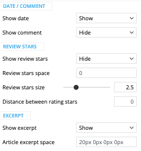
 Here is a screenshot showing the block used (Flex Block 1).
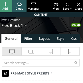
… with settings set to show excerpt and hide comments.
Here is also a screenshot of the category sections from my mobile…
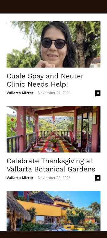
The page shown above can be found here. It displays correctly on desktop but not on mobile.
 larutachina
 I already fixed the menu problem but I still have the blank space between the header and the content in the mobile version. I just downloaded the theme again but I still have the same problem.
 digitalbrothers
 yes, we found the problem on mobile. i hoep that now no “noindex” command there is on the page.
can you check?
digitalbrothers To complete the analysis we found that on mobile there is a critical error.
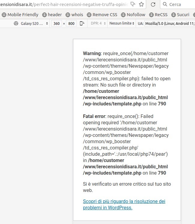
We wait for your kind help
larutachina And other problem I have (sorry I forgot to mention before) is that I see a blanket space between the header and the starting of the posts that doesn’t exit in the composer. Sorry if it’s a really silly question but I’m using this tool for the first time and the mobile page is a fundamental part of my website.
Thank you!
larutachinaHi!
I’m just starting my website but I’m not being capable to make the mobile menu to work.
It works in the composer but not online.
What would be the problem?
Thank you
Website: http://www.larutachina.com
Calin Hi,
What you can try is to set a big line-height on header elements from header and desktop, another alternative is with css, for example for mobile it can be used this custom css:
.td-header-main-menu  {

min-height: 100px!important;

}

.td-header-menu-wrap {

    min-height: 101px!important

}

#td-top-mobile-toggle i {

      line-height: 101px;

}
– https://i.imgur.com/tzKCv1q.png
I hope this will help you!
 renovaweb
Hello !
I really like this theme, thanks !
But the mobile version doesn’t work (critical error)
Homepage seems fine
I tried with AMP, AMP + Mobile, Mobile
I tried with AMP plugin not activated too
Website: https://dev.magazine3rve.cc/
PHP 8 with php ini ressources boosted to max
WordPress 6.4.1 with Newspaper Child theme Version : 9.0c
NewspaperVersion : 12.6.1
PHP errors on inner pages or articles
Warning: require_once(/home/mag3rve/dev.magazine3rve.cc/wp-content/themes/Newspaper/legacy/common/wp_booster/td_css_res_compiler.php): Failed to open stream: No such file or directory in /home/mag3rve/dev.magazine3rve.cc/wp-includes/template.php on line 790
Fatal error: Uncaught Error: Failed opening required ‘/home/mag3rve/dev.magazine3rve.cc/wp-content/themes/Newspaper/legacy/common/wp_booster/td_css_res_compiler.php’ (include_path=’.:/opt/cpanel/ea-php80/root/usr/share/pear’) in /home/mag3rve/dev.magazine3rve.cc/wp-includes/template.php:790 Stack trace: #0 /home/mag3rve/dev.magazine3rve.cc/wp-content/plugins/td-composer/legacy/common/wp_booster/td_autoload_classes.php(42): load_template(‘/home/mag3rve/d…’, true) #1 [internal function]: td_autoload_classes->loading_classes(‘td_css_res_comp…’) #2 /home/mag3rve/dev.magazine3rve.cc/wp-content/plugins/td-composer/legacy/common/wp_booster/td_global.php(780): class_exists(‘td_css_res_comp…’, true) #3 /home/mag3rve/dev.magazine3rve.cc/wp-content/plugins/td-composer/legacy/common/wp_booster/td_wp_booster_functions.php(1184): td_global::reset_theme_settings() #4 /home/mag3rve/dev.magazine3rve.cc/wp-includes/class-wp-hook.php(324): hook_wp_head(”) #5 /home/mag3rve/dev.magazine3rve.cc/wp-includes/class-wp-hook.php(348): WP_Hook->apply_filters(NULL, Array) #6 /home/mag3rve/dev.magazine3rve.cc/wp-includes/plugin.php(517): WP_Hook->do_action(Array) #7 /home/mag3rve/dev.magazine3rve.cc/wp-includes/general-template.php(3052): do_action(‘wp_head’) #8 /home/mag3rve/dev.magazine3rve.cc/wp-content/plugins/td-standard-pack/Newspaper/header.php(11): wp_head() #9 /home/mag3rve/dev.magazine3rve.cc/wp-content/plugins/td-composer/td-composer.php(259): require_once(‘/home/mag3rve/d…’) #10 /home/mag3rve/dev.magazine3rve.cc/wp-includes/class-wp-hook.php(324): {closure}(”) #11 /home/mag3rve/dev.magazine3rve.cc/wp-includes/class-wp-hook.php(348): WP_Hook->apply_filters(”, Array) #12 /home/mag3rve/dev.magazine3rve.cc/wp-includes/plugin.php(517): WP_Hook->do_action(Array) #13 /home/mag3rve/dev.magazine3rve.cc/wp-content/themes/Newspaper/header.php(2): do_action(‘tdc_header’) #14 /home/mag3rve/dev.magazine3rve.cc/wp-includes/template.php(790): require_once(‘/home/mag3rve/d…’) #15 /home/mag3rve/dev.magazine3rve.cc/wp-includes/template.php(725): load_template(‘/home/mag3rve/d…’, true, Array) #16 /home/mag3rve/dev.magazine3rve.cc/wp-includes/general-template.php(48): locate_template(Array, true, true, Array) #17 /home/mag3rve/dev.magazine3rve.cc/wp-content/plugins/td-standard-pack/Newspaper/page.php(7): get_header() #18 /home/mag3rve/dev.magazine3rve.cc/wp-includes/template-loader.php(106): include(‘/home/mag3rve/d…’) #19 /home/mag3rve/dev.magazine3rve.cc/wp-blog-header.php(19): require_once(‘/home/mag3rve/d…’) #20 /home/mag3rve/dev.magazine3rve.cc/index.php(17): require(‘/home/mag3rve/d…’) #21 {main} thrown in /home/mag3rve/dev.magazine3rve.cc/wp-includes/template.php on line 790
Thank you very much !
Anamaria Hello,
You can create a new sidebar for mobile by hiding the sidebar for the desktop, and vice versa. You can also create a new one using the Tagdiv Composer -> https://forum.tagdiv.com/sidebars-tutorial/
Thank you!
 Arsenio Spadoni
I need to have two different sidebars, one for the standard homepage and one for the mobile homepage. I created the “Default Newspaper” that I use for the home page, I would like to create a “Default Newspaper bis” (different from the standard) to use only on the mobile page. It’s possible? How can I do?
Thanks you in advance,
Arsenio Spadoni
 news9
news9Hi
How can I set height for header on both desktop and mobile specifically?
Thank You
 stefanoroma
Hi,
I migrate the website from https://www.cestaysetas.com/dev/ url to https://www.cestaysetas.com/ and it is a nightmare.
It’s really a very bad bad experience with this theme.
If you try with chrome smartphone simulation all is fantastic but if you try with real mobile (cache is deleted and it the same in new mobile) begin the nightmare.
– The header in mobile don’t work, it charge the theme default header
– Categories and post page are the dafault, it don’t load the CloudTheme
So please help because it is very noising problem.
I can’t undestand how you have 4.8 rating in Themeforest.
The website is: https://www.cestaysetas.com/ please check with your mobile.
Calin Hello,
Here is an example where the code is apply – https://i.imgur.com/lOPrGqL.png (if you are using cloudflare you need to purge it).
Please do a test and instead setting the code in mobile section set it in this place – https://i.imgur.com/k6xqA5S.png
Thank you!



