- TutorialsFrom WPBakery to tagDiv Composer
- TutorialsWhat is Ajax preloading?
 Anamaria
 Hello,
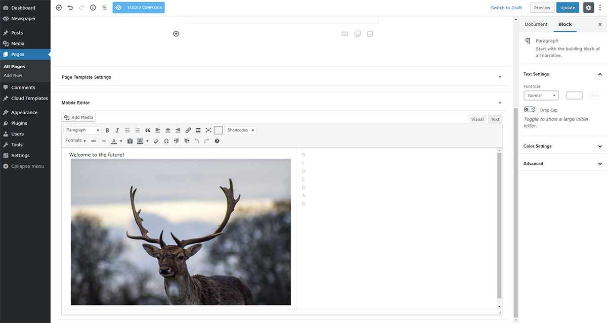
The page content is made without builders in mobile editor => https://www.screencast.com/t/xbgZG8kH so you can only add the elements that are present in the toolbar, without shortcodes(blocks).
Also, you can apply a filter for grids on the front page from Theme Panel -> Mobile Theme.
Thank you!
 Bettina
 Hello!
If you have Mobile Theme plugin installed and active, then you can not customize it because it has its own design templates.
You can have just some setting for it and those can be found in Newspaper -> Theme panel -> Mobile theme.
A full explanation you can find here: https://www.youtube.com/watch?v=SpGkOnJeNZY
When you deactivate Mobile Theme plugin, then your responsive mobile version will be on which is similar with the desktop version and all should be alright.
Thank you!
Anamaria Hello,
To change the background image for the menu on mobile, please access Newspaper -> Theme panel -> Background -> Mobile menu/search background and change the image from here https://www.screencast.com/t/ATV1Jr7s
Hope that helps you!
Thank you!
 fozcengiz
Hi everyone,
As you can see on the video; The Drop-Down Menu doesn’t appear for “BLOG YAZILARI” on the Mobile Phone. There is no arrow for the see child menu.
You can see on the menu “Tedaviler”, which I want.
 _edwin_
Hi there,
I have created a page through a template, https://stressplein.nl/gratis-burn-outproducten-en-informatie/ but on mobile I see an fatal error message.
I cannot figure out what the problem is and how to fix this, anyone can please?
 fabioweb90
 Ok great. Everything works fine now. Only last info
How can i manage resize into mobile theme “GRIDS” section?
https://ibb.co/3ztjR5T – https://ibb.co/jH1D4FR
Regards
 sparky263
When I click on hamburger on left side of mobile menu on my iphone, I see a background pic of a bridge. How do I get rid of this or change it to plain coloured B/G?
https://moic.onlineinvestmentconference.com
 beckib
 Sure – below are screenshots of the Mobile Page with TD Composer. In portrait mode, it looks how I want, but when I switch to landscape mode it’s all messed up. When previewing on Chrome – inspect with ipad on, it looks the same as the landscape mode below.
I also tried editing elements of the mobile page in the landscape mode via TD Composer, but it changes the portrait mode as well.
Mobile – Landscape Mode (Also displays on tablet)
I’d like to be able to use the main page (not mobile page) layout for landscape and ipad mode, or be able to revise the layout on the landscape mobile page.
-
This reply was modified 5 years by
beckib.
Anamaria Hello,
Usually, the problem is from a cache plugin, because you are using the mobile theme plugin => https://www.screencast.com/t/mpbsqaVtX2kL, the mobile layout will have a different design and most of the cache plugins do not recognize this and provide the mobile version for desktop (or vice versa). We recommend using WP Super Cache plugin with the settings from our guide -> https://forum.tagdiv.com/cache-plugin-install-and-configure/
Thank you!
 jbminc
Hello Support,
When we access our site via a desktop many times it displays the mobile version of the site/theme.. any ideas how this is occurring?
https://www.awesomescreenshot.com/image/7551828?key=b34fced2622a34132d0832affe420ef7
Our website is at https://amazinghealthsecrets.com
Thanks!
Cheers
James
 carlodap
Hi there,
I’d like to set up a mobile theme, but there is something I can’t sort out.
– The logo, the size is set as you advise, is not displayed properly https://imgur.com/nG6kvku
– There are some blocks at the end of the mobile page I can’t modify or remove https://imgur.com/szeFFzH
Can you help me?
Many thanks in advance
 imdarshanpetkar
When the mobile theme plugin is active, how can I show my some particular category’s posts on them? Let’s say for example I have a Page Of Health Tips and on that page, I want to show only Health Tips category posts. I am unable to do it with the mobile editor option—-> https://tagdiv.com/wp-content/uploads/2018/11/gutenberg-welcome-to-the-future.jpg
How can I do that?
 Felipe Moretti
 I disabled the mobile tagdiv plugin, and now the images have disappeared from the posts, how do you make them appear?
imdarshanpetkar Is there any possibility that my mobile pages will rank for desktop SERP results? Or desktops pages on mobile SERP results?
and creating mobile pages is SEO friendly?
Anamaria Hello,
The page speed is not related only to the theme that you are using, this is affected by plugins/content/ads/ external resources, etc.
I just checked your website and it looks that your images and thumbs are not optimized, for example, you can use EWWW Image Optimizer plugin, also, you can try other plugins like Autoptimize. => https://www.screencast.com/t/dPuNRR9u Your website needs an optimal speed that’s why you need to make some settings also to help for the improvement.
By the way, we have such a great result with this new update and with our new tool: https://www.youtube.com/watch?v=tnkVapqhIHc
Our tool is running only on normal pages and not for posts or categories for example.
Also, to increase the page speed you can check these similar topics for more solutions:
– https://forum.tagdiv.com/topic/optimize-script-to-improve-site-speed/
– https://www.infophilic.com/get-almost-100-pagespeed-newspaper-theme/
– https://forum.tagdiv.com/topic/a-few-tips-for-newspaper-x-speed-high-cpu-usage-issues/
– https://tagdiv.com/how-to-increase-page-loading-speed/
However, page loading speed can depend on many factors, and each website is unique from this point of view.
Let me explain some of these factors and maybe they give you some starting points for optimizing your website.
External factors: server speed, if you are using CDN or not, the external resources loaded by your website like ads, fonts, tracking scripts like Facebook Pixel, Google Analytics, Twitter analytics, Hotjar and so on.
Internal factors: the number of elements on the page, image size, image formats, if you are using mobile optimized layouts, console errors, if you are using the Standard Pack plugin on not if you are using PRO demo or a standard one.
To remove CLS please check these guide => https://developers.google.com/web/tools/lighthouse/ -> https://www.sqlpac.com/en/documents/google-pagespeeds-lighthouse-6-new-features-lcp-cls.html -> https://web.dev/lighthouse-whats-new-6.0/
Also, please remove the logo and add it again => https://www.screencast.com/t/Qj9gb0vY
Hope this helps you!
Thank you!
beckibHi – I created a mobile page for my homepage (not using mobile theme) and edited it with TD Composer. It looks great on mobile, but is also displaying on tablet where it looks horrible. Further, I can’t adjust the tablet layout when revising mobile page and selecting tablet (it also adjusts mobile). I’d rather use the original page’s tablet layout. Is there a way to fix this?
Anamaria Hello,
What version do you use for mobile? Mobile responsive version or mobile page?
If you have mobile page, then you need to edit the mobile page, and select the header logo and change the text.
This is a video about Responsive Newspaper Theme, AMP & Mobile Theme, Mobile Pages & Templates -> https://www.youtube.com/watch?v=SpGkOnJeNZY
Thank you!
Bettina Hello!
From what you describe it seems you have installed Mobile theme plugin. If you created the mobile pages with TagDiv Composer, then when you install Mobile Theme plugin, your pages will be overwritten by the plugin.
The Mobile Theme is a performance optimized theme included in the Newspaper main theme and it loads only for mobile devices. It comes with its own templates for page, post, category, etc so your current templates from the desktop theme will get converted to the mobile theme layout. For more details, please take a look here: https://forum.tagdiv.com/the-mobile-theme/
Better deactivate the plugin and see the results which you already did because I checked your website and it seems all is alright at the moment.
Thank you!
Bettina Hello!
If you have set up a mobile page you can easily shift or select no mobile pages. But if you delete it, then the mobile page is already there but blank. So, in this case you need to assign another mobile page, and then to select no mobile pages without deleting the previous one. After selecting no mobile pages, you can delete also the mobile pages which you created.
In conclusion, don’t delete first so you will don’t have any issues.
Thank you!
Anamaria Hello,
“See this Desktop view—> https://imgur.com/VJNjS9e” if you want to use mobile theme plugin, and you want to have the responsive layout, then you can disable the mobile theme plugin on that page from the Gutenberg editor using the following option => https://www.screencast.com/t/axXRJsWby
Also, as I said above the page content is made without builders in the mobile editor, so if you want to use mobile theme on that page, then you need to make the page in the mobile editor => https://tagdiv.com/mobile-theme-automatic-optimization-for-mobile-newspaper-theme/
Thank you!
 jph1313
jakehotchkiss.com
My header is working fine on the desktop page, but on mobile, the title of the website says “Classic”. I can’t figure out how to update it to “Jake Hotchkiss”.
Felipe Moretti( https://prnt.sc/11s0bty ) this is the correct form that should appear but it is appearing like this in all mobiles: ( https://prnt.sc/11s0dls ) it’s not the way I left it in the newspaper.
1 https://prnt.sc/11s0p2d
2 https://prnt.sc/11s0pqc
3 https://prnt.sc/11s0qe6
4 https://prnt.sc/11s0opq
If in my tagDiv Composer settings are correct, why on mobile phones the layout format does not remain as I left it ??
Thank you.
 Demir
Demir Hello again!
I have already done these operations with the method you suggested.
I deleted all mobile templates and followed the steps below:
- First, I created a blank mobile template called “Anasayfa – mobil“.
- Then I applied and saved the changes I deemed necessary in this mobile template.
- In the admin panel, I assigned the mobile template I designed and saved to the homepage.
- I cleared all the caches.
When I tested, it still comes with the standard mobile page instead of the mobile page I designed.
When called “www.arthenos.com/anasayfa-mobil” from my mobile phone, the mobile page I designed works without any problem. However, when I call “www.arthenos.com” from my mobile phone, the standard page comes up as if I had not assigned any mobile page.
This is the problem I’m trying to explain.
Regards.
 zinger
Hi there, is there anyway of hiding the tagDiv tool items when logged in? Specifically, tagDiv Analyzer, and Mobile Page? On a smaller screen, they break the line and block other links.
Thank you
imdarshanpetkar In my case, On my website, Whenever I install a mobile theme, my pages do not show any content(In mobile-only. They work properly on desktops).
See this Mobile view—> https://imgur.com/3JU1dov
See this Desktop view—> https://imgur.com/VJNjS9e
You said in the above reply that the desktop theme will get converted to the mobile theme layout in the mobile theme. Then what are the issues.
I am ready to give you my admin controls. Just solve this issue. Cause without a mobile theme website performs very slow on mobile devices.
Please help.