
- TutorialsFrom WPBakery to tagDiv Composer
- TutorialsWhat is Ajax preloading?
 DeRev
DeRevHi, we installed the template with the Fashion demo (you can check pbricherasio.com) but we cannot change the violet color that appears when you go on the images in the homepage. We can’t find it in the div composer.
In the same way, we can’t understand how to change colors and images that appears in the mobile version in the hamuburger menu and in search results.
Could you please help us to understand how to change them?
Thank you, best
 Calin
Calin Hi,
Please note that the mobile editor is only for pages -> https://i.imgur.com/8eOnB4l.png, not posts -> https://i.imgur.com/jn9ppCi.png also if you want to use the responsive version will work only if you are using the Gutenberg editor (and you do not deactivate it or use classic editor).
Also please note that we specific that if you are using the mobile theme you need to create a new page content using the mobile editor or the option for responsive version -> https://forum.tagdiv.com/the-mobile-theme/ -> https://i.imgur.com/JtW261Z.png -> https://i.imgur.com/NU6C1gr.png -> https://i.imgur.com/QN6o5By.png
Make sure that you do not have a plugin conflict, please deactivate ALL plugins except tagDiv plugins, also if you are using child theme or cache plugin, deactivate them, clear all cache and try again.
If there is still a problem, you can send us an email at contact@tagdiv.com and provide admin login, as well as cPanel. We will take a look. Include a link to this topic in the email.
Thank you for your understanding!
Calin Hi,
If you are using the mobile theme plugin, then you need to use a custom css to remove the featured image -> https://i.imgur.com/nXdlLdI.png
.td-post-featured-image {

display: none;

}
The code need to be set in Them Panel> Mobile Theme> Custom code > Css.
Also you can adjust mobile theme from here -> https://i.imgur.com/ET40GBB.png
Hope this will help you!
Thank you!
 info@eskuare.com
 Ok Thanks,
But.. what about the google adsense on the mobile version?? Eveythinhg seems like is ok but we cant see ads on real smartphones?? (but if you test it as amp page on a desktop computer you can see the ads)
WHat is the problem???
Calin Hi,
If you are using the mobile theme plugin that provide you a better speed then responsive version of theme, but in order to achieve that speed you’ll need to create a new content for pages because in the most of cases those were made with builders ( tagDiv Composer, WPBakery ) and you need to use only the mobile editor ( you need to set the content for pages in mobile editor and this content will be display on mobile theme)
-> https://i.imgur.com/9d0UWLT.png
Also you can show the responsive version on mobile theme -> https://i.imgur.com/m0bVB5T.png you can check more details about mobile theme in our documentation -> https://tagdiv.com/mobile-theme-get-mobile-ready-with-newsmag-theme/ or if you want to have the responsive version only, you can use the amp option from mobile theme -> https://i.imgur.com/oofST3D.png (to use the mobile theme template on amp) or you can disable the plugin.
Hope this will help you!
Thank you!
Calin Hi,
If you are using the mobile theme plugin that provide you a better speed then responsive version of theme, but in order to achieve that speed you’ll need to create a new content for pages because in the most of cases those were made with builders ( tagDiv Composer, WPBakery ) and you need to use only the mobile editor ( you need to set the content for pages in mobile editor and this content will be display on mobile theme)
-> https://i.imgur.com/9d0UWLT.png
Also you can show the responsive version on mobile theme -> https://i.imgur.com/m0bVB5T.png you can check more details about mobile theme in our documentation -> https://tagdiv.com/mobile-theme-get-mobile-ready-with-newsmag-theme/ or if you want to have the responsive version only, you can use the amp option from mobile theme -> https://i.imgur.com/oofST3D.png (to use the mobile theme template on amp) or you can disable the plugin.
Hope this will help you!
Thank you!
Calin Hi,
If you want to use the mobile theme plugin only for amp plugin, then you can use this option -> https://i.imgur.com/0SbPJka.png also if you do not want it at all, you can disable the plugin, unfortunately there is no general option to use it only on posts or pages, this can be set only manually.
Thank you!
 Vlad S
 Hello !
We have investigated your website on mobile / desktop, resize but couldn’t identify any bug. Please post a picture of your issue.
Thank you !
Calin Hi,
I just find a better solution please replace the code from this file wp-content/plugins/td-composer/mobile/parts/logo.php with the code from this pastebin this will check if is homepage and will add an h1 only on homepage -> https://i.imgur.com/RDb52Md.png
But please note that all these settings in theme files will be lost after you’ll make a theme update.
Hope this will help you!
Thank you!
Vlad S Hello !
That is a suggestion from gtmetrix and google to use the perfect sizes but that will affect your website in other ways. Because using another thumb for mobile will create additional images on your website which will lead to more space occupied on your server.
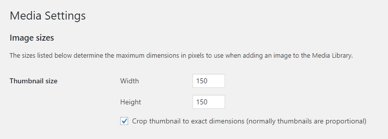
Most of the results from gtmetrix and google page speed are suggestions. You can add another size for your thumbs in wordpress here:
Go to your WordPress dashboard.
Navigate to the Settings > Media tab.
Look for the Image sizes > Thumbnail size section.
Change the default width and height of your thumbnails in pixels.
Thank you !
Vlad S Hello !
The pages don’t render because you are using The Mobile theme, was specially designed for optimization on mobile devices. Unfortunately on mobile theme you cannot do much changes of design. If you want to have the same design as on desktop mode you can achieve that by simply disabling the mobile theme.
You will have to recreate your pages into the Mobile editor or completely disable the mobile theme. The mobile editor will not render shortcodes !
Also you can disable mobile theme on certain pages or posts by following this setting: 
Please take a look here: https://forum.tagdiv.com/the-mobile-theme/
Mobile theme plugin can be disabled from Newspaper Plugins as you can see here: https://www.screencast.com/t/LnkZCEVC
In order to enter on a website as amp you will have to go through google search and from there access your website.
Thank you !
Calin Hi Marcel001,
Please try using a pc or laptop, also the page is displaying correctly on mobile too, but you need to scroll the page content and editing with the mobile will be very hard.
Hi Nserebrenik make sure that you do not have a plugin conflict, please deactivate ALL plugins except tagDiv plugins, also if you are using child theme or cache plugin, deactivate them, clear all cache and try again.
Hope this will help you!
Vlad S Hello !
For sharing. That can be modified using a SEO plugin: https://www.yokoco.com/control-facebook-share-link/
For more information about amp / mobile theme please follow our documentation here: https://forum.tagdiv.com/tagdiv-amp-plugin-tutorial/ ; https://forum.tagdiv.com/newspaper-theme-documentation/
Thank you !
 kevinperry
 I have had to disable the mobile theme plugin as this is the only way I could access content on mobile. I have never used the amp plugin. Help appreciated
kevinperryim having lots of page load issues with my website tvblackbox.com.au especially on mobile. The error log seems to be suggesting the problem is coming from the composer plugin. can someone help me please?
[Sun Apr 12 22:39:30.256546 2020] [proxy_fcgi:error] [pid 2331] [client 66.249.70.21:58728] AH01071: Got error ‘PHP message: PHP Warning: require_once(/home/389923.cloudwaysapps.com/nkpcuuvxjt/public_html/wp-content/Newspaper/tagdiv-deploy-mode.php): failed to open stream: No such file or directory in /home/389923.cloudwaysapps.com/nkpcuuvxjt/public_html/wp-content/plugins/td-composer/mobile/functions.php on line 11\nPHP message: PHP Fatal error: require_once(): Failed opening required ‘/home/389923.cloudwaysapps.com/nkpcuuvxjt/public_html/wp-content/Newspaper/tagdiv-deploy-mode.php’ (include_path=’.:/usr/share/php’) in /home/389923.cloudwaysapps.com/nkpcuuvxjt/public_html/wp-content/plugins/td-composer/mobile/functions.php on line 11\n’
 BuddhaNET777
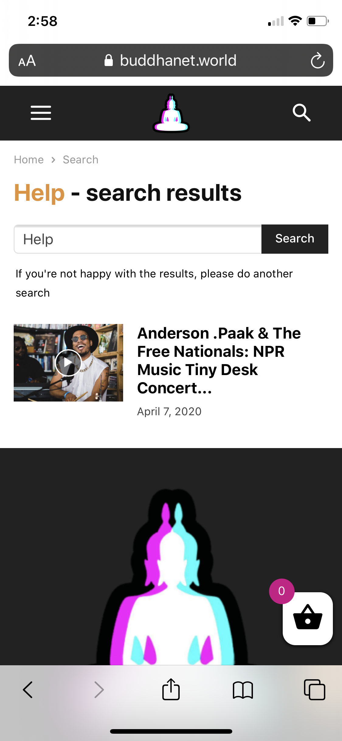
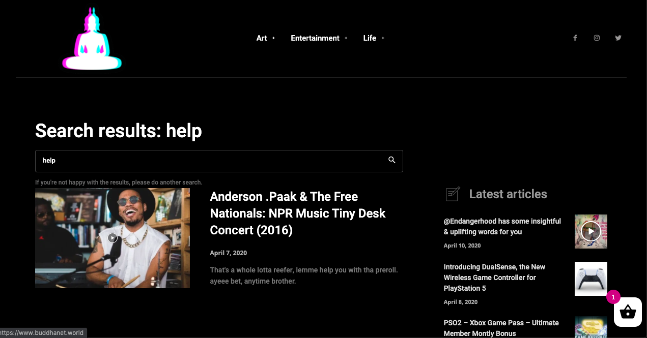
I have applied the black pro search template via theme panel, it works for the desktop version of theme but does not apply to the mobile version resulting in an ugly white block. please advise. both screenshots are below.
website: https://buddhanet.world
 bluetonic
I add custom ad code
I see desktop , laptop , tablet it’s ok
but I don’t see in mobile (header)
thanks for support
 chip303
 What I noticed:
As soon as I have called up an article, the search is superimposed on top, the menu and the mobile header (inside still no function) are displayed in a reduced size.
By the way, both in Chrome, Firefox, Safari (each mobile on the phone)
chip303Hi there,
apparently my burger menu of the mobile theme has a problem with WP Rocket plugin.
I have created a smaller menu for the page for the mobile view, which does not include all pages. I also entered this in the theme panel under the mobile menu.
Also in the theme itself, I have approved the mobile sticky menu with the tagdiv composer.
But instead of opening, the mobile view (on the phone / mobile view on the PC) only shrinks to the start page, the menu or the search itself cannot be opened.
I have read a lot here before, somehow all the proposed solutions here do not seem to apply to me or ultimately ignore the matter.
I am now a bit baffled – what exactly can I do to make the mobile + amp view work as usual again?
 bo
bo I have applied the CSS code found here:
https://forum.tagdiv.com/topic/center-align-mobile-logo/
It seems to have fixed the issue. Is it enough/correct?
Thank you in advance.
Chris
-
This reply was modified 6 years by
bo.
boHello,
on my blog tospitakimou.gr in most cases the mobile logo is aligned left.
http://imgur.com/a/twjycbU
I am not using a cloud template for header and I cannot find how to align it in center.
Thanks a lot in advance for your support.
With kind regards,
Chris
 japjeet1
Hello,
I recently downloaded a Demo page- Smart list
using the Smartlist 6 – is working really well, I, however, have a couple of questions.
For your reference: My post: https://travelnewsy.com/2020/04/12/hotel-performance-worldwide-march-results/
1) the feature i liked is that there is also a dropdown due to which readers can jump to a specific page rather than having to go through every single one of them.
In this, case this specific list is not any sort of ranking, so i need not show them as 5,4,3,2,1 etc…
My Question: Can i remove the numbering, however still have that drop down option?
2) I have only made 4 posts, however, the Dropdown and Pagination has added another post to the list : (5. Related)
I dont know where is this coming from. – Can I remove that, please
3) i am not getting this dropdown option when I view it on my Mobile
4) Also, now that i have downloaded a demo for smart list, how dies it relate to Smart list under the post settings.
Do i need to make any changes there?
 alimbolar
 The error on mobile view was resolve by disabling the ‘Mobile Theme’.. Please advise what is the mobile theme and how should one use it.. I enabled it by default assuming it’s needed.
Anyways the flickering still exists on the desktop view.
Please advise.
Regards,
Alim
alimbolarHi
Here’s the URL of the staging site..
https://fourplusmedia.staging.wpmudev.host/visionplusmag/
The staging site looks fine and works decent on a desktop.. but on a mobile view it shows this message on the screen.
There has been a critical error on your website
Meanwhile on a desktop it does show fine but the screen flickers a log while scrolling and sometimes there’s multiple layers stacking up over each other.
Screenshot of layers overlapping on desktop
Any help would be really appreciated.
Regards,
Alim
 lioron23
 This was (hopefully) solved by adding the following CSS for mobile devices. Maybe you should take a look:
html, body {
max-width: 100% !important;
overflow-x: hidden !important;
}



