
- NewsmagSocial counter styles on Newsmag
- NewsmagNewsmag documentation
- NewsmagtagDiv Social Counter tutorial
- NewsmagIntroduction
- NewsmagCategory grid styles
- NewsmagTheme colors introduction
- NewsmagPage templates
 Adaras
Hi,
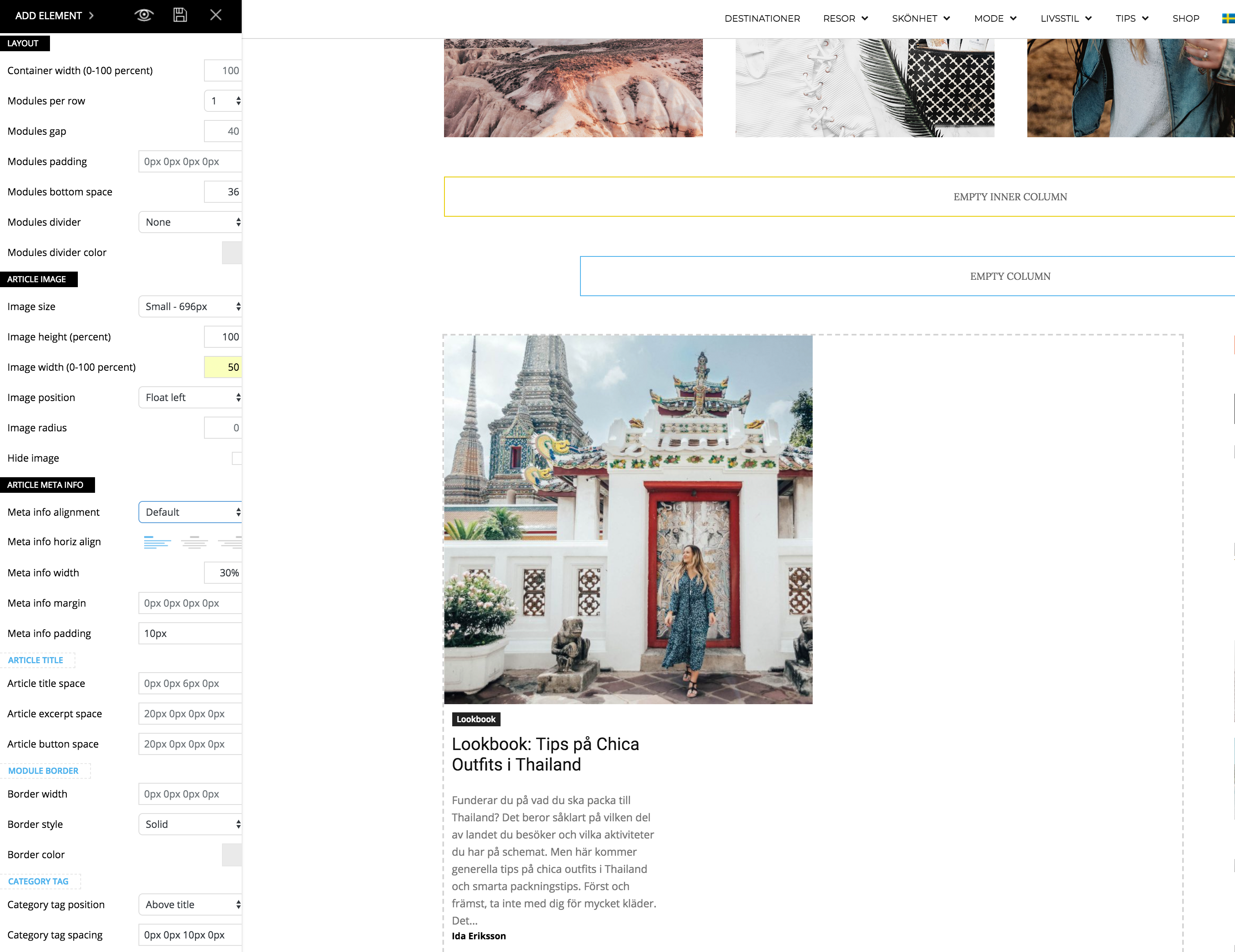
I just updated to the newest version of the theme and noticed a problem when I’m trying to make my flex block as the example for “2 modules per Row here”: https://demo.tagdiv.com/newspaper/flex-block/
I can’t get my meta description to show next to the photo. It’s position below or above the photo, no matter what I do.
When I inspected the elements I see that the difference is that my .td_module_flex_1 .td-module-container has flex-direction: column. And if I change it to “row” like in the example it works. But how do I get it right with only the TD composer?
 Simion C.
 Hi,
Custom sizes you can define yourself are not possible with the tagDiv composer on pages or posts. You can split the row or stretch the rows to predefined sizes, but to set a desired width for a column is not possible.
The widths are calculated automatically in percentages, based on the layout you choose
– https://www.screencast.com/t/Ynx0UlrUlz
The content in sidebar like blocks or other widgets have predefined padding, margins and other design based on those percentages. So if they are changed the result will probably be a broken sidebar or entire page.
This level of flexibility is not yet possible with the composer. As it is further developed maybe such options will be available.
Thanks
 meri
meriHi,
I use this code to align the titles on mudule 6
.td_module_6 .item-details {
display: flex;
align-items: center;
}
But now the ratings are on the right hand side. How could I have them below (and in line, not on 2 lines)?
Screenshot: https://ibb.co/fVyMPd
URL http://www.coupdepoker.com
Thanks for your help
 ctoweett
 Hi. Correct this in flex module 2 “Modules image negataive right margin” and “Modules image negataive right margin”. Or is this done on purpose?
 Bogdan B.
  ppbub
ppbub nexionly
Hello, when editing the Flex Block 1 and 2, I can’t edit the text sizes. I also don’t seem to see the flex block font settings in the main theme font settings, am I missing something?
Simion C. Hi,
For category tags the flex blocks has settings, so you can hide them if needed. Either use the general setting in Theme panel->Block settings
– https://www.screencast.com/t/3p9bOiPqbGwp
Or the individual settings per block, in the tagDiv composer block settings, layout tab
– https://www.screencast.com/t/VZHtkUd55C
I believe that is what you wanted to do. The settings are nor per a specified category, but per block or in general.
Thanks
 tszabolcs
Hey,
here is a minor but annoying bug: the Flexbox block (great features by the way there!) displays ‘hidden’ categories. That is ones that were set hidden in the Theme panel’s ‘Categories’ section (‘HIDE CATEGORY ON POST AND ON CATEGORY PAGES’ switch). Probably the switch is not implemented there.
Cheers,
Sz.
Simion C. Hi,
The theme will crop the images you set as featured image, each module has it’s own thumbnail size
– https://forum.tagdiv.com/featured-image/
– https://forum.tagdiv.com/theme-thumbs/
– https://forum.tagdiv.com/thumbnails-vs-featured-image-size/
A module will always display the same thumbnails, it cannot be modified. So you could change the block type or grid that you use, if you want different looking modules. Here are all the block types (check Features menu)
– https://demo.tagdiv.com/newspaper/
At the moment there are also two flex blocks, which can be configured by you, they are not predefined
– https://tagdiv.com/go-beyond-flexibility-new-flex-block/
Thanks
 Zamara
 1) Ok thx.
2) ohhh.. my bad 😀
I want category button like this: https://prnt.sc/jr8kgz
3) Where i can change FLEX BLOCK font size? (sportodiena(.lt) i want change “NBA” font size and “EUROLYGA” font size.)
4) How can I make one block? Now I do not find anything like this, and as a result duplicates the news. (https://prnt.sc/jr98pi)
Simion C. Hi,
That would prove difficult to do. All the blocks (except the flex blocks)and grids have predefined design to make sure they will always display properly on all devices. There are fixed values for margins and padding. Like here for example
– https://www.screencast.com/t/uYmQsZ2GXX
Modifying these values is not recommended, it will most likely break the layout of the row, column, block or grid.
 Catalin
 Hello Zamara,
Please check here -> https://demo.tagdiv.com/newspaper/flex-block/ -> https://www.screencast.com/t/QuxWS5C8KY because there you will find all of the available blocks which can be used by you on your website.
Thanks for your understanding!
Simion C. Hi,
You could use the flex blocks. These new blocks offer a wealth of possibilities to design a block
– https://demo.tagdiv.com/newspaper/flex-block/
You can use the flex block layout settings to make it look as you want. For example this demo’s homepage contains only flex blocks
– https://demo.tagdiv.com/newspaper_crypto/
Maybe you can do what you want with these blocks as well.
Thanks
Simion C. Hi,
Use the tagDiv composer to make changes to the page, split rows, add new rows and elements. I provided a composer guide above, this is a block settings guide
– https://forum.tagdiv.com/block-settings-guide/
These are all the available blocks (25 types + flex block)
– https://demo.tagdiv.com/newspaper/block-1/
These are the big grids (12 big grids + 10 full big grids)
– https://demo.tagdiv.com/newspaper/big-grid-1/
– https://demo.tagdiv.com/newspaper/full-big-grid-1/
There are also many other elements that can be used to create pages with the tagDiv composer.
So you want to display a bigger module on the left and a smaller module on the right. Check the block types, choose the one you like best. Split the row as you want
– https://www.screencast.com/t/qgoAjZnW
Instead of trying to replicate another design, maybe you could create a new design with the elements the theme and page builder provides.
Thanks
 Amit
Amit Welcome @benti
Yea, It is super flexible and I am loving it ❤️
 benti
benti This theme is amazing very flexible options…
thanks a lot!
 sanotes
 Hi Simon. Already it’s been 3 updates. Is there any news regarding flexibility in terms of the width of the content and the sidebar? My previous question:
Is it possible to change the width of the post area and the sidebar. I need the width of the post and the sidebar as on the following site – https://habrahabr.ru/post/351978/

https://www.dropbox.com/s/ier5293qpql669n/width-post-sidebar.jpg
-
This reply was modified 8 years by
sanotes.
 Vlad111
Hi. Is it possible to change the date disposition, for example, in “Block 9” or “Flex block 1”?
I want to have a possibility to put the date in the same line with the post title or above the title.
I didn’t find such options, and simple CSS tricks didn’t work for me.
Thanks.
 flclazio
Hi, what is the best size for image in the post ?
In home page i have:
flex block 1 for slide
Block 22
Block 14
Block 15
I have problem in resizing in the home page.
Thanks for reply
Simion C. Hi,
I see you have used the flex block in the page. Note that this block can be configured as you want by device. So for example if you want to display 3 modules per as you do now, it will look good on desktop. But on mobile it will not, so display fewer modules per row on mobile
– https://www.screencast.com/t/23hFY2P2
– https://www.screencast.com/t/RPlZLr9Ljzc
One module per row would be suited for mobile.
The page template you are using is the overlay template, this will position the header over the page content, in this case over the slider. This template would not be the best to use if you want to display a slide below the header. These are some demos that use it, that is how it should be used if possible
– https://demo.tagdiv.com/newspaper_spa/
– https://demo.tagdiv.com/newspaper_smart_app/
– https://demo.tagdiv.com/newspaper_construction/
In your case it would be like this, with no background color
– https://www.screencast.com/t/b5PoXxMK
You should consider changing the page template for better results
– https://www.screencast.com/t/1cMUKPafR
Thanks
 kurdi
kurdi Hello,
I am working on a temporary dev site URL, so I would prefer not to give out a URL publicly. I can private message if you like.
I do not have caching enabled (being a dev site), but anyway I disabled every single plugin except for one: “tagDiv Composer”. I even disabled “WPBakery Page Builder” and all the other plugins that come with the theme.
Next, I went in to edit the page with tagDiv Composer. I am using flex block 1. I made sure that “A to Z Sorting” was selected in the filtering tab; re-selected it again just in case, and made sure to save the page. Here’s a screenshot:
https://i.imgur.com/yuw4Hch.jpg
On viewing the site, there is not A to Z sorting. As you can see below, the first item starts with C, the second with L, the third with A, etc.
https://i.imgur.com/8kzS28b.jpg
My guess is that there is an A to Z sorting, but it takes the names of the three levels of pages into consideration. Something like this
some-domain.com/products-hpi/allergies/cerin/
some-domain.com/products-hpi/allergies/loreen/
some-domain.com/products-hpi/cardiovascular-system/azarten
Where
allergies/cerin
allergies/loreen/
cardiovascular-system/azarten
… are actually sorted alphabetically; of course what I need is:
azarten then cerin then loreen
You can easily recreate this as follows:
– Create the following 8 PAGES (not posts) on a clean Newspaper theme:
Items
Items/Allergies
Items/Cardiovascular
Items/Dermatololgy
Items/Allergies/A item
Items/Allergies/Z item
Items/Cardiovascular/C item
Items/Dermatology/B item
Create a page with a block (I am using flex block 1 but had the same problem no matter which block I used)… and ask for A to Z sorting.
See what you get.
My guess is that you will NOT get an alphabetically sorted
A Item
B Item
C Item
Z Item
but rather
A item (Allergies/A item)
Z item (Allergies/Z item)
C item (Cardiovascular/C item)
B item (Dermatology/B item)
Thank you for your help.
kurdi The flex block worked beautifully — thank you!
Simion C. Hi,
1. Do you use any caching or CDN? If possible try without any of these as a quick test. How the website loads could be affected by such services. You can check the live theme demo, see how it loads
– https://demo.tagdiv.com/newspaper/
2. From what I can see you use stretched rows with blocks. The images may look blurry, the same thumbnails will be used, as in a non-stretched row.
You could use the flex block which allow you to choose a thumbnails size, this would be more suited for full width. Or use Full big grids
– https://demo.tagdiv.com/newspaper/full-big-grid-1/
3. I inspected the website, for me this issue is not happening
– https://www.screencast.com/t/QNu7izkp
That would be the header menu section, but it should not have a height of 1068px
– https://www.screencast.com/t/jiHw3rU2q
4. The latest theme version is 8.7.4, the theme and WordPress should always be kept to date if possible.
– https://forum.tagdiv.com/how-to-update-the-theme-2/
If you use WPBakery page builder for your website, remember to deactivate the tagDiv composer after you update. When both these page builders are active there could be problems with some elements.
Thanks
Simion C. Hi,
Please try to avoid using blocks in such row layouts, the results may not be the best. Blocks should be used only in these row layouts
– https://www.screencast.com/t/IHeHtDFuXZ
This will ensure that they will always display properly
– https://demo.tagdiv.com/newspaper/block-5/
The other row layouts are meant to be used with multipurpose elements.
However you could try the flex block, this block is more flexible and could be placed in a 1/4 + 3/4
– https://www.screencast.com/t/jJaLRjST
– https://www.screencast.com/t/aPjXD2mhVpuk
Thanks


