
- NewsmagHeader styles
- NewsmagHeader ads
- NewsmagtagDiv Composer Tutorial
- NewsmagCategory templates
- NewsmagSmart list ads
- NewsmagWeather Widget
- NewsmagInstagram widget
- NewsmagPage Menu
- NewsmagMain menu
- NewsmagTop bar templates
- NewsmagLogin – how to enable the user registration
- NewsmagLogo & Favicon
- NewsmagFooter templates
- NewsmagCategory grid styles
- NewsmagCategory top post styles
- NewsmagHow category settings work
- NewsmagTheme colors introduction
 desiree_kr
 Show single Site in header categories list
hi I want my mobile Categories the same as my normal website. I have one single site “Shop” as a categorie. How do I change it on mobile?
website:
https://www.screencast.com/t/t8CDvjb1djDJ
mobile shop doesnt show
 Amie
AmieHello!
This is a question about the “Header main menu” that appears when you scroll down the page.
I would like to change the color of the submenu-title to “Custom color #5” i.e. “#555555”.
However, even if I change it with TagDiv Composer, the color doesn’t change and it is set to the color “#111111”.


Could you guess why?
Thank you for your help!
Our page: https://blog.sumemiya.net/
Amie
 Marian
 Salut, am adaptat un pic codul iar pe desktop cu acesta:
body .td-header-wrap .td-header-main-menu, .td-header-menu-wrap.td-affix {

backdrop-filter: saturate(180%) blur(5px);

background: rgb(10 12 13 / 35%);

}
Arata in regula (imagine), totusi pe mobil nu functioneaza.
Mai departe, ca si exemple, puteti vedea site-ul https://wccftech.com/ (pe dark mode). (imagine 1 / imagine 2)
Va multumesc!
 Calin
Calin Buna,
Te rog incerca acest css pentru deskto:
body .td-header-wrap .td-header-main-menu, .td-header-menu-wrap.td-affix {

backdrop-filter: saturate(180%) blur(5px);

    background: rgb(55 25 25 / 29%);

}
Daca nu este ce trebuie, te rog sa-mi dai un exemplu de cum sa fie.
 Anamaria
 Hi,
So, you add the code in Theme Panel, but do you use a Header template or a heder from Theme Panel? Please provide the link to your website.
Thank you!
 shivamsdesk
After installing the theme on wordpress I cant use headers or footers as it asks me to choose from cloud template, and there it shows an error saying Envato key is missing, please register your theme using a valid key. Please reply asap, as this website is an assignment and I have to submit my assignment at the earliest.
Marian Buna ziua,
Multumesc frumos pentru raspuns, puncele 2 si 3 au fost rezolvate cu succes, intr-adevar la punctul 3 am omis sa selectez si mobile la viewport.
Legat de punctul 1, am uitat sa precizez ca pentru header-ul de acum as vrea un cod ce sa se potriveasca pe dark, de exemplu eu folosesc fundalul: #0a0c0d, in rest totul functioneaza cum trebuie.
Va multumesc mult!
 sebpre0805
 Hello Anamaria,
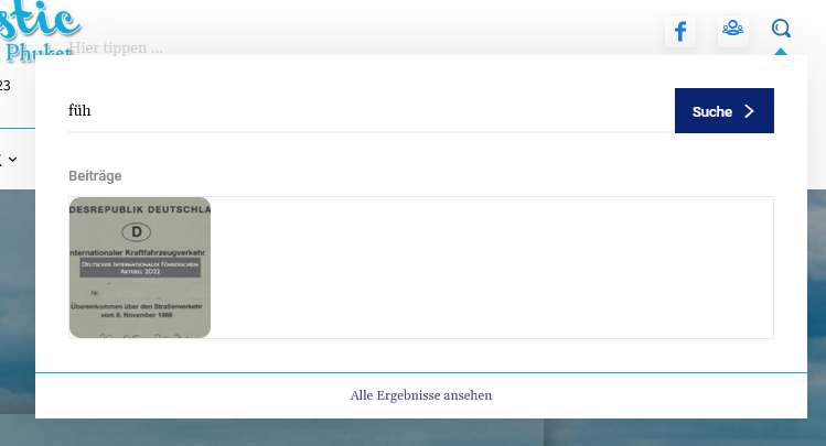
unfortunately that was also unsuccessful. Nothing is still displayed. When I search the site and look at all the results, everything is there, including all the meta information.
I had already deleted the style and from the beginning nothing is displayed. Have the header search already completely deleted and started again from the beginning. Nothing goes. Cache is cleared and the problem is not only with Firefox but also with Chrome.
Then another question, is it possible to customize the composer (left menu). As you can see, I don’t see everything (see red arrow) and there is no scroll bar.
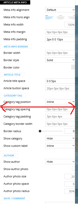
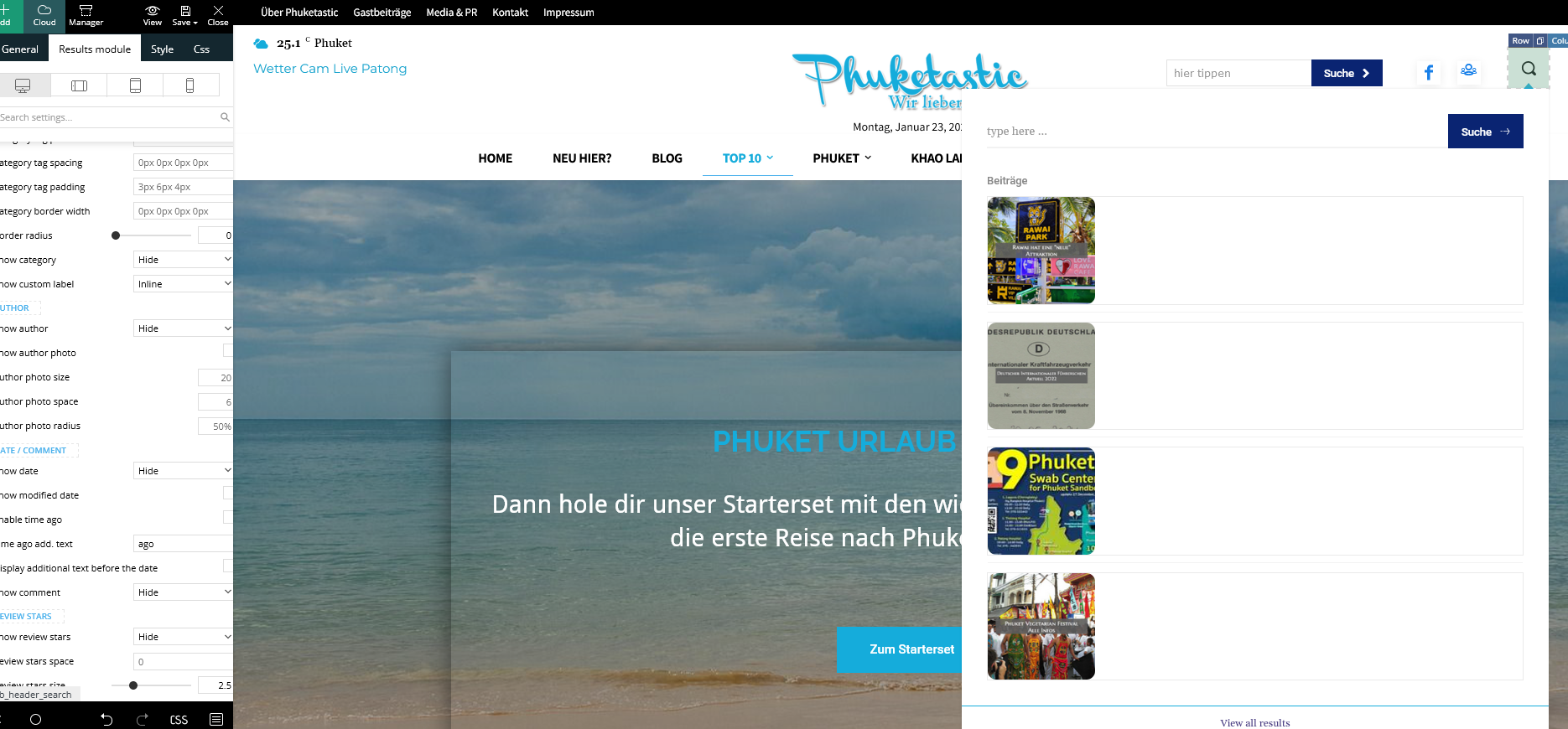
Best Regards
Calin Buna,
De obicei pe forum scriem in engleza pentru a ajuta si alti utilizatori, dar acum o sa facem o mica exceptie.
1. Se poate folosi acest css pentru desktop
.td-header-menu-wrap.td-affix{

backdrop-filter: saturate(180%) blur(20px); /* Blurry */

background: rgba(255,255,255,0.7); /* White Opacity 70% */

}
Pentru mobil
body .td-header-wrap .td-header-main-menu, .td-header-menu-wrap.td-affix {

    backdrop-filter: saturate(180%) blur(20px);

    background: rgba(0,0,0,0.1);

    background-color: transparent !important;

}
Va trebui ca pentru elementele din meniu sa schimbati culoare de pe alb pe negru.
2. Trebuie sa setati cu tagDiv Composer pe elementul de featured image in viewport-ul mobil in tabul de css margine stanga si dreapta cu -20 – https://i.imgur.com/q7ShD5r.png
3. Dca functioneaza pe desktop se poate si pe versiunea mobila, trebuie sa selectati elementul in viewport-ul mobil si sa setati elementul the share sa fie inline – https://i.imgur.com/9c2SQUn.png poti fi mai multe solutii dar acum nu vad acest buton pe site pentru a oferi un exemplu mai concret.
Sper ca raspunsurile mele sa va ajute!
 ilouie
Hi, I am trying to create a modal page and I’d like to place a Vertical Menu in it. I’ve tried including the Header Main Menu composer but, I can’t find a way to display vertically, and show submenus horizontally. It only displays horizontally. I tried setting the width and it looks like it’s doing it, but then the links get cut. Does anyone know if it’s possible to create a vertical Menu here or do I have to create my own html and css code. Thanks in advance. I am trying to make the menu display like in https://www.forbes.com/?sh=289d4daf2254.
Anamaria Hello,
Please make sure that you have a cloud header set up -> https://i.imgur.com/0C2QsfT.png
Also, please provide some screenshots to help you efficiently.
A solution for sending a screenshot/video is this:
Download, capture, and send: https://www.techsmith.com/jing-tool.html
After making the screenshot, you will have a link; paste it here.
Thank you!
 nikunjnrmg
tagDiv Composer not showing on header for edit theme?
what can i do please help me
 icode919
Hello, I placed google ads in header, sidebar and In-Article but I can’t see them anywhere.
I just see the placeholders nothing else. Can you please help me asap. Thank you!
Anamaria Hello,
You can set the font size for mobile version, you need only to select the viewport for phone.
Please change the logo from the TagDiv Composer, and also from the sticky header: https://www.screencast.com/t/rt2wWAt3JFEY
For mobile please edit with tagDiv Composer, select the viewport on phone, select the header logo and change it => https://i.imgur.com/cR7F0v4.png https://www.youtube.com/watch?v=HXQQygkCCJo -> https://forum.tagdiv.com/add-logo-newspaper/
Thank you!
Anamaria Hello,
Please provide a video with your settings and what you are referring to ” However, my top header seems to be unmovable. ”
Thank you!
Anamaria Hello,
I just checked now, and the logo is displayed correctly in the header -> https://i.imgur.com/l8DfuY6.png
Thank you!
Marian Salut,
Revin cu cateva precizari si inca alte cateva puncte pe care as vrea sa le ating cu tema dumneavoastra, pentru ca am vazut ca se mai discuta in Romana si pentru a ma face si mai bine inteles, doresc sa va explic in romana, ceea ce doresc sa fac, si in cazul in care se poate sa gasesc raspuns aici.
1. Pentru a face meniul sticky blurry, doresc un css pentru versiunea stock a temei si nu pentru un alt template din cloud templates, acest lucru din cauza faptului ca am reusit sa customizez pe plac fara a mai avea nevoie de alte elemente de header. CSS-ul il voi baga in custom code. De asemenea doresc ca acest efect sa apara si pe mobil. In trecut foloseam jnews iar codul era “/* Make Sticky Header Blurry and Transparent */
.jeg_header_sticky .jeg_stickybar {
backdrop-filter: saturate(180%) blur(20px); /* Blurry */
background: rgba(255,255,255,0.7); /* White Opacity 70% */
}
/* For Mobile */
.jeg_navbar_mobile {
background:unset;
}
.jeg_navbar_mobile .jeg_mobile_bottombar {
backdrop-filter: saturate(180%) blur(20px); /* Blurry */
background: rgba(0,0,0,0.1); /* Black Opacity 10% */
}”
Doresc acum pentru aceasta tema, dupa cum am aratat mai sus, ceva in stilul site-ului de la apple https://www.apple.com/ro/.
2. Vreau ca marginile imaginii reprezentative sa atinga marginile in varianta mobila, precum in imaginea atasata, iar pe desktop sa ramana asa cum este acum. Am cautat sa fac setarea asta dar nu am reusit. (https://i.imgur.com/L2sw5Of.jpg)
3. Doresc sa pun un buton de “follow on google news”, care sa fie inline cu butoanele de share atat pe mobil cat si pe desktop. Se poate seta inline pentru “inline text” si sa pun codul html, insa din pacate pentru share post buttons nu. Am incercat din tab-ul “CSS” sa selectez in loc de “show”, “inline”, insa nu a functionat pe mobil. (https://i.imgur.com/IdNc5wt.jpg).
Acestea sunt modificarile pe care doresc sa le aduc site-ului pentru un aspect mai modern si de lunga durata. Sper ca ma puteti ajuta.
Va multumesc!
 Erekibeon
Hi there,
This morning I noticed my theme went from this:
http://web.archive.org/web/20221119102718/https://www.erekibeon.com/blog/ (Original blog header image, colors, fonts)
To this one:
http://web.archive.org/web/20230122111703/https://www.erekibeon.com/blog/” (Current blog header image, colors, fonts)
When logging in my WordPress admin I noticed that suddendly I was asked to activate my newspaper theme… that was previously activated, of course. I did so, and then tried to restore my blog to the last full backup I did two days ago… with no luck.
It seems something went bad from the theme side, don’t know if it keeps the saved settings anywhere else… and they are no more alive.
What could happen? What should I do to restore those lost settings that weren’t saved in my daily blog backup?
Thank you in advance,
Erekibeon
 csam
csam Thanks @Bettina.
Grateful for the insightful content. However, my top header seems to be unmovable. Please how do I go about it?
sebpre0805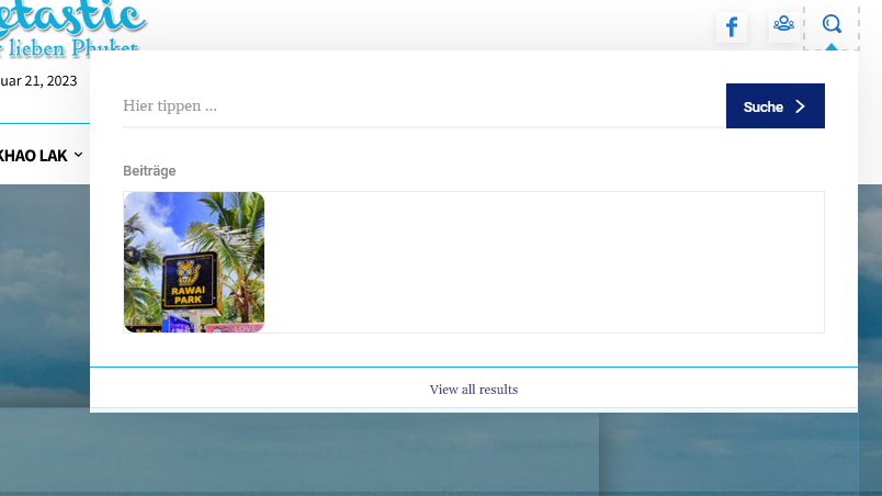
 discovermh
Hello Tagdiv,
From last 2 years there is no change in mobile theme. there are some features which is present in main theme but not in mobile theme.
1) 2 Column Option in Home, Category or archive page
2) Sticky social share option.(I already did it via css check https://www.discovermh.com/how-did-shivaji-maharaj-look-like/ )
3) Reading indicator
4) Carousel menu option under header like Jnews theme
5) Read Full Article Button on Post. which compact post and shows button after click on button it shows full article.
5) Remove other css from style.css for mobile view
6) Whenever you add bookmark/read later functionality make sure it is added in mobile theme also.
Almost all website have most users from mobile device. so this is very useful features need to implemented in mobile theme.

 stelas2120023
my site url : https://the-ktimes.com
problem : when I click post, then header style suddenly change
and the logo disappear, instead color bar with text appears.
and social share icons are too big
I don’t have problem in PC, but mobile has problem.
plz. let me know how to fix this problem.
 MahmudjahidMahmudjahid
Unable to change image in Lifestyle Blog demo header.
MarianHello, I want to make a Blurry Transparent Sticky Header for this website mobilehub.ro, I saw that you already have the option in Header Template – Reel News PRO, I now use Blank – Header Template and I want to make the header sticky like here ” https://www.apple.com/ro/”




