
- Apitd_api_header_style::delete
- Apitd_api_header_style::update_key
- Apitd_api_header_style::update
- Apitd_api_header_style::add
- ApiAPI – Header style – Introduction
- Apitd_api_top_bar_template::update_key
- Apitd_api_top_bar_template::update
- Apitd_api_top_bar_template::add
- ApiAPI – Top Bar Template – Introduction
- Apitd_api_single_template::update_key
- Apitd_api_single_template::update
- Apitd_api_single_template::add
- ApiAPI – Single Template – Introduction
- Apitd_api_footer_template::update_key
- Apitd_api_footer_template::update
- Apitd_api_footer_template::add
- ApiAPI – Footer Template – Introduction
- Apitd_api_smart_list::update_key
- Apitd_api_smart_list::update
- Apitd_api_smart_list::add
 kalintz
I installed the racing theme with sample data. I changed the single post template to “template 8” and then the sidebar goes missing.
I want to:
1) Add the side bar back in – I tried to use the widgets in the widgets area but the style doesn’t match the original sample data side bar
2) I want to get ride of the word “SHOP” at the top of the header menu.
3) I want to get rid of the search icon at the top of the header menu (mobile)
Please provide instructions on how to do these 3 things.
Thanks
 Prateek
Hello, team tagDiv.
I am facing a very strange issue with the search template. It’s a custom template. When I search something that doesn’t exist in the database, it shows different template (the header changes magically) than the template that shows up when the results are found.
Also it shows no message like “No results” or “Nothing found”.
I know that it’s extremely hard to understand what I am talking about from the above statements. That’s why I made this document. Please check with this link.
Please give me a solution as soon as possible because I have to publish my website.
Thanks.
 bob@mrrogersweborhood.com
Hi.
I exported the Newspaper theme options and pages from our test site and added them to our live website. The page header doesn’t look the same in the live website. I edited the cloud template on the test website and copied all the information and added it as a new cloud template on the live website, but the header doesn’t look anything like the test website.
Also, our mobile header is different than the desktop one. Screenshot: https://www.dropbox.com/s/iffse2q1vfq0xr3/2019-07-03%20Newspaper%20theme%20header%20on%20mobile.png?dl=0
Also, theme colors in the footer are not being copied correctly.
Our test website is mrrwebdev01.wpmudev.host. Our live website is okobserverorg.wpmudev.host.
I’m not finding a solution to either of these issues in the documentation.
Can you please assist?
Thanks.
Bob
 digitalbusiness
 Hello Simon,
Thanks for your response.
The problem is just on the French version. The english version of the website is not het launched. It is in project!
So the problem is at this link : https://www.digitalbusiness.africa/
In Details, here are things that do not display or function very well on the Homepage of the website. In backoffice (even on TagDiv Composer), everything is clear an display.
Home page
-The date and time: at the Top header
-Search icon at the menu header do not function ( but display)
Sidebar:
-La Une du Mag under Téléchargement
-WhatsApp’s photo
The bloc Dossier spécial : Tittle crossed out
The Bloc Entretiens et Interviews : the photos are not visible. Just the titles.
The Block Start-Up de la Semaine: The title and the image are invisible
Footer:
Digital Business logo in the first column is invisible
In the Page Article :
The Facebook Like button that counts the number of Like per Article do not display. Very important.
These are some of the dysfunctions and as I Told you, in back office, all this seem to funtion very well
Find Attached two screenshot how the homepage were presented few days ago. Homepage and Page Article. Today, it’s no more like what you see in today’s homepage and today’s page Article.
Regards,
 Calin
Calin Hi,
First I recommend you to check documentation, in this way when you’ll star will start to work on your website will be more easy.
-> https://forum.tagdiv.com/newspaper-theme-documentation/
-> https://tagdiv.com/category/documentation/
You’ll see that you do not need to create everything from scratch, you can use demos, header/footer/post/category templates.
From what I can see you want to have a full width footer and header, this can be achieve from theme panel -> https://www.screencast.com/t/6x3KZbaxEG2 also you want a top bar with menu -> https://www.screencast.com/t/lPuHjLxNvbcl
Thank you!
 insumedical
 header full-width, footer full-width..
content full-width(X)
——–
thank you~!
But it’s difficult.
When you first start
Can you help me get started?
Calin Hi,
If you want to have a custom header, you can use the Header manager and build the header you want, or you can check the headers from tagDiv Cloud Library end edit them after your needs.
For full width please check those similar topics
-> https://www.screencast.com/t/RIp6nzQ2
-> https://forum.tagdiv.com/topic/force-full-width-on-categories-post-grid/
-> https://forum.tagdiv.com/topic/homepage-full-width-content/
Basics: Using the tagDiv Composer Front-End Page Builder -> https://tagdiv.com/tagdiv-composer-page-builder-basics/
Thank you!
Calin Hi,
In order to fix this problem, please try this custom css
-> https://www.screencast.com/t/ASfFJfxhm1
.tdm-header-style-3 #td-header-menu{

  margin-right: 150px;

}
You need to set the code in Theme Panel>Custom code>Custom css
Let me know the results!
Thank you!
 Vlad S
 Hello !
Here are the codes:
.page-id-15 .td-header-rec-wrap {

display: none;

}

.page-id-17 .td-header-rec-wrap {

display: none;

}

.error404 .td-header-rec-wrap {

display: none;

}

.category-united-states .td-header-rec-wrap {

display: none;

}
You will have to paste them here: https://www.screencast.com/t/NBHBB6P9g
I hope this was helpfull !
Thank you !
 Simion C.
 Hi,
@CRiTiCAL That won’t work in a child theme. Currently the only way of loading code in the mobile header is to manually add it in the file mentioned above. I will make a note of this and it will be considered to add a field for it in the theme panel mobile theme settings.
@Jose That is an interesting suggestion, so something to allow the user to enable/disable the mobile theme for all the categories, posts, pages etc. There will be an option to choose for which pages or posts the mobile theme applies specifically, as an option in the edit screen. I will add this suggestion and it will be strongly considered by our developer team. Thank you for mentioning it.
In the coming theme updates there will be quite a few options added for the mobile theme. These are currently in work, some in testing. All suggestions are welcome. Please let us know if you have more suggestions.
Thanks
insumedicalNewspaper theme, I plan to buy and build a site.
Header part design
↓↓↓↓↓↓↓
http://carloansinfor.com/wp-content/uploads/2019/07/header.jpg
Can design?
Can I get help?
 Bruce Fischer
Wow. This is a total mess. I paid for the updated theme. I updated it and now my entire site looks terrible. The homepage is lumped into a classic post. The composure is not recognizing the old code at all. This is disappointing to say the least. When I try to edit my homepage, I get a classic post cluster-f**k that looks like this:
[vc_row][vc_column][td_block_trending_now limit=”8″][/vc_column][/vc_row][vc_row css=".td-top-border{border-top-width: 1px !important;}"][vc_column width="2/3"][td_block_slide autoplay=”4″ category_id=”11″ custom_title=””][td_block_2 custom_title="Featured Cases" header_color="#dd9933" category_id="2" sort="alphabetical_order" limit="15"][td_block_2 custom_title="Endorsed Cases" header_color="#dd9933" border_top="no_border_top" category_id="3" sort="alphabetical_order" limit="15"][td_block_2 custom_title="Successful Cases" header_color="#dd9933" category_id="53" sort="alphabetical_order" limit="15"][td_block_11 custom_title=”Judges For Justice Featured Cases” header_color=”#dd9933″ category_id=”67″][td_block_11 custom_title=”Justice For Illinois Wrongfully Convicted Cases” header_color=”#dd9933″ category_id=”75″][/vc_column][vc_column width="1/3"][vc_single_image image="1796" img_size="" alignment="center" style="vc_box_rounded" onclick="custom_link" link="https://www.facebook.com/Injustice-Anywhere-270758032980401"][vc_separator][vc_widget_sidebar sidebar_id="td-default"][/vc_column][vc_column][td_block_video_youtube playlist_title=”Recommended Videos” playlist_yt=”D0CqOtEITZg, d_nUtdU0wic, bh_X5vKF_LM, HAsEEXk84pA”][vc_empty_space height="2px"][td_block_video_youtube playlist_title=”Recommended Music” playlist_yt=”LZNCSGxM5Gw, pnfhCg6VAac, 1KylNm5eTrM”][/vc_column][/vc_row]
 pavel@earnware.com
Hey,
Can you include a fix, for the headers, that contain backgrounds. So if you just make it a background (colored or image), the sides go too wide (the only fix is to place 1 in the margins, and then it’s exact width like the rest of the divs/modules). Please see this screenshot: 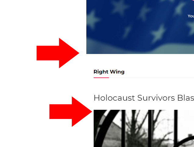
The live websites is here, you will see the top header: https://www.conservativesociety.org/
This is a problem, that we wait an update for – for a very long time, please see it, so the fix we do is like in this screenshot here: 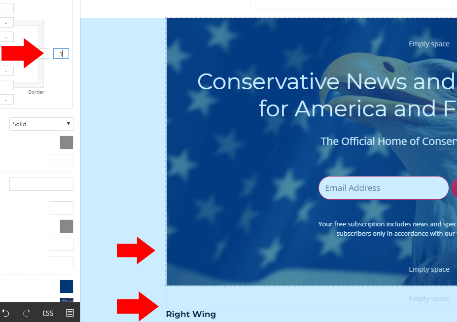
As you can see, when we type in 1, it works – but this is not a real fix, it should have the right width especially, if we own more than 20 websites, and having 4-5 header pages for each – it’s about 100 pages to fix.
 SGAccount
Hello,
i intalled newspaper9 today and i think there are some icons missing. i imported the black version content. but there are some details missing – like the icons and header backgrounds.
example: https://handballbundesliga.com/
pass: sgsk
is there a way to get the icons and i think the css – without importing the whole content again?
Simion C. Hi,
I modified that code, so now the top menu appears on mobile – http://prntscr.com/o9j62r
If you want to use the sticky code from above as well, the result will be like this, on sticky mode – http://prntscr.com/o9j6h8
Here is the code
@media (max-width: 767px){

.td-header-top-menu,

.td-header-top-menu-full,

.td-header-sp-top-menu {

display: block!important;

text-align: center;

}

.td-wpml .menu-top-container .top-header-menu > li {

display:inline-block;

}

.td-wpml .menu-top-container .top-header-menu > li a {

margin-right: 16px;

}

.body-td-affix .td-header-top-menu-full {

position:fixed;

top:54px;

}}
If needed I could modify this code. Let me know.
I should note that with the cloud header templates you can design the header on both desktop and mobile, both default mode and sticky mode. These are templates built by us that can be imported and modified if needed
– https://cloud.tagdiv.com/#/load/Headers
You can also build your own using a blank header template – http://prntscr.com/o8vge6
Here are some articles – https://tagdiv.com/newspaper-theme-customize-the-header-manager/
– https://tagdiv.com/header-main-menu-newspaper-theme/
And a guide about the cloud plugin – https://forum.tagdiv.com/tagdiv-cloud-library-plugin/
Thanks
 isagachie
 Hi, the code doesn’t fit on my website.
I’m using Style 11 header annd I would like excatly the same result than Aaakash
– Sticky top bar
– Top bar AND Menu bar menus both appearing in mobile view
Here is the result I obtained on https://www.gogin.eu/gogin_new/en/
https://www.dropbox.com/s/wvgsw4l1q51awq5/2019-07-02_11-54-44.jpg
The top bar overlays the main menu and is shifted to the left. Also, the top bar menu does not appear in the mobile menu?
Any solution? Thanks in advance for your help!
isagachie Thanks Calin, I should have precise I use header style 11!
 Catalin
 Hi,
Please note that our theme has two different header.php folders for Desktop version and Mobile theme, like this -> https://www.screencast.com/t/hQlhnFsVNbKv -> https://www.screencast.com/t/k3XijmDuQ
Hope this helps!
Thank you!
Calin Hi,
Is look like the problem is with Language Switcher menu, this is not show in Top header menu. Please make sure that you translate the menu according to this documentation -> https://wpml.org/documentation/getting-started-guide/translating-menus/
Thank you!
Calin Hi,
In order to achieve all those you’ll need to use the tagDiv Composer and Header manager .
Please check those topic too:
-> https://forum.tagdiv.com/topic/how-do-i-change-join-to-subscribe-feature-on-top-bar/
-> https://forum.tagdiv.com/topic/how-to-add-extra-features-on-top-bar-like-donate-my-subscriptions-subscribe/
-> https://forum.tagdiv.com/topic/on-mobile-menu-how-do-i-replace-search-with-subscribe/
Thank you!
Calin Hi,
This can be achieve only using the Header manager and build your own header or import one from tagDiv Cloud Library and edit it -> https://www.screencast.com/t/ab6OkAv3oa -> https://www.screencast.com/t/PQBunPzAN
Thank you!
Calin Hi,
You can use the Header manager and build your own header or import one from tagDiv Cloud Library and edit it -> https://www.screencast.com/t/ab6OkAv3oa or you can use a multi-purpose header -> https://www.screencast.com/t/XSWpW8ccm and set a button -> https://www.screencast.com/t/CFh9byzg
Thank you!
Calin Hi,
1. Unfortunately you can not import parts/section from our theme design in avada theme, because our this using tagDiv Composer, Header manager and tagDiv Cloud Library that are working only with our theme ( this builder with the library was build special for our theme ) and the shortcode will not be recognize by other theme
2. Yes, this can be achieve, you can use the Import / Export theme settings -> https://forum.tagdiv.com/import-export-theme-settings/ or you can use some plugins to duplicate the current website.
Thank you!
 inveress
Hi,
Our hosting is being upgraded from 7.1 to PHP 7.3 — we have no choice in this.
We’ve been testing under 7.3 and it seems to work OK, but I see a few PHP notices in our logs:
PHP Notice: Undefined index: td_action in /www/wp-content/plugins/td-composer/css-live/css-live.php on line 30 when calling load_css_live(), request: POST /wp-json/td-composer/save_post?uuid=d3e44293-be63-b604-a390-de4c4db69833, request_id: fd9c7092f6fe56f5b1ce67b29af644a8
PHP Notice: compact(): Undefined variable: tcp in /www/presslabs/db.php on line 689 when calling compact(), request: POST /wp-json/td-composer/save_post?uuid=d3e44293-be63-b604-a390-de4c4db69833, request_id: fd9c7092f6fe56f5b1ce67b29af644a8
PHP Notice: Undefined index: action in /www/wp-content/plugins/td-composer/includes/tdc_ajax.php on line 89 when calling tdc_on_save_post(), request: POST /wp-json/td-composer/save_post?uuid=d3e44293-be63-b604-a390-de4c4db69833, request_id: fd9c7092f6fe56f5b1ce67b29af644a8
PHP Notice: Undefined index: tdbTemplateType in /www/wp-content/plugins/td-cloud-library/includes/tdb_functions.php on line 934 when calling require_once(), request: POST /wp-json/td-composer/get_header_templates?uuid=0c592d16-88eb-343a-1ea3-ce91699d952b, request_id: af8f94f958948f35820b6c1af00aeb07
These seem all related to live editing using REST-API. It looks like I am able to edit and save post content in TD Composer and the normal WP editor without errors.
Could you please advise whether these issues would be affecting site operation in any meaningful way?
I understand you recommend 7.2 at this point, but as I said, we are being upgraded to 7.3 so we need to know what the effects of these issues are.
Also, I see the theme has been certified for 7.2 for more than a year but is still not certified for 7.3. When will that be happening?
Thanks,
Peter.
 cyrus
cyrus Thank you both for replies,I have deactivated Mobile Theme. How do I edit the Top Bar, so that it appears like the link below? With 6-7 features on desktop view? The Epoch Times, NY Times and Bloomberg both have this feature, and on mobile it comes out to Menu on left, name in middle, and Subscribe on right.
https://www.theepochtimes.com/
1. The DivTag Builder only came with 3-4 row options. I would not get all 6 buttons or 6 elements on header. I wanted to have Menu, Donate, Time on left, Title of News company in middle, and on right to have Subscribe, About us, and Search bar on right. Basically 7 features either on a header.
The layout I have currently on Desktop is.
1. Top Bar, which I would like add more icons buttons to it?
2. Header, I have menu button on left, company title in middle, and subscribe button on right, header only has 3-4 rows. I want a center row with the title, but for the 1/3 left row and 1/3 right row, to each have 3 features, Left Menu, date Search bar, right Subscribe, About us, Donate.. Mobile menu, Id like to have all of it show, is that possible, or more than just 3 elements which is title, search bar and menu. I have deactivated the mobile plugin
3. I have company Logo Below the header.
4. I have Menu List Below the Header
5. I have the slider
6. Articles
This is the design I am building and I like. Lot of trouble with the header, Top bar and menu transition Over 30 hours of time spent, seems I have it almost figured out. Please assist in clarifying…… and Remedying what I want done.
Thank you
Cyrus


