- NewspaperRetina Images
- Thumbnails vs. Featured image size
- NewspaperIntroduction to CPT and ACF with Newspaper Theme
- NewspaperFlex Block Settings Guide
- NewspaperThe Newspaper Mobile Theme: Introduction
- NewspaperBig Grid Flex Settings
- NewspaperAd Box Element and Ads Overview
- NewspapertagDiv Composer Tutorial
- NewsmagAbove footer ads
- NewsmagSmart list ads
- NewspaperThe Mobile Theme
- NewsmagUsing other ads
- NewsmagArticle ads
- NewsmagSidebar ads
- NewsmagHeader ads
- NewsmagTheme thumbs
- NewsmagFont customization
- NewspaperUsing Other Ads
- NewspaperTheme Thumbs
- NewspaperHeader ads
 simchris
 Well, I think this is covered in the them docs, but once you install the theme, you need to use the “regenerate thumbnails” plugin (not included) — this sets all the image thumbnail sizes for the theme, which may be different sizes than from your prior theme.
see
https://wordpress.org/plugins/regenerate-thumbnails/
🙂
edit: I guess they now recommend the “force regenerate” plugin; but either way does same thing.
edit 2: and I guess they got rid of the “why don’t my images fit” topic that was once in the docs. Guess they are rewriting everything to make it better and dumped some of the oooold stuff.

 Emil G
 Hi,
For icons the theme uses sprite files, you can find theme inside the ../Newspaper/images/social/sprite folder – http://screencast.com/t/Xi4NrbPF
As you can see there are different sizes. You could either replace each icon or use custom css to replace the icons used by you on your site, the browser inspector will reveal which file is used and the background position – http://screencast.com/t/iNcWX4nZ
Thank you, Emil G.
 Alin [tagDiv]
 Hi,
1. The images are cropped for different sizes to be used on modules and you have this issue because of image aspect ratio. You can change the height size so the aspect ratio of the image to be closer to the aspect ratio of the picture – http://screencast.com/t/Uor66sP8FL0 but unfortunately there isn’t an ideal image size so it can look good on all thumbs, also depends which blocks/modules that you use for aspect ratio and you have to do some tests and see what aspect ratio to use.
You can find out more about cropping here – http://www.davidtan.org/wordpress-hard-crop-vs-soft-crop-difference-comparison-example/ – https://codex.wordpress.org/Function_Reference/add_image_size
2. Please try this custom css in Theme Panel > Custom Css: http://screencast.com/t/pxATV4cS
.td-g-rec-id-header .adsbygoogle {

top: 5px;

}

.td-logo-rec-wrap {

min-height: 100px;

}
Hope this helps!
 exhab
exhabHi,
website is http://www.autribune.com
1.
The featured images are cropped in a weird way and I cannot seem to figure it out. I want the featured images on the homepage to be scaled down to fit the space rather than be cropped at all.
2.
The header ad is cut off by the theme. I have tried all different options for sizes but its always cut off. Currently its on auto size from both the adsense code and the theme settings but is still cut off.
 mgrimshaw
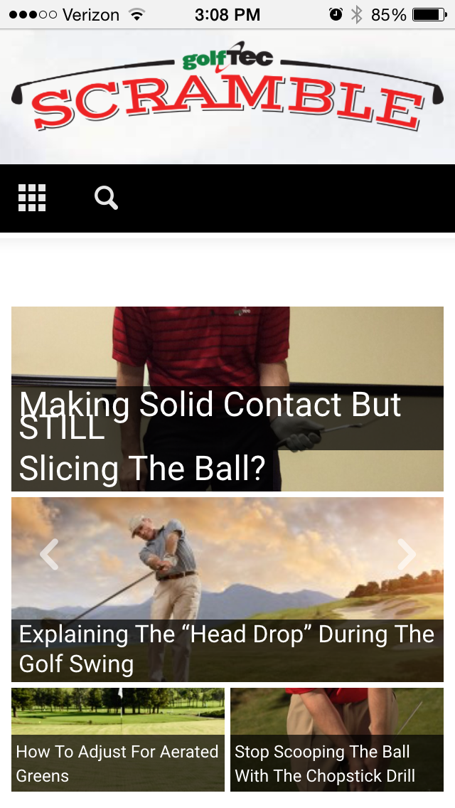
I am having an issue with Big Slide Main Font overlapping on mobile devices, please see screenshot here:
http://golftec-images.s3.amazonaws.com/2015/website/scramblemobile-bug.png
Have adjusted font sizes and line height to no avail.
Your suggestion would be greatly appreciated!
Thank you,
Alin [tagDiv] Hi,
I have checked your site, but you use a non-responsive fixed ad and I’m afraid that it cannot be fixed via custom css as it take the image at fixed sizes how you can see – http://screencast.com/t/eTgg4jOZg
I cannot overwrite the image container and image size via custom css – http://screencast.com/t/IKreevED – http://screencast.com/t/G7kiaUPaq
The theme ads system was designed to work with adsense code, the other ads are rendered as entered by the user.
Thanks!
 r1kay
r1kayI’m using post style 3 and that featured image size is 1074 x 483, which is fine for desktop. But when I debug my site on mobile I see that the featured image size used on the posts is still the 1074 x 483 size. Shouldn’t the theme be using a smaller image size, since mobile screen aren’t bigger than 767px? I’ve regenerated all thumbnails and image crop on post settings is on. Is the mobile featured image supposed to be that big? The featured image on mobile could easily be one of the smaller sizes generated by the theme! Loading those big images on mobile has a negative impact on page speed and uses more bandwith over time!!
Alin [tagDiv] Hi,
2. Please update you theme to the latest version 1.7.1 using this guide(FTP method): https://forum.tagdiv.com/how-to-update-theme/ as in the 1.7 version it was an issue with ads (eliminate the codes). This issue was fixed in the latest version.
10. The image appear like this because of it aspect ratio. The image is catted for different sizes for modules – http://screencast.com/t/bmsl1KdRws4 so the image is cropped center top at that height. You can change the height size so the aspect ratio of the image to be closer to the aspect ratio of the picture(default image).
You can find out more about this here – http://www.davidtan.org/wordpress-hard-crop-vs-soft-crop-difference-comparison-example/
13. You can set your sidebar for categories from Theme Panel > Categories section – http://screencast.com/t/GMB0Cxpe1knq add widgets into the sidebar from Widgets – http://screencast.com/t/j3z3jsgnt
Also if you want to use the same sidebar on your pages please use Widgetised sidebar block in your page and set the sidebar to display: http://screencast.com/t/6wlYuuZ43
Thanks!
simchris Google recently changed their mobile algorithm for checking, and so it has started throwing an error on just about everything from image sizes, to anything not plain text having some kind of render blocking. If you can get your mobile score to 88 or above, you’re good. Below 85 is not as good, below 80 is “bad.”
 paivadaniel
 Tks Alin,
About the ads management:
2. There’s a problem with your ads manager, for the ads in articles, you can access this url:
hxxp://concursospublicos.ninja/tecnologo-pode-prestar-concurso/
I used the “article top ad” with a 336x280px ads, and is appearing a horizontal ads. And in “article bottom ads” I used a responsive ads.
In the homepage I used:
– a 728x90px in custom_ad_1 after the header block named “em destaque” and a responsive ads in custom_ad_2 after the block named “preparacao”.
As you can see doesnt matter the size of the ads blocks, your theme have own sizes in specific locations. I dont know why this is happening, I tried to desactive all plugins (except visual composer) I verified another site with the same theme, and it is working fine (like hxxp://sensacionalista.com.br).
9. How can I create “sliding sidebar blocks” like in the demo of newsmag? Note that I want to use this functionality with the sidebar blocks created in visual composer, not with the widgets.
10. About the size of the cover images for the articles. I tried to use the plugin Regenerate Thumbnails, but without sucess with your theme.
What I can do to adjust a better view to the images in each type of visualization that you theme offer? For example, for the same posts your theme use diferent sizes for the homepage and for the page of the categories.
As you can see the same post “O Que Faz um Analista Tributário da Receita Federal?” with the cropped image in the page of category:
hxxp://concursospublicos.ninja/carreiras/
But not cropped in the:
hxxp://concursospublicos.ninja/
 srikanth
Hi,
As per our requirement we are planning to delete one of the images sizes which are not being using in our theme.
what is the procedure to delete this both from the file manager and also the related info in the database ..
in file manger i tried doing it with unix …Can you help me in deleting the entry from the database as well
–Srikanth
simchris Welcome to WordPress. WP doesn’t support “enlarging of images.” They (Automattic) turn OFF the built in function of the ImageMagick module on server for their stupid philosophy that enlarged images look fuzzy. Hence need to use a plugin to allow images to be larger than the size you upload.
So, not a theme issue. But still super annoying. Hence need for a plugin to “unlock” the featured to make thumbs larger to “crop and fit” things like sliders/blocks.
Obviously you have to regenerate your thumbnails to fit the sizes used by the theme if they don’t exist.
🙂
 adamcharnock
Hello,
I’m trying to improve my page load times on mobile devices. As you can see from this screenshot, things are not looking great:
The theme is serving out full-sized images for mobile devices. However, the plugins seem to only work for feature images and images added via the media browser (this is based on their description, I have not tried them). However, my home page is full of images not served in this way and therefore is very slow to load.
Am I missing something obvious?
Thanks!
Adam
Alin [tagDiv] Hi,
1. If you refer to the featured images you can change sizes here: http://screencast.com/t/GDZGdlzvk and then regenerate thumbnails using this guide: https://forum.tagdiv.com/how-to-fix-strange-thumbnails/
2. To not display parent category on post page please comment this line: http://screencast.com/t/TvyKamXn
3. Unfortunately there is no option for that, when you make a parent category megamenu it will display automatically subcategories. You will need custom modification for that.
Thanks!
 Rony123456
 One more thing. I am using the default template style. On my old articles, i have set featured images that are Full HD in resolution. The problem is that they appear in Full Res as featured images too, and the entire top of the site is taken by the image. example: http://goo.gl/pqOHQ1
Is there any way to force the images to show in smaller sizes as featured images?
 ronnie
When I insert a “Large” image from the media gallery, the width and height tags are right (set to 700), but the actual img src has the larger 1024 size instead of 700.
It comes out like:
img src=”xxx-1024×467.jpg” alt=”image” width=”700″ height=”319″
while it should have been:
img src=”xxx-700×319.jpg” alt=”image” width=”700″ height=”319″
When I pick the thumbnail or medium sizes the img src is correct i.e. xxxx-300×300.jpg.
Any idea?
 Bryson T
 Once you enable all of the sizes in the theme panel (they don’t all come enabled by default), regenerate your thumbnails and that grey area will go away. The images will be both scaled down correctly from the original and cropped to fit the exact dimensions of each thumbnail use on the site. But again, only if enabled in the panel I screen capped above.
As Chris pointed out, WordPress will only scale images down, not up. So make sure any images you upload are originally large enough to fill any space you will need it for. I believe the lone exception is that the theme will blow up an image to fit the screen if you use a the full-width featured post post format, but that’s because it’s a background image in that style.
Bryson T URL?
And have you checked this section of the theme panel to make sure the proper thumbnail sizes are turned on? The theme automatically creates the correctly sized and/or cropped images for each element in the theme, if it is turned on via this section. This section allows you to turn off certain sizes that you don’t use, which saves resources.

Alin [tagDiv] Hi,
1. Please try this custom css for background color: http://screencast.com/t/3Nd1pdmNKB
.td-page-wrap{

background-color: rgba(42, 172, 203, 0.38) !important;

}
2. I think that you refer to this shadow: http://screencast.com/t/w3vHbM9pk so please try this css code in Theme Panel > Custom Css: http://screencast.com/t/K7V92H9tCC0
.td-full-layout .td-footer-wrap{

background: none !important;

}
3. Please remove this code from td_block.php: http://screencast.com/t/MCSkzGbWD
And also add this css to remove underline when you hover: http://screencast.com/t/ztNDEiKt
.td_block_wrap .block-title a:hover{

text-decoration: none !important;

cursor: default;

}
Also for background I think that you want something like this: https://forum.tagdiv.com/topic/background-color-for-title-of-block-or-widget/
For the arrows you can use a background image to replace them, as the arrows are images and you cannot change the color: http://screencast.com/t/Xsbs6PmTqZ5
.td_ajax-prev-page, .td-ajax-next-page{

background-color: blue;

}
4. You can try customize a module for example comment this code in module_search.php: http://screencast.com/t/jwd5LedNCV use it for category page from Theme Panel: http://screencast.com/t/3OW8Hp2l8
And use this custom css: http://screencast.com/t/eUkykVx7QCe
Or you can create a new module: https://forum.tagdiv.com/topic/has-anyone-successfully-made-custom-blocks-that-show-up-in-visual-composer/#post-10478
5. You can add an extra class to the column and target block 10 using inspector tool.
6. Unfortunately theme doesn’t an option for this and you will need custom work for this. You can try to follow this topic but this will affect all blocks: https://forum.tagdiv.com/topic/how-to-sticky-post-on-big-silider/#post-12938
7. WordPress has some default cropping sizes http://screencast.com/t/ifk8fE1HYk and we added more sizes inside the functions.php file – http://screencast.com/t/2QaaubXnqxL
Those sizes are used on modules and sliders (including the Big Slider), you can read here about the thumbs used on modules and sliders https://forum.tagdiv.com/modules-and-blocks/ It isn’t an ideal image size so it can look good on all thumbs.
Thanks!
simchris Well on mobile devices “responsive” images have to be resized as there is now way of knowing what the actual thumbnail size might be if you have 3 images side by side in a grid; well the width of that grid might change depending on the device.
You *could* add more image sizes to your functions file to build those additional sizes; keeping in mind you might end up with 20 images per raw image (!). If you have the storage space or using CDN, might be worth it.
Or, consider using something like mod_Pagespeed with your hosting provider — which is what we do — if 50 people request a new image size, scaled from larger image — it MAKES ONE and caches it. Wicked cool.
Or, ignore that suggestion and go run the official Google PageSpeed Insights check and if they don’t bug you about those scaled images, just ignore it.
 Proseo79
Hello! I am using Newsmag theme.
This theme generates more then 14 different sizes of each image that I upload.
For example:
When I upload the image (432×1024), the theme generates the following different sizes:
100×75
127×300
150×150
177×420
180×135
238×178
300×160
300×194
300×350
341×220
432×1024
432×350
432×360
432×580
80×60
I have a lot of images on my site. I have thousands of images and the copies of these images can make my backup sizes extremely large.
How can I stop Newsmag theme from generating unnecessary image sizes?
simchris Well, the database does not store the image, just the info about the image.
So, typically it’s not huge overhead to have three sizes of images vs one size of image — since there still needs to be a data record OF the actual image someplace (otherwise the media manager would not work).
Often good idea to take a look at your dbase in something like phpMyAdmin, and read up on some of the online guides on cleaning house on your dbase for this kind of operation.
WP-Optimize really helps. I use it every day :_)
Alin [tagDiv] Hi,
Unfortunately that happens as the module uses a small thumb and on mobiles it gets enlarged (stretched) via css.
If you don’t mind using a larger thumb image for module 10 thumbs you could try to change the thumb size for it. Edit the td_config file and change the width and height of the thumb from here: http://screencast.com/t/oaBaVnCOMDW ..then regenerate thumbnails using this guide: https://forum.tagdiv.com/how-to-fix-strange-thumbnails/
Please also consider that changing this thumb sizes will also affect mega menu and block 11 which also use this thumbs.
Or you can use the same size for images like there are on desktop also on mobile screen using this custom css: http://screencast.com/t/ALLD1c6teqj
@media (max-width: 767px){
.td_module_10 .td-module-thumb {
width: 180px;
}
}
Hope this helps!
-
This reply was modified 11 years by Alin [tagDiv].
-
This reply was modified 11 years by Alin [tagDiv].
 sfeaton
 In different screen sizes the image seems stretched. Is there a way to not make the height a fixed height but ratio?
srikanthHi,
All my images for modules and galleries are using the full images …but i have a separate images sizes enabled for as per modules using …
Can u help me with some solutions on this ..
-Srikanth