
There are a total number of 10 Big Grid Flex elements you can choose from to create unique layouts and show off your highlighted posts.
You can also choose the exact size for your thumbnails, the column layout, the number of posts shown and many more.
All the available Big Grid Flex elements have 5 Settings Tabs (General, Filter, Layout, Style, and CSS) so that you can highly customize them as you want.
1. General Big Grid Flex Settings
The Big Grid Flex elements have a set of pre-made styles you can choose under the General tab for a quick setup of your chosen Big Grid Flex, without going in too deep into the settings.
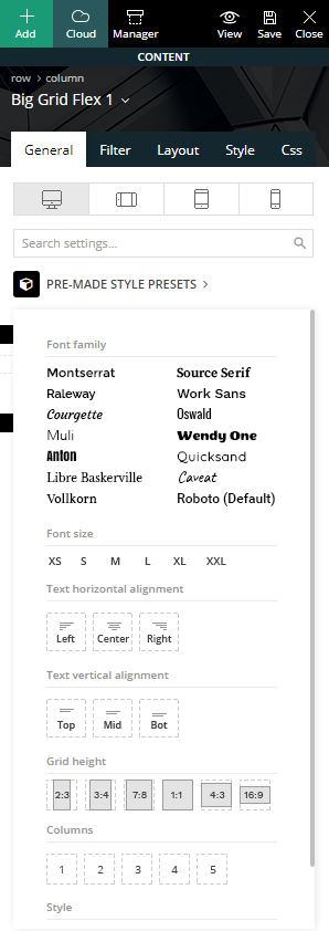
It provides a panel to set the overall fonts, text alignment, and grid style.
For example, in this section, Big Grid Flex 1 also provides options for grid height and column count for you to choose the preferred number of posts to show in a row.
However, for a more in-depth look at the settings available, each section appears below.
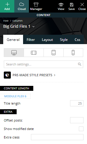 Content-Length – You can select the title length for each of the modules used on the Big Grid.
- Offset posts – Start the count with an offset for the posts that display on the grid. If you have a block that shows five posts before this one, you can make this one start from the 6th post (by using offset 5). This means you can make the Big Grid jump over a set number of posts to avoid duplication.
- Extra class – Add a particular or unique class for your grid in the input field. This, in turn, allows you to add additional customizations to the grid.
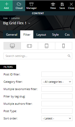
2. Filter Tab
Use this tab to order your posts. You can filter posts in-depth using individual Posts IDs, Categories, Tags, Authors, Post Types, and a variety of custom sort order options.
- Post ID filter – Specific posts can be filtered to your block by using the post ID. You can get the post ID by accessing Wp Admin > Posts section, hover the post title and check the link displayed on the browser left-bottom area. Use the URL to extract the IDs. To exclude posts from a Big Grid add a ‘-’ symbol in front of each ID.
- Category filter – Choose a category for the block from a drop-down menu containing all the existing categories.
- Multiple categories filter – This option allows you to filter the posts by multiple categories. The procedure is similar to the one used on Post ID filter. Add the category IDs separated by commas (ex: 13,23,18). If you want to exclude categories, just a ‘-’ symbol in front of each ID. If you want to display posts from a category and remove the posts included in one of its sub-categories, first add the parent category ID (ex. Fashion category: 341) and after it places the sub-category ID (ex. Daily subcategory id: 342) with a ‘-’ symbol in front, like it’s shown in the image. If you decide to use the ‘multiple categories filter,’ the standard Category Filter is ignored.
- Filter by tag slug – Filter the grid posts by their labels and enter the tag slugs separated by commas (ex: tag1, tag2, tag3).
- Multiple authors filter – This allows you to filter the posts by author(s). Enter the author IDs separated by commas (ex: 13, 23, 18).
- Post type – Use this filter if you want to display custom post types. Add the name of the post type provided by the plugin used to create the CPT, or by the user, if it’s custom-made. Usage: post, page, event – write 1 or more post types delimited by commas.
Sort order
This option lets you order the posts inside the grid. Most of these options are self-explanatory, but there are a few options that have requirements:
- Standard sorting options:
- Latest posts – Shows posts from newest to oldest.
- Oldest posts – Reverses of the previous sorting option.
- Alphabetical A > Z – Your posts are sorted in alphabetical order by their name.
- Random posts – This sorting option brings up posts randomly on each loading of the page. Every time you refresh the page, the posts are different. As a note: do not use the random posts sorting options together with pagination as it could result in duplicate articles.
- Random posts from the last 7 days – This field brings up random posts based on the articles published in the last 7 days.
-
 Sorting options that feature extra requirements:
- Popular (all time) – This sorting option requires the post views to be active. If views are disabled, this option does not work.
- Popular (last 7 days) – You have to enable the 7 days post sorting from Theme Panel > Block Settings > 7 Days Post Sorting.
- Popular (jetpack + stats module required) – Does not work with other settings/pagination and it requires Jetpack – Stats Module to be installed.
- Featured – It displays posts included in the Featured category which is available through the theme. If you delete this category and you want to restore it, create a new category with the name of ‘Featured,’ and a slug ‘featured.’
- Random posts today – Requires the post views to be active.
- Highest rated – It requires review posts, to see how you can set a review please check the following guide.
- Most commented – You need comments to be active on posts. Enable/disable the comments from Theme Panel > Post Settings > Post and Custom Post Types.
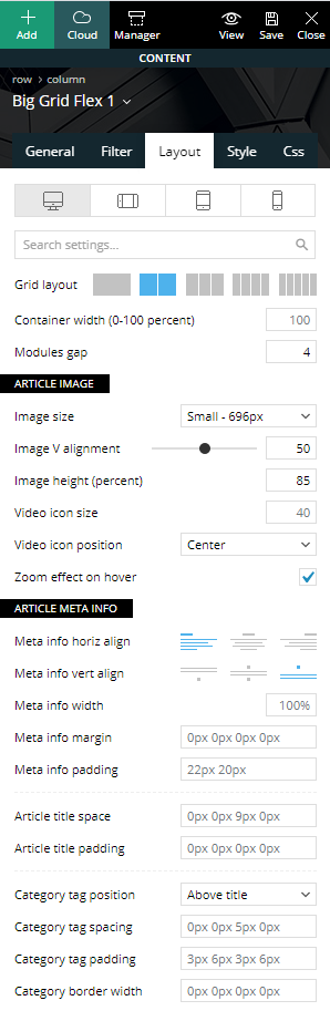
3. Layout
The layout tab is the section where you create the layout for your content. A Big Grid Flex layout can be made out of 1 or more modules. You can find the settings in this section not only for the Big Grid Flex element in particular but for every module used on the particular Big Grid Flex as well.
Individual Big Grid Flex elements have the following options more or less, depending on the selected block type. For the sake of keeping this guide as short as possible, we only mention the most important ones as there are lots of customization options to choose from.
-
Overall layout
Big Grid Flex 1 is the exception as it offers 2 extra controls in this section regarding the grid layout where you can choose between 1 and 5 posts per row and the container width section in percentage.
The overall layout lets you choose the gap between modules, the alignment of the meta information, the category tag position as well as the option to turn on or off the zoom effect.
-
Per module settings
Set different options for each module in particular for your grid. The image size lets you control the thumbnails shown for your content. There are 4 thumbnail sizes that Big Grid Flex element uses, namely: small, default, large or full.
After you choose the image size, you can also play around with its vertical alignment, image width, and height (in percentage). Among the controls in this section, we can mention the meta information width, margin and padding, article title space, and padding, category tag spacing and padding, the option to show or hide the category tags, the post author, and publishing date.
There are separate sections for each module allowing you better control over each element of the grid.
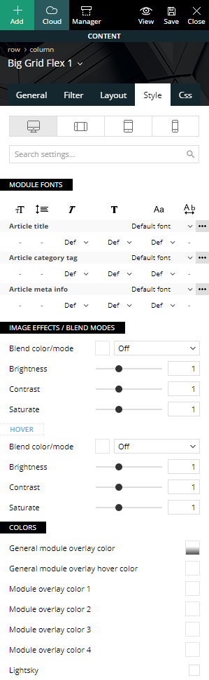
4. Style
The style tab is all about design. Change fonts and colors for your newly created grid element.
- Module fonts
The top section allows you to change the font size, font family, line height, font weight, letter spacing, and text transform. Alter the module title, category tag, meta information as well as the mobile versions of the fonts in particular.
- Colors
The color settings allow you to change individual colors for each of the layout sections. You can change the general or individual overlay color, meta info colors, review stats color, as well as add the “lightsky” hover effect.
5. CSS
This section allows you to change the CSS for the overall grid element. It includes a box model where you can control the margins, padding, and border for the grid.
Extra settings include border settings (color, style, radius, and width), shadows (shadow size, color, offset), the block overall background color or image (as well as their position and opacity).
The color overlay feature adds a gradient on top of your block. Choose multiple colors to add all new creative gradients to take your grid style to the next level.
The display option allows you to show or hide a particular block. This is useful if you want to hide a particular block for a specific device using the top device tabs.