
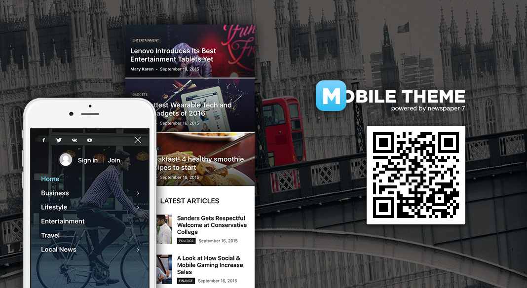
The Mobile Theme is a feature designed to maximize the Newspaper theme performance on mobile devices.
Watch the video
How does the Newspaper Mobile Theme work?
- The Mobile Theme is a lighter, performance optimized theme included in the Newspaper main theme and it loads only for mobile devices.
- It comes with it’s own templates for page, post, category, etc so your current templates from the desktop theme will get converted to the mobile theme layout.
- The homepage is automatically changed to a layout containing a grid showing 3 featured posts and a latest articles section.
- The Mobile Theme is also used as an AMP template. Please read our AMP tutorial for more details.
- Once activated it’s own administration panel will show up at the bottom of the Theme Panel area, from here you can customize various settings for the Mobile theme.
- The Mobile Theme is optional meaning that, if you decide not to use it, the main theme will still look good on mobiles because of it’s responsive design.
Caching:
This Newspaper mobile theme works fine with WP Super Cache. For more details on how to set the plugin visit the Cache plugin – install and configure page.
IMPORTANT: If you are using other cache plugin, you need to check the cache documentation and enable the mobile cache option.
Installation:
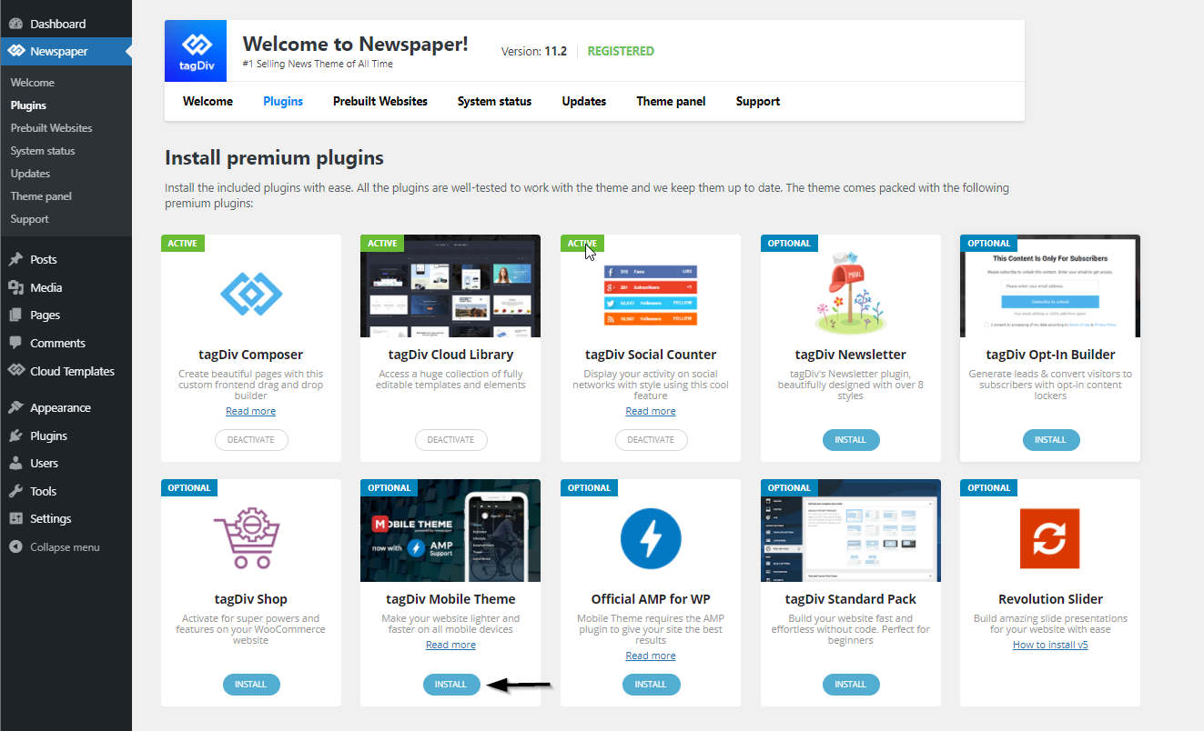
You need to access the Newspaper Plugins section, which contains all of the theme’s specific plugins.
Page customization:
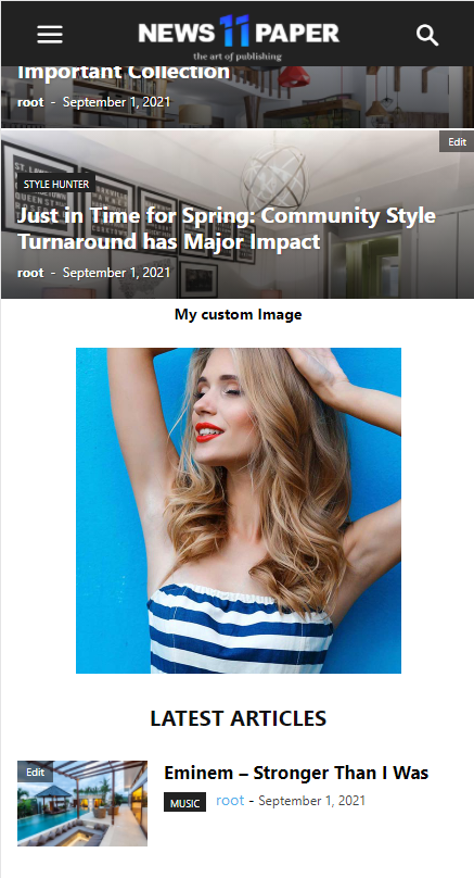
Homepage – the Newspaper Mobile Theme comes with a single predefined page template that includes two section:
- Top grid – displays 3 featured posts (posts included in the Featured category)
- Latest articles – displays the latest articles
This template appears only if a static page is used, for this check the wp-admin Settings>Reading section.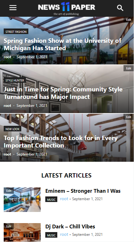
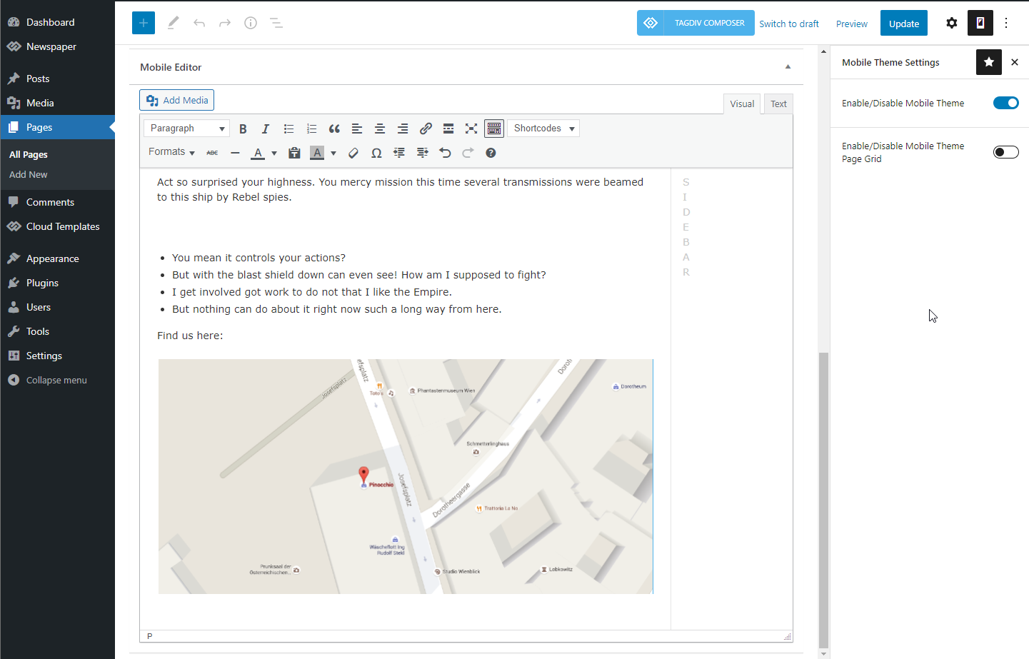
- To make your custom pages visible into the Mobile Theme they need to be recreated inside the Mobile Editor tab. It supports custom HTML and photos too !
- This Mobile Editor does not recognize a page builder so the tagDiv Composer shortcodes cannot be rendered.
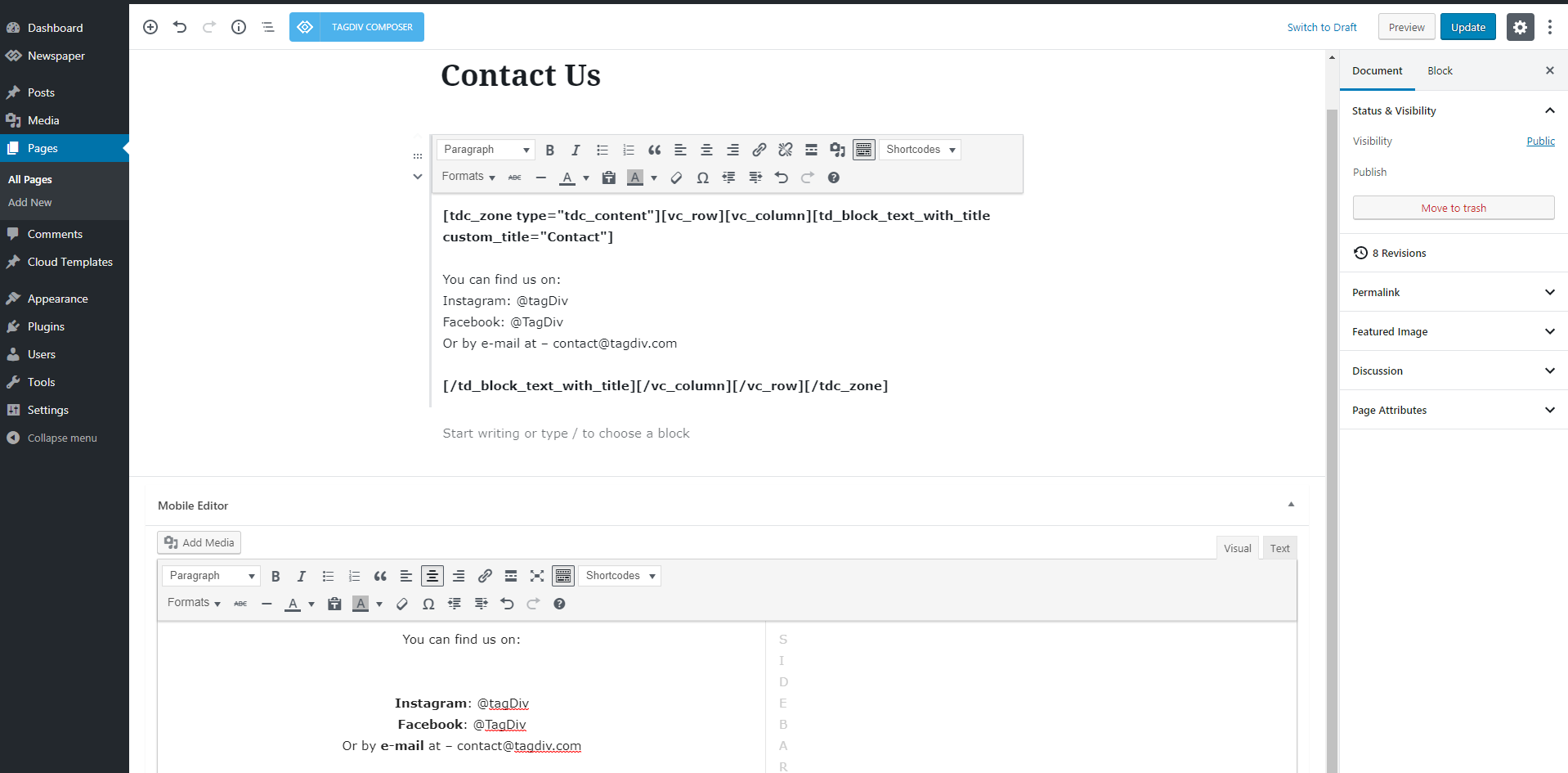
On the front-end the custom elements will appear between the Top Grid and the Latest Articles section.
 Important notes:
Regular pages – The content of custom pages (ex. Contact Us page), present on the main theme, doesn’t appear on the Mobile theme, because the last one comes with it’s own editor and the possibility to add content that’s specially designed for mobiles. This offers you the opportunity to display the same content in two different ways, one optimized for desktop and another for mobiles.
The mobile theme requires the 265×198 and the 741×486 thumbnail sizes in order to show the featured images properly.
Page builder elements – The Newspaper Mobile theme is designed for users who want to optimize the page content for mobile devices or they want to display fewer / different elements on mobiles.
For optimal performance we removed the page builder dependency; this means you cannot use the page builder elements for the Mobile pages. If you want to display the same elements on both mobile and desktop, don’t use the mobile theme, the main theme is already capable of this with it’s responsive design for mobiles.
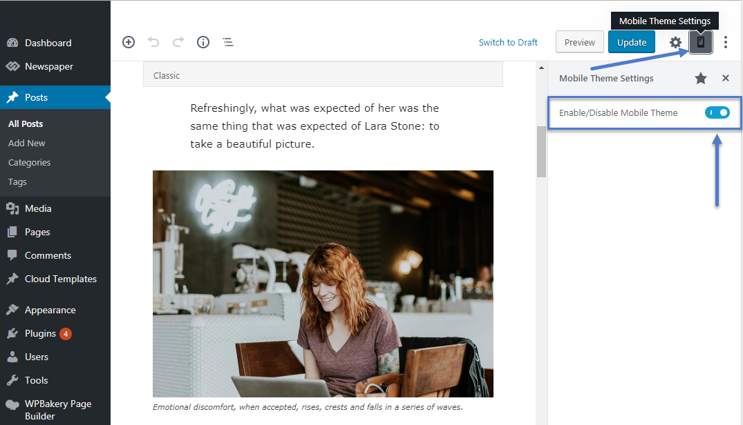
 The mobile theme can be disabled for individual posts or pages from the Gutenberg editor using the following option: