
- TutorialsWhat is Ajax preloading?
 Thegazettenews
Hello, You can check this page https://thegazettenews.co/contact-us/ and also other pages. In those both the logo in header and footer both are showing H1 tags. Which I want to remove, but couldn’t.
The second issue is the mobile menu. If you check from mobile version then you can see that the mobile menu background image is there of a blue blazer guy which is a feature image of demo post which I have already removed. So I want to change that also. But I couldn’t.
Please help me in solving these two issues.
 urska
urskaHello,
I am trying to make changes in Burger menu, Mobile view. Unfortunately I can not access to Element button (see photo). Please give me instructions.
 gsocialmedia
I just purchased the theme, added the mobile plugin, and the mobile menu is not working, unless I hard hold on it and open it in a new window. How can I fix this? Checked the forum but there are not any solutions. Thanks
 Vlad S
 Hello !
1. For this you will have to make sure that your filters are set properly as you can see here: https://www.screencast.com/t/RRYITmrG3NL0 this can be achieved using tagDiv Composer.
2. By using flex blocks on your sidebar you can change the size of the thumbnails as you can see here: https://www.screencast.com/t/0XtMkqrDOFc7
3. Since whatsapp is a mobile app the share icon will not be present on desktop.
4. Yes, please make sure you follow our guide here: https://forum.tagdiv.com/page-menu/
5. On posts I suggest to use Cloud Library Templates that are fully editable with tagDiv Composer. If you are already using one you can simply remove the element you want as you can see here, simply right click on the element and you can remove it: https://www.screencast.com/t/h5iPdf6K5BsA
6. Please make sure that your social counter is set properly as you can see here: https://forum.tagdiv.com/tagdiv-social-counter-tutorial-2/
7. You can use the column text element in order to render shortcodes or use HTML codes.
Simply copy the shortcode and insert it in the text area of the column text as you can see here: https://www.screencast.com/t/UEMEsVKog
Column text is an element from tagDiv Composer.
Thank you !
 Calin
Calin Hi,
You can use tagDiv Composer to hide the text-logo on desktop -> https://i.imgur.com/MtbBJpa.jpg or you can remove it from desktop header and set it only on mobile menu -> https://i.imgur.com/19vFcby.png without settings on mobile the svg logo.
Thank you!
 niky23
Hi,
it’s really great to work with your theme. Just a few smaller questions. My site: https://www.dfz21.at/dfz/
– Duplicate content. I simply want to show no post twice espacially on the home. ‘The offset post’ ist only a work arround as i have to set categories only for the home and use everywhere the same cat. Unique articles is not shown in posts… Can i sidewide prevent content to be shown more than once?
– How can i change to block-look of widget boxes in the post-sidebar like more aritcles or featured posts (with smaller picture, eg)?
– whatsapp icon in articles is only shown mobile but not desktop.
– can i make a page that is also in the main menu a megs menu? (i saw only cats in the dropdown)
– More articles below post: how can i NOT show more from author tab?
– thirst block in my default sidebar is the social counter. if i don’t use a header it just shows empty space instead. and so the counter ist not on the same height as the block on the left side.
– can i show something like a more/featured article box in an post with putting some (short)code in a text block?
Thank you for your help, Niky
Calin Hi,
In order to customize the menu and search from mobile -> https://i.imgur.com/1PyoDVk.png you need to edit your homepage with tagDiv Composer -> https://i.imgur.com/t2FujNW.png set the mobile view port and click on icons -> https://i.imgur.com/uyrTuaj.png -> https://i.imgur.com/IzWOOit.png
The background color can be set for mobile from here -> https://i.imgur.com/UzKmnIe.png
Also the fonts for mobile menu can be set from here -> https://i.imgur.com/E1p9aH6.png
Unfortunately for the moment fore these sections https://i.imgur.com/LQ7tGBX.png are only few settings.
Hope this will help you!
Thank you!
 SquallSFU
Hi guys,
today, after more than two months of work, I finally published my website (http://www.facilesfizioso.it). Newspaper is wonderful and I found myself very well. However, there is one aspect that I have not been able to customize:
In the mobile version, how can I customize the styles of these menus?
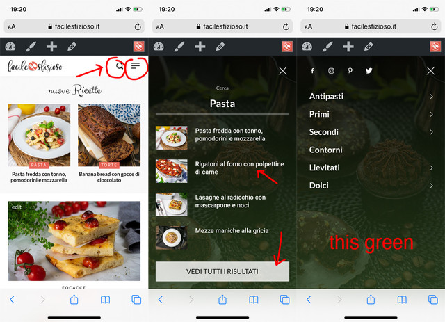
I tried to activate the tagDiv Mobile Theme plugin, but it completely changes the layout of the mobile version.
Thanks for your help.
Calin Hi fox100,
If you want to change the background image from mobile menu or search , you can do it from theme panel> background -> https://i.imgur.com/a5UgjpK.png also the colors can be change from theme panel> theme colors > mobile menu -> https://i.imgur.com/p6H7Dz0.png and the text size can be adjusted on mobile from here -> https://i.imgur.com/5Oqs6ZH.png
Hope this will help you!
Thank you!
 roqya_France
Can I write a text in the buttom of the mobile menu ? (one line)
the same for the search menu on the mobile.
If yes please tell me.
Thanks.
roqya_FranceI am not using mobile tagdiv option , and I don’t want to use it , I just use responsive.
I just want to change the Font and Size of the header text “Roqya Marseille thérapies” and the slogan.
Please look roqya-coach.com
I saw there’s maybe a custom code for that ?
Please help.
 Livingstone
Halo. I want to remove the background image on both mobile menu/search background and saign in/joind (https://prnt.sc/tbttx6) and replace it with COLOR ONLY. How can I replace it with color only
 ranggujarati
Hi There,
I have tried with so many possibilities but I am not able to set the background image to the mobile menu.
Please check below snapshot:
https://imgur.com/E5o1xzJ
https://imgur.com/GZM3snR
https://imgur.com/GZM3snR
Requesting support team to guide me to set up the background image for mobile theme (non AMP responsive layout)
 gumball44
Hi,
I have a problem, when I go (with my phone) on my site lowtechnation.com from my Instagram bio, I land on a amp version but without ?amp in the url, and everything is ok and I have further a nice lazy loading effect on my images.
But when I go (still with my phone) on my site thanks to google, I land on my site but this time with ?amp in the url and my menu doesn’t work normally ( I mean the scrolling menu doesn’t work). Furthermore I don’t have the nice lazy loading effect my images, anymore.
My questions are : Is possible to make land people only on the version without ?amp in the url ? If Yes, Would Google still consider my site as AMP ?
Thank you
watch my topic on amp forum
 Topfgartenwelt
 Ok, thank you for the information – so I have to comment out that complete part:
tdAffix.init({menu_selector:”.td-header-menu-wrap”,menu_wrap_selector:”.td-header-menu-wrap-full”,tds_snap_menu:tdUtil.getBackendVar(“tds_snap_menu”),tds_snap_menu_logo:tdUtil.getBackendVar(“tds_logo_on_sticky”),menu_affix_height:48,menu_affix_height_on_mobile:54})?
Greetings Kathrin
Calin Hi,
If you want to remove them entirely, you need to go in Theme panel> Social networks> Social networks and remove from there the links -> https://i.imgur.com/TA3qaY8.png this will remove the social from mobile menu too.
Thank you!
Calin Hi,
Yes, that code is use for sticky and snap menu on desktop, you can comment it without problems because you have removed this from your website, after that check the results for CLS.
Hope you’ll get good results as you had for mobile.
Thank you!
Calin Hi,
Indeed our theme has many options and you can do a lot of things, but as you said the animation for mobile menu can not be change.
I’ve added your suggestion to our list of improvements.
Thank you for your suggestion!
 Pixel Cities
Hi,
I have removed the social icon element on the template, but they are still showing once clicked in the burger menu on mobile device ?
How do I remove this?
Kind Regards
Mark
Topfgartenwelt I know you are working hard on that problem. But it seems that the code you gave me and modified the min.js in the mobile theme worked. The layout shift is getting better and the test tool (plugin for chrome doesn’t show any layout shift anymore). So my question is: is there also a min.js file for the desktop version that I can modify in the same way?
In wordpress/wp-content/plugins/td-composer/legacy/Newspaper/js I found the following file: tagdiv_theme_min.js (the same file that you mentioned for the mobile theme) and it includes this part: tdAffix.init({menu_selector:”.td-header-menu-wrap”,menu_wrap_selector:”.td-header-menu-wrap-full” After commenting out tdAffix.init(“.td-header-menu-wrap”) in the mobile js file as you recommended the cumulative layout shift was gone, but what should I do here? There is also contained menu_wrap_selector:”.td-header-menu-wrap-full…Thanks for your help!
Greetings Kathrin
-
This reply was modified 6 years by
Topfgartenwelt.
 Shubham Patel
You told that we made header builder, footer builder, post template builder to make new unique Website but nothing gives value without mobile menu animations, I see every Website looking similar because everyone has same mobile menu opening animation so it spoil your hard work and we buyer’s loss our investment because it doesn’t provides unique Website experience because of there is no animations and options to changes mobile menu opening animation. I want to buy multiple newspapers licenses to make my different unique website but due to this same mobile menu opening animation stops me to do that because I don’t want to showcase my similar.
So it’s my request to tagdiv developers to add different mobile menu opening animations and option to assign animation that animation to mobile menu while we make unique header.
This helps both developers and buyers like me, developers gets more sells and we buyers get right solution to make unique Website from header to footer.
Waiting for your positive response with assurance to add this request in your next upcoming update.
Topfgartenwelt Dear Calin,
the overall score is not the problem, the problem for the mobile as the desktop theme is the cumulative layout shift which is part of the web core vitals. As you can see the CLS is for
Desktop: https://i.imgur.com/7ckfgfG.png 61% (green) 11% (orange) 28% (red) the time is 0,28s but Google only allows a maximum of 0,25s. Otherwise the page is categorized as poor. In my case all 175 sites are categorized as poor because of a to high layout shift. I don’t use any Google Fonts and I have deactivated the Font Awesome for the menu, but there is a problem that persists. When I prove the desktop-site with the Google Plugin for Chrome to count the Webcore Vitals I get a bad score as soon as I scroll up and down. As you can see it here: https://www.topfgartenwelt.com/cumulative-layout-shift
And if the CLS is not fixed the site never matches the Speed Test. But that will be a big problem in future because that will be a ranking factor.
Is there nothing in the desktop-version like this (as you mentioned for the mobile version) that could cause the problem with the layout shift: wp-content/plugins/td-composer/mobile/js/tagdiv_theme.min.js and search for tdAffix.init(“td-header-wrap”)??
Greetings Kathrin
Topfgartenwelt The sticky menu is disabled for both (mobile and desktop)… There must be something else in the header to produce the high cumulative layout shift…
What else can cause collabsing of the header?
Greetings Kathrin
 Rinemedi
 Hello again Calin,
Thanks for your reply, the problem is with the mobile version only, if i try to visit any of the pages that are in my footer menu, it simply doesn’t work, there is just the title of the page displayed and the ads but nothing else … however it works perfectly on desktop.
Here is a screenshoot of the problem: https://i.ibb.co/wrXy5sZ/78350509-1205385863129228-5137359969704711851-n.png
Feel free to try it yourself on your phone … http://fitnessreads.com/
Thank you.
Calin Hi,
You can set the logo on mobile using our video documentation from here -> https://www.youtube.com/watch?v=HXQQygkCCJo
The mega menu will display all the subcategories and sub-sub categories from the category selected, there is no option to filter the subcategories -> https://forum.tagdiv.com/mega-menu/
Similar topic -> https://forum.tagdiv.com/topic/how-do-i-make-the-main-menu-not-drop-down/
Thank you!



