
- TutorialsWhat is Ajax preloading?
 duck1970
 Hi Calin, you’re a genius, you’ve mastered your craft. I’m just a beginner.
I think I was able to restore everything by following your instructions. It’s now displayed correctly, but I still have three problems that I can’t figure out how to fix. That’s why I’m asking for your help again.
1. I’m still having the same problem I mentioned with the menu bar on the website: when you scroll, the NEWSPAPER tab appears in the menu. How can I remove that tab?
2. I still don’t know how to control the mobile header. I’m doing my best. I’m attaching a photo of the home screen to see if it’s possible to make the first module appear a little larger with the photo I display in the header.
3. How can I customize the header of the other sections?
If you click on the dots on the home screen and go to any of the pages, the header only displays a logo.
How can I replace the current logo and display the same photo I have on the home screen?
ONCE AGAIN THANK YOU FOR EVERYTHING Calin.
https://new.radiomarcabarcelona.com/capture/header-mobil.png
duck1970 Hi Calin, I think I’ve more or less managed to create the mobile and header menus, solving points 2 and 3. But I couldn’t remove the NEWSPAPER tab. I did manage to keep the menu fixed without scrolling. However, I don’t know what I’ve done that broke the header. The main block isn’t visible in its entirety; it appears stacked. And I can’t find what I’ve done to get it back to the way it was, which showed the entire block. Can you help me figure out what I need to do to restore the first block? I’ve attached a photo.
Thanks and sorry for this inconvenience.
https://new.radiomarcabarcelona.com/capture/block.png
 Calin
Calin Hello,
1. What you see is the sticky menu, which can be disabled using tagDiv Composer, checking the manager and disabling it https://forum.tagdiv.com/header-manager/ – https://i.imgur.com/ZXBFvVT.png. Do the same for both the desktop and mobile versions.
2. This situation appears because the header from desktop is using a different code nad the mobile header othere code, so those can be different, so what you can do is to use tagDiv Composer to edit the mobile header, edit the homepage, selct the mobile viewport and add a new row under the mobile header (make sure it’s under the header not content) an ad box element https://i.imgur.com/Oz1Ev58.png https://i.imgur.com/dxujNzQ.png
3. You need to have created a menu as in this guide https://forum.tagdiv.com/main-menu/, then use tagDiv Composer, edit the homepage and select the mobile viewport, then select the mobile menu and choose the created menu – https://i.imgur.com/MvNUaM8.png – https://i.imgur.com/KjMQiem.png – https://i.imgur.com/vFflmzh.png
Thank you!
duck1970Hi, I’m just finishing up my new website, and I have three questions to answer, which I’ll explain below.
2- In the web version, when you scroll, the NEWSPAPER tab appears in the menu. When you scroll to the top and stop scrolling, it disappears, leaving the menu with the tabs I created. How can I make the Newspaper tab not appear?
2- In the web version, I show a photo ad, but it doesn’t appear in the mobile version. What should I do to make it appear on mobile devices?
3- What do I need to do to display my menu on mobile devices? Currently, the menu isn’t displayed.
I’ve attached a photo with the three questions, and I’m leaving a link to the website under construction.
https://new.radiomarcabarcelona.com/capture/3_questions.png
https://new.radiomarcabarcelona.com
Thank you very much for your help. Best regards.
Calin Hi,
The best approach to create the menu you’re looking for is not to edit the theme files directly, as any changes will be overwritten when the theme is updated. Instead, I recommend using TagDiv Composer along with the Popup Element. You can design your desired menu with the theme builder and use the Popup Element to display it as a mobile menu on mobile devices.
Regarding AMP, the situation is a bit more complicated since the template cannot be edited using the builder; modifications will need to be made directly in the theme files.
Thank you!
Calin Hello,
Upon checking the console, it appears that the website is unable to locate an image and is trying to load it from the following URLs:
I suggest verifying whether this image is set as a background under the mobile menu or search background in the EWSapper > Theme Pane > Background section. You can check here:
If the image is present, simply remove it and save the settings. Afterward, please clear all cache. This should help improve the website’s loading speed.
Once this is done, we can check if the website is loading faster and assess what further optimizations can be made.
Thank you!
 muterobert
 I have now set the color as the Mobile Toolbar Background, however I’m still seeing the same inconsistent behavior. Sometimes the sticky menu uses the right color, sometimes it doesn’t, and the top static menu never does: https://imgur.com/a/Rc81wQ2
 adityabansal
I want to customise mobile menu, I was able to reorder social icons using css, and customise gtranslate widget in this menu. But I couldn’t add more items in the list.
1. For example, I want to add short code of darkify plugin (gtranslate widget appeared automatically after activation of plugin) but for darkify plugin icon – how should I add it? I have the widget shortcode. Where should I do the changes to reflect it here?
2. Please can you also provide the same menu mobile AMP page location. AMP menu customisation.
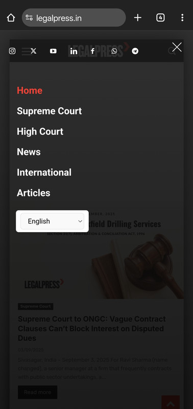
muterobertI’m trying to make sure that mobile Safari picks up our brand color in the menu bar, but I’m seeing inconsistent behavior.
When looking at the static header at the top of the page, the menu bar area (with the time and battery) is using the site’s background color: https://imgur.com/a/5dj3ue7
But when the sticky header comes out after scrolling down, it correctly uses the header color: https://imgur.com/a/BItyQUd
I’ve tried setting the background color of the static header and sticky header to the same thing, but I’m seeing this inconsistent behavior. How can I fix this?
Here is the live page if it’s helpful for diagnosing the issue: https://alpha.roadtovr.com/
 barrydmoore
 HI Anamaria, the Model popup is fixed as a H3 Tag. Is there a way to change it to a DIV? I have it as a menu at the top on mobile, and the document then starts with an H3, which is not good for SEO. Thanks
Calin Hi,
This can be done using the theme panel settings from Newspaper > Theme Panel> background – Mobile menu/search background – https://i.imgur.com/P3tj9UO.png
Then the colors from Newspaper > Theme Panel> theme colors – https://i.imgur.com/XCxtNJb.png
Or you can use the popup element and create your own mobile menus using the pages
I hope this will help you!
 dragzini
Hello.
How can I set the mobile version of the theme to show submenu items? Image: https://ibb.co/bRMZxyS5
And one more question. How can I translate the date? Image: https://ibb.co/6RH1NCgW
Greetings
 3 Narratives News
My mobile site 3narratives.com the menus are requesting people to sign in to wp menu builder. How do I fix this???
 mdtonmoyfaraji
How do I customize default mobile off-canvas navbar and search bar
https://prnt.sc/JP4sFircbFB6
https://prnt.sc/WO-ZB7a-0F9t
I want to change background color. The hover actie color of menu items and also search sidebar background color and etc
Calin Hi,
The orange color is a global color on the demo you are using, so what you can do is to use tagDiv Composer, edit a page, select the manager and in colors, change the color from orange to the new color you want https://imgur.com/lwb7sNv
The situation with the menu on mobile can be resolved by using tagDiv Composer, slect the mobile view port, then select the top row, the one holding the logo and check the css tab – https://i.imgur.com/DNsPpin.png that -10 margin should be remvoed and the problem will be resolved.
 danirblanco
Hi, I’m having a problem with TagDiv Composer on my website: https://www.conocerasturias.es
When I create a new page, it doesn’t load. It also doesn’t work with my existing pages, and the following text appears: ‘, footerTemplateId: ”, footerTemplateContent: ”, mobileMenuId: ’35’, tdbPInfiniteLoadStatus: ‘on’, tdbPInfiniteType: ”, tdbPInfiniteCount: ‘3’, isMobileTemplate: ‘0’, tdbTemplateSettings: [], }; // Set the local storage to show inline the iframe wrapper and the sidebar window.localStorage.setItem( ‘tdc_live_iframe_wrapper_inline’, 1 );
Here are some screenshots.


The headers also don’t work.
thank you
Calin Hi,
2. What you need to do is to change the mobile menu icon – https://i.imgur.com/SHimyDh.png https://i.imgur.com/yQtfClG.png
3. The live search on the element is a bit different; it can be used to display the results in a dropdown element – https://i.imgur.com/j8jVsGG.png or under the element input, to make it to have the element input and display results as you want, you ned to use this custom css:
.td-header-desktop-wrap .tdb_header_search {

    top: -30px;

    position: absolute;

    z-index: 999;

}
Personally, I will recommend the option from the theme.
Thank you!
Calin Hi,
Edit the homepage using tagDiv Composer https://i.imgur.com/LqZci0B.png, select the mobile view port – https://i.imgur.com/irzI2i7.png then the menu and change the title – https://i.imgur.com/EQOebz7.png
Thank you!
 natedoggydog
 I had the mobile menu turned off on the theme panel. User error haha.
Thanks for the help!
 iamkingsleyf
Hi,
On https://homequirer.com/ on mobile there is an “urbanobserver” text displaying, i have openned Modal Mobile Menu several time but i can’t find where the text is displayed so i can change it. I have zoom IN and OUT too.
See screenshot https://imgur.com/kPhekUH
Calin Hi,
The menu js seems to be loading on the website https://i.imgur.com/elyxcRp.png
Can you check the theme panel settings, go to Theme Panel > Header > Mobile header – https://i.imgur.com/o9wfKx6.png
Also, please do a test using only tagDiv plugins to see if the problem persists, if it persists, please make a full backup of the website and contact us via email at contact@tagdiv.com and please provide temporary wp-admin and cPanel access to investigate the situation.
Thank you!
Calin Hi,
The social networks from the mobile menu can be removed/add from Newspaper > theme panel > social/apis under social networks – https://i.imgur.com/03ZD3Bq.png. Unfortunately, for the “Mobile menu” element the social networks do not have an option to set the order, but if you choose to create a popup menu, you can create a page with the menu elements you want and use the social element that allow you to set the social orders – https://i.imgur.com/gahlUIp.png
Thank you!
natedoggydogWhen I add a mobile menu to my header template it appears, but doesn’t work. I add the element, select the menu, but when I save and exit it doesn’t open. When I go back to edit the mobile menu there isn’t a menu selected, like it never saved it in the first place.
Thanks for any help!
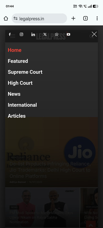
adityabansalHow can I rearrange or edit these social icons links.
Calin Hi,
What you can do is use tagdiv Composer, edit the header and on the tablet, where you want the mobile menu to be displayed, not the desktop one, hide the current menu – https://i.imgur.com/JsdDBGu.png and add the mobile menu element https://i.imgur.com/PoNW2hd.png (this must be hidden on the viewports that you do not want to display, such as the desktop) https://i.imgur.com/wuLyNXM.png
Thank you!



