
- ApiUsing the Theme API in plugins
- ApiPractical example – How to add a new Block and Module
- ApiAPI – Smart Lists – Introduction
- ApiAPI – Category top section style – Introduction
- ApiAPI – Category top section template – Introduction
- Apitd_api_module::update
- Apitd_api_module::add
- ApiAPI – Modules – Introduction
 Bettina
 Hello!
I can see that you have a lot of errors in the console. Make a test and deactivate ALL plugins except tagDiv ones, also if you are using a cache plugin, deactivate it, clear all cache and try again.
We have 3 options for mobile versions that you can use:
1. Responsive version: A responsive version of your website looks similar to the desktop version. TagDiv Composer is used to edit the page.Click on the mobile viewport: https://www.screencast.com/t/XDQJedlggSB. There, you can see your mobile version and edit or adjust the elements to look better.
2. Mobile pages: https://tagdiv.com/newspaper-10-3-7-update-brings-customizable-and-fast-mobile-pages
3. Mobile theme plugin: The Mobile Theme is a performance-optimized theme included in the main Newspaper theme that only loads on mobile devices. It comes with its own templates and designs for pages, posts, categories, etc., so your current templates from the desktop theme will get converted to the mobile theme layout. Please see https://forum.tagdiv.com/the-mobile-theme/ and https://forum.tagdiv.com/mobile-theme-introduction/ for more information.
A full explanation is here: https://www.youtube.com/watch?v=SpGkOnJeNZY
If you need to use mobile version 1 or 2, then you need to uninstall the Mobile Theme plugin and AMP.
Thank you!
Bettina Hello @stefanegirard !
There is no layout for the mobile theme on your website. Your mobile version looks the same as your desktop version. TagDiv Composer is used to edit the page. Click on the mobile viewport: https://www.screencast.com/t/XDQJedlggSB. There, you can see your mobile version and edit or adjust the elements to look better.
Do you use AMP plugin instead?
Thank you!
 Anamaria
 Hello,
The page loading speed can depend on many factors, and each website is unique from this point of view. Let me explain some of these factors and maybe they give you some starting points for optimizing your website. A good choice for the page speed, could be the mobile layout which contains fewer elements because it can improve a bit your page speed.
There are many optimization guides provided by our users here in the forum, some made by us; you could check some of them
– https://www.infophilic.com/get-almost-100-pagespeed-newspaper-theme/
– https://forum.tagdiv.com/cache-plugin-install-and-configure/
– https://forum.tagdiv.com/how-to-make-the-site-faster/
– https://forum.tagdiv.com/topic/high-number-of-ajax-request/
– https://forum.tagdiv.com/topic/score-100100-pagespeed-with-newspaper-wordpress-theme/
– https://www.andraware.com/wp-rocket-for-newspaper-theme/
– https://forum.tagdiv.com/topic/page-speed-guide-for-2023-beginners-and-advanced/
– https://forum.tagdiv.com/topic/newspaper-theme-speedify-your-website/
– https://forum.tagdiv.com/topic/tutorial-chriss-custom-optimizations-for-functions-php-etc/
– https://forum.tagdiv.com/cloudflare-cdn/
– https://forum.tagdiv.com/topic/theme-causing-high-cpu-usage-2/
– https://forum.tagdiv.com/topic/sql-querys-high-cpu/
– https://forum.tagdiv.com/topic/newspaper-theme-slow-to-respond/
– https://premium.wpmudev.org/blog/optimizing-your-wordpress-database-a-complete-guide/
– https://underconstructionpage.com/optimize-wordpress-database/
– https://crunchify.com/better-optimize-wordpress-database-all-in-one-guide/
Also, pagespeed is not covered by support -> https://forum.tagdiv.com/newspaper-theme-support/
If you use Wp Rocket, you can try to exclude the following files
/jquery-?[0-9.](.*)(.min|.slim|.slim.min)?.js
/jquery-migrate(.min)?.js
/wp-content/plugins/td-composer/legacy/Newspaper/js/tagdiv_theme.min.js
tdBlocksArray
To be able to optimize and to remove CLS and LCP please check these guide => https://developers.google.com/web/tools/lighthouse/ -> https://www.sqlpac.com/en/documents/google-pagespeeds-lighthouse-6-new-features-lcp-cls.html -> https://web.dev/lighthouse-whats-new-6.0/ -> https://web.dev/lcp/ -> https://web.dev/cls/
Thank you!
Anamaria Hi,
Please provide the link to your website. Also, if you have activated the mobile theme plugin, please deactivate it and check afterward.
Thank you!
 stefanegirard
Hi
The Mobile Theme is deactivated but on my mobile phone I see the Mobile Theme.
Please help as I do not know how this theme works.
 ComicsBeat
After a site redesign I’m getting a great page speed result for desktop, but my mobile version is in the red. I have the mobile theme turned on, not sure why the ranking is so bad?
My site is comicsbeat.com
 liza_dev
I have a mobile theme for main page. After last update to Newspaper 12.3 I saw that header contain custom content – text Newspaper Pro. Also default blocks in body looks not as earlier.
Bettina Hello @novodia!
If you use cloud templates, then you need to change the logo in the tagdiv Composer.
Please check our tutorial here: https://forum.tagdiv.com/tagdiv-composer-tutorial/
More documentation about the cloud templates is here:
– https://forum.tagdiv.com/cloud-library-templates/
– https://forum.tagdiv.com/design-post-pages-using-cloud-library-templates/
– https://forum.tagdiv.com/cloud-library-category-templates/
We have 3 options for mobile versions that you can use:
1. Responsive version: A responsive version of your website looks similar to the desktop version. TagDiv Composer is used to edit the page.Click on the mobile viewport: https://www.screencast.com/t/XDQJedlggSB. There, you can see your mobile version and edit or adjust the elements to look better.
2. Mobile pages: https://tagdiv.com/newspaper-10-3-7-update-brings-customizable-and-fast-mobile-pages
3. Mobile theme plugin: The Mobile Theme is a performance-optimized theme included in the main Newspaper theme that only loads on mobile devices. It comes with its own templates and designs for pages, posts, categories, etc., so your current templates from the desktop theme will get converted to the mobile theme layout. Please see https://forum.tagdiv.com/the-mobile-theme/ and https://forum.tagdiv.com/mobile-theme-introduction/ for more information.
A full explanation is here: https://www.youtube.com/watch?v=SpGkOnJeNZY
If you need to use mobile version 1 or 2, then you need to uninstall the Mobile Theme plugin and AMP.
Thank you!
 novodia
I’ve already made several changes to the ThemePanel and using Div as well and it doesn’t change on desktop or mobile
 datingvergleich
 Please take a look at this section of the source code of any website page:
<div class="tds-button td-fix-index"><span class="tdm-btn-text">See pricing</span><i class="tdm-btn-icon td-icon-arrow-right-rounded"></i></div></div>
These links are inserted automatically. However, if you check a page in desktop browser (not in mobile theme), let’s say:
https://www.dating-vergleich.com/
There is no such button or link visible. So it seems to be hidden somehow. This really hurts my SEO and Google rankings, as hidden links (leading to 404 error pages) are a negative ranking factor and should by all means be avoided.
Maybe the classes of this div block of the code section gives your technical team a hint where and how it is inserted by the theme.
Anamaria Hi,
You need to disable the mobile theme and amp to have mobile responsive version.
Using our theme you can choose from 3 mobile versions
-> mobile responsive => https://www.screencast.com/t/oJ2ShOp47
-> mobile theme plugin => https://forum.tagdiv.com/the-mobile-theme/
-> mobile page => https://tagdiv.com/newspaper-10-3-7-update-brings-customizable-and-fast-mobile-pages/
If you created the mobile pages with tagDiv Composer, then when you install the Mobile Theme plugin, your pages will be overwritten by the plugin (the mobile theme comes with its templates for page, post, category, etc so your current templates from the desktop theme will get converted to the mobile theme layout, the page content is made without builders in mobile editor => https://www.screencast.com/t/xbgZG8kH also, the options that are provided to edit the mobile theme version are limited (this keeps the things simple)).
This is a video about Responsive Newspaper Theme, AMP & Mobile Theme, Mobile Pages & Templates -> https://www.youtube.com/watch?v=SpGkOnJeNZY
So, the mobile responsive is what you see then that you select the viewport on phone => https://www.screencast.com/t/matV17hH, so some settings may apply for each viewport(where is the border blue), and others are not(where the border is black).
The mobile page has the mobile templates from Cloud Library => https://www.screencast.com/t/YCcZ8rL8
The Mobile responsive version of the theme and the mobile page editor can be edit with tagDiv Composer, the mobile theme plugin cannot.
For example, you can have the mobile theme plugin activated and use the mobile page/mobile responsive version for the homepage/pages, but for the categories pages/404 page, you can’t use the mobile page/mobile responsive version if you have the mobile theme plugin activated.
So, if you want to design the pages with tagDiv Composer, you can use the mobile page or mobile responsive version.
Thank you!
datingvergleich I have deactivated mobile theme and AMP pages for testing, now.
However, the links to the 404 pages are still there. After investigating the source code for the desktop version of the theme, I have found following section:
</div></div><div class="tdm_block td_block_wrap tdm_block_button tdi_30 tdm-block-button-full tdm-content-horiz-right td-pb-border-top td-press-button td-move-arrow td_block_template_1"  data-td-block-uid="tdi_30"     >

<style>@media (max-width:767px){.tdi_30{text-align:left!important}}</style>

<style>.tdm_block.tdm_block_button{margin-bottom:0}.tdm_block.tdm_block_button .tds-button{line-height:0}.tdm_block.tdm_block_button.tdm-block-button-inline{display:inline-block}.tdm_block.tdm_block_button.tdm-block-button-full,.tdm_block.tdm_block_button.tdm-block-button-full .tdm-btn{display:block}.tdc-row .tdi_30 .tdm-btn{height:auto;padding:15px 25px}@media (min-width:768px) and (max-width:1018px){.tdc-row .tdi_30 .tdm-btn{height:auto;padding:12px 20px}}</style>

<style>.tdc-row .tdi_31{padding:15px 25px;height:auto;line-height:1}.tdc-row .tdi_31 i{font-size:16px}body .tdc-row .tdi_31 .tdm-btn-icon:last-child{margin-left:10px}body .tdc-row .tdi_31{background-color:var(--tt-accent-color)}body .tdc-row .tdi_31:after{background-color:var(--tt-hover)}body .tdc-row .tdi_31 .tdm-btn-text,body .tdc-row .tdi_31 i{color:#ffffff}.tdc-row .tdi_31 svg{fill:#ffffff;fill:#ffffff}.tdc-row .tdi_31 svg *{fill:inherit;fill:inherit}body .tdc-row .tdi_31:hover .tdm-btn-text,body .tdc-row .tdi_31:hover i{color:#ffffff;-webkit-text-fill-color:unset;background:transparent;transition:none}body .tdc-row .tdi_31:hover svg{fill:#ffffff;fill:#ffffff}body .tdc-row .tdi_31:hover svg *{fill:inherit;fill:inherit}body .tdc-row .tdi_31 i{color:#ffffff;-webkit-text-fill-color:unset;background:transparent}body .tdc-row .tdi_31:hover i{color:#ffffff;-webkit-text-fill-color:unset;background:transparent;transition:none}.tdc-row .tdi_31:before{border-width:0px;border-style:solid}.tdc-row .tdi_31{font-size:16px!important;line-height:1.2!important;font-weight:600!important;text-transform:uppercase!important;letter-spacing:0.5px!important;height:auto}@media (min-width:768px) and (max-width:1018px){.tdc-row .tdi_31{padding:12px 20px;height:auto;line-height:1}.tdc-row .tdi_31{font-size:14px!important}}</style><div class="tds-button td-fix-index"><span class="tdm-btn-text">See pricing</span><i class="tdm-btn-icon td-icon-arrow-right-rounded"></i></div></div></div></div><div class="vc_column tdi_33  wpb_column vc_column_container tdc-column td-pb-span4">

<style scoped>.tdi_33{vertical-align:baseline}.tdi_33>.wpb_wrapper,.tdi_33>.wpb_wrapper>.tdc-elements{display:block}.tdi_33>.wpb_wrapper>.tdc-elements{width:100%}.tdi_33>.wpb_wrapper>.vc_row_inner{width:auto}.tdi_33>.wpb_wrapper{width:auto;height:auto}.tdi_33{justify-content:center!important;text-align:center!important}@media (min-width:768px) and (max-width:1018px){.tdi_33{padding-top:30px!important;width:36%!important}}</style><div class="wpb_wrapper" ><div class="tdm_block td_block_wrap tdm_block_socials tdi_34 tdm-content-horiz-left td-pb-border-top td_block_template_1"  data-td-block-uid="tdi_34" >

<style>.tdm_block.tdm_block_socials{margin-bottom:0}.tdm-social-wrapper{*zoom:1}.tdm-social-wrapper:before,.tdm-social-wrapper:after{display:table;content:'';line-height:0}.tdm-social-wrapper:after{clear:both}.tdm-social-item-wrap{display:inline-block}.tdm-social-item{position:relative;display:inline-block;vertical-align:middle;-webkit-transition:all 0.2s;transition:all 0.2s;text-align:center;-webkit-transform:translateZ(0);transform:translateZ(0)}.tdm-social-item i{font-size:14px;color:var(--td_theme_color,#4db2ec);-webkit-transition:all 0.2s;transition:all 0.2s}.tdm-social-text{display:none;margin-top:-1px;vertical-align:middle;font-size:13px;color:var(--td_theme_color,#4db2ec);-webkit-transition:all 0.2s;transition:all 0.2s}.tdm-social-item-wrap:hover i,.tdm-social-item-wrap:hover .tdm-social-text{color:#000}.tdm-social-item-wrap:last-child .tdm-social-text{margin-right:0!important}</style>

<style>.tdi_35 .tdm-social-item i{font-size:14px;vertical-align:middle}.tdi_35 .tdm-social-item i.td-icon-linkedin,.tdi_35 .tdm-social-item i.td-icon-pinterest,.tdi_35 .tdm-social-item i.td-icon-blogger,.tdi_35 .tdm-social-item i.td-icon-vimeo{font-size:11.2px}.tdi_35 .tdm-social-item{width:28px;height:28px;margin:5px 10px 5px 0}.tdi_35 .tdm-social-item i{line-height:28px}.tdi_35 .tdm-social-item-wrap:last-child .tdm-social-item{margin-right:0!important}.tdi_35 .tdm-social-item i,.tds-team-member2 .tdi_35.tds-social1 .tdm-social-item i{color:var(--tt-accent-color)}.tdi_35 .tdm-social-item-wrap:hover i,.tds-team-member2 .tdi_35.tds-social1 .tdm-social-item:hover i{color:var(--tt-hover)}.tdi_35 .tdm-social-text{display:none;margin-left:2px;margin-right:18px}@media (min-width:768px) and (max-width:1018px){.tdi_35 .tdm-social-item i{font-size:12px;vertical-align:middle}.tdi_35 .tdm-social-item i.td-icon-linkedin,.tdi_35 .tdm-social-item i.td-icon-pinterest,.tdi_35 .tdm-social-item i.td-icon-blogger,.tdi_35 .tdm-social-item i.td-icon-vimeo{font-size:9.6px}.tdi_35 .tdm-social-item{width:24px;height:24px}.tdi_35 .tdm-social-item i{line-height:24px}}</style><div class="tdm-social-wrapper tds-social1 tdi_35"><div class="tdm-social-item-wrap"><i class="td-icon-font td-icon-instagram"></i><span style="display: none">Instagram</span></div><div class="tdm-social-item-wrap"><i class="td-icon-font td-icon-linkedin"></i><span style="display: none">Linkedin</span></div><div class="tdm-social-item-wrap"><i class="td-icon-font td-icon-twitter"></i><span style="display: none">Twitter</span></div></div></div><div class="td_block_wrap td_block_raw_css tdi_36 td-pb-border-top td_block_template_1"  data-td-block-uid="tdi_36" ><div id=tdi_36 class="td_block_inner td-fix-index"><style>.td-coaching-mm .td-sd-menu-icon.tdm_block_icon_box {

  cursor: pointer;

}

.td-coaching-mm .td-sd-menu-icon.tdm_block_icon_box .tdm-col-icon {

  transition: padding 0.1s ease-in-out;

}

.td-coaching-mm .td-sd-menu-icon.tdm_block_icon_box:hover .tdm-col-icon {

  padding-right: 10px;

}

</style></div></div></div></div></div></div></div></div>
Here, these problematic links are inserted in the header section. However, the links are not visible (i.e. hidden) on the rendered web pages and I cannot find them in the tagdiv composer templates.
Do you have a clue how to remove them and why/how they are inserted?
 sandeep15r
 How to use a mobile responsive theme or mobile pages in my website.
Anamaria Hi,
I don’t fully understand your issue. Please provide some screenshots.
To change the font and color for the mobile menu please go to Theme Panel -> Theme Colors -> Mobile menu/mobile search => https://www.screencast.com/t/0CvSgXp9H to set a background image go in Theme Panel -> Background -> Mobile menu/mobile search => https://www.screencast.com/t/uvDejzbX to change the font from Theme Fonts => https://www.screencast.com/t/ANBQe7hQhJd
Thank you!
datingvergleich Dear Bettina,
as I like the concept of the mobile theme and AMP pages, it would be a pity to deactivate them. Isn’t there another configuration or tweaking option to hinder them from creating those URLs?
According to your documentation, the AMP option should only create slugs with /amp/ added to the post URLs. I don’t understand why the other slug endings are created or whether they have a function at all.
Kind regards
Joachim
Anamaria Hi,
For the mobile theme and amp, this option will not be added. The option is available for mobile responsive and mobile pages/templates.
Thank you!
sandeep15r Please work in this regard. It is essential for the Mobile theme to show “updated date” in blog posts. The reason is that Google indexes mobile pages and more people search on mobile phones than desktop.
Pl do the needful in matter.
 pricelesspassport
 I am having the same problem. None of the colors or modifications I made to the desktop version are showing up on the mobile theme. Also there is a weird background photo for the drop menus on mobile. Please help! My site is pricelesspassport.com
Bettina Hello Joachim!
Please uninstall the mobile theme and amp because amp creates those URLs.
Thank you!
 Aydmain
Hello, I just modified the urbanedge demo for my website and I really love the way it’s cool. But checking on my mobile device, I noticed it is something different entirely. I hate the fact that the mobile is different from my desktop. I want them unified please. how do I do that?
My website is Theosvox.com
 howtoisolve
 My issues is not with setup,,,my Issue is with Date (Last modified date…)
Here are my settings attached for the Last Modified Date – attached screenshots.
i enabled Modified date settings on Mobile them… (https://snipboard.io/Np5Koz.jpg) this is showing correctly to me…(https://snipboard.io/uTLnsN.jpg)
But As I enable this setting on the Mobile theme, the Main Desktop theme automatically misses the Last Modified Date Toggle (https://snipboard.io/S13Qqm.jpg). Problem:- https://snipboard.io/bGIsBd.jpg
Check This URL:- https://demo.itechsoft.biz/best-iphone-bicycle-computer-apps-good-review/
datingvergleichDear Support Team,
on tools like GTmetrix and Google Page Speed Insights there is an issue with loading fonts and icons of the Newspaper theme (on mobile devices).
This causes problems with First Contentful Paint and Last Contentful Paint metrics.
Please kindly refer to this screenshot:
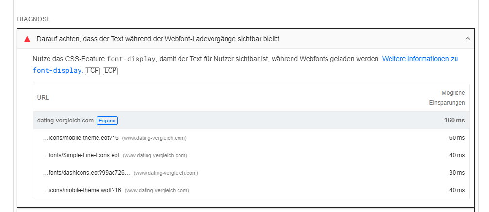
Is there the option to implement the CSS-Feature font-display for these fonts?
Thank you for a brief feedback!
Kind regards
Joachim
Bettina Hello!
We have 3 options for mobile versions that you can use:
1. Responsive version: A responsive version of your website looks similar to the desktop version. TagDiv Composer is used to edit the page.Click on the mobile viewport: https://www.screencast.com/t/XDQJedlggSB. There, you can see your mobile version and edit or adjust the elements to look better.
2. Mobile pages: https://tagdiv.com/newspaper-10-3-7-update-brings-customizable-and-fast-mobile-pages
3. Mobile theme plugin: The Mobile Theme is a performance-optimized theme included in the main Newspaper theme that only loads on mobile devices. It comes with its own templates and designs for pages, posts, categories, etc., so your current templates from the desktop theme will get converted to the mobile theme layout. Please see https://forum.tagdiv.com/the-mobile-theme/ and https://forum.tagdiv.com/mobile-theme-introduction/ for more information.
A full explanation is here: https://www.youtube.com/watch?v=SpGkOnJeNZY
If you need to use mobile version 1 or 2, then you need to uninstall the Mobile Theme plugin and AMP.
Every mobile version has its own settings section.
Thank you!
Bettina Hello @ramiz1819 !
Unfortunately, AMP is not working with the cloud templates because the AMP’s layout is not fully customized.
The AMP version works best with default templates and not cloud templates. That’s why we integrated it with the Mobile theme plugin.
The feedback from our clients about AMP was negative and it is not used anymore, that’s why we didn’t add more customization options. From my point of view, if you don’t use the Mobile Theme plugin, then there is no reason or benefit to AMP.
We have 3 options for mobile versions that you can use:
1. Responsive version: A responsive version of your website looks similar to the desktop version. TagDiv Composer is used to edit the page.Click on the mobile viewport: https://www.screencast.com/t/XDQJedlggSB. There, you can see your mobile version and edit or adjust the elements to look better.
2. Mobile pages: https://tagdiv.com/newspaper-10-3-7-update-brings-customizable-and-fast-mobile-pages
3. Mobile theme plugin: The Mobile Theme is a performance-optimized theme included in the main Newspaper theme that only loads on mobile devices. It comes with its own templates and designs for pages, posts, categories, etc., so your current templates from the desktop theme will get converted to the mobile theme layout. Please see https://forum.tagdiv.com/the-mobile-theme/ and https://forum.tagdiv.com/mobile-theme-introduction/ for more information.
A full explanation is here: https://www.youtube.com/watch?v=SpGkOnJeNZY
If you need to use mobile version 1 or 2, then you need to uninstall the Mobile Theme plugin and AMP.
Thank you!
howtoisolveWe want to complate a setup on my website that cares for speed, SEO, and Google Easy index features.
right now i am facing issue with Date, i installed on my demo website.
Modified Date is not working on Desktop and mobile theme.
if i enable last Modified Date in Mobile Them, Desktop theme options not showing. – Desktop theme showing only Published Date.
i recommend to use Mobile them for mobile users.



