
- ApiUsing the Theme API in plugins
- ApiPractical example – How to add a new Block and Module
- ApiAPI – Smart Lists – Introduction
- ApiAPI – Category top section style – Introduction
- ApiAPI – Category top section template – Introduction
- Apitd_api_module::update
- Apitd_api_module::add
- ApiAPI – Modules – Introduction
 Bettina
 Hello @xenia.arg !
Everything can be fixed. I can see the mobile theme displaying on the desktop and mobile versions too. This situation appears when you are using the mobile theme plugin and the cache plugin that you have does not feature options for a separate mobile theme plugin therefore do not know when to deliver the mobile version and when to deliver the desktop version. We have 3 options for mobile versions that you can use:
1. Responsive version: A responsive version of your website looks similar to the desktop version. TagDiv Composer is used to edit the page.Click on the mobile viewport: https://www.screencast.com/t/XDQJedlggSB. There, you can see your mobile version and edit or adjust the elements to look better.
2. Mobile pages: https://tagdiv.com/newspaper-10-3-7-update-brings-customizable-and-fast-mobile-pages
3. Mobile theme plugin: The Mobile Theme is a performance-optimized theme included in the main Newspaper theme that only loads on mobile devices. It comes with its own templates and designs for pages, posts, categories, etc., so your current templates from the desktop theme will get converted to the mobile theme layout. Please see https://forum.tagdiv.com/the-mobile-theme/ and https://forum.tagdiv.com/mobile-theme-introduction/ for more information.
A full explanation is here: https://www.youtube.com/watch?v=SpGkOnJeNZY
If you need to use the mobile version 1 or 2, then you need to uninstall the Mobile Theme plugin and AMP.
Make sure that all the settings are like in our requirements, please follow the guide carefully: https://forum.tagdiv.com/requirements-for-newspaper/
and please increase all requirements that are lower, and follow all steps.
Thank you!
Bettina Hello @hmader !
We have 3 options for mobile versions that you can use:
1. Responsive version: A responsive version of your website looks similar to the desktop version. TagDiv Composer is used to edit the page.Click on the mobile viewport: https://www.screencast.com/t/XDQJedlggSB. There, you can see your mobile version and edit or adjust the elements to look better.
2. Mobile pages: https://tagdiv.com/newspaper-10-3-7-update-brings-customizable-and-fast-mobile-pages
3. Mobile theme plugin: The Mobile Theme is a performance-optimized theme included in the main Newspaper theme that only loads on mobile devices. It comes with its own templates and designs for pages, posts, categories, etc., so your current templates from the desktop theme will get converted to the mobile theme layout. Please see https://forum.tagdiv.com/the-mobile-theme/ and https://forum.tagdiv.com/mobile-theme-introduction/ for more information.
A full explanation is here: https://www.youtube.com/watch?v=SpGkOnJeNZY
If you need to use the mobile version 1 or 2, then you need to uninstall the Mobile Theme plugin and AMP.
Sometimes, the issue can be from a plugin conflict or a cache issue. That’s why we recommend first deactivating ALL plugins except tagDiv ones; if you are using a cache plugin, deactivate it, clear all cache (also from your browser), and see the results.
Thank you!
Bettina Hello @MatHuk !
We have 3 options for mobile versions that you can use:
1. Responsive version: A responsive version of your website looks similar to the desktop version. TagDiv Composer is used to edit the page.Click on the mobile viewport: https://www.screencast.com/t/XDQJedlggSB. There, you can see your mobile version and edit or adjust the elements to look better.
2. Mobile pages: https://tagdiv.com/newspaper-10-3-7-update-brings-customizable-and-fast-mobile-pages
3. Mobile theme plugin: The Mobile Theme is a performance-optimized theme included in the main Newspaper theme that only loads on mobile devices. It comes with its own templates and designs for pages, posts, categories, etc., so your current templates from the desktop theme will get converted to the mobile theme layout. Please see https://forum.tagdiv.com/the-mobile-theme/ and https://forum.tagdiv.com/mobile-theme-introduction/ for more information.
A full explanation is here: https://www.youtube.com/watch?v=SpGkOnJeNZY
If you need to use the mobile version 1 or 2, then you need to uninstall the Mobile Theme plugin and AMP.
Thank you!
Bettina Hello @maribilerm !
We have 3 options for mobile versions that you can use:
1. Responsive version: A responsive version of your website looks similar to the desktop version. TagDiv Composer is used to edit the page.Click on the mobile viewport: https://www.screencast.com/t/XDQJedlggSB. There, you can see your mobile version and edit or adjust the elements to look better.
2. Mobile pages: https://tagdiv.com/newspaper-10-3-7-update-brings-customizable-and-fast-mobile-pages
3. Mobile theme plugin: The Mobile Theme is a performance-optimized theme included in the main Newspaper theme that only loads on mobile devices. It comes with its own templates and designs for pages, posts, categories, etc., so your current templates from the desktop theme will get converted to the mobile theme layout. Please see https://forum.tagdiv.com/the-mobile-theme/ and https://forum.tagdiv.com/mobile-theme-introduction/ for more information.
A full explanation is here: https://www.youtube.com/watch?v=SpGkOnJeNZY
If you need to use the mobile version 1 or 2, then you need to uninstall the Mobile Theme plugin and AMP.
Thank you!
 zoldfulu
Since the last update, the front page of our website (Egzostive) is basically “gone”.
This means that it starts with a “lite” view (maybe the mobile view?) With a lite menu on the side, and the three line to access it.
This one does not have the slider or the widgets, just a list of latest articles. And it also misses the front banner, and instead it shows “Newspaper Discover the art of publishing” as logo.
Once I click to the second page (in the bottom navigation menu), I get the full page layout.
I thought this could be badly archived update that comes back from some cache, but I deleted it manually in the Dashboard.
Bettina Hello @nmanikrishnan !
There is an option called accent color in the Newspaper -> Theme panel -> Mobile theme -> Theme colors -> Accent color.
Thank you!
 maribilerm
 Hello Bettina
I don’t have any post settings in the mobile theme. And I have completely another style for my website in the mobile version
How I can fix it?
 Satheeshraj
Hi,
When I use any single page template, I’m facing rendering delay issue in mobile. But When I use mobile theme there is no rendering delay. The delay is nearly 1000 times higher when using any single page template. How to reduce this rendering delay without using mobile theme.
Note: Rendering delay can be seen clearly in Google page speed insight. Here is the screenshot of my issue: https://prnt.sc/Wv6lff8mbfvC
Post url: https://simplytamil.com/the-new-comedy-legend-from-tamil-movie-industry/
 Calin
Calin Hi, if you are using the mobile theme plugin and you have Newspaper v12.6 please check the inline css option from the theme panel to be off – https://i.imgur.com/6QIAL32.png (this can interfere if you are using other plugins for cache or css optimize).
Also if the amp is used without the mobile theme plugin make sure that this is set on “reader” -https://i.imgur.com/VoeQ4Dn.png
Thank you!
 shahjada
 Thanks Calin for the quick response.
As per your suggestion,
1. Disabled mobile theme: It loads super slow, and images are misshaped.
2. Enabled mobile theme and configured AMP only: Loading is good; Images are misshaped and The pages break down.
Could you please point what needs to be done??
Current config: Mobile theme enabled with AMP.
Thanks!
 taketwo10
 Hi Calin, thanks for your quick response. The representations of the footer, for example, are device-dependent. I use Newspaper’s mobile theme, which also works very well. The translations in Newspaper’s theme panel settings also apply to Newspaper’s mobile theme. Everything works perfectly on devices like the iPad because the mobile theme doesn’t yet work here. With a viewport <768 pixels, the mobile display takes effect and the translations in the footer are only partially adopted. I have attached a link you can find a screenshot where the differences become clear.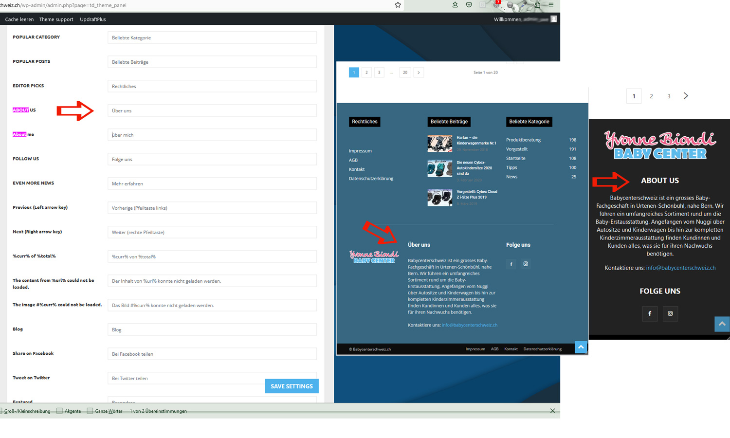 The domain is https://blog.babycenterschweiz.ch Best regards Uwe
-
This reply was modified 3 years by
taketwo10.
 positivenewsfoundation
 Hi Calin, could you please have a look also to our mobile blogposts?
we ran into some problems with mobile about a year ago, and had it fixed by a 3rd party because we could not figure it out. Our website after the help looked perfect on mobile homepage and blog pages alike.
Between a year ago and some theme updates further, the mobile blog page changed. We just
noticed. The mobile home page of https://positivenewsfoundation.org looks fab, but all the blog pages look weird.
How to fix this?
Kind regards,
Calin Hi taketwo10,
I just tested the option and for me seems to work ok – https://i.imgur.com/EiRDhsA.png – https://i.imgur.com/iJLDbe0.png but this will work only on mobile theme. If is a page or a cloud template it is possible to be set using the tagDiv Composer.
Thank you!
Calin Hi shahjada, I see that you are using the mobile theme plugin, so the mobile layout will be different. If you want the same layout as on desktop, then please disable the mobile theme plugin or if needs use it only for amp.
Hi mudassar120859, I checked your website and I do not see the mobile theme, but I see a litespeed cache and maybe you are using the mobile page template, in this case you’ll needed to be sure that your cache plugin cam deliver cache for mobile separately then desktop.
Is this problem persisting when you are logged in? If no, then the problem is related to the cache plugin.
Tank you!
shahjada I am facing the same as well.
Theme is not loading which is configured/designed for mobile devices, its rather loading a different one on its own.
 mudassar120859
After upgrading theme to atest version I am facing a very weired issue. Some time website show mobile theme on mobile sometime not. Sometime different header sometime different. I am really frustrated from this
 topmagazin
After upgrading to 12.6 – “general Theme Colors” are messed up. Although a color is specified in theme settings standard color “#4db2ec” or black is used for
– Mobile menu background
– buttons
– Links
– block-title backgrouns (td-block-title ) (–td_header_color is not defined –> black)
– and a few more
 Partha0000
 You provide me a wrong screenshot I just don’t mean it. I provide you the code you provided me a screenshot that is the WordPress by default button I just don’t mean it.
Actually, I need 2 Static button when user scroll the page the button will always be static. For this reason I write the code and its working other WordPress theme fine.
I provide you the login information in the previous session. Please login and go to edit a post. Then select HTML and best the code. Then you can get exact information what I mean by it. The code is below:
<div class=”fixed-buttons”>
<button id=”whatsapp-button”>
<i class=”fab fa-whatsapp fa-3x”></i>
</button>
<button id=”phone-call-button”>
<i class=”fas fa-phone fa-3x”></i>
</button>
</div>
<style>
.fixed-buttons {
position: fixed;
bottom: 20px; /* Adjust the distance from the bottom as needed */
left: 50%; /* Center the buttons horizontally */
transform: translateX(-50%);
z-index: 9999;
text-align: center;
}
.fixed-buttons button {
padding: 10px; /* Adjust the button size as needed */
margin: 5px; /* Adjust the button spacing as needed */
background-color: #0073e6; /* Adjust the button’s background color */
color: black; /* Adjust the button’s text color */
border: none;
cursor: pointer;
}
.fixed-buttons button i {
margin-right: 5px; /* Add spacing between the icon and text */
}
.fixed-buttons button:hover {
background-color: #0054a9; /* Adjust the button’s background color on hover */
}
@media (max-width: 768px) {
.fixed-buttons {
left: 20px; /* Adjust the left distance for mobile and tablet screens */
bottom: 5%; /* Center the buttons vertically */
transform: translateY(-50%);
display: flex;
flex-direction: column;
}
.fixed-buttons button {
padding: 5px; /* Make the buttons smaller for mobile and tablet screens */
margin: 5px 0; /* Add spacing between the buttons */
}
.fixed-buttons button i {
font-size: 24px; /* Increase the icon size for mobile and tablet screens */
}
}
</style>
 Anamaria
 Hello,
The page loading speed can depend on many factors, and each website is unique from this point of view. Let me explain some of these factors and maybe they give you some starting points for optimizing your website. A good choice for the page speed, could be the mobile layout which contains fewer elements because it can improve a bit your page speed.
There are many optimization guides provided by our users here in the forum, some made by us; you could check some of them
– https://www.infophilic.com/get-almost-100-pagespeed-newspaper-theme/
– https://forum.tagdiv.com/cache-plugin-install-and-configure/
– https://forum.tagdiv.com/how-to-make-the-site-faster/
– https://forum.tagdiv.com/topic/high-number-of-ajax-request/
– https://forum.tagdiv.com/topic/score-100100-pagespeed-with-newspaper-wordpress-theme/
– https://www.andraware.com/wp-rocket-for-newspaper-theme/
– https://forum.tagdiv.com/topic/page-speed-guide-for-2023-beginners-and-advanced/
– https://forum.tagdiv.com/topic/newspaper-theme-speedify-your-website/
– https://forum.tagdiv.com/topic/tutorial-chriss-custom-optimizations-for-functions-php-etc/
– https://forum.tagdiv.com/cloudflare-cdn/
– https://forum.tagdiv.com/topic/theme-causing-high-cpu-usage-2/
– https://forum.tagdiv.com/topic/sql-querys-high-cpu/
– https://forum.tagdiv.com/topic/newspaper-theme-slow-to-respond/
– https://premium.wpmudev.org/blog/optimizing-your-wordpress-database-a-complete-guide/
– https://underconstructionpage.com/optimize-wordpress-database/
– https://crunchify.com/better-optimize-wordpress-database-all-in-one-guide/
Also, pagespeed is not covered by support -> https://forum.tagdiv.com/newspaper-theme-support/
If you use Wp Rocket, you can try to exclude the following files
/jquery-?[0-9.](.*)(.min|.slim|.slim.min)?.js
/jquery-migrate(.min)?.js
/wp-content/plugins/td-composer/legacy/Newspaper/js/tagdiv_theme.min.js
tdBlocksArray
To be able to optimize and to remove CLS and LCP please check these guide => https://developers.google.com/web/tools/lighthouse/ -> https://www.sqlpac.com/en/documents/google-pagespeeds-lighthouse-6-new-features-lcp-cls.html -> https://web.dev/lighthouse-whats-new-6.0/ -> https://web.dev/lcp/ -> https://web.dev/cls/
Thank you!
Bettina  techplaymate
I just installed the new theme update and it broke my header only displaying code now as following :
[tdb_header_weather icon_color=”#ffffff” temp_color=”#ffffff” loc_color=”#ffffff” inline=”yes” tdc_css=”eyJhbGwiOnsibWFyZ2luLXJpZ2h0IjoiMzIiLCJkaXNwbGF5IjoiIn0sImxhbmRzY2FwZSI6eyJtYXJnaW4tcmlnaHQiOiIyMCIsImRpc3BsYXkiOiIifSwibGFuZHNjYXBlX21heF93aWR0aCI6MTE0MCwibGFuZHNjYXBlX21pbl93aWR0aCI6MTAxOSwicG9ydHJhaXQiOnsibWFyZ2luLXJpZ2h0IjoiMjAiLCJkaXNwbGF5IjoiIn0sInBvcnRyYWl0X21heF93aWR0aCI6MTAxOCwicG9ydHJhaXRfbWluX3dpZHRoIjo3Njh9″ location=”New York” f_temp_font_line_height=”28px” f_loc_font_line_height=”28px”][tdb_header_date inline=”yes” date_color=”#ffffff” tdc_css=”eyJhbGwiOnsibWFyZ2luLXJpZ2h0IjoiMzIiLCJkaXNwbGF5IjoiIn0sImxhbmRzY2FwZSI6eyJtYXJnaW4tcmlnaHQiOiIyMCIsImRpc3BsYXkiOiIifSwibGFuZHNjYXBlX21heF93aWR0aCI6MTE0MCwibGFuZHNjYXBlX21pbl93aWR0aCI6MTAxOSwicG9ydHJhaXQiOnsibWFyZ2luLXJpZ2h0IjoiMjAiLCJkaXNwbGF5IjoiIn0sInBvcnRyYWl0X21heF93aWR0aCI6MTAxOCwicG9ydHJhaXRfbWluX3dpZHRoIjo3Njh9″ f_date_font_line_height=”28px”][tdb_header_user inline=”yes” logout_tdicon=”td-icon-logout” usr_color=”#ffffff” log_color=”#ffffff” log_ico_color=”#ffffff” tdc_css=”eyJhbGwiOnsibWFyZ2luLXJpZ2h0IjoiMTQiLCJkaXNwbGF5IjoiIn19″ photo_size=”19″ f_usr_font_line_height=”28px” f_log_font_line_height=”28px” show_log=””][tdb_mobile_horiz_menu inline=”yes” menu_id=”” f_sub_elem_font_weight=”” text_color=”#ffffff” f_elem_font_size=”11″ f_elem_font_weight=”400″ tdc_css=”eyJhbGwiOnsibWFyZ2luLWJvdHRvbSI6IjAiLCJkaXNwbGF5IjoiIn0sInBvcnRyYWl0Ijp7ImRpc3BsYXkiOiJub25lIn0sInBvcnRyYWl0X21heF93aWR0aCI6MTAxOCwicG9ydHJhaXRfbWluX3dpZHRoIjo3Njh9″ text_color_h=”#4db2ec” elem_padd=”0″ f_elem_font_line_height=”28px” elem_space=”16″ sub_left=”-18″ f_sub_elem_font_line_height=”1.2″ main_sub_tdicon=”td-icon-down”]
[tdb_header_logo image=”” image_retina=”” align_vert=”content-vert-center” align_horiz=”content-horiz-center” image_width=”eyJwb3J0cmFpdCI6IjIyMCJ9″]
[tdb_header_menu mc1_title_tag=”p” main_sub_tdicon=”td-icon-down” sub_tdicon=”td-icon-right-arrow” mm_align_horiz=”content-horiz-center” modules_on_row_regular=”20%” modules_on_row_cats=”25%” image_size=”td_324x400″ modules_category=”image” show_excerpt=”none” show_com=”none” show_date=”” show_author=”none” mm_sub_align_horiz=”content-horiz-right” mm_elem_align_horiz=”content-horiz-right” inline=”yes” menu_id=”” mm_align_screen=”yes” f_elem_font_family=”” f_elem_font_size=”eyJwb3J0cmFpdCI6IjExIn0=” mm_width=”1300″ mm_subcats_bg=”#ffffff” mm_elem_border_a=”0 1px 0 0″ mm_elem_padd=”eyJhbGwiOiIycHggMjJweCIsInBvcnRyYWl0IjoiMCAxNHB4In0=” mm_sub_padd=”eyJhbGwiOiIxNnB4IDAiLCJwb3J0cmFpdCI6IjE0cHggMCJ9″ f_title_font_size=”eyJhbGwiOiIxNSIsImxhbmRzY2FwZSI6IjE0IiwicG9ydHJhaXQiOiIxMyJ9″ f_title_font_line_height=”1.2″ art_title=”3px 0″ f_mm_sub_font_size=”eyJhbGwiOiIxMyIsInBvcnRyYWl0IjoiMTEifQ==” mm_child_cats=”10″ mm_elem_border=”0 1px 0 0″ mm_height=”eyJhbGwiOiIzNDUiLCJsYW5kc2NhcGUiOiIzMDAiLCJwb3J0cmFpdCI6IjI0MCJ9″ mm_sub_width=”eyJsYW5kc2NhcGUiOiIxNjAiLCJwb3J0cmFpdCI6IjE0MCJ9″ mm_padd=”eyJwb3J0cmFpdCI6IjE0In0=” modules_gap=”eyJwb3J0cmFpdCI6IjE0In0=” elem_padd=”eyJwb3J0cmFpdCI6IjAgMTJweCJ9″ f_elem_font_line_height=”eyJwb3J0cmFpdCI6IjQ4cHgifQ==” video_icon=”eyJwb3J0cmFpdCI6IjI0In0=” all_modules_space=”26″ tds_menu_sub_active=”tds_menu_sub_active1″ tds_menu_sub_active2-line_color=”” tds_menu_active=”tds_menu_active1″][tdb_header_search inline=”yes” toggle_txt_pos=”after” form_align=”content-horiz-right” results_msg_align=”content-horiz-center” image_floated=”float_left” image_width=”30″ image_size=”td_324x400″ show_cat=”none” show_btn=”none” show_date=”” show_review=”” show_com=”none” show_excerpt=”none” show_author=”none” art_title=”0 0 2px 0″ all_modules_space=”20″ tdicon=”td-icon-magnifier-big-rounded” icon_size=”eyJhbGwiOiIyMCIsInBvcnRyYWl0IjoiMTgifQ==” tdc_css=”eyJhbGwiOnsiZGlzcGxheSI6IiJ9LCJwb3J0cmFpdCI6eyJtYXJnaW4tdG9wIjoiMSIsImRpc3BsYXkiOiIifSwicG9ydHJhaXRfbWF4X3dpZHRoIjoxMDE4LCJwb3J0cmFpdF9taW5fd2lkdGgiOjc2OH0=” modules_on_row=”eyJhbGwiOiI1MCUiLCJwb3J0cmFpdCI6IjUwJSIsImxhbmRzY2FwZSI6IjUwJSJ9″ meta_info_horiz=”content-horiz-left” form_width=”600″ input_border=”0 0 1px 0″ modules_divider=”” form_padding=”eyJwb3J0cmFpdCI6IjIwcHggMjBweCAyMHB4IiwiYWxsIjoiMzBweCJ9″ arrow_color=”#ffffff” btn_bg_h=”rgba(0,0,0,0)” btn_tdicon=”td-icon-menu-right” btn_icon_pos=”after” btn_icon_size=”7″ btn_icon_space=”8″ f_title_font_family=”” f_cat_font_family=”” f_cat_font_transform=”uppercase” f_title_font_weight=”” f_title_font_transform=”” f_title_font_size=”13″ title_txt_hover=”#4db2ec” results_limit=”6″ float_block=”yes” icon_color=”#000000″ results_border=”0 0 1px 0″ f_title_font_line_height=”1.4″ btn_color=”#000000″ btn_color_h=”#4db2ec” all_underline_color=”” results_msg_color_h=”#4db2ec” image_height=”100″ meta_padding=”3px 0 0 16px” modules_gap=”20″ mc1_tl=”12″ show_form=”yes” f_meta_font_weight=”” h_effect=”” results_msg_padding=”10px 0″ f_results_msg_font_style=”normal” video_icon=”24″ modules_divider_color=”” modules_border_color=”” btn_padding=”0″ form_border=”0″ form_shadow_shadow_offset_vertical=”3″ results_padding=”0 30px 30px” btn_bg=”rgba(0,0,0,0)” icon_padding=”eyJhbGwiOjIuNCwicG9ydHJhaXQiOiIyLjYifQ==”]
Partha0000Hello sir I want to add a code using HTML and CSS in this theme. But this code is not working. But I try another wordpress website where is install another themes in this another themes it’s working fine.
I just want to add two button in a specific post. The post will be sure to static button. It’s working another theme fine but in this newspaper things not work.
My website login username and password:
https://acallgirl.com/wp-admin
The code is in the below section:
<div class=”fixed-buttons”>
<button id=”whatsapp-button”>
<i class=”fab fa-whatsapp fa-3x”></i>
</button>
<button id=”phone-call-button”>
<i class=”fas fa-phone fa-3x”></i>
</button>
</div>
<style>
.fixed-buttons {
position: fixed;
bottom: 20px; /* Adjust the distance from the bottom as needed */
left: 50%; /* Center the buttons horizontally */
transform: translateX(-50%);
z-index: 9999;
text-align: center;
}
.fixed-buttons button {
padding: 10px; /* Adjust the button size as needed */
margin: 5px; /* Adjust the button spacing as needed */
background-color: #0073e6; /* Adjust the button’s background color */
color: black; /* Adjust the button’s text color */
border: none;
cursor: pointer;
}
.fixed-buttons button i {
margin-right: 5px; /* Add spacing between the icon and text */
}
.fixed-buttons button:hover {
background-color: #0054a9; /* Adjust the button’s background color on hover */
}
@media (max-width: 768px) {
.fixed-buttons {
left: 20px; /* Adjust the left distance for mobile and tablet screens */
bottom: 5%; /* Center the buttons vertically */
transform: translateY(-50%);
display: flex;
flex-direction: column;
}
.fixed-buttons button {
padding: 5px; /* Make the buttons smaller for mobile and tablet screens */
margin: 5px 0; /* Add spacing between the buttons */
}
.fixed-buttons button i {
font-size: 24px; /* Increase the icon size for mobile and tablet screens */
}
}
</style>
Anamaria Hi,
The mobile theme comes with its own templates for page, post, category, etc so your current templates from the desktop theme will get converted to the mobile theme layout, the page content is made without builders in mobile editor => https://www.screencast.com/t/xbgZG8kH also, the options that are provided to edit the mobile theme version are limited (this keeps the things simple)).
So, if you want to use the cloud templates, then you need to disable the mobile theme and AMP plugins, and then use the responsive version.
You can disable the mobile theme plugin on the pages from the Gutenberg editor using the following option => https://www.screencast.com/t/axXRJsWby
Also, please check this topic where I explained each mobile version -> https://forum.tagdiv.com/topic/mobile-version-not-working-properly-2/ -> https://forum.tagdiv.com/topic/amp-pages-not-working-well-with-this-theme/ and choose what mobile version you want.
Thank you!
Bettina Hello @cassiano12 !
Yes, or the cache plugin. We have 3 options for mobile versions that you can use:
1. Responsive version: A responsive version of your website looks similar to the desktop version. TagDiv Composer is used to edit the page.Click on the mobile viewport: https://www.screencast.com/t/XDQJedlggSB. There, you can see your mobile version and edit or adjust the elements to look better.
2. Mobile pages: https://tagdiv.com/newspaper-10-3-7-update-brings-customizable-and-fast-mobile-pages
3. Mobile theme plugin: The Mobile Theme is a performance-optimized theme included in the main Newspaper theme that only loads on mobile devices. It comes with its own templates and designs for pages, posts, categories, etc., so your current templates from the desktop theme will get converted to the mobile theme layout. Please see https://forum.tagdiv.com/the-mobile-theme/ and https://forum.tagdiv.com/mobile-theme-introduction/ for more information.
A full explanation is here: https://www.youtube.com/watch?v=SpGkOnJeNZY
If you need to use the mobile version 1 or 2, then you need to uninstall the Mobile Theme plugin and AMP.
Thank you!
 joshimilestoner
 The amp version and mobile theme is not working properly and the table of content many things remains unchanged the menu getting changed on mobile after almost every scroll please check and help me.



