
- NewsmagSmart list ads
- NewsmagIntroduction
- NewsmagMain menu
- NewsmagLogo & Favicon
- NewsmagHeader ads
- NewsmagSmart sidebar
- NewsmagSharing buttons
- NewsmagCategory tag on modules/blocks
- NewsmagBackground introduction
- NewsmagTheme colors introduction
 croboy
 Hello,
This is not an issue of image optimization
Here is code from mobile theme:
Only image width=”696″ height=”392″ is preloaded.
I don’t know why multiple images sizes are used on mobile theme.
Can that be changed in theme panel? I mean can I define that only one image size is used for mobile theme for featured image.
Thank you

 Anamaria
 Hello,
We no longer recommend using AMP because it is deprecated https://developer.bigcommerce.com/docs/storefront/wordpress/platform-integration/enabling-amp
For mobile theme + Amp the content need to be added in Mobile Editor -> https://www.screencast.com/t/xbgZG8kH
Please check this topic where I explained each mobile version -> https://forum.tagdiv.com/topic/mobile-version-not-working-properly-2/ -> https://forum.tagdiv.com/topic/amp-pages-not-working-well-with-this-theme/ and choose what mobile version you want.
Also, please let me know what plugin for the cache you use now.
Thank you!
 Herodie
On our website for some time now, when entering from a mobile phone, things do not work as they should and the elements go out of place.
We did not find the solution until deactivating the AMP plugin. In the plugin it indicates that it is not compatible with tagdiv. Is that so? Can something be done?
 Bettina
 Hello @BLAY!
That’s strange because an update can’t delete your mobile pages from your backend.
Did you install a new demo on your website?
Thank you!
Anamaria Hello,
1. Usually, this happens with cache plugins. If the cache plugin does not have mobile support then the mobile theme version can be delivered instead.
Also, please let me know what plugin you use for the cache now.
2. Please progvide the linkt ot your website.
Thank you!
 BLAY
BLAY Hello Bettina,
Ok for the link
My mobile pages are assigned to the desktop pages , everything was ok until now but after the last update no mobile pages .
Could you help me ?
 Wriper
As mentoied in other topics with mobile menu i have the same issue.
After tap on it it just keep loading for a very long time, sometimes it loads sometimes it freeze.
Mobile menu is working fine only when no javascript is called in header .
I have tried deffering javascript but it didnt work.
Only thing that worked was delaying until interaction or after few seconds.
Also what worked was switching to mobile theme plugin BUT you are not compatibile with Cloudflare so this is not an option for us.
There is no issue with plugin conflicts this is happening also on clean website without plugins activated.
Website:https://www.zaujimavysvet.sk/
Other topics with this problem:
https://forum.tagdiv.com/topic/hamburger-menu-still-doesnt-work/
https://forum.tagdiv.com/topic/hamburger-menu-not-working-on-mobile/
 apbforum
Hi, I am using newspaper theme and have created a mobile page to display home page in mobile. Here are the issues I am seeing;
1) When I open the page on my mobile sometimes it shows the Mobile home page which I created and sometimes the actual home page (responsive) page will be displayed.
2) When I open homepage in my tablet it displays the horizontal version of my mobile page, where I am looking to display mobile page only on mobiles not on tablets.
Not sure how to limit the mobile page to be displayed only on mobile but not on tablets
Please let me know if you have any suggestions.Thanks a lot.
 frankiefop
Hello,
I have highlighted four issues I needed to fix below.
Site URL: https://converseer.com
1. After analysing my site, I realised fonts make up 57.8% of the total page size. This is a lot just for fonts. Please, how do I reduce this?
2. The DOM is very large and it’s causing high TBT time. How do I fix this – which HTML element do I need to fix or remove?
3. How do I preload the LCP image on the homepage? The theme is also using CSS background image, which I’ve realised can’t be preloaded. Is there an option to load these images inline instead?
4. The tagdiv JS file is very large and can’t be delayed. It should be more modular but everything seems to be in one big JS file. How do I optimise it? Is there any way you can load more of your CSS in an external file?
Please, I need help with this. I have been stuck, instead of creating content, I am stuck with optimisation. 👉 https://pagespeed.web.dev/analysis/https-converseer-com/ty7j496bq7?form_factor=mobile
See screenshots via the links:
i. https://paste.pics/dc62669811dc058f56da1886394f408e
ii. https://paste.pics/310b4a236e5dd1a960ad287335ce139e
iii. https://paste.pics/ed5381602eaea936e8b930e1c4deca66
iv. https://paste.pics/943b1b809d1c784b2d3b4b849b04c81b
v. https://paste.pics/ce6eb42f1377f5c2eff08c041d73f002
I know you’ll say speed optimisation is not covered by you, however, I am asking you to do it, just show me how, and I will but the one you can, please, I help by doing it.
Thank you.
Bettina Hello @BLAY!
No. It’s working. Please copy-paste the link manually in a new tab of your browser.
If you want to use mobile pages, then you should assign them to the desktop pages.
Thank you!
BLAY Hello Betina,
Fyi Your link for Mobiles pages is broken I obtained Error 404
On my website I have Mobile pages but for a few days I don’t have these mobile pages on my mobile phone but the desktop version !!! why ?
I don’t use mobile theme plugin and don’t use AMP and no new plugin only the new newspaper version
-
This reply was modified 2 years by
BLAY.
Anamaria Hi,
Did you add the logo in theme panel -> header for mobile?
If yes, please delete it from there.
Thank you!
Bettina Hello!
1. You should edit an article with the tagdiv composer and use the element Single Post Tags. Make sure you have tags assigned to your article as well. Also, check if you have a tag template in Cloud Template and set it global.
2. Please check the console if you have any errors when you click Save Settings.
A similar situation has already been discussed here; please check: https://forum.tagdiv.com/topic/theme-panel-settings-are-not-saving-2/
3. You can hide it on mobile, and you’ll have it on the other viewports. You can hide every element from the CSS tab: https://prnt.sc/1FJiMub9ke4s for each viewport: https://www.screencast.com/t/XDQJedlggSB
I recommend you turn this option on: https://app.screencast.com/R9qXYOO0g44lO before anything else.
4. You should place it in the content zone and not in the header or footer zones that are global, and it will display on all pages.
Thank you!
 GEORGI
 thank you for your support,but i try all and its not working:
on desctop version its ok but on the mobile not:
first the logo load good on mobile version and in some seconds going blurry again,its something like auto resize option.
can you help me with that?
best regards
GEORGI
 m
m Thank you, Paste After helped for mobile version.
The problem in the desktop version in the length of the border lines – they are higher than the border lines for other items. That can be also seen on your screenshot:
https://app.screencast.com/m7nvTkPlUXhOy?conversation=vNlQeVvc2sCLTtjLR9HUJ0
I want to make the border lines between items the same length.
Bettina Hello!
Sure. Follow the steps:
1. Add the element Single Post Views somewhere there. Copy and paste it after this element, as here: https://app.screencast.com/kbctcWo1U0XZH and delete the first one added before.
2. Apply these settings: https://app.screencast.com/m7nvTkPlUXhOy
3. These are the settings for the mobile viewport: https://app.screencast.com/MwRo5lxM1oNdr
Thank you!
 Craig
Craig I have fixed the incorrect block size issue, but the smile face at the bottom of my website on mobile remains. Feel free to see link to website, any page will show issue.
Thanks, Craig
 waleed9
Hello my dears, I hope everyone is well
I have some unfinished business that I wanted to inquire about
Of course, I use a Video News PRO https://blog.horrortape.com
1- Tags do not appear at the bottom of the article on a single page. I do not know how to display them https://prnt.sc/I1OXpyQTNzUt
I haven’t done anything related to tags since uploading the thame except adding tags when publishing and The tags page appears like this https://prnt.sc/A0rWhSKgsPp9
2- The THEME ACCENT COLOR does not change. I tried to change it several times, but it does not change It does not change from this same panel after I save it. When I refresh the page, its default color returns, and therefore the color does not change at all.https://prnt.sc/1cLgHdxoN3ba
3- Now, if Newsletter is still not working on the mobile, is the way to remove it from the mobile phone by deleting it from the mobile version from here? https://prnt.sc/BA2wXUgwJvu5
Or do I need to intervene in the code or something else?
4- Also, is the contact form loaded on all pages? and therefore I can disable it from all pages except the Contact Us page? And how is that done?
Thank you very much
m I have solved it for mobile, but I can’t for desktop.
Do you have any instructions for desktop?
 anooona
Hello,
Trying to disable the “Share” for both desktop and mobile (And move the text to the left). Is this possible? Tried to disbale socials in backend and search in the documenation but couldn’t find any good information.
Website:
https://best-i-test.co/
 dharma3d
I’m having some undesired spaces in the hearder of my mobile theme, and I’m tryin to resolve that through custom css and that works when I load the mobile theme on desktop but on mobile phone I don’t see those changes.
For example
:
.td-a-rec-id-header_mob {
margin: 0;
}
This is how it looks on mobile phone:
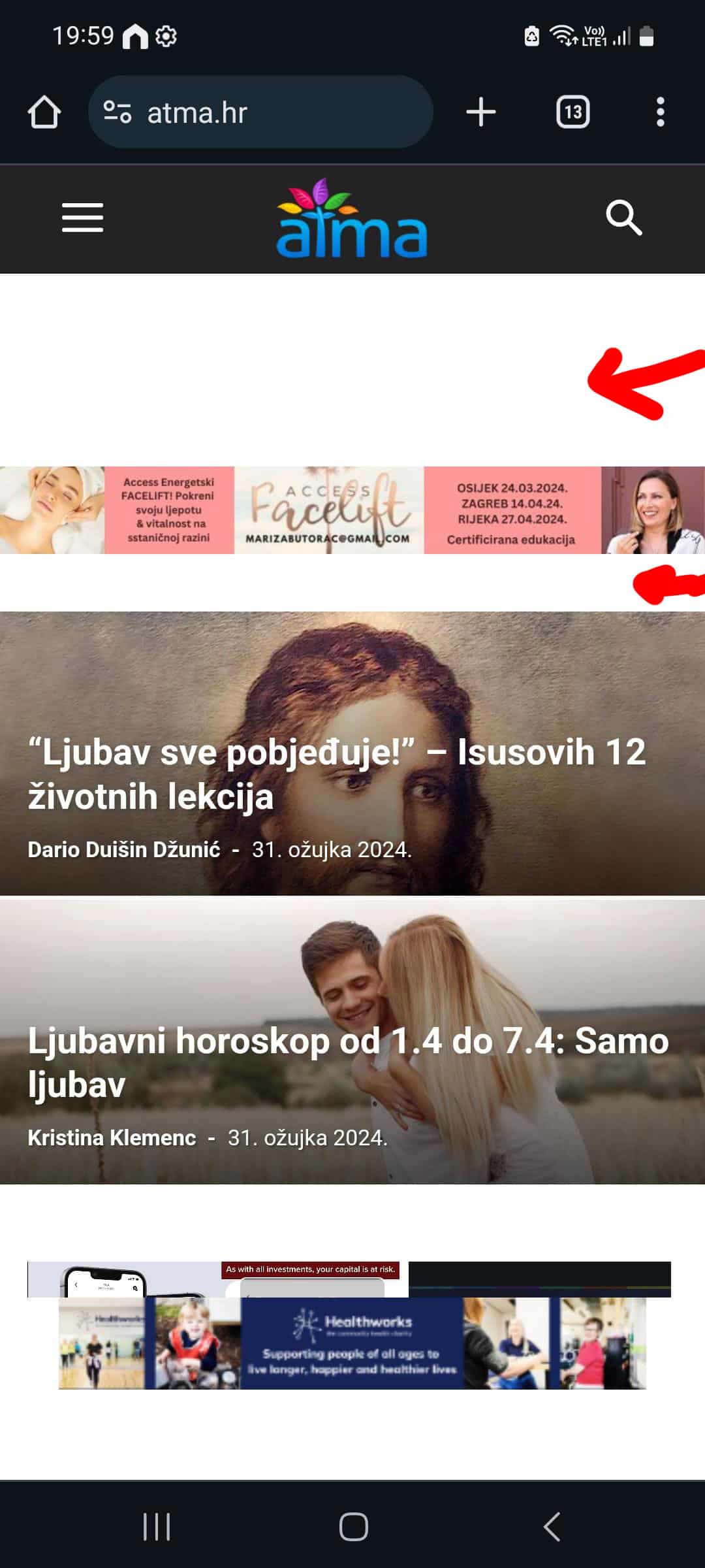
And this is the result is see in DevTools when I switch to mobile view:
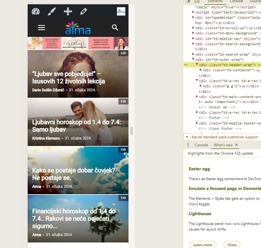
Or is there another way to get rid of those spaces?
Thanks!
My site is https://atma.hr/
 haipo
haipo Hi Bettina,
Thanks for your reply
However, as I wrote you, I have over 100,000 pages\
Adn now I’m preparing a migration to TAGDIV
And some images are not aligned with the mobile width
I cant scan 100,000 pages
I need a central CSS fix for that, as your mobile code is missing some images.
–
Thanks,
Yaron
croboyHello,
I noticed that with Permatters I get preload only for image dimension 696×392
On some mobile devices image is used in size 1200×675.webp
Any suggestion how to preload image based of used size or how to define fixed size for mobile template?
Problem is with LCP
Thank you
GEORGIhi,in my site,on the mobile version,i add logo but the resolution on zoom its come blurry,can you help me to fix that:
this my site:
https://newspoint.bg
its looking like:

i check another similar news paper and its loock good here example:

best regards
GEORGI
CraigHi Team,
Some of my blocks on mobile are not going to full width? In TDC they look fine and as expected and even on desktop they are fine.
Also I have some white space and a small smiley face under the footer.
Pages with the issues are:
http://www.newzealandguide.co
& https://newzealandguide.co/category/destinations/south-island/
Let me know what you think?
Cheers, Craig
