
- TutorialsFrom WPBakery to tagDiv Composer
- TutorialsWhat is Ajax preloading?
 max-4
max-4 Hi,
It’s simple when you put the sticky header with the logo that already gives you 2 h1 tags plus 2 for mobile, then you have to deactivate 3 and leave only one, problem, that’s it you still keep 4 times the title tag and 4 times the Alt tag, and with respect to Google it’s forcing on the title and keywords at the same time, really bad for SEO.
 chaywood0896
 There is a Single Post Template. Within that option, there is a Mobile Template (and only one). It is the Mobile Template that works most of, but not all of, the time. There appears to be an option to not have a separate Mobile Template for posts, but to have a mobile version of the Single Post Template (this is not currently used). Is that a better option that might avoid this problem.
 Ishola
The Mobile Menu Modal seems to be skipping a few of my mobile responsive pages. Am I missing a global switch somewhere? Thanks.
 birkasi
 Hi Calin,
Hi Calin. I have the same situation, but I only see it from my mobile phone. Can the exclusion you suggested solve the problem for me? I switched to Cloudflare on Friday, also to speed up the website. Apparently – although I know it’s part of the support, but I’ll give it a try because I failed to solve it – after minifying the javascript and css files, one of my important ads (the javascript code is placed in the footer because it’s displayed as a bottom ribbon ad by a third party) doesn’t show up. Even after I turned off the minifying, I still couldn’t get it to revert. Do you know what could be the conflict? Thank you very much!
 haipo
haipoHi Team
The elements in my post header look great in desktop
but when showing in mobile, the category tag loses his row, althaugh ther is plenty of room
I changed the customing to many differen layout of inner-row
But I don’t manage to align it to one row.
–
Please look at these examples:
1. in desktop – looking great
2. In mobile – the category tag goes one line below
–
Thanks
Yaron
 eman
eman Hello and thank you,
unfortunately, after deactivating the mobile and AMP plugin, the problem is still there!
The website no longer displays in mobile version, without doing anything, the mobile display changes over time.
How can this happen?
IsholaI think I’m getting mixed up. To use the responsive version of the Newspaper template, do you need to:
1) Create and assign a global mobile template in CLOUD TEMPLATES (which you then edit with TDC)? Do you have to create anything at all?
or
2) Do you just edit the responsive version that is in the Viewport, and you’re done? Your mobile look is done?
 maidigitalcreations
Website: maiwanderlustlife.com
I don’t understand where I go to change this. I made the mobile version look exactly the way I wanted it too (header and footer = white background, menu = blue background). The blog posts look different.
Issues/Questions:
1. Header and footer are not white on blog post.
2. The menu color is different on the blog post.
3. How do I change the category label color?
4. Is the theme panel: mobile theme section where I make changes because I reviewed it and I don’t understand where the different colors came about.
 stringbenderb5
Can you please watch the short video below to see the issue?
How can this be fixed?
 rahuldas
Can I make my mobile menu from
this- https://imgur.com/mTy7s0d
to this- https://imgur.com/Z73yFlC
 Sikandar
 The global header you are seeing and the one I have set, and seeing on mobile are different. Is this a cache problem? Or Something else?
Header: https://imgur.com/a/nf2raqG
 Bettina
 Hello @Sikandar!
There was a hidden modal popup element in the mobile viewport that should be deleted.
Thank you!
 Anamaria
 Hi,
Please let me know what template you use for the header. If I checked seems there you have a standard template, but somehow the header template if also loaded, so you need to edit the header template from the cloud template with tagdiv Composer, and delete the bookmark also, for mobile -> https://i.imgur.com/YW7NjRJ.png
Thank you!
Anamaria Hello,
You need to edit the page called Mega Menu Mobile and delete the button https://i.imgur.com/JP9a8KK.png with a right-click.
Please let me know the results.
Thank you!
chaywood0896 Please (a) review my screenshots and (b) try the same thing yourself on multiple mobile devices, so you understand what the problem is. Thank you.
Anamaria Hello,
You can import whatever template you like from the cloud template for header, footer, homepage, etc.
Check our documentation here: https://forum.tagdiv.com/how-use-tagdiv-cloud-library-templates/
You can change that color in the tagdiv composer: https://app.screencast.com/Zeot2ydVHgKZg
Edit your article with the TagDiv Composer; click on that element, and you can see those settings.
Also, you can global colors -> https://forum.tagdiv.com/tagdiv-composer-website-manager/
Please follow the video to see where you can find and build your sticky header on mobile and desktop too: https://www.screencast.com/t/l6v2Belt
Thank you!
Bettina Hello @eman!
We have 3 options for mobile versions that you can use:
1. Responsive version: A responsive version of your website looks similar to the desktop version. TagDiv Composer is used to edit the page.Click on the mobile viewport: https://www.screencast.com/t/XDQJedlggSB. There, you can see your mobile version and edit or adjust the elements to look better.
2. Mobile pages: https://tagdiv.com/newspaper-10-3-7-update-brings-customizable-and-fast-mobile-pages
3. Mobile theme plugin: The Mobile Theme is a performance-optimized theme included in the main Newspaper theme that only loads on mobile devices. It comes with its own templates and designs for pages, posts, categories, etc., so your current templates from the desktop theme will get converted to the mobile theme layout. Please see https://forum.tagdiv.com/the-mobile-theme/ and https://forum.tagdiv.com/mobile-theme-introduction/ for more information.
A full explanation is here: https://www.youtube.com/watch?v=SpGkOnJeNZY
If you need to use mobile version 1 or 2, then you need to uninstall the Mobile Theme plugin and AMP.
From my point of view, if you don’t use the Mobile Theme plugin, then there is no reason or benefit to AMP. Unfortunately, AMP is not working with the cloud templates because the AMP’s layout is not fully customized.
The AMP version works best with default templates and not cloud templates. That’s why we integrated it with the Mobile theme plugin.
The feedback from our clients about AMP was negative and it is not used anymore, that’s why we didn’t add more customization options.
Thank you!
emanHello, I have a problem with the mobile version and it’s driving me crazy, I need help.
Here’s the setting in the options: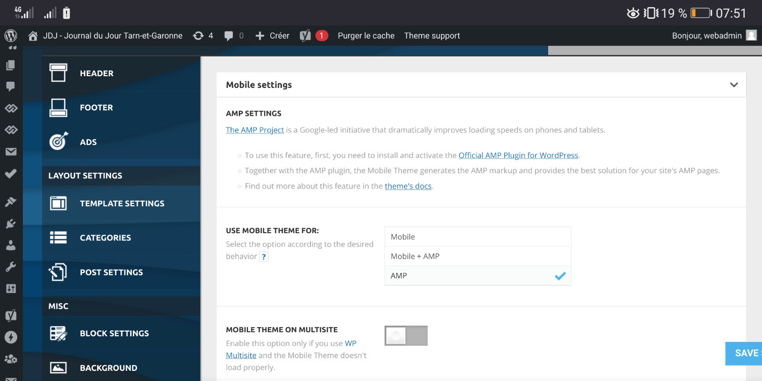
and here’s the rendering that appears and that I want to have : 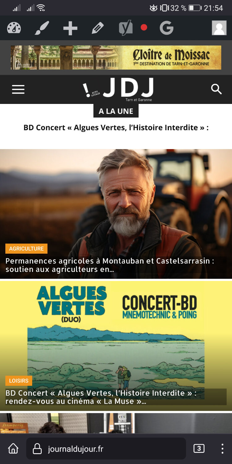
BUT! this rendering doesn’t stay, it displays another visual by itself!! and then looks like this :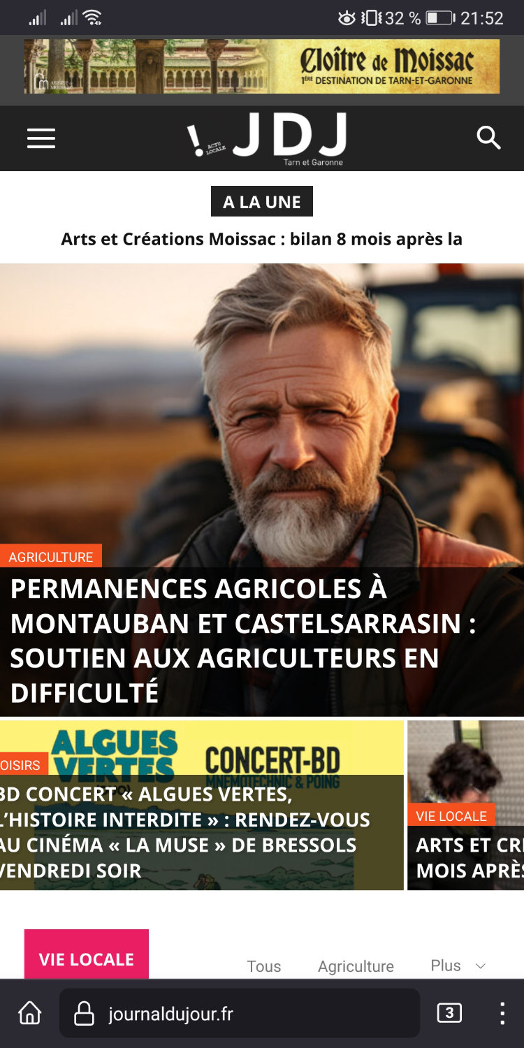
I have the cash WP plugin SUPER CHACHE, and I’m constantly forced to connect to the site admin and clear the cache to get the right version! but it never stays in place!
PLease help
Thank you
 villu
villu Hi, thanks for the early replay. In mobile is working because I have the AMP plugin. It’s in desktop where we have the problems
haipo Hi Anamaria
The problem is here again
and now I can replicate the root cause, but I don’t manage to fix it:
If I add a sticky row and add a menu in it, then the mobile menu disapears.
I tried to bypass this problem with no luck.
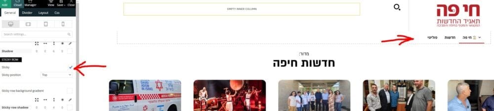
–
Maybe you have a resolution for that?
–
Thanks,
Yaron
haipoHi team
When using the RTL template
And display in bobile
The mbile header shows and then disapears after one second.
I didn’t find a way to make it stable.
–
Please advise how to resolve that.
Example:
https://dev2.haipo.co.il/item/485841
–
Thaks
Yaron
 Ahmet Hakan Kablama
I built menu for Mobile and Desktop. However, I want to hide the built-in icon element from logged in users. There is no built-in setting for this. Is there some kind of “Extra class” for this?
 Calin
Calin Hi,
I understand. I asked a developer about this situation to see what can be done to resolve this situation on mobile per title article element. I will provide here the answer that I will received!
Thank you!
chaywood0896 The issue is extensively detailed above. I will not provide cpanel access unless you can provide a very specific reason why what would be necessary. The first step should be for you to review all the details I have provided and see the problem for yourself on your own mobile device. Once you have confirmed we agree on the problem, and you still cannot tell why your theme is doing this without direct access to the website, then I will consider providing access the WordPress instance. Thanks.
To recap (although I have provided screenshots above), sometimes when viewing a page on mobile, on different browsers, the formatting is wrong (it extends beyond the edge of the page). This does not occur on all pages. It is usually, though not always, fixed by a refresh. It happens to pages that have just been published, so therefore there is no caching problem. Pages revert to this problem later. I use CloudFlare, but it is not a caching problem there either; I regularly purge the entire cache.
Anamaria Hello,
You have the mobile theme plugin activated. There are two options:
One disable the plugin , and then will work or two disable the mobile theme only for those pages from here -> https://i.imgur.com/d3kTBRf.png
Thank you!



