
- ApiPractical example – How to add a new Block and Module
- ApiAPI – Smart Lists – Introduction
- ApiAPI – Category top section style – Introduction
- ApiAPI – Category top section template – Introduction
- Apitd_api_module::update
- Apitd_api_module::add
- ApiAPI – Modules – Introduction
- ApiUsing the Theme API in plugins
 Anamaria
 Hi,
Seems you have ads https://i.imgur.com/jVVB7A1.jpg -> https://i.imgur.com/BC9JZRh.png
Also, for mobile https://i.imgur.com/rMph1IF.png -> https://i.imgur.com/MvAg33j.png
Thank you!
 freakkz
 okay where can i find the mobile theme plugin to disable?
 libertylens
 Hi Bettina,
1. I want to remove the large space that is found on the top of the mobile site.
2. I want to insert a space in the header where a leaderboard ad can be inserted.
Does that help?
Thanks,
Ken
 Southview92
 hi, i have put it there but for some reason no adds are showing here https://www.in2town.co.uk/grantham-news/man-74-arrested-in-grantham/
also, how do i do this for mobile site
 dimitrisv
 I am not quite getting it.
Can I hide the existing menu column for the two types of tablet and have visible for the two type the bottom row (and then hide the bottom row in the desktop and mobile versions)?
It will be much better, easier to just modify the break point of the mobile menu, so say, that if the width of the screen is less than 1000 pixels then the mobile menu will be activated. Where can I change this breakpoint?
 gabriele342
Hi, I’m writing to get information about how your theme works, I wanted to know:
– if when I select a pre-set site it will modify the color palette, the headers and also fuck other previously created pages (otherwise I wanted to know how to create pages with the same template);
– why the template of the pages changes from mobile, and if so, how are two pairs of the page created, one for desktop and one for mobile so that both are used if the person visits the site from one device or another.
the problem concerns a page that changes template depending on whether it is selected from desktop or mobile
images
Anamaria Hi,
You have H1 on the logo for desktop and mobile, so please edit the header template and disable the h1 https://i.imgur.com/kxF9v1Y.png also on the sticky header.
Thank you!
 Calin
Calin Hello,
1. You have now the amp plugin but also the mobile theme plugin, but I understand that you want to use the responsive version, therefore non of those plugins are not required (you can disable the tagDiv mobile theme and amp plugin).
2. This is usually related to a cache or optimizing plugin that is interfering with the js from the theme. Is this situation always, for example when you are logged in (and the cache is not apply)? If yes, then please check the browser console to see if there are any errors.
Indeed, I checked the website pagination is working now (because you disable the mentioned options from LiteSpeed cache plugin).
For css I think that you can use some options but not all of theme and for js please try to exclude those:
/jquery-?[0-9.](.*)(.min|.slim|.slim.min)?.js

/jquery-migrate(.min)?.js

tagdiv_theme.min.js

tdBlocksArray
If this is not work please try this:

/jquery-?[0-9.](.*)(.min|.slim|.slim.min)?.js

/jquery-migrate(.min)?.js

tagdiv_theme.min.js

tdBlocksArray

tdb_globals

td_youtube_list_ids

iosSlider

/td-cloud-library/assets/js/js_files_for_front.min.js
Also, the amp is deprecated – https://i.imgur.com/gipeN7q.png
Thank you!
 Bettina
 Hello!
You can adjust the design of your website in the three viewports: desktop, tablet, and mobile. If you click here: https://www.screencast.com/t/XDQJedlggSB, You can also verify the mobile viewport and tablet viewport at https://www.screencast.com/t/YUVUcyrgh.
This is the setting: https://app.screencast.com/5Wm649fFumvya and can be different on every viewport.
Thank you!
dimitrisv Anamaria this cannot happen because the description is this.
What we like to do is to make the mobile menu (that appears underneath) to also appear in a similar manner for displays up to 1000 pixel wide.
It will be most helpful if you tell me where do I set the breakpoint for this to happen.
 0xid0
0xid0Hello,
I have an issue. In the big grid block, when i see it from a smartphone or tablet, the headline is too big and doesn’t appear entirely, but it looks nice from a computer. I attach a screenshot taken on a tablet to see the problem better.
Is there any way to limit the font size on mobile devices? thank you

 joeyfatstat
 Ok,#1 The mobile webpage is jacked and #2 my pagination doesn’t work even when all plugins are deactivated.
#1:
I just want my mobile site to look like this:
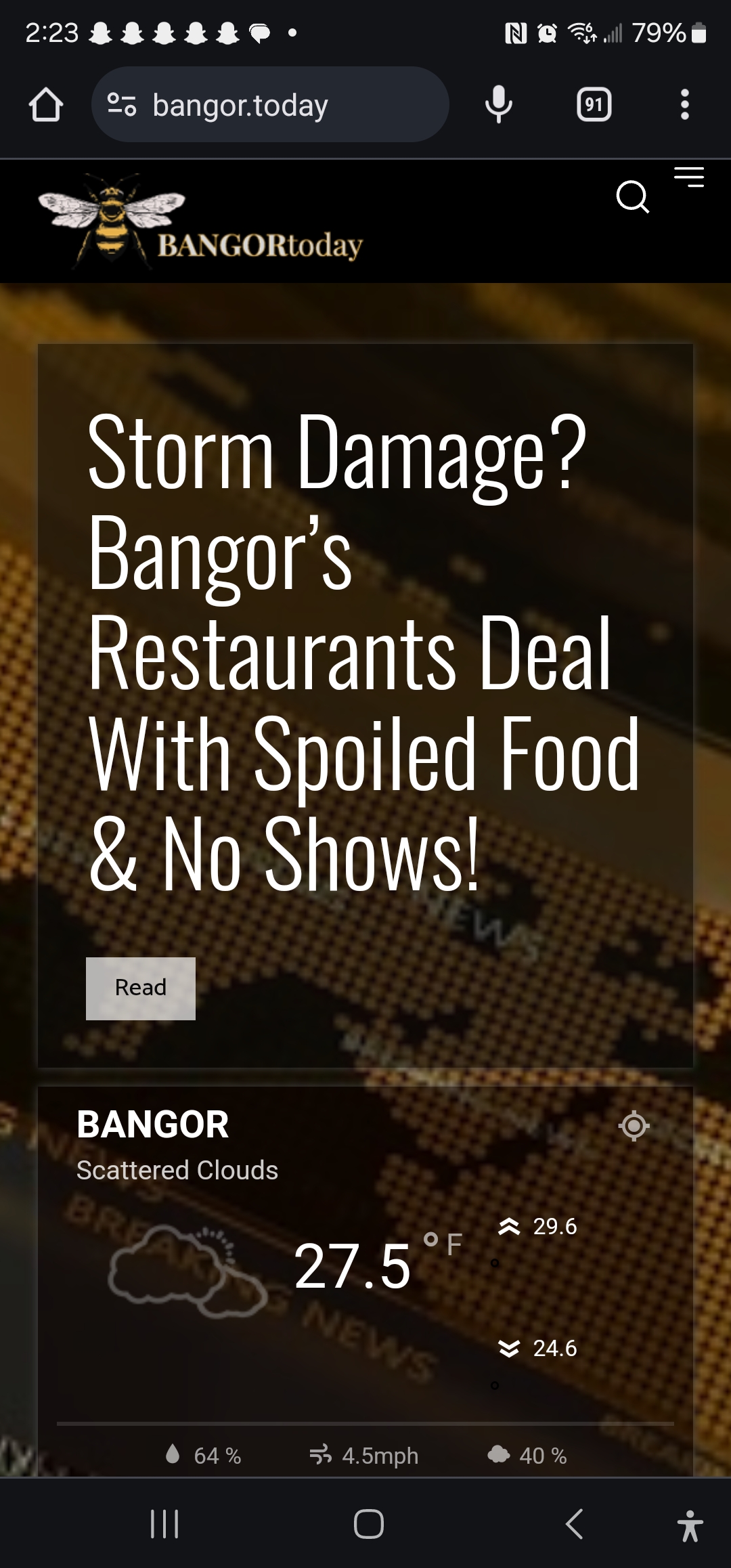
But the ONLY way it shows up WITHOUT showing “AMP” style is when “AMP” is selected. … AMP has to be selected in order for NON-AMP mobile site to work… ARGGGG!
This is the selection: 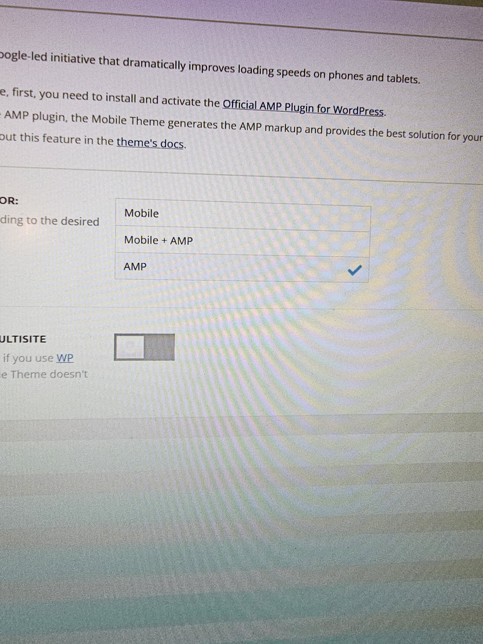
My website is currently configured with AMP turned on just t o show the webpage I designed. Even tho I do have the webpage on mobile showing up, something is wrong. I dont even want AMP activated. I cannot Deactivate AMP at all… If I Deactivate AMP, then AMP will show up. Its backwards and eternally frustrating
#2 My pagination doesnt work. I have deactivated all my plugins and still no pagination buttons will paginate. This is cray cray.
Please stay active in this support request because I need to get this done. Please!
dimitrisvThe issue has to do with this demo site:
https://demo.tagdiv.com/newspaper_interior_designer_pro/
Here is a description of the issue
https://www.loom.com/share/cbd2c3d2665244f3a06f82ad60cc3eae
Bettina Hello @gorthi!
You have the possibility to order the inner columns/columns: https://prnt.sc/HQXqP90oy3vJ
If you can’t re-order, then please check if you have this option enabled: https://forum.tagdiv.com/topic/how-to-re-order-the-post-page-on-mobile/
Thank you!
 gorthi
Hello
On RTL, when using a left sidebar for desktop, it shows before the content of article on mobile.
My question is how can I reverse them on mobile without recreating it ?
Anamaria Hi,
For this, I recommend creating a mobile page https://i.imgur.com/BFGmEKM.png -> https://tagdiv.com/newspaper-10-3-7-update-brings-customizable-and-fast-mobile-pages/, and setting the limit for block.
This is a video about Responsive Newspaper Theme, AMP & Mobile Theme, Mobile Pages & Templates -> https://www.youtube.com/watch?v=SpGkOnJeNZY
Thank you!
Bettina Hello @afratus !
The mobile pages are separate pages. This can be changed by choosing the option no index or by using a SEO plugin to choose exactly what you need to index. After the changes, you need to re-index your website.
Thank you!
Anamaria Hello,
Please check with the tagDiv Composer and disable the H1. For example, H1 from logo(header, footer, mobile, sticky): https://forum.tagdiv.com/topic/6-h1-tags-on-front-page-bing-have-deindexed-my-site/
Thank you!
 nangluv
Hi there,
I’m using single post 12 templete but the the featured image in single post was not responsive
Anyone can help me pls!
This’s PC design

This mobile

Tks all for reading and help!
libertylens Thanks, Bettina.
Here’s another problem. Not sure if this wasn’t added with TagDiv Composer or not.
I am trying to remove a large space at the top of a three pages (mobile view):
– https://libertylens.news/evidence/
– https://libertylens.news/bias-discrimination/
– https://libertylens.news/donors/
Also, for the header on these pages, I’d like to omit the category menu below the main header. Can you help me with this one?
Thank you,
Ken
 depatech
 Yes ok, but is there any hook for mobile content like
the usual for desktop?
 Bureauman
Hi. Looked through the topics but could not find what I was looking for.
Anyway to my question. I have a site I am producing with lots of comments per post. Nothing unique about that. I would however like to have four versions of the single post (desktop, tablet landscape, tablet portrait and phones) which showcases the comments to that specific post. In the desktop version everything works fine just as mobile version (created mobile version through the tagdiv builder) Great function by the way.
If I create new versions of the post template and call for the comments counter and comments form it will not work or rather the link down. Is it possible for a workaround to allow these commentlinks to work with several instances?
 afratus
Hi, I just realized that my mobile pages versions are being indexed by Google as a separate page. How do I handle mobile versions of pages and indexation? Should I tag them no index? Or set canonical to the desktop version?
Thanks.
Anamaria Hello,
You need to edit the mobile page from here -> https://i.imgur.com/BFGmEKM.png -> https://tagdiv.com/newspaper-10-3-7-update-brings-customizable-and-fast-mobile-pages/
This is a video about Responsive Newspaper Theme, AMP & Mobile Theme, Mobile Pages & Templates -> https://www.youtube.com/watch?v=SpGkOnJeNZY
Thank you!
Bettina Hello @jkakade!
To increase the page speed you can check these similar topics for more solutions:
– https://www.infophilic.com/get-almost-100-pagespeed-newspaper-theme/
– https://forum.tagdiv.com/topic/score-100100-pagespeed-with-newspaper-wordpress-theme/
– https://developers.google.com/speed/docs/insights/v5/about
– https://www.youtube.com/watch?v=tnkVapqhIHc
– https://www.xtechkr.com/optimize-newspaper-theme/
– Check those guides : https://web.dev/lcp/ – > https://www.sqlpac.com/en/documents/google-pagespeeds-lighthouse-6-new-features-lcp-cls.html -> > https://wp-rocket.me/google-core-web-vitals-wordpress/improve-cumulative-layout-shift
– https://forum.tagdiv.com/topic/to-high-cumulative-layout-shift-in-mobile-theme/
Please check the tutorials from those platforms gt metrix and Google Pagespeed Insights and I’m sure you can increase the page speed.
Please note that page speed is not covered by the support team: https://forum.tagdiv.com/newspaper-theme-support/
Thank you for understanding!



