
- ApiPractical example – How to add a new Block and Module
- ApiAPI – Smart Lists – Introduction
- ApiAPI – Category top section style – Introduction
- ApiAPI – Category top section template – Introduction
- Apitd_api_module::update
- Apitd_api_module::add
- ApiAPI – Modules – Introduction
- ApiUsing the Theme API in plugins
 Anamaria
 Hello,
If you want to add a custom code CSS for mobile then you can add it in Theme Panel -> Custom Code -> Advanced CSS => https://www.screencast.com/t/CRaBgpxghCw
Thank you!
 Bettina
 Hello!
If you will change the row of the featured image set as Stretch row by default it is the normal size of the image. If you want the featured image to be little than normal, then you can set the width of the row like this: https://www.screencast.com/t/VYKYvXwBq3 and for mobile: https://www.screencast.com/t/sLg2Ms5xt0A
Hope that helps you!
Thank you!
Anamaria Hi,
Using our theme you can choose from 3 mobile versions
-> mobile responsive => https://www.screencast.com/t/oJ2ShOp47
-> mobile theme plugin => https://forum.tagdiv.com/the-mobile-theme/
-> mobile page => https://tagdiv.com/newspaper-10-3-7-update-brings-customizable-and-fast-mobile-pages/
If you created the mobile pages with tagDiv Composer, then when you install the Mobile Theme plugin, your pages will be overwritten by the plugin (the mobile theme comes with its templates for page, post, category, etc so your current templates from the desktop theme will get converted to the mobile theme layout, the page content is made without builders in mobile editor => https://www.screencast.com/t/xbgZG8kH also, the options that are provided to edit the mobile theme version are limited (this keeps the things simple)).
This is a video about Responsive Newspaper Theme, AMP & Mobile Theme, Mobile Pages & Templates -> https://www.youtube.com/watch?v=SpGkOnJeNZY
So, the mobile responsive is what you see then that you select the viewport on phone => https://www.screencast.com/t/matV17hH, so some settings may apply for each viewport(where is the border blue), and others are not(where the border is black).
The mobile page has the mobile templates from Cloud Library => https://www.screencast.com/t/YCcZ8rL8
Mobile responsive version of the theme and the mobile page editor can be edit with tagDiv Composer, the mobile theme plugin not.
For example, you can have the mobile theme plugin activate and use the mobile page/mobile responsive version for the homepage/pages, but for the categories pages/404 page you can’t use the mobile page/mobile responsive version if you have the mobile theme plugin activate.
So, if you want to design the pages with tagDiv Composer, you can use the mobile page or mobile responsive version.
I hope this information helps you!
Thank you!
 cdpragazzi
Hello, i have insert ads code (ADSENSE) in a Theme Setting but not it works in a desktop mode.
Code insert in this section:
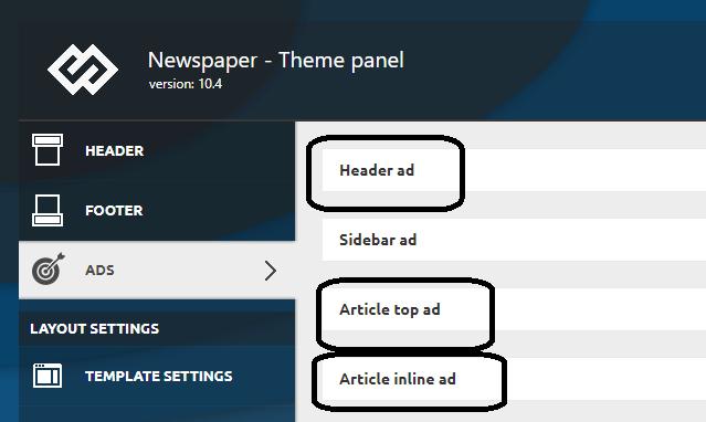
In a mobile i use a Theme Mobile (and has other settings) and it works.
 Balint
 I have the same problem.
I want to use 2 different codes for header banner, on for desktop and on for mobile, but If I paste the desktop ad code via TagDiv Composer to the Custom ad area the same code appears at the mobile are too.
What can be the solution?
 Allen Clein
When I click on the mobile view icon to edit the mobile view it doesn’t load anything. I can only see the desktop version. Please help. Details in the screenshot.
Picture:
 stelas2120023
 thx for your reply. (but I already know that)
I want to make the height of title + excerpt texts are equal to height of photo.
(for any size of device : desktop, notebook, tablet pc, mobile phone..whatever)
and I think there is no such fuction in the pre-set Tagdiv editor.
I need to change code. how can I do?
this is sample site. (the height of news title + excerpt texts are equal to height of photo regardless of device)
http://www.kyeonggi.com/
 Scholars
 Sorry it seems like the image link isn’t working, please see below
https://ibb.co/g6MHLyj – header mobile made global
https://ibb.co/nzZ9FCb – mobile plugin settings
https://ibb.co/nLJ6QRr – mobile front page (not what I want)
https://ibb.co/Pw4LtGY – desktop front page (I want the mobile version of the mainpage follow this mobile responsive page)
https://ibb.co/1Qv0rM1 – footer (what I want)
https://ibb.co/LNQsskg – another post sample that doesnt have the header/footer global template that I want
 Scholars
 Oh and one more screenshot of my mobile theme.
Anamaria Hello,
1. If you say that after clean the cache it works for a period of time, it means that the problem may be due to the caching plugin used. Also, please send the link to your website to inspect it.
2. Do you use a mobile page? Maybe the problem is also related to the cache plugin used.
Also, if you sent an email, please check if the address is correct contact@tagdiv.com and that you made a backup beforehand.
Thank you!
 thcp2020
Hi,
We want to change a page that needs custom Css but wondered how to add it in custom CSS for mobile viewport only.
We do not want to change the page for desktop, landscape or portrait view as they are fine.
Is there a way to add custom Css just for mobile?
All the best
Thomas
 Oldmagio
 Hello,
I’ve the same problem if Renu just when I see the website through the tablet. Then appears in the menu the “search” field that I removed from every template. I created mobile pages for every page and mobile themplates for categories and tags but is like if appears a 3rd kind of template for the resolution of the tablet that I don’t find.
Moreover: I don’t find the Theme Panel> Post settings> Featured Image> Disable SHOW FEATURED IMAGE and FEATURED IMAGE too.
It could be caused by the deactivation of AMP and TagDiv Mobile theme?
If yes I’ve a doubt:
I deactivated those plug-ins and I created in the past mobile pages for every page and mobile themplates for categories and tags. If I’ll activate those plug-ins will change the assignment of every mobile page that I just attributed?
Best regards
Scholars And just to add on, I activated the header and footer with a mobile page
 Tinystepsbabyclub
 Hi Bettina
It appears that the fix hasn’t worked and the non-mobile theme desktop version is once again appearing on the homepage only.
I sent a reply email to the team to see if they can again take a look into this for me but I have heard nothing back from them.
I’m contemplating removing the theme, which I don’t want to do, because the homepage of my site is looking pretty awful.
I just can’t understand why the rest of the site is displaying the mobile theme fine but the homepage won’t?
Regards
Sarah
ScholarsHi my website is http://www.scholarsinsider.com. The layout, header and footer of the desktop version of the homepage is different from the layout, header and footer of the mobile version of the homepage. Please advise.
Bettina Hello!
From what you describe it seems you have installed Mobile theme plugin. If you created the mobile pages with TagDiv Composer, then when you install Mobile Theme plugin, your pages will be overwritten by the plugin.
The Mobile Theme is a performance optimized theme included in the Newspaper main theme and it loads only for mobile devices. It comes with its own templates for page, post, category, etc so your current templates from the desktop theme will get converted to the mobile theme layout. For more details, please take a look here: https://forum.tagdiv.com/the-mobile-theme/
Better deactivate the plugin and see the results.
Thank you!
Anamaria Hello,
To display the ad in the header of mobile, you need to add it like in this video => https://we.tl/t-NyZtzjoYdm you need to edit with tagDiv Composer, select the viewport on phone, add a row and in the row add “ad box” and set the code for the ad.
Thank you!
 IliasK
Hi. For some reason, although I had setup the mobile home page to “Homepage Mobile – Magazine PRO” the page returns some minimal default layout.
Please advise. Many thanks.
url: https://news.b2green.gr
 The Inner North
Hi,
I’ve just launched and am having two major issues.
1) When I go to post an article on Facebook, via phone or desktop, it only comes up with the link to the website. No metadata, image, or description. When I clear the cache it might work but then it’ll stop working after a while. Something is messing around with it constantly. Twitter seems to work fine.
I’m also using Yoast SEO.
2) I have a few changes I made to the mobile homepage, mainly just the top articles structure, however it seems to be reverting back to desktop settings after a while.
Thanks! I’ve emailed with these issues but still have not had any response.
 robertb
On desktop my featured image is HUGE and takes up too much space.
How can I make it smaller and center aligned so there’s a better layout?
But, on mobile it is currently proper. I don’t want it to be smaller on mobile.
I need to only adjust the desktop layout so it’s way smaller.
Screenshot: https://drive.google.com/file/d/1sTO5iPqYxuvuPe52CmURVh8N0VbPVQHt/view?usp=sharing
I tried adjusting the width, but then it adjusts the width on mobile, too, which is a problem.
Thanks in advance!
robertb Thanks Vlad.
Unfortunately, I have played with the CSS options and I cannot get rid of the huge white space on mobile devices below the revolution slider row.
Screenshot: https://drive.google.com/file/d/14Gm4gabt_KQ9_kU8ng9xBZUAfPaZKdb8/view?usp=sharing
Issue 1: The bottom of the revolution slider should be touching the top of the dark gray row below it. The huge blank area of white space should not exist.
Issue 2: The revolution slider should fit to 100% of the screen width so there is no white space to the right/left of the slider image. I selected Row Stretch = Stretch Row and Content, but that didn’t work. Note that on desktop it properly fills the entire width/row.
The revolution slider element does not have any CSS settings.
On the row CSS (for mobile) I set the bottom margin at -50 and could see that it moved things up, but not nearly enough. If I do “-350” then I can see it moves it up, but then within the Editor, I can no longer see the row at all. And that is too big a number that something must be wrong. The same problem happens if I edit the column mobile CSS.
Please advise how to resolve this.
Note that using your previous screenshot, I was able to resolve the spacing issue between the image blocks below.
Thanks in advance.
 wgtimes
 I sent the email.
I think this issue is related with mobile page.
Few minutes ago, when I changed the mobile page I met the problem.
Thanks,
 drang
drang I’m afraid your screencast works because it’s taken from a desktop emulating a mobile device. As I said in my starting post “Mobile menu works properly on mobile view from a desktop, but on smartphones and tablets pages don’t fully load. Progress stops at around 40-50% so neither sticky columns nor mobile menu work“. Please try it on a real mobile device and even on tablet. You will notice that mobile menu doesn’t show, the viewport just shrinks. Even in your video I can see the viewport shrinking for an instant right before opening the hamburger menu.
 kkovacheva
A few days ago i activate the AMP plugin by tagdiv and my current mobile disappeared, nothing can be done at all, the site is very unsupported to AMP, in the theme settings there is a mobile + amp option to implement my theme, but so far, neither the home menu is same as on the desktop I tried to create a new mobile page, I try everything. Please give advice.
 designandtravel3@gmail.com
 There is another problem. I am using inline text as I’ve already mentioned the problem that text with image and column text shortcodes aren’t working.
.
Go to pages, open any mobile page, and use inline text. You won’t be able to see the increase in text size. No matter how many large numbers you put in the setting. The text size remains the same.
