
- ApiPractical example – How to add a new Block and Module
- ApiAPI – Smart Lists – Introduction
- ApiAPI – Category top section style – Introduction
- ApiAPI – Category top section template – Introduction
- Apitd_api_module::update
- Apitd_api_module::add
- ApiAPI – Modules – Introduction
- ApiUsing the Theme API in plugins
 Bettina
 Hello!
In your screenshot I can see desktop version, but in my picture is mobile viewport. Please do step by step what I said above and do not ruin your desktop version.
Let me know the results!
Thank you!
 anandvishwas
Why My site open mobile site sometime?
 pavel@earnware.com
 There’s more.. on mobile it loads a very weird version of the logo:  that cuts the logo..
-
This reply was modified 5 years by
pavel@earnware.com.
-
This reply was modified 5 years by
-
This reply was modified 5 years by
 sgupta
hello
We had checked everything but menus are not working on mobile not in footer also not side menu… kindly help me to fix this
thanks
 vistaradio
Hello,
I am trying to add an ad spot to the top of all my pages to be placed directly under the navigation bar.
I was able to do it no problems on the desktop pages but on the mobile pages, the edits just do not show.
I have added the ad spot to both my “Mobile header” as well as my “Desktop header, mobile view”.
Either will not show the ad spot – OR – anything i put under the navigation.
I have tried adding new rows, Inner row and even just using any element other than Ad spot … nothing takes on mobile view. Odd part, if I add it above the nav bar, it takes – just nothing below it!
Website is here: https://dev.mylethbridgenow.com/
Screenshots of my TagDiv composer.
You can clearly see the Ad Spot is there in its own row.
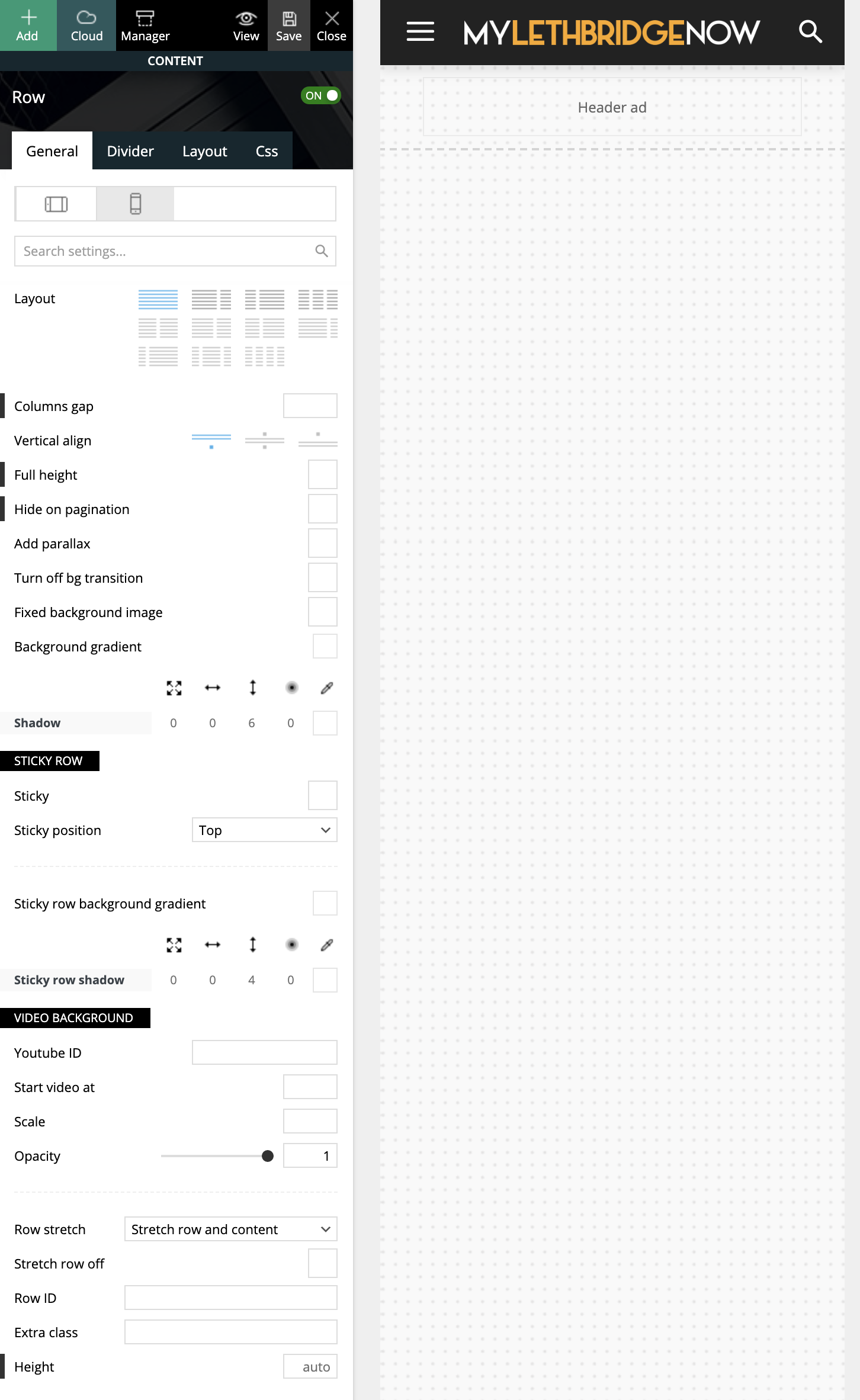
I have tried many attempts and many methods, which leads me here asking for guidance (or reporting a bug?!)
Cheers,
Ash
 sirms
sirms Do you hava a PHP snippet using the theme’s hooks? I need it so i can add my custom headers and menu. The Theme is wrapping my header so it dose not work on both desktop and mobile.
sirmsDo you hava a PHP snippet using the theme’s hooks? I need it so i can add my custom headers and menu. The Theme is wrapping my header so it dose not work on both desktop and mobile.
 Jimmy_X
Hello guys. I have updated Newspaper 10.4 on WordPress 5.7 and Social Media buttons doesn’t show on Newspaper Mobile version. Is just a blank space but if you touch that region links are active to social media. Never has that issue before.
Also, Instagram in footbar has’nt update for a while. Shows old posts. Acces Token is active and updated.
Thank you, I hope for fix(es).
Bettina Hello!
A responsive version of your website is looking similar like on desktop, then you need to deactivate Mobile Theme plugin, edit the page with TagDiv Composer, click on the mobile viewport: https://www.screencast.com/t/XDQJedlggSB ; there you can see your mobile version and you can edit the elements there.
Check and let me know if you use a mobile page assigned to your homepage. For more information about this mobile version please take a look in this article: https://tagdiv.com/newspaper-10-3-7-update-brings-customizable-and-fast-mobile-pages/
Hope that helps you!
Thank you!
Bettina Hello!
Make sure you did the right settings for mobile pages: https://tagdiv.com/newspaper-10-3-7-update-brings-customizable-and-fast-mobile-pages/
Hope that helps you!
Thank you!
Bettina Hello!
I would recommend to use Yoast breadcrumbs because if you are using cloud library post templates for example the breadcrumbs will be a shortcode.
Standard Pack is used only for default templates and not for a cloud/PRO templates.
Please note that AMP is faster and works better only with Mobile Theme, and is not working because it is not compatible with cloud templates. Also, Mobile Theme has not so many option to customize because it has its template design.
Thank you!
 Anamaria
 Hello, @sabyp,
1. You’ll need to reset the license key from that website: https://www.screencast.com/t/Zt12bpyX and remove the theme (delete), in this way the license will be available for the new website and you can use the theme without any problems.
2. WP Rocket is not tested with the theme, but many users use it without problems, but you can check this guide -> https://www.infophilic.com/get-almost-100-pagespeed-newspaper-theme/
3. Cloudflare works well with the theme if it set as in our guide https://forum.tagdiv.com/cloudflare-cdn/
4. The Lite Speed Cache plugin is untested and may cause problems with unrecognized mobile theme plugins and mobile pages, for example, but you can try it.
Thank you!
I’m sorry and I know it is not nice to see your work destroyed.
Bettina Hello!
Please check if you disable h1 in logo on every viewport, also in mobile viewport.
If this problem is not solved after that, then we need to take a look and see what happened there.
Please contact us via email at contact@tagdiv.com and provide the following:
– admin url and credentials
– a link to this topic in order to identify you
Thank you!
 GroupGalactica
Good morning
how can I remove the transparency from the main menu in the mobile version?
 thcp2020
 Hi there,
1. Sorry, please let me explain it more clearly. I would like to change the submenu width so that when the ‘Community’ tab is aligned to the right and underneath ‘My account they do not clash and I can get to the submenu (logout). But when I try to change the width using TD composer nothing changes. The white space for ‘Logout’ is too big!
Please see attached – https://paste.pics/C4PFT. https://paste.pics/C4PGE
2. Thank you so much, your video tutorial was very very helpful! Is there a way to customise the mobile menu?
All the best
Thomas
 arunsmarty
Page contents are showing in mobile laptop, but its not showing in mobile. What to do. how to edit for mobile version.
 Vlad S
 Hello !
Everybody sees the registered version. please make sure to refresh your page when going into the mobile viewport. On mobile the page looks like this : https://www.screencast.com/t/TvBJfq7F
To increase the page speed you can check these similar topics for more solutions:
– https://forum.tagdiv.com/topic/optimize-script-to-improve-site-speed/
– https://www.infophilic.com/get-almost-100-pagespeed-newspaper-theme/
– https://forum.tagdiv.com/topic/a-few-tips-for-newspaper-x-speed-high-cpu-usage-issues/
– https://tagdiv.com/how-to-increase-page-loading-speed/
Thank you for your understanding!
 emreyldz41
The page I prepared for mobile is also visible on the desktop
Anamaria Hello,
I saw you have for mobile version the mobile theme plugin, if you want to use the mobile responsive version or mobile page, then you need to deactivate the mobile theme plugin.
To make full width, you need to select the row, select the viewport on phone => and set the margin left and right to -20 => https://www.screencast.com/t/p1QZxiyMEC
Also, please please send me what element you have on the nav.
Thank you!
 Anonymous
 Indeed I found a fix on some forum, but not sure if it is ideal..
So, I’d really like to know what was your fix for it (as your mobile homepage does not have it, and thus something must have been done to it). Or was it a fluke?
 cyrus
cyrusHello,
Please Answer these 4 questions in detail and including images. It is very important for our company, and we have 5 of Newspaper9 products and looking to get more.
On our website home page Grid Style 1 as default has been picked with big Grid 2 as the option to appear for desktop and moble. For Mobile view it shows a big image, and 3 small slider. What I like to happen is:
1. For that exact big image of Grid 2 to show, but in between put the a button link like you see for Theaiorganization.tv and The Great Reset book that lead to another page, than right below the button icons, put the rest of the Big Grid 2 Slider there in 3 boxes that are small like that.
2. I would like to have the main page starting big article image in grid NOT TO SHOW the words, rather words to show below it outside of the box with header, just like the article pages back to back on the post pages (But 1 image-not All articles, not like the post article page) or match newspapers like The Washington Post, Wall street Journal,Etc?
3. How do I make the small image slider of the Grid mixed with Article and Video/ May be 2 Articles and 1 video?
4. Is there an Icon for Telegram App like Twitter and Facebook?
Thank You,
Jill O”Connor,
Staff,
 stanisci
Hello, how is everything? Well, I would like to increase the space on the desktop screen. Desktop only, not mobile. How I do?
Website: palmeirasonline.com
thcp2020Hi there,
I am making a header using the header manager, using a blank template and I have a couple issues.
1. I have made a header menu that has a sub menu but I can’t seem to make it smaller. I have set the width as auto and 15 but it does not change. Please see attached – https://paste.pics/C4F02 https://paste.pics/C4F08
2. How do I make a custom mobile header. I have tried to change the layout to 1/3 but TD composer changes it to 3 separate lines. There might be an issue with my TD composer as the portrait viewpoint is the same. Please see attached – https://paste.pics/C4F0B
All the best
Thomas
 Leedr
LeedrHi,
How do I do the following to the following sub nav (in the blue panel): https://firstcardev.wpengine.com/learning/
How do I make the blue background full width/to the edge of the screen?
Original – https://ibb.co/1LjMDTr
Proposed design – https://ibb.co/4VY5Cb9
How do I alter the size of the icons and the space between them and the titles
How do I centralise the text in the navigation? I have every setting set to centred but on mobile it is left aligned.
 gm07
gm07Hi
i’m using Default PRO theme,without tagDiv Mobile Theme on another website with tagDiv Mobile Theme
