- NewsmagSmart list ads
- NewsmagIntroduction
- NewsmagMain menu
- NewsmagLogo & Favicon
- NewsmagHeader ads
- NewsmagSmart sidebar
- NewsmagSharing buttons
- NewsmagCategory tag on modules/blocks
- NewsmagBackground introduction
- NewsmagTheme colors introduction
 gumball44
How to disable sticky menu on mobile version ?
lowtechnation.com
Thank you
Kind regards
 ranamj1987
 Okay,
Please tell me how I can only show the “Featured articles” on the homepage of the mobile theme?
And please do remember that the home page should display all the featured articles and not “Just 6”.
 Vlad S
 Hello !
The Mobile theme was specially designed for optimization on mobile devices. Unfortunately on mobile theme you cannot do much changes of design. If you want to have the same design as on desktop mode you can achieve that by simply disabling the mobile theme.
You will have to recreate your pages into the Mobile editor or completely disable the mobile theme. The mobile editor will not render shortcodes !
Also you can disable mobile theme on certain pages or posts by following this setting: 
Please take a look here: https://forum.tagdiv.com/the-mobile-theme/
Mobile theme plugin can be disabled from Newspaper Plugins as you can see here: https://www.screencast.com/t/LnkZCEVC
Thank you !
 amerbih
Hello,
I cant see contact form and privacy policy pages on mobile theme, but on desktop version its fine, what can i do..
Ty
Vlad S Hello !
1. We have tested your page on multiple mobile devices and everything works out fine.
2. That can be done by going into Theme Panel – Translations and you will be able to change it.
Thank you !
 Simion C.
 Hi,
I checked that, seems to be there https://prnt.sc/udku6e
Are you using the latest theme and WordPress versions? Is the mobile theme plugin active?
Thank you!
Simion C. Hi,
The mobile editor can display text, images, shortcodes from plugins may work as well. So while the desktop pages can display composer content, the mobile editor will not. The mobile theme is intended to be compatible with AMP, and also be much more faster than the responsive version of the main theme.
The mobile theme is optional, if you want to display the same content from desktop for all the website, deactivate it. If you want to display the same content from desktop for specific pages or posts, deactivate the mobile theme for them https://prnt.sc/udkq2c
Thank you!
Vlad S Hello !
I am sorry for misunderstanding !
For the categories to look like that you will have to use templates from the Theme panel as you can see here: https://prnt.sc/udjd41 Unfortunately at the moment that option is not available on the Cloud library templates.
Mobile theme:
Unfortunately that is not possible. As I mentioned above you can “remove” the latest articles and extend the grid options (featured articles) .
Unfortunately in only AMP you can’t do much design changes. Amp works best with Mobile Theme.
I hope this was helpful !
Thank you !
 albertometafune
Hi everyone,
I’m new to this forum, so first of all I want to thank all tagdiv staff for this great theme
I updated my website (linkonomy.it) to the latest version of the theme some time ago and since then my live mobile search hasn’t worked anymore
I think this is due to the last update; alternatively, maybe I should change some settings in the theme panel
As soon as you click on the button, the link that appears in the address bar is as follows:
linkonomy.it/#
Could someone help me?
Best regards,
Alberto
Vlad S Hello !
I am sorry for the missunderstanding.
If your page only has text and images, then simply copy the content and paste it in the mobile editor. If you have created that page using tagDiv Composer, the content will not be rendered on the mobile editor. Mobile theme uses the mobile editor on pages. And in the mobile editor you can insert only text and images.
I hope this was more helpful !
Thank you !
 TechieBraj
Hello team,
I recently upgraded from NewsPaper Default to the NewsPaer Default Pro cloud template. My footer was responsive in the NewsPaper default theme. But after upgrading to the cloud template my footer is no more responsive in mobile.
Live site with Default theme (https://keeptaxisalive.org/) -> https://prnt.sc/udhf33
Staging site with Default Pro theme(https://staging.keeptaxisalive.org/) -> https://prnt.sc/udhfj8
I know I can edit the Footer section with TD Composer as you can see here-> http://prntscr.com/ud0zcv
But there is only the option to remove inline and show it vertically, I don’t wish to show the menu vertically. I want to show it horizontally, and if the device size is smaller then the menu should shift to the next line like it is in the default NewsPaper theme here: https://prnt.sc/udhk2v
Please let me know how to solve this responsiveness issue.
Thanks!
Simion C. Hi,
We will reply as soon as possible.
1. There is no setting crated specially for changing the font properties for the smart list 6. If you just want to change the font size I could create a CSS code for it.
For example – https://prnt.sc/udf08q
.td_smart_list_6 .td-sml-description li{

font-size: 20px;

}
2. The recent posts widgets is not a block we provide, it is provided by WordPress. So it cannot use the agitation we have created for our blocks, like the next/prev pagination.
3. Plaese check here – https://prnt.sc/udf39i Clock on default there and save. Then check if the email address uses the theme accent color.
4. I could remove it with some CSS, the option is not per desktop/mobile, it is general.
Try this code, it will remove the more articles box on mobile
@media (max-width: 767px) {

.td-more-articles-box {

display: none;

}}
5. I have no suggestion unfortunately, I have not tried such plugins. Try some of these for example https://winningwp.com/best-related-post-plugins-for-wordpress/
For mobile speed we recommend to use the mobile plugin https://tagdiv.com/mobile-theme-automatic-optimization-for-mobile-newspaper-theme/ Which can be used with AMP as well, like this https://tagdiv.com/blazing-fast-websites-how-to-optimize-amp-with-newsmag-theme/
The super cache should be set like this https://tagdiv.com/wp-super-cache-plugin-install-and-configure/
You can also try the autoptimize plugin, that should speed up the website as well.
Thank you!
 jackos86
 Hello Simon,
My settings : Mobile Theme + Amp
And there is content in mobile editor for homepage you can check https://prnt.sc/udexhg
But its still not visible on tsotsi.com/?amp
Simion C. Hi,
Are you referring to the mobile theme homepage? The mobile theme homepage will be different than the desktop page https://tagdiv.com/mobile-theme-automatic-optimization-for-mobile-newspaper-theme/
That is the case for the mobile theme + AMP homepage as well.
If you want to display extra content in the mobile homepage, enter it in the mobile editor https://prnt.sc/udesye
The same has to be done for all pages, you must enter content in the mobile editor for them, that content will be displayed on mobile and mobile + AMP.
If you have more questions let me know.
Thank you!
 Rollo
RolloHi guys, I recently published my website however for some reason I can not optimize the mobile version.
It appears perfectly on desktop however it seems to go in and out of 2 designs on mobile. It also does not come up with anything when I click on any of the categories on the menu which is extremely frustrating.
Any help would be massively appreciated.
Many thanks :))
 aassi
aassiHi,
So, yes: before contacting you I disabled all plugins (using the Health Check & Troubleshooting plugin). I installed (and uninstalled) the suggested Cache plugin. Disable all cache plugins, CDN and cache in my hosting provider. I rebuilt the menu.
Nothing stopped my mobile hamburger menu to reload the page as I click on it, and not simply open it and wait until something is clicked.
When clicked, the hamburger menu opens and starts a search (just like a product search in Woocommerce). https://prnt.sc/udan0r
Thanks for your (great) support.
ps: BTW, is there a way to change the layout of the “searching” box? (That’s something that I’d like to do later on when get to the Woocommerce setup.)
 vineydhiman
Whenever I enable mobile theme for my site geekermag.com, it also load for desktop theme https://imgur.com/2HvgCoY
 gpamplona235
 palani99
 Hi support team,
Actually I have tested my website on google page speed insights, when compared with Desktop score my mobile score is very low [30]. SO please suggest to me how can I increase both the desktop and also the mobile speed score. I have found wp super cache conflicts issues. SO please recommend the best plugins to optimize and to increase my website speed. I need your support so please suggest to me.
Thank You so much! Please Reply me.
gpamplona235 I understand that you need to create content in the mobile editor, but I can’t. Those were made in builders, and the mobile editor does not have this feature.
Vlad S Hello !
The Mobile theme was specially designed for optimization on mobile devices. Unfortunately on mobile theme you cannot do much changes of design. If you want to have the same design as on desktop mode you can achieve that by simply disabling the mobile theme.
You will have to recreate your pages into the Mobile editor or completely disable the mobile theme. The mobile editor will not render shortcodes !
Also you can disable mobile theme on certain pages or posts by following this setting:
Please take a look here: https://forum.tagdiv.com/the-mobile-theme/
Mobile theme plugin can be disabled from Newspaper Plugins as you can see here: https://www.screencast.com/t/LnkZCEVC
Thank you !
 Howler
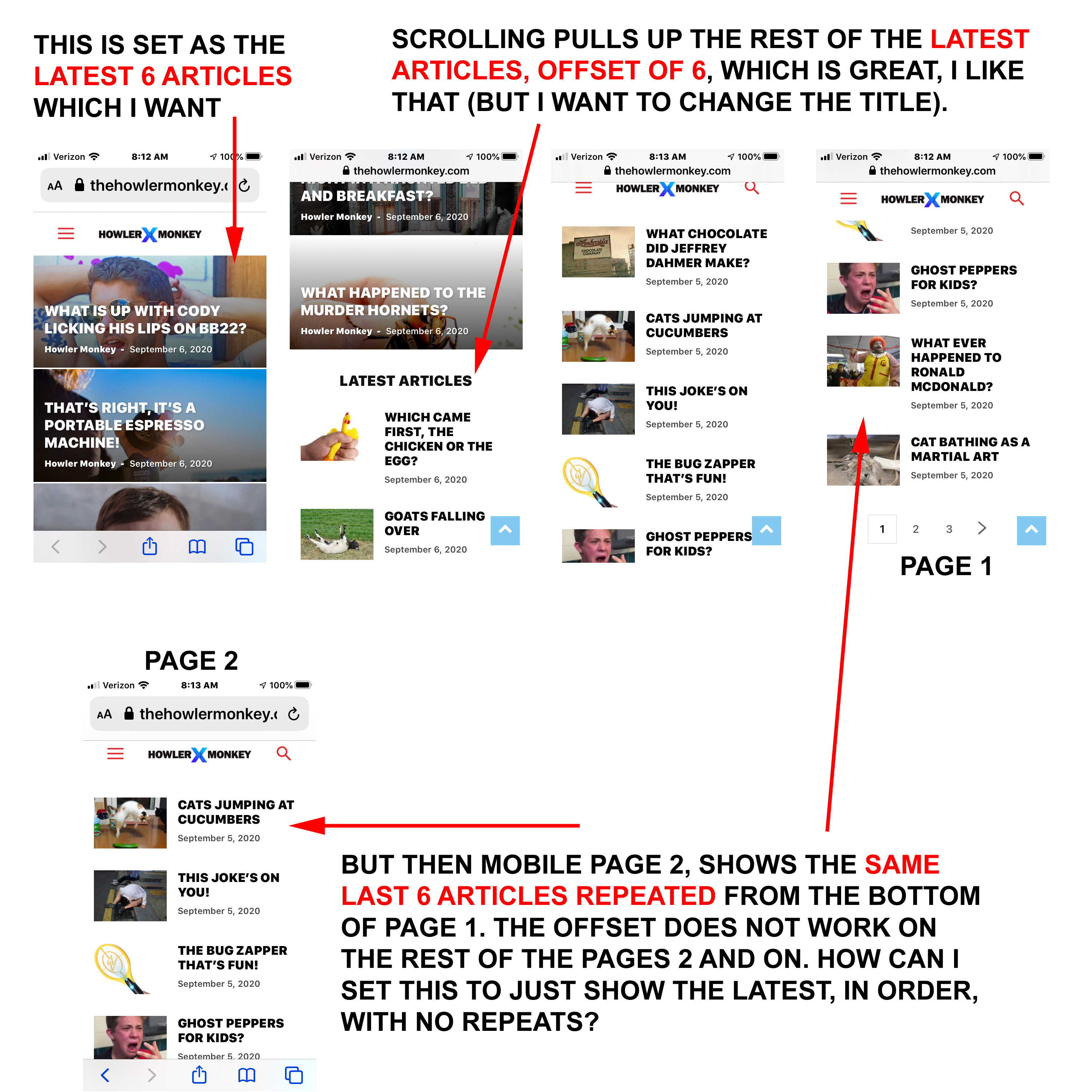
2 questions. 1) I have the top 6 images on mobile set for latest articles. That I like. Below that, I have the latest articles continued, with an offset of 6, so it shows the rest with no repeats. That works perfectly. But then when you go to page 2 on mobile. The top 6 images are repeated from the bottom of the list on page 1 (the offset doesn’t work on page 2, page 3, and so forth). How can I adjust this so there are no repeated articles? The website is here: https://www.thehowlermonkey.com/
The screenshot is here: https://www.thehowlermonkey.com/images/Mobile-Offset.jpg
2) How do I change the LATEST ARTICLES title? I want it to say something like MORE ARTICLES.
 Tinystepsbabyclub
Hi guys
I am using the mobile theme and all is well. I have followed your guide https://imgur.com/RvCDBYd to add in a banner to the mobile theme homepage. It places it just below the three articles at the top, which is fine, but i’d like to add padding in there as it sits very close to those top three articles.
Is this possible?
Thanks
TS
 RGLAS
RGLAS Hello Simon,
Thanks for your explanation, by now everything works as it should. use WP Rocket again, and Desktop and Mobile works fine now.
Simion C. Hi,
Seems there isn’t enough space to display all the menu items in a line on mobile. One solution would be to decrease the space between them on mobile. So for example while on desktop a 15px margin will be alright https://prnt.sc/ucwbdo on mobile you could reduce that to about 8px https://prnt.sc/ucwbun
The result should be like this https://prnt.sc/ucwcdq if you set it to 8. Please give it a try.
I could try and think of other methods if you should not consider that a solution.
Thank you!