
- NewsmagSmart list ads
- NewsmagIntroduction
- NewsmagMain menu
- NewsmagLogo & Favicon
- NewsmagHeader ads
- NewsmagSmart sidebar
- NewsmagSharing buttons
- NewsmagCategory tag on modules/blocks
- NewsmagBackground introduction
- NewsmagTheme colors introduction
 giwalola
 Sorry Calin, but you have this option in your theme. I add same menu with your new header builder (Mobile horizontal menu). The problem is that the menu is not fluid. I doesn’t slide well.
 lifemathmoney
So around 30% of the time when navigating the site, the side panel shows up for a split second and then goes away.
Like this: https://imgur.com/a/qLV9xiV
I’ve set the background color to be white temporarily to prevent it from being as annoying, but please help me out urgently.
How do I fix this.
 Calin
Calin Hi,
Unfortunately our theme do not have this option for menu slide on mobile, sorry! maybe this option will be add in coming updates.
Thank you for your understanding!
giwalolaHi, is there any way to make horizontal menu in mobile slide longer?
Like un this websites (mobile version)
http://www.elconfidencial.com
http://www.hola.com
http://www.applesfera.com.
Those are some examples, and all horizontal menu slides the same, and yours stops after each item.
Any solution?
Is nicer and more useful.
 reddisl
 Hello Sir,
this is my website: https://clipaxis.info
Looking forward for your answer :
1. Move Above Post AD a little bit to left
2. Fix ARTICLE INLINE AD not showing
3. Remove Search button in mobile theme
Calin Hi,
In order to add some custom php code in post in Newspaper v9.7 , you need to edit the loop-single-n, n is for the number of the template that you are using, for example if you are using post template 1 you need to go in plugins/td-composer/legacy/Newspaper/parts/single/loop-single-1.php
-> https://www.screencast.com/t/eCPWKrIl2
This settings will apply on responsive version too, but if you use mobile theme you’ll need to make this changes in plugins/td-composer/mobile/single.php too.
Hope this will help you!
Thanks.
 Simion C.
 1. Of course there is, you can name it while editing it, either in the backend
– http://prntscr.com/obzqs1 – http://prntscr.com/obzqyh
Or in the composer – http://prntscr.com/obzrhi – http://prntscr.com/obzs5b
– http://prntscr.com/obzsar
2. I see you have built a cloud header template and applied it. But on mobile it is empty.
Please edit the header template and check if there are any elements in it in mobile mode
– http://prntscr.com/obzth5
When creating a cloud header template you must add elements in both desktop and mobile mode. If there are no elements for mobile, the header will be empty.
Let me know if you have more questions or I misunderstood the problem.
Calin Hi,
Yes, you can use only the AMP option -> https://www.screencast.com/t/a3UFnyMy from the mobile theme, there will be no problems.
Mobile Theme: Automatic Optimization for Mobile with Newspaper Theme -> https://tagdiv.com/mobile-theme-automatic-optimization-for-mobile-newspaper-theme/
How to Make an AMP Ready Website with Newspaper Theme -> https://tagdiv.com/amp-newspaper-theme/
If you want the responsive version and amp you should use this opinion -> https://www.screencast.com/t/jZct5ueBqOrb but if you have amp activate on pages you’ll need to create in Mobile editor a content for AMP version of page.
Thank you!
Calin Hello,
The number of the related articles can be set from the Theme panel -> https://www.screencast.com/t/5lhNNIjP
Unfortunately, for the moment the number of the grids from the mobile theme, from the homepage can not be change, maybe in coming updates.
Thank you!
Calin Hi,
If you are using the mobile theme, the mega menu will not be display, this can be display only in responsive version of the theme, if you have the responsive version, you can try this custom css
.td-mobile-content .td-icon-menu-right {

display: inline-block;

}
The code need to be set in Theme panel> Custom code> Custom css
If there is still a problem, please provide me a link to take a closer look to it.
Thank you!
Calin Hello @gmpaus,
I think that you have the mobile theme activate, if is so then the mobile layout will look different from desktop, if you want to have the same content/layout you’ll need to deactivate the mobile theme plugin.
If there is still a problem, please provide some more details and a link where I can inspect it.
Thank you!
Simion C. Hi,
That would happen if there is no content entered in the mobile editor for the respective page.
When the mobile theme is active each page will require you to enter content in the mobile editor – https://tagdiv.com/mobile-theme-automatic-optimization-for-mobile-newspaper-theme/
If there isn’t any the page will be empty on phones.
The mobile theme is an optional plugin, it is created for improved performance on mobile. If it’s not active the same content from desktop will be displayed on phone as well.
Currently I see that the page is not empty on mobile, so that means there is content in the mobile editor for it.
Please let me know if you have more questions.
Thanks
 hoebehop
Hi,
My in-article ads are not showing properly on desktop and mobile, but are doing just fine on AMP.
Example article: https://radmag.nl/games/hollow-knight-review-2019/
Header and footer ads are working fine as well. This is purely about the ads inside the article content.
Any help is much appreciate, ’cause I can’t figure it out! 🙁
Thank you.
Simion C. Hi,
There is a setting for it in the theme panel post settings – http://prntscr.com/oby2h6
The setting is general, it will affect both desktop and mobile. If you have more questions let me know.
Thanks
Calin Hi,
Just set the code for mail chimp in mobile editor in text section -> https://www.screencast.com/t/jrOOSHoJZd8
Thank you!
 sunnyaditya
Can I use only Amp instead of mobile theme +Amp. Is there any SEO impact going with only AMP.
 KarinaB7
 Another question if you enter my site you will see that one of the categories is in red, how can I make it so that the mobile also appears in red? My site is primeravueltanoticias.com
sunnyadityaHow to show more post in theme “related article” part. Or show more category in mobile theme on home page
 shuaybi
I created a mega menu using category and subcategories. This displays well on desktop. On mobile however it only shows the top level category (when user clicks the burger icon). How do I display subcategories as a submenu on the mobile displays?
 MOH YUSUF ROHMAN
Hi, I have a problem with empty space in the biggrid section and also ads. Can you help me to eliminate it with CCS.
Mobile: https://ibb.co/8gCGxzx
Desk: https://ibb.co/RvFJRbB
Site: http://www.warnabiru.com
 gmpaus
Hi,
I am using dental studio demo, when I used the mobile to view the website, it displays the post page as a front page on mobile device. I would like to show the Home — Front Page on the mobile instead of the post page.
Can someone please help. Very much appreciate.
Thanks,
Danny
reddislHello Tagdiv support,
I have 2 issues:
1. I would like to move the Above Post ADS (YOUR ARTICLE TOP AD )to Left a little bit because as you can see my website is RTL
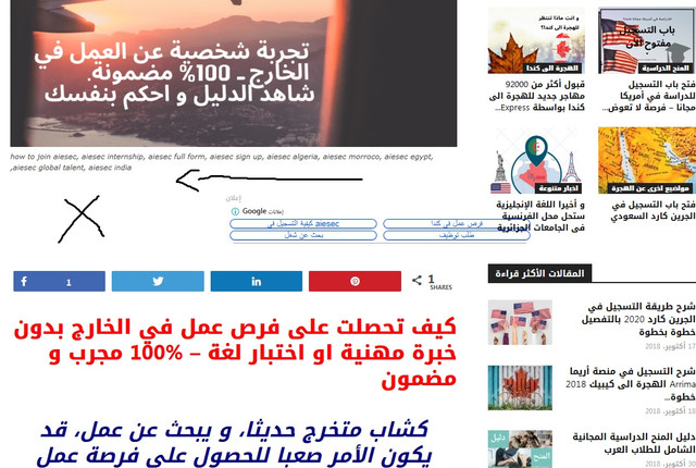
However in MOBILE, they are 1000% responsive , just in DESKTOP there is this issue.
2. Since I bought the theme, the ( YOUR ARTICLE INLINE AD ) never appears even though I set them after 2 paragraphs, In mobile AMP they appears after 2 paragraphs, but in desktop or when I visit my website via mobile they don’t appears , how can I fix this?
3. If you visit my website via mobile, you will see that the Search button is on the menu button like an error, I want to disable the button of search for mobile.
I used this CUSTOM CSS under Mobile theme in THEME PANEL but it didn’t work
#td-header-search-button-mob {
display: none;
}
.header-search-wrap {
display: none;
}
 TheWrestlePost
 Thanks for the help. The subtitle works on mobile but not on desktop.
Mobile – https://prnt.sc/obcg8u
Desktop – https://prnt.sc/obcfxg -> https://prnt.sc/obcfvl
Can you tell what is the issue here?
 boxmining
Seems like none of the “Pages” work : https://boxmining.com/coin-guide/
Works on mobile, but when I view it on the phone it shows an empty page.
“Posts” Work
MOH YUSUF ROHMANI want to hide post navigation on both mobile and mobile themes. Can you help me. Here’s the picture
https://ibb.co/jDhRQSX
