
- NewsmagMain menu
- NewsmagIntroduction
- NewsmagLogo & Favicon
- NewsmagBackground introduction
- NewsmagTheme colors introduction
 Central
 Your screenshot is giving 404
Ther desktop site we fixed it me and my programmer,
the mobile still has no menu no logo etc.
This is ridiculous, i am sory to say it.
I am using Child theme to be able to update with out problems, but after the update i lost everything was used/downloaded from your cloud.
You come after the update when i create the ticket, to tell me that i had to back up from the theme.
 usc-shift
Hi, I’m trying to make a multi-language site using polylang. I have a problem with the menu in the mobile theme. Since I can assign only one menu in the theme panel -> mobile. And for the standard menu, polylang provides an option to create a separate menu for each language/location pair. How can I solve this problem (can be code or plugin or something useful to fix this). Thanks
 Alex
AlexHi,
In VERSION: 12.6.3
Option to stop zones render on mobiles for Header Menu and Header Menu Sticky
On Mobile: When mobile device is turned horizontally – header is not showing.
Option to stop zones render on desktop for Mobile Menu and Mobile Menu Sticky;
On desktop: When screen is narrowed to approx mobile device size header is not showing.
Is this an expected behaviour?
 Bettina
 Hello!
The social icons from the mobile menu are coming from the Theme Panel -> Social/Apis -> Social Networks -> https://i.imgur.com/kKYIECB.png remove/edit them after your needs.
Here you can remove/set a picture for mobile menu background: https://www.screencast.com/t/x3Xrln2b88x
And the background color here: https://www.screencast.com/t/PbU3hQpDqHh
Or you can delete that element and create a fully customizable page there using the modal popup: https://forum.tagdiv.com/modal-popup/
Thank you!
 Jay2K973
 Nope, it hides ALL the grids, even my text below.
The only way I found to show my homepage properly is to deactivate the mobile plugin.
But now I have a chicken picture in the background of my mobile menu. How can I remove/change it ?

Also, how can I edit/remove the social icons in the same menu ?
Thanks in advance.
Bettina Hello @loaphuong24h !
Click on that hamburger menu and choose a menu: https://prnt.sc/KM1WiaiJlPSD
The social icons from the mobile menu are coming from the Theme Panel -> Social/Apis -> Social Networks -> https://i.imgur.com/kKYIECB.png remove/edit them after your needs.
Here you can remove/set a picture for mobile menu background: https://www.screencast.com/t/x3Xrln2b88x
And the background color here: https://www.screencast.com/t/PbU3hQpDqHh
Or you can delete that element and create a fully customizable page there using the modal popup: https://forum.tagdiv.com/modal-popup/
Thank you!
 miltonrodas
site url: Golfgame.io
——————————-
Hi, according to your template, the main page being utilized for the homepage of my website is a page named ‘News’, which is also linked to in the top main menu.
The issue I need help with is that the Site Identity information I have added for the site is not reflecting when people visit my website on desktop or mobile, and it only shows “News – Golf Game” as the name of the website when they arrive at the site.
Please, how can I update the title of the Page named ‘News’, to show the site name and slogan, so it looks like this on the browser bar:
Golf Game | To Grow The Golf Game Community!
 loaphuong24h
i dont know how to customize the default mobile menu. Now when i click on that button, it appear list of category. i want to add or remove some stuff on that screen
 gigiograndi
Hi,
How to have the topbar mobile? we need top menu also in mobile version
Regards
Staging url: https://www.edigraph.it/fin_20244/
 Anamaria
 Hello,
Usually, the color and image are set on the row, so please edit and select the row and go in the tab CSS https://i.imgur.com/iqpxjpt.jpg -> https://forum.tagdiv.com/topic/background-color-of-the-main-menu-be-changed/ please check each row/column/zone and replace the background color/image -> https://i.imgur.com/LgeVdGD.jpg
To change the background image, go in Theme Panel -> Background -> Mobile menu/mobile search => https://www.screencast.com/t/uvDejzbX and delete the image, because this no longer exists.
Thank you!
 cokemayorga
Hello good afternoon,
Along with my greetings, I request assistance with changing the background of the menu, on desktop as well as on mobile.
Thank you, I share an image.
Anamaria Hi,
To remove a background image, go in Theme Panel -> Background -> Mobile menu/mobile search => https://www.screencast.com/t/uvDejzbX and delete the image, because this no longer exists.
Thank you!
 mg
mgHello Support Team,
I hope this message finds you well. I would like to bring to your attention an issue regarding the search and main menu functionalities on the mobile version of the website. There seem to be problems with both the search menu and the main menu, and unfortunately, there are no options available to address these issues.
I have attached screenshots illustrating the issues for your reference. Your prompt assistance in resolving this matter would be greatly appreciated.
Thank you for your attention and support.
Best regards,


 jaywhack
The mobile version of my site navigation isn’t working. Whenever its tapped the page gets a grey background and then I’m unable to scroll up or down the page. This behavior happens across all browsers (Safari, Chrome, etc).
It looks like the page URL changes from golatindance.com to golatindance.com/#.

Please advise on a fix.
Thanks,
Jason
 a123gfh
 I followed your instructions exactly but it still doesn’t work. I can email the admin account for you to check. You can log in with your phone to detect the error (domain https://quanphanbon.com)
My mistake was: using my iPhone to click on the Menu, nothing appeared and it seemed to freeze. but that menu still appears on my computer when I try to switch to mobile editor.
 Hector1
After setting up the website, any update to the text, menu, or images completely disconfigures the website in both the web and mobile versions.
The website was finished and put online, however, no matter how small the change in the text, for example, the website is disconfigured, the banners appear out of order, the home areas are all mixed up
I’ve already increased the php memory and I’m also using a plugin to clear the cache
 Calin
Calin Hello Evie,
When the mobile humburgar menu is touched an extra class should be set on the body – https://i.imgur.com/m0YkKkD.png and this should make the menu visible, now the problem can be related to the ios that the mentioned class to no longer be added.
Unfortunately I do not have an ios device to test it and now on simulators seems to work correctly.
Thank you!
 platmm
Hello there! I know this has come up a few times here but I’m also getting an issue with the mobile menu. I’m using the “Reel News Pro” mobile header but it also shows up in “influencer” – anyone where after the hamburger menu is pressed, the screen shrinks, and then the menu appears.
It works perfectly on an Android and Mac Chrome but only shrinks the menu and does not display the menu in Mac Safari, Mac iOS (Safari and Chrome). The “Search” menu works fine everywhere where the page shrinks and the menu appears on top. Same situation under incognito.
php memories are 300M and all green in the Theme Panel. Any guidance would be helpful!
Thanks for your help!
Evie
 Snippet Media
When i go to our site: http://www.saarmagazine.nl
most of the time it shows our mobile template in stead of our desktop desktop homepage. The desktop homepage shows a grid of three recent posts, dhe mobile template shows one large post. Next to this it doesnt show the logo and menu header on desktop (when it shows the mobile layout).
Also when I go to a blog from the website on my desktop, it shows the mobile layout for posts in stead of the desktop layout. So the image shows smaller and the text is on the left side of the screen and very narrow. Also without logo/menu header.
When i do a hard refresh on that page it seems like the cache erases so i get the right version, but my colleages never get to see the right version.
Here you see the mobile layout showing on a blog desktop (just showing the top of the page), + missing logo and menu and text on the left side):
https://www.saarmagazine.nl/wp-content/uploads/2023/12/Schermafbeelding-2023-12-04-om-14.59.41.png
Here you see what it should look like (image showing entire page):
https://www.saarmagazine.nl/wp-content/uploads/2023/12/screencapture-saarmagazine-nl-ik-wil-zeggen-tegen-vrouwen-die-wel-kinderen-hebben-2023-12-04-15_02_59.png
We’re already usng WP super cache.
And I also tried the Newspaper Mobile Theme, but the same problem appears. I hope you can help me!
 nagi
nagi mobile horizantal menu our css settings
—————————
https://gallery.123telugu.com/images/theme_test/Narender12-02—1.jpg
https://gallery.123telugu.com/images/theme_test/Narender12-02—2.jpg
my navbar error links
——————
1.https://gallery.123telugu.com/images/theme_test/Narender12-02—6.jpg
2.https://gallery.123telugu.com/images/theme_test/Narender12-02—7.jpg
3.https://gallery.123telugu.com/images/theme_test/Narender12-02—8.jpg
4.https://gallery.123telugu.com/images/theme_test/Narender12-02—3.jpg
Anamaria Hello,
Usually, the color and image are set on the row, so please edit and select the row and go in the tab https://i.imgur.com/iqpxjpt.jpg -> https://forum.tagdiv.com/topic/background-color-of-the-main-menu-be-changed/ please check each row/column/zone and delete the background color/image -> https://i.imgur.com/LgeVdGD.jpg
It seems that you have a sticky header. Please follow the video to see where you can find and build your sticky header on mobile and desktop too: https://www.screencast.com/t/l6v2Belt
Thank you!
 mashmedia
Hi, I found a lot of css problems in the RTL theme.
The header is not correct and I can’t edit it, also the footer.
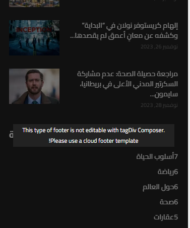
As you can see, the titles in footer is from left to right.
And at the header the menu and search to close to each others. that’s not correct ! and not acceptable..
the demo should work without any problems I just import it and didn’t do anything on it.
So if you can’t fix this issues I need a refund because I can’t work on something like this.
nagiRespected Sir/Mam,
I am a developer at Mallemaala Entertainments, located in Hyderabad. our website 123telugu.com. I am hereby mentioning that requirement.
1. In the mobile horizontal menu navbar, the menu is being displayed differently on small, medium, and large mobiles. But we need it to be of same size on every device. We will send the CSS settings as screenshots through a link. We are sending you the screenshots of our website’s mobile version navbar as screenshots. We want the navbar to be stretchable along with padding.
my site link
————-
https://tv.123telugu.com/telugu/ (newspaper theme installed)
my navbar error links
——————
1.https://gallery.123telugu.com/images/theme_test/Narender12-02—6.jpg
2.https://gallery.123telugu.com/images/theme_test/Narender12-02—7.jpg
3.https://gallery.123telugu.com/images/theme_test/Narender12-02—8.jpg
4.https://gallery.123telugu.com/images/theme_test/Narender12-02—3.jpg
mobile menu our css settings
—————————
https://gallery.123telugu.com/images/theme_test/Narender12-02—1.jpg
https://gallery.123telugu.com/images/theme_test/Narender12-02—2.jpg
I want this stretchable
————
https://www.123telugu.com/index.php
https://gallery.123telugu.com/images/theme_test/Narender12-02—12.jpg
https://gallery.123telugu.com/images/theme_test/Narender12-02—11.jpg
https://gallery.123telugu.com/images/theme_test/Narender12-02—10.jpg
Thanking you,
Regards,
Narendhar.
 afratus
Hi, I tried to design some kind of stick menu with buttons on a single post row, but I can’t make it work full width with buttons with equal sizes.
What I did was:
Row with two sections. Each section with internal rows with 3 sections. So, I put 6 full width buttons. One on each section on internal rows.
But it doesn’t work on all mobile sizes full screen. It gives me a blank space on one size in bigger phones, and if I try to enhace the size of the buttons, it’s bad for smaller screens.
Here’s one solution I found, but it looks terrible: https://www.topensandoemviajar.com/agenda-cultural-sp
I want to make all the buttons same size, so they occupy all the row (without paddings) in all sizes of mobile.
(Please delete the link after seeing this).
Thanks.
 Stexs
Stexs Here is the link: https://www.tennisfever.it/pagina-test/ Just look at the filter tab on mobile.
I’ll put the question here in simple format: is it possible to close the categories menu by clicking on the “altro” item? https://drive.google.com/file/d/1tSti7G5CawFqbcVOqrcmHb7PnBUtKYj8/view?usp=sharing



