
- NewsmagSmart list ads
- NewsmagIntroduction
- NewsmagMain menu
- NewsmagLogo & Favicon
- NewsmagHeader ads
- NewsmagSmart sidebar
- NewsmagSharing buttons
- NewsmagCategory tag on modules/blocks
- NewsmagBackground introduction
- NewsmagTheme colors introduction
 amd4ever
After a lot of testing i changed block 13 at home page at 1/1. But i have some questions. 1. For mobile the space between blocks i want to be less and there 2. I want to remove the —- after block 13. the block width is 970 now and but i want to be Center alignment (or reduce the space at right by increase the space at left of the block). My site topnews(dot)gr
The code: @media (min-width: 1000px) {
.td-pb-span12 .td_block_13 .td_module_14 .entry-title { font-size: 32px; line-height: 34px; margin: 0 0 2px 0; }
.td-pb-span12 .td_block_13 .td_module_14 .td-module-meta-info { bottom: 0px; padding: 14px 60px 0px 85px; }
.td-pb-span12 .td_block_13 .td_module_14 .td-module-thumb { margin-bottom: 5px; height: 520px; }
.td-pb-span12 .td_block_13 .td_module_14 .td-module-thumb { margin-bottom: 5px; width: 970px; }
.td-pb-span12 .td_block_13 .td_module_14 { padding-bottom: 0px; }
.td-pb-span12 .td_block_13 .td_module_14 .entry-thumb { height: 100%; } }
 Catalin
 Hello airshoot,
Please try to disable all the active plugins, except Visual Composer, clear all caches and install only the plugins that come bundled with our theme. I’ve tested on my side and works fine…as you can see this in our demo -> http://screencast.com/t/NKiBKwQpd
Please note that if you use JetPack plugin, please disable the Photon and Mobile Theme because have caused conflicts with our theme and that might be a reason to not be displayed on your mobile.
Hope this helps and let us know how it goes!
Thank you for the message!
 Bogdan B.
 Hello,
Unfortunately changing the width of the sidebar or the main content will cause problems as our theme was built on a fixed width and a grid view. Every element depends on this to display properly.
You can try it to see how it works by using this code:
@media (max-width: 767px){
.td-main-sidebar{
width:50%!important
}
}
As for the theme width for the mobile version, you will have to change quite a few parts of the style.css to make the theme activate the mobile theme on a different scrren size than 767px. Do a quick search through the style.css and search for 767 and see how many entries there are.(http://screencast.com/t/Nvc2O9O5ml) All of these will have to be adjusted to the new screen size if you truly need this customization.
Thank you!
Catalin Hello seobatam,
Normally the Envato policy allows to use a theme only on one install. You can, however, use the theme on a sub-domain if you plan on creating a testing site, but if we are talking about totally different sites with different content, then only one theme per install is legally allowed: http://screencast.com/t/NqzloVgyUJB.
For your second problem, please try to disable all the active plugins except Visual Composer and install only the plugins that come bundled with our theme. JetPack is in our tested plugins but when we tested all the features of this have worked properly at that time. In meanwhile, JetPack has a lot of updates and added a new features wich have caused some conflicts with our theme, as example ->Photon, Theme mobile, …. Please check all the options of these and try to deactivate these features and see how it works. I’ve tested the JetPack Plugin on my side and everything seems to work properly and until now, we do not have any reports about this problem.
Hope this helps and let us know how it goes!
Thank you for the message and sorry for the inconvenience!
 airshoot
Hello Guys,
I use newsmag with a featured video on (fast) each article. And the video is not displayed on mobile version of my website. Am i miss some settings or is it normal ?
Please help me to find the solution.
Have a nice day !
 0870711
I have searched the forums and found this code to add the topbar to mobile but I get an error while adding the custom code in the control panel
@media (max-width: 767px){
.td-header-top-menu-full {
display: block!important;
}
}
The error I get it says “Use of !important”
I tried without but still nothing shows
any help please?
Thanks for reading
 Jukka Mykkanen
 Hello,
” At the moment, on the mobile version the sidebar moves to the bottom of the content.”
Is it possible to adjust the width limit when sidebar goes to the bottom or activate mobile template with wider screen than with default settings?
 sazanlushi
Maybe this type of ads can increase revanue of users, can you pls add this type of adplace for mobile version…!?

 Andrei L.
 Hi
Basically you have to change all media queries which refers at the mobile menu from @media (max-width: 768px)@media to (max-width: 1021px). Also you have to make some js customizations in this function: http://screencast.com/t/g9zja6vlGGg
This is a complex task which require lots in theme’s core files and unfortunately I can’t provide a solution now. If you need this and you’re you’re not aware of the steps you need to take in this regard please consider hiring a developer or a freelancer to do this for you because we can’t offer customization services at the moment.
Thanks!
 TaskTeam
Hello,
I would like to initiate the Mobile menu when my website is viewed on iPads and tablets. Can you please give me a few tips on how I can achieve this?
Thank you.
 simchris
 @mboydnv
I do agree on being a bit against the “bloated one plugin for all” concept. I used to hate YOAST. We used to build our own themes, or hack things like Canvas to add custom if/then and queries for meta data in our headers. Yoast simply made it easier for us to deploy and add some things more quickly. But it has gotten a bit big and bloated and every major version it crashes and burns. I certainly don’t think it’s the only game in town, but it does work for a lot of folks. Of course, we’re using some other things on some sites, just because they’re smaller and work as well.
As for canonical tags — the reason they are useful for many sites, is for things like the pending /amp/ protocol from Google rolling out in 2016 to speed up mobile pages separate from things like mod_pagespeed or http/2 (previously inclusive of mod_SPDY). So, for example mobile accelerated pages will soon be loaded as so:
yoursite.ooo/name-of-my-article/amp/ — in this context, the canonical tag is useful to identify the /amp/ version is not another page, but an alternate “version” of the same page.
In our case — I should have stated — we syndicate our news from some sites, and the canonical tag helps identify we did it first, and when we link back to the parent page from the child syndicator.
Also be aware that article on MOZ is from 2013, and going into 2016, the canonical tag is more mature now.
However, you are correct — if you have no duplicate versions of content, if you’re not dealing with malformed inbound links to your site like /site/name-of-article/?12hy6 — where Google is saying you have duplicate content for too many 404 errors — then you may not need it !!
In our case, it helps control inbound malformed links from external sites, and also because with modern social media you have a dozen sites inventing their own links to your website page; meaning FB, Twitter, LinkedIn, etc. all use a shortcode in some case to link to you, and the canonical can help identify that the URL on your site is the de-facto CORRECT one, even though it should be self evident being on your site.
I’m not arguing you need to have them, just saying they are useful and do NOT hurt inbound traffic in any way. Just like adding a default img tag, or an author tag, or other meta data; it’s read by those systems that have use for it, and other things ignore it.
Anyway — just some food for thought 🙂
Andrei L. Hi
I’ve checked your site and noticed that on mobile devices you’re using a different theme then Newsmag: http://screencast.com/t/fsIxznStv2MV This usually happens due to Jetpack mobile theme. Try to deactivate that module, or deactivate the all plugins except Visual Composer, clear all caches and test again.
Let me know how it goes.
Thanks!
 peravoj
On mobile phone LG G4 that i have for testing i noticed that homepage is not displaying correctly. Im using stock internet browser from google (not chrome – in chrome its opening fine). 
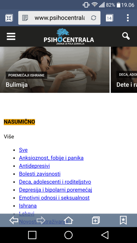
Is there any way to fix this?
 chrisuk73
I have been struggling to change the post title font size for mobile devices without it impacting desktop. With long titles on mobile the font fills 1/3 of the screen. If I change it the post title font goes tiny on desktop.
Is there a way to have the best of both?
Thanks
Chris
 dodikmulyanto
Hi , iam use newspaper theme and its cool , but i got eror if check my site here >>> https://www.google.com/webmasters/tools/mobile-friendly/?url=http%3A%2F%2Fwww.postku.com%2F , but i try to open in my android mobile phone , the images was appear . sory for my bad english
Screen shoot >>> http://prntscr.com/9djak3
Screen shoot >>> http://prntscr.com/9djasr
thats Indonesian language
simchris Usually a conflict with something else; try turning off the mobile option in Jetpack if using that; disable any “mobile” plugins. Theme is responsive so mobile by default.
 aquackworth
Hi There,
Installed Newsmag a few weeks back. Looks great on desktop but breaks on mobile (Iphone 4S and samsung galaxy). I’ve just taken this site over, so it may be an issue with legacy plugins but I was wondering if you could have a quick look.
I can get to a responsive version of the site by going to “view full site”down at the bottom. I’ve gone into the theme/template settings and can’t see anything in there and have tried turning off all non relevant plugins (but I’m not 100% on which were included/recommended with the theme.)
Any thoughts would be greatly appreciated!
Thank you!
Angie
Also, btw I seriously love this theme!!
Bogdan B. Hello,
Block 16 by default shows the author name: http://screencast.com/t/GGnWhB4I, but in order to make it show the avatar it will need further customization. you can follow this topic to see how it can be done: https://forum.tagdiv.com/topic/customizing-excerpts-homepage-block-12/
For the excerpts, they were hiden on tablets and mobile phones as a design choice.You can make them reappear with this custom css:
@media (max-width: 1018px) and (min-width: 768px){

.td_block_16 .td-excerpt {

display:block!important;

}

}
@media (max-width: 767px){
.td_block_16 .td-excerpt {
display: block!important;
}
}
Thank you!
 Lewis
Lewis now i have weird black point in the mobile designe..
how to remove it please
Bogdan B. Hello,
Unfortunately this is the case with blocks that display the full screen image on mobile. It was a choice made by the developers to improve loading speed and avoid creating an exaggerated number of thumbnails. You could override this functionality by forcing the block to use the full image by editing the theme code but then the page speed would greatly be affected. You can find the code for the block 3 here: http://screencast.com/t/Y7MngT46sL7m
You can see all the thumbnails our theme uses here: http://screencast.com/t/nklxPLxCd
You can edit the first file and select another thumbnail for it (replace the thumbnail with another thumb name) so the mobile version will have more quality, but it will need a few more css adjustments for it to work.
I hope this helps.
Thank you!
Bogdan B. Hello,
I understand what you mean now, and there is a an explanation for it.The featured image uses a thumbnail while images inserted into a post use the full size. So when compressed on a mobile phone, the difference will be visible between a full size image ex: 1920×1080 and the thumb used by the theme for featured image which has a size of 696×0. This choice was made for pagespeed. You can override this thumbnail if you want by editing the theme files. You need to edit the template you use. Every post template has a separate file corresponding to it:
http://screencast.com/t/YBaK9ToiDFm Inside these files you will find the code used for image and the thumbnail: http://screencast.com/t/irKCRL3Qm You siumply need to change the td_696x0 to full and then the full image will be used for the featured image.
I hope this helps.
Thank you!
 Sayeed
Hi…
I am using block 3 for my home page and for sidebars… when I access the site on Mobile I see a low quality thumbnail…
Can you please tell me how to fix that?
http://www.magzeo.com is the site
 andrestreamz
Hi guys, can I customize my block 16?
I want to make my block 16 looks like this -> http://imgur.com/cIeuWSh
at least, it can show the author name and author avatar below the post excerpt.
And how to customize block 16 so it can show post excerpts below the title on mobile view?
Like this -> http://imgur.com/0WziWvx
Thanks!
 Barun
BarunI am purchasing Newspaper theme. Some problem I am facing.
My website address : http://lnx9.cloudhostdns.net/~a9a78e32/
Problems are :
1. When I opening it in Mobile It appears left & some portion missing from left. Its showing only in Homepage. Other category page is OK.
Snapshot: http://lnx9.cloudhostdns.net/~a9a78e32/mobile.jpg
2. I don’t want Latest tab in category section
Snapshot : http://lnx9.cloudhostdns.net/~a9a78e32/latest%20remove.jpg
Please help. Thank You.
 Alin [tagDiv]
 Hi,
Please provide a link so we can take a closer look at this. If you don’t want to paste the url here on forum please send an email at contact@tagdiv.com as we need to inspect this. Also paste a link to this conversation so we can know what your issue is.
Also you can check the options from Theme Panel for each ad like Bogdan stated above and set a different size for mobile device – http://screencast.com/t/EAyCtVCzGTP also please provide details about the device you are using(Android or Windows phone) so we can check.
Thanks!

