
- TutorialsFrom WPBakery to tagDiv Composer
- TutorialsWhat is Ajax preloading?
 Anamaria
 Hello,
You can use AMP, but we offer support for the mobile version only with mobile theme + AMP plugin and set for AMP -> https://forum.tagdiv.com/tagdiv-amp-plugin-tutorial/ => https://i.imgur.com/1kMs1ds.png and set the AMP for posts => https://i.imgur.com/GLEeeoZ.png, but you can’t customize the layout for AMP with tagDiv Composer.
Also, please check this topic where I explained each mobile version -> https://forum.tagdiv.com/topic/mobile-version-not-working-properly-2/ and choose what mobile version you want.
Also, you can check our documentation here:
-> https://forum.tagdiv.com/tagdiv-amp-plugin-tutorial/ please set the AMP like in our guide.
-> https://forum.tagdiv.com/the-mobile-theme/
This is a video about Responsive Newspaper Theme, AMP & Mobile Theme, Mobile Pages & Templates -> https://www.youtube.com/watch?v=SpGkOnJeNZY
Thank you!
 comms
commsNot sure what went wrong, however before the 11.5* update these were showing up OK. We are having issues with both category and single post templates.
We are using dedicated mobile templates before this, now, it seems whenever I use tagdiv composer to edit a page (desktop mode) I see two more options for mobile views
Example below: (censored some content)
I am editing a Category template (desktop view) – everything looks OK.
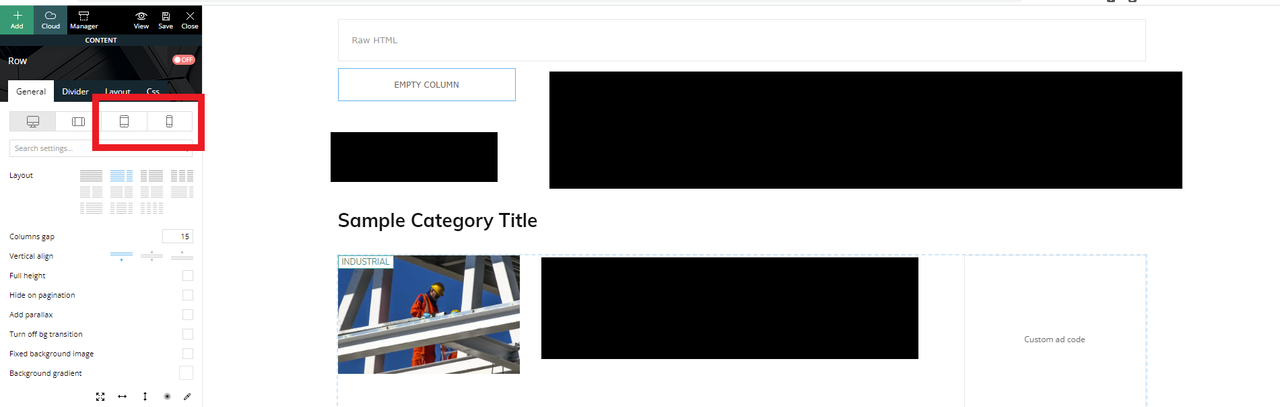
However, I see two new options in the panel for tablet/mobile views (which were not in the previous version)
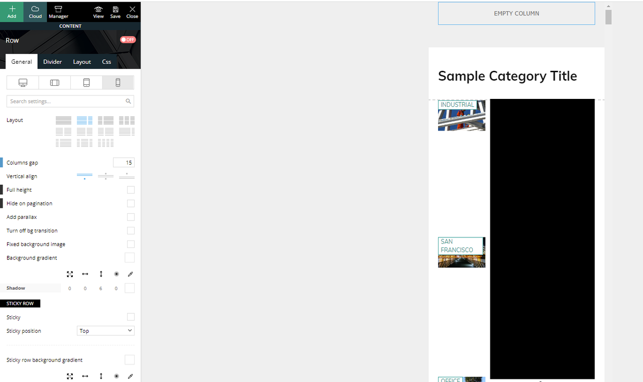
If I click the mobile view, this is what I see and what is actually being displayed if you browse the website in mobile mode.
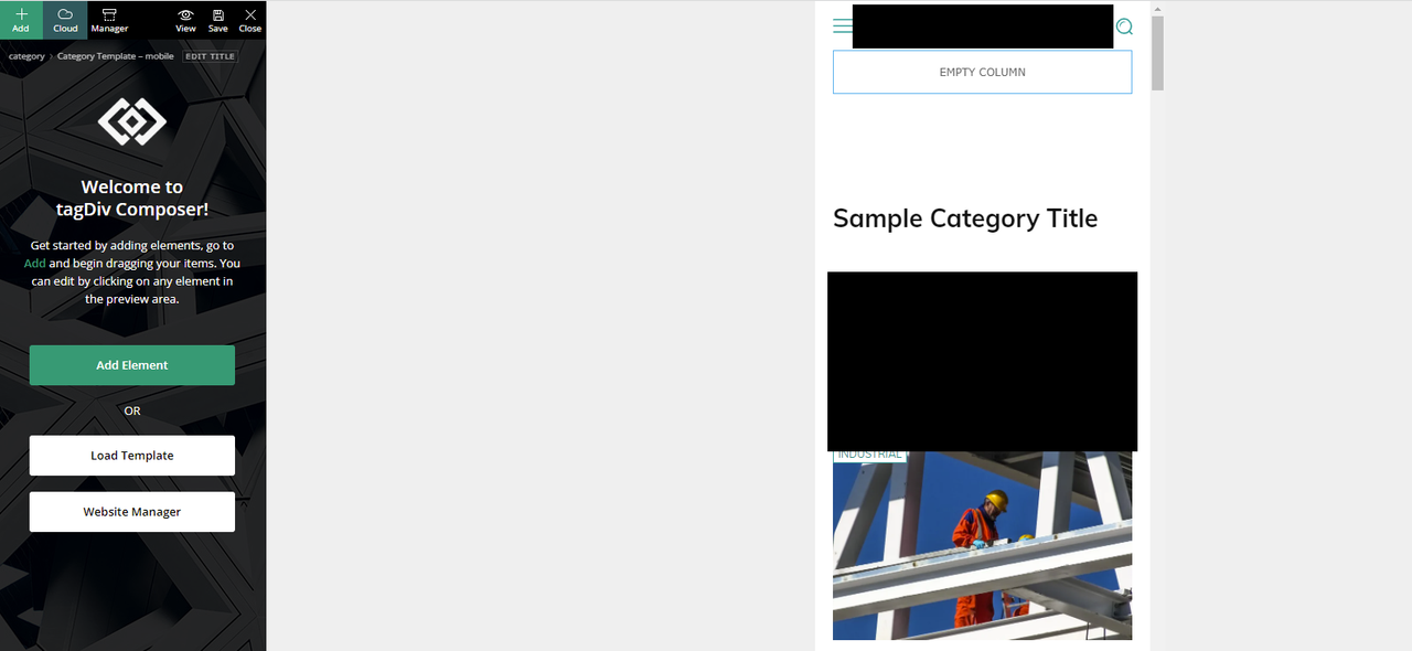
We have another mobile only template that was created and was working (being displayed) before the update.
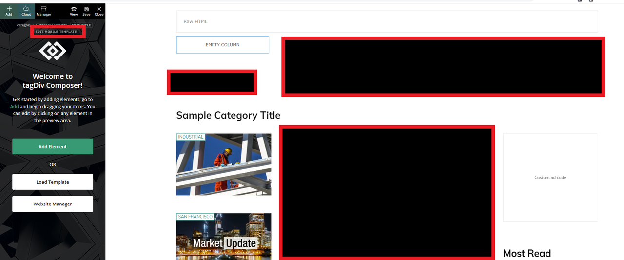
If I click on the “Edit the mobile template” from the desktop view takes us to the right mobile template that should have been displayed.
How can we fix this?
Thank you
 Crw19
Crw19 Already done those things. There is an error here.
If I remove text under mobile element only – it removes it from desktop and doesn’t do anything on mobile. The mobile still has NP Newspaper Publication stuck there. No matter what I add or remove, that stays the same.
 Bettina
 Hello!
AMP is faster and works better only with the Mobile Theme plugin. From my point of view, if you don’t use the Mobile Theme plugin, then there is no reason or benefit to AMP. Please read all about AMP here: https://forum.tagdiv.com/tagdiv-amp-plugin-tutorial/
It comes with its own templates/design for page, post, category, etc so your current templates from the desktop theme will get converted to the mobile theme layout. Documentation here:
– https://forum.tagdiv.com/the-mobile-theme/
– https://forum.tagdiv.com/mobile-theme-introduction/
Make sure the redirect mobile visitors to amp option is disabled and try again.
Thank you!
Anamaria Hello,
Please disable the mobile theme plugin.
Thank you!
Bettina Hello!
Please let me know if you do not use the Mobile Theme plugin. You can uninstall it, clear the cache, and see the results. Or, you should add the ads in the theme panel -> mobile theme -> mobile ads.
Thank you!
Bettina Hello!
Please uninstall the Mobile theme plugin, clear the cache and see the results!
Thank you!
Anamaria Hello,
There are two different sections.
So, after you set the responsive version you need to refresh to the page to upload the mobile theme version, please check this video https://www.screencast.com/t/M7ZFh5zHj8
Also, if you want to disable the mobile theme plugin, then you need to upload the image as I said in the first reply “please access Newspaper -> Theme panel -> Background -> Mobile menu/search background and change/remove the image from here https://www.screencast.com/t/ATV1Jr7s”
Thank you!
Bettina Hello!
Please uninstall the Mobile Theme plugin and see the results!
Thank you!
Anamaria Hello,
1. Please deactivate the mobile theme plugin, clear all cache and check the results.
Also, please check this topic where I explained each mobile version -> https://forum.tagdiv.com/topic/mobile-version-not-working-properly-2/ and choose what mobile version you want.
2.A solution is to set the offset posts on the blocks => https://www.screencast.com/t/Tsiu65TSaRS -> https://www.screencast.com/t/YbkmVbsBrnk
You can use the Flex Block 1 and you can filter it to display the posts only from a category -> https://i.imgur.com/Nnt3zGX.png and you can design it to look like a posts loops block.
Thank you!
 tmckee007
Hi,
We want to make our mobile site look like your demo site.
Here is the demo site:

Here is our’s:

We want it to look exactly the same. What are we doing wrong?
 zarpe77
 Is their an answer to this issue I am having with the right side bar as well as mobile view in posts only.
The site displays correctly for pages.. it only seems to be an issue with posts
 cmundial
I would like to know how to activate the related articles in the mobile version (I am not using the mobile plugin) I would like it to work as in the desktop version
zarpe77when going to edit a post the edit with tagdiv composer is not an option. It is however an option on pages
I believe this may be a reason that my posts are showing up in mobile mode
Can you tell me why this is happening
 kevingrech
Hi
Google adsense is not appearing on mobile view, but appear when using desktop.
Anybody know the reason?
zarpe77 After looking into it further it seems that the posts are showing in mobile mode. Could this be because of AMP plugin? Does newspaper theme need a AMP Plugin?
 popseo
1) Via tagdiv editor, I see this on laptop
On Mobile I see this
How do I achieve https://ibb.co/JsvVcHg on mobile?
1) Suppose I want the latest post in category as featured
In the second row, I want to display same category but not the latest post as it shows odd. How can this be achieved?
tmckee007Here is the embed code:

It shows up on desktop: https://www.springfieldfitlife.com/magazine/
It does not show up on mobile.
It works on both desktop and mobile from Squarespace: https://matt-nelson-p7dh.squarespace.com/
The other one is https://www.springfieldfitlife.com/events/
It works on desktop, not mobile.
Here is that code:

Crw19The mobile version – https://thesmarterdollar.com/
The logo text for the theme demo is stuck there. I have gone to mobile editor, deleted the text, removed it, turned it off, changed it… nothing happens. It’s just stuck
tmckee007 Hi,
I have adjusted the opacity but that did not change the image of the mobile menu.
See 1.png

I have changed the background of the mobile menu. See 2.png

The image does not appear to be changed. See 3.png

That is what I want to change. The site is https://www.springfieldfitlife.com/
We have cleared browser cache
There is no website cache
We have used multiple devices
We have tried it on phones in multiple geographic locations
we have used browser resolution websites
 Viktorit
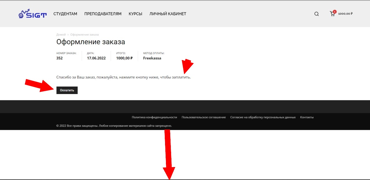
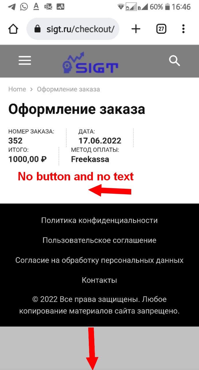
When ordering an item on mobile, the Pay button and text disappear
Screenshot of the desktop version
Screenshot of the mobile version
Place your order from here
https://sigt.ru/courses/financial-breakthrough/
Also, the footer does not stretch downwards
Anamaria Hello,
In your video is loaded the responsive version, not the mobile theme version.
Also, as you can see here you have set background color and the image is behind the color -> https://i.imgur.com/Slah2Mj.png -> https://i.imgur.com/JlPrpql.png please change the opacity.
Thank you!
Bettina Hello!
We recommend using only one cache plugin, the WP Super Cache plugin with this configuration: https://forum.tagdiv.com/cache-plugin-install-and-configure
You need to take into account:
External factors: server speed, if you are using CDN or not, the external resources loaded by your website like ads, fonts, tracking scripts like Facebook Pixel, Google Analytics, Twitter analytics, Hotjar and so on.
Internal factors: the number of elements on the page, image size, image formats, if you are using mobile optimized layouts, console errors.
Our developers are working a lot to improve the page speed in every update.
As a suggestion, disable the lazy load animation. Other starting points to improve your website page speed are here:
– https://www.xtechkr.com/optimize-newspaper-theme/
– https://forum.tagdiv.com/how-to-make-the-site-faster/
– https://forum.tagdiv.com/topic/score-100100-pagespeed-with-newspaper-wordpress-theme/
– https://www.infophilic.com/get-almost-100-pagespeed-newspaper-theme/
– https://developers.google.com/speed/docs/insights/v5/about
– https://www.youtube.com/watch?v=tnkVapqhIHc
Please check the tutorials from those platforms gt metrix and Google Pagespeed Insights and I’m sure you can increase the page speed.
Please note that page speed is not covered by the support team: https://forum.tagdiv.com/newspaper-theme-support/
Thank you for understanding!
Bettina Hello!
We have 3 options for mobile versions that you can use:
1. Responsive version: A responsive version of your website looks similar to the desktop version. Edit the page with TagDiv Composer. Click on the mobile viewport: https://www.screencast.com/t/XDQJedlggSB; there you can see your mobile version and edit or adjust the elements to look better.
2. Mobile pages: https://tagdiv.com/newspaper-10-3-7-update-brings-customizable-and-speedy-mobile-pages/
3. Mobile theme plugin: The Mobile Theme is a performance-optimized theme included in the main Newspaper theme that only loads on mobile devices. It comes with its own templates and design for pages, posts, categories, etc., so your current templates from the desktop theme will get converted to the mobile theme layout. Please see https://forum.tagdiv.com/the-mobile-theme/ and https://forum.tagdiv.com/mobile-theme-introduction/ for more information.
A full explanation you can find here: https://www.youtube.com/watch?v=SpGkOnJeNZY
You can choose to use whichever one is more affordable and useful for you.
If anyone doesn’t fit as you created, then make a test and deactivate ALL plugins except tagDiv ones. Also, if you are using a cache plugin, deactivate it, clear all cache and try again.
Note: If you want to use version 1 or 2, then you need to deactivate the mobile theme plugin and see the results.
Thank you!
Anamaria Hello,
You can disable the mobile theme plugin on the pages from the Gutenberg editor using the following option => https://www.screencast.com/t/axXRJsWby
Thank you!



