- NewsmagSmart list ads
- NewsmagIntroduction
- NewsmagMain menu
- NewsmagLogo & Favicon
- NewsmagHeader ads
- NewsmagSmart sidebar
- NewsmagSharing buttons
- NewsmagCategory tag on modules/blocks
- NewsmagBackground introduction
- NewsmagTheme colors introduction
 Vlad S
 Hello !
The Mobile theme was specially designed for optimization on mobile devices. Unfortunately on mobile theme you cannot do much changes of design. If you want to have the same design as on desktop mode you can achieve that by simply disabling the mobile theme.
You will have to recreate your pages into the Mobile editor or completely disable the mobile theme. The mobile editor will not render shortcodes !
Also you can disable mobile theme on certain pages or posts by following this setting: 
Please take a look here: https://forum.tagdiv.com/the-mobile-theme/
Mobile theme plugin can be disabled from Newspaper Plugins as you can see here: https://www.screencast.com/t/LnkZCEVC
Also please make sure that you clear your cache!
Thank you !
 Calin
Calin Hi,
You can try this custom css for mobile theme -> https://i.imgur.com/7gOv6dg.png
#td-outer-wrap {

background-color: #222;

}

#td-outer-wrap * {

color: #fff;

}
The code need to be set in theme panel> mobile theme > custom code> css.
Hope this will help you!
Vlad S Hello !
The Mobile theme was specially designed for optimization on mobile devices. Unfortunately on mobile theme you cannot do much changes of design. If you want to have the same design as on desktop mode you can achieve that by simply disabling the mobile theme.
You will have to recreate your pages into the Mobile editor or completely disable the mobile theme. The mobile editor will not render shortcodes !
Also you can disable mobile theme on certain pages or posts by following this setting:
Please take a look here: https://forum.tagdiv.com/the-mobile-theme/
Mobile theme plugin can be disabled from Newspaper Plugins as you can see here: https://www.screencast.com/t/LnkZCEVC
Also please make sure that you clear your cache!
Please provide a link to your website in order to inspect the breadcrumbs.
Thank you !
 DaveKinetic
Hello,
I want to change the default styling of the pull quote block on AMP. It seems excessively large and is set to 60% width. I have tried editing the pull quote section in Mobile Theme > Font Settings > Pull Quote, but that doesn’t seem to make any difference to font style.
Any idea where to change the font styling and the max-width, please?
 Archerix
Hi,
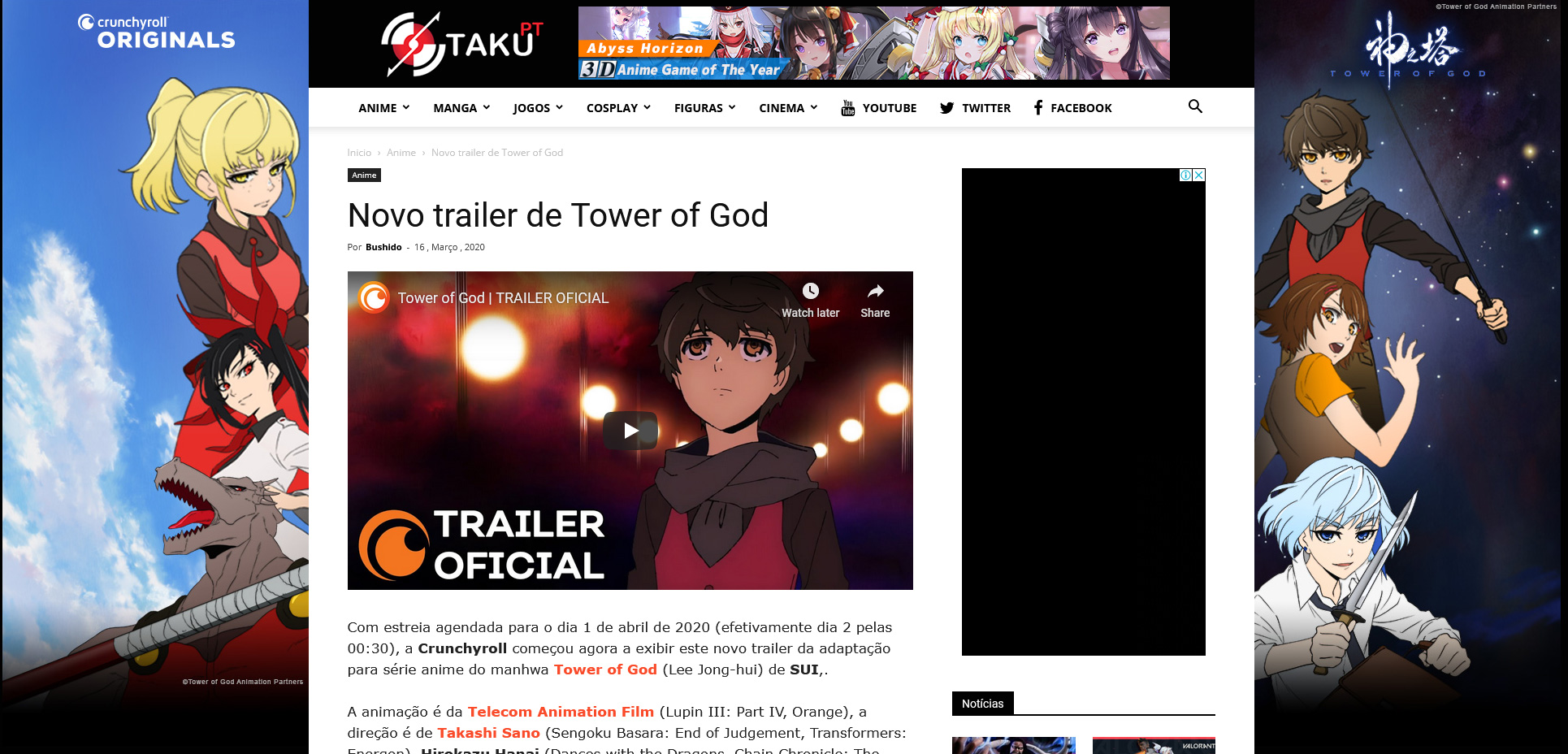
I’m using the newspaper theme on a large website, more than 1 million pageviews per month and recently a company wanted to promote a series on our website with a site skin, the only problem is that the only option that newspaper as is “background click ad”, basically two large ads in the side of the website.
The result was this below
What the company wanted is something like the photoshoped version bellow
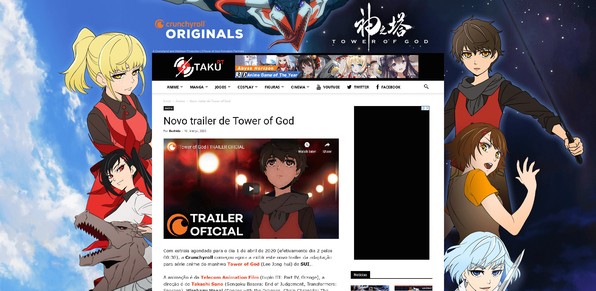
The problem with “background click ad” is that it does not shows in smartphones, only in desktop. I have seen in other themes a better application of the site skin, in which the ad sides are not shown but the top is.
So, basically, I’ve negotiated a worse contract because I didn’t find a way to show the ad to mobile users, which are 60% of my users.
How in mobile it should look:

So what I’m asking is how could I do this with Newspaper and asking you to implement more options to “background click ad”
Best regards
 bunon
bunonI want to make the mobile menu subcategory font bold.
https://ibb.co/rdq0pF9
 jbyrnes
Hi,
My website is not showing correctly on Microsoft Edge browser, it works perfectly fine on Mozilla Firefox and Chrome and mobile, but the text/images are further apart, like it doesn’t seem to fit the original design.
Have you had issues with the Edge browser before and how do I fix this?
Many thanks.
jbyrnesWhere can you edit mobile menu (change the background etc….) I don’t seem to find that in TD Composer…
 anniewheeler
When i view my site see above link. It crops the main two images I do I make it so it shows the whole image?
 FietsersbondHZ
 Ok, the new category layout eventually updated on my desktop but now I get to see the old layout on my tablet and mobile phone…Also my tablet and mobile phone is still showing the old header image while on the desktop I get to see the new one.
Loading more articles in the category works fine on the desktop but no new articles are loaded on tablet and phone, the loading icon just keeps spinning and nothing happens.
-
This reply was modified 6 years by
FietsersbondHZ.
FietsersbondHZI have come across a annoying issue where layout changes in tagdiv composer don’t save correctly, when I make a change in the category template this new change is saved on some categories but not on others and this while I have set the correct template in the themepanel global settings for the category, same for the header, I set the new header image which displays correct on my desktop and tablet but the old header image is still visible on a my mobile phone. What could be causing this?
 smile099
 It’s not working.
For some reason, I can see ads created for desktop on mobile and desktop. And can’t see ads created for mobile anywhere.
Here’s an ad code that we are having right now:
<div class="td-visible-desktop doubleAds">

<script>
AdSense Code here
</script>
</div>
<div class="td-visible-desktop doubleAds">
<script>
AdSense Code here
</script>
</div>
<div class="td-visible-phone">
<script>
AdSense Code here
</script>
</div>
And here’s our css code:
.page-nav a[href$="/2/"] {

width: 80%!important;

margin-left: 10%;

box-shadow: 0px 4px 10px 0px #888888;

border-radius: 4px;

}

.page-nav a {

width: 45%!important;

font-size: 16px;

margin: 0 2.5%;

padding: 18px 48px;

color: #fff;

background-color: orange;

box-shadow: 0px 4px 10px 0px #888888;

border-radius: 4px;

}

.page-nav a, .page-nav .current{

display: none;

}

.page-nav a:first-child, .page-nav a:last-child {

display: block;

}

.page-nav a:first-child i:before {

content: "PREV";

}

.page-nav a:last-child i:before {

content: "NEXT";

}

.page-nav a:last-child i:before, .page-nav a:first-child i:before {

font-family: sans-serif;

font-size: 33px;

text-transform: uppercase;

font-weight: 600;

}
.doubleAds {
display: inline-block;
width: 300px;
}
@media (max-width: 767px){
.dads {
display: none;
}
}
 Calin
Calin Hi,
Please try this custom css for mobile -> https://i.imgur.com/uGZmJlu.png
.single .page-nav a[href$="/2/"] {

width: 100%!important;

margin-left: 0!important;

}
The code need to be set in section for phone.
Hope this will help you!
Thank you!
 ankhlabs_gmbh
I’ve installed the theme including all the plugins, but there are no pictures next to the postings on the mobile version.
URL of the website ist: https://einfach-sicher.online
Thank you for your support
Calin Hi,
If you want to use auto ads for amp, this code need to be set in mobile theme in amp ads -> http://prntscr.com/pt3bmw
Only one code is need to be set in theme panel, the other one is a standard code and is already add in our theme -> http://prntscr.com/pkwtzh also the code need to be set only in AMP ads -> http://prntscr.com/pkwum2
If you want, you can send us an email at contact@tagdiv.com and provide admin login, as well as cPanel or FTP if possible. We will take a look. Include a link to this topic in the email.
Thanks
 Twolle
 Hi,
I tried it, but eventhough I have cleared the cache on the website and on my mobile and have used different browsers, then the color #222222 stays there.
I have in mobile view port changes ROW + COLUNM to #000000.
What else can we do?
Thanks 🙂
/Twolle
 rnbjunk
 Hello,
I’ve deactivated Wp-Rocket, and Imagify, and i’ve installed your cache suggested plugin Wp-Super Cache. I’ve disabled plugins too.
Still having issues with images on mobile theme (as you can see everything is ok on the desktop theme).
It looks like the images are served with original size, instead of an appropriate thumb little size. I have also used the plugin you suggested to reg thumbnails.


I need to fix that
Calin Hi,
That is because on that class was set an extra css, and removing the class will remove the css too, but you can use a custom css for this, for example, please set this custom css
.header-search .polylang-flags {

  display: none;

}
in theme panel> custom code> custom css
and this css
.td-header-menu-wrap .header-search .polylang-flags {

  display: block;

  margin-right: 20px;

}
in theme panel> custom code> advance css> phones.
The above codes should remove the button from desktop, but display it on mobile.
Hope this will help you!
Thank you!
Calin Hi,
You can adjust it using tagDiv Composer edit the header and choose the mobile port view -> https://i.imgur.com/vve8Vv9.jpg after that select the row and in css tab add the background color -> https://i.imgur.com/o4sz9Bp.png
Hope this will help you!
Thank you!
 golasuresh
 thenews24goaweb
 I have installed default pro version of theme and imported Technews header from the cloud.. everything was working fine. Its was sticky. But when i changed the header by importing other cloud themes after that its not showing sticky header in mobile version. Kindly help to ressolve this. When editing with td composer, while scrolling down in movile version its instead of showing sticky header its shows Empty Column. I tried deleting wordpress and reinstalling but this still exixt. Are you storing our template design in your server data ? How can this happen suddenly!
Calin Hi,
That is because you are using the mobile theme plugin, you’ll gain a better speed then responsive version of theme, but in order to achieve that speed you’ll need to create a new content for pages because in the most of cases those were made with builders ( tagDiv Composer, WPBakery ) and you need to use only the mobile editor ( you need to set the content for pages in mobile editor and this content will be display on mobile theme)
-> https://i.imgur.com/9d0UWLT.png
Also you can show the responsive version on mobile theme -> https://i.imgur.com/m0bVB5T.png you can check more details about mobile theme in our documentation -> https://forum.tagdiv.com/the-mobile-theme/ or if you want to have the responsive version only, you can use the amp option from mobile theme -> https://i.imgur.com/oofST3D.png (to use the mobile theme template on amp) or you can disable the plugin.
Have a nice day!
 chrismartel0817
Hi,
my site http://www.thebardsmusings.com is having a few problem. My logo doesn’t link to the home page and on mobile all of the icons that come with the theme are broken like the social icons and the slider arrows.
 bilimdergi
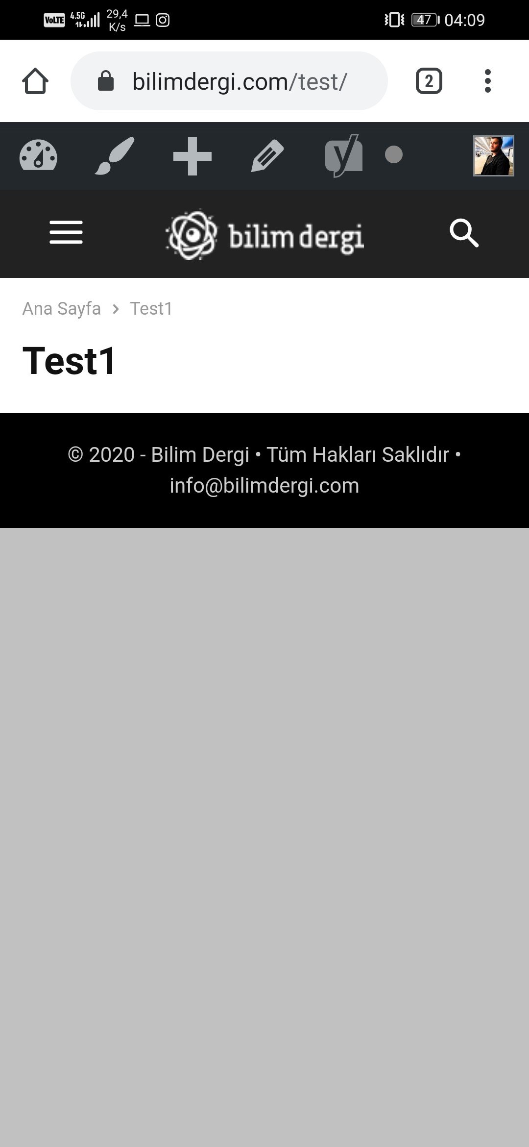
Hello, the pages look blank when I activate the mobile theme in the Newspaper theme.
Pages work on the computer, but only titles appear on the phone, not content.
Help please.
Page link: https://bilimdergi.com/test/
Screenshot JPG: https://i.hizliresim.com/dGue5Y.jpg
Website: Bilimdergi.com
 GabrielVB1100
Hello, in the mobile theme, how to target the post content, I want to set a background color instead the default white to match the desktop version.
I want to target that area, and also the area in the title and subtitle