
- NewsmagSmart list ads
- NewsmagIntroduction
- NewsmagMain menu
- NewsmagLogo & Favicon
- NewsmagHeader ads
- NewsmagSmart sidebar
- NewsmagSharing buttons
- NewsmagCategory tag on modules/blocks
- NewsmagBackground introduction
- NewsmagTheme colors introduction
 miixtapechiick
 I deactivated the plugin and cleared the cache and it’s still not showing my mobile template on mobile
 lavozdelfestejo
 Dear Ana María,
Thank you for your detailed response and for the resources provided. I’ll review them thoroughly to address the issues I’ve encountered. However, I have a few additional questions and concerns:
As mentioned earlier, I’ve used TagDiv Composer for creating the entire page structure, but for posts, I’ve been using the Classic Editor combined with Elementor Pro for final adjustments. Do I need to recreate or modify all the posts I’ve already built? Will this require starting from scratch?
The header and menus have already been set up using TagDiv Composer, and they work well on desktop. However, the mobile version doesn’t display correctly, and I’m unable to adjust it properly. Could you assist me with optimizing the mobile view?
I’d like clarification on the use of multiple page builders. Is it safe to deactivate Elementor entirely after migrating to TagDiv Composer for all templates? Would this impact the content and structure of posts already created using Elementor?
Regarding categories: I’ve noticed that my category pages are not displaying posts dynamically as expected, even though they work on the homepage. Is this related to the cloud templates or the blocks applied to category pages?
How can I change the parts of the template that are still in English into Spanish? Is there a specific setting or approach for translating these elements?
Additionally, if possible, could you provide your response in Spanish? This would greatly help me in better understanding and implementing your recommendations.
Thank you very much for your assistance and guidance. I look forward to resolving these issues with your support.
Best regards
 David
David Also on mobile it seems to be “smart snap” and not “always”.
So my remaining questions are:
1. is there a way to change it from “smart snap” to “always” for mobile?
2. is there any way to make it just sticky on mobile?
David Oh I see its sticky for mobile as well it was just covered by the mobile sticky header. But is there any way to make it just sticky on mobile? it looks like if I remove the checkmark for desktop its removed for mobile as well.
DavidHi,
I do have a title (not header) that I want to make sticky on mobile devices. I tried it the following way:
I add “sticky” to a new row and placed my title in it. Now the the title is sticky, but only on deskop. But I need it exactly the other way round. On desktop the full page content is visible, so I have no need to make it sticky here. But on mobile where the user has to scroll I want this specific title sticky so that the user can see it all the time in his viewport.
Is there any way to achive this? Sticky on mobile while normal on desktop?
Thanks in advance for any help!
 filippocatania
Dear Team,
I hope I explain it well and I apologise for my English.
I created the mobile pages of the site, but I cannot display them well in the mobile device.
In the menu, I have added both the page in the dashboard list called ‘About us’ (also made for mobile with TagDivManager), for example, and the one called ‘About us mobile’: unfortunately, neither of these appears in mobile as made. I also made the page with the classic Gutemberg editor as Anamaria wrote to me earlier.
Thank you very much in advance
Filippo Catania
 PolishExpress
I created a separate template for mobile phones, but it’s also displaying on desktop versions. I’m using the W3 Total Cache plugin, and I suspect it’s causing the mobile template to display incorrectly. Has anyone experienced this issue and can suggest which function in the plugin to disable so that the Newspaper theme correctly detects the desktop and mobile templates?
 Simion C.
 Hi,
That could happen. The basic cloudflare setup as far as I know does not cache or deliver the content based on device/viewport. While this is not a problem for a responsive website, it will probably be a problem when using dedicated mobile content. From what I know they do provide cache by device type like so https://developers.cloudflare.com/automatic-platform-optimization/reference/cache-device-type/ But that is a premium service unfortunately. Other than that, I don’t recall seeing a working solution for using dedicated mobile content with cloudflare. In this case the solutions would be to either not use the mobile theme, or use cloudflare APO and activate cache by device type.
Thank you!
 Anamaria
 Hi,
Usually, this happens with cache plugins. If the cache plugin does not have mobile support then the mobile version can be delivered instead.
The solution would be to use the recommended WP Super Cache plugin instead and activate these settings (especially the mobile device support): https://forum.tagdiv.com/cache-plugin-install-and-configure/
Also, you can check this https://i.imgur.com/Es7nHNh.png
Also, this issue can be caused by some options that you have configured for the plugin can cause the issue.
Thank you!
Simion C. It’s looking fine at this time. I browsed the website desktop and mobile, and it is displaying correctly. I believe its safe to say that the matter is solved. But in case there are other issues, or if you have any questions, please let us know.
Thank you!
 technologyinnovatorsmedia
Hi
when we are opaning our website its showing in destop but its not showing in mobile device
what is the issues and how to fix this
Anamaria Hello,
You have activated the tagdiv mobile theme plugin, so please disable it.
Please check this topic where I explained each mobile version -> https://forum.tagdiv.com/topic/mobile-version-not-working-properly-2/
You can use the WP ROCKET plugin, which we recommend, but you need to set the options to get better results.
To increase page speed, I recommend checking which thumbnails you are using on your blocks. You might want to avoid having all of them enabled and optimize and regenerate images. You can use the EWWW Image Optimizer for image optimization and the OMGF plugin for fonts.
Thank you!
Anamaria Hello,
Ok, I’m glad that you found a solution.
Please check this topic where I explained each mobile version -> https://forum.tagdiv.com/topic/mobile-version-not-working-properly-2/
Thank you!
 Clecio
I would like to use a menu on the main page and another menu when the user is logged in. Is this possible ?
 maxcrandale
Hi everyone,
We’ve been facing an issue with caching on our website, specifically with Cloudflare. We are using the mobile theme exclusively (no mixing of mobile with Google’s AMP version or desktop version). The problem we’re encountering is that Cloudflare caching seems to conflict with our mobile theme, sometimes breaking it while the desktop theme works fine.
We’ve tried multiple solutions, including using Cloudflare’s caching settings such as Cache Everything and Standard Cache Level, along with Bypass Cache on Cookie and other strategies for mobile-specific caching, but we haven’t been able to successfully get the mobile theme to function properly without issues. Here’s the specific code we used in an attempt to address this problem:
// Cloudflare Worker code to bypass cache for mobile devices
export default {
async fetch(request, env, ctx) {
let userAgent = request.headers.get(‘User-Agent’);
if (userAgent && /Mobile|Android|iPhone/i.test(userAgent)) {
// Mobile logic – Bypass cache for mobile users
return fetch(request, { cache: ‘no-store’ }); // Ensures the cache is bypassed
} else {
// Desktop logic – Allow caching for desktop users
return fetch(request);
}
},
};
We’ve applied this code to bypass cache for mobile devices, and tried several approaches using Cloudflare’s Bypass Cache on Cookie option, but the problem persists. The mobile theme works intermittently, sometimes caching properly and sometimes breaking.
Additionally, we’ve been wondering if there is a distinct mobile theme other than the one we’ve been using that might be causing this issue. If anyone knows about a different mobile theme or specific settings for mobile theme caching that we might have missed, we would appreciate any guidance.
What we are looking for:
We are seeking advice from anyone who has faced a similar problem or knows how to properly configure Cloudflare for caching mobile themes while ensuring they load properly for users. Specifically, we are trying to:
Cache the mobile version correctly without affecting the desktop theme.
Ensure that the mobile theme doesn’t break due to cache conflicts.
Identify any additional configuration steps or tools that might help in fixing this issue.
Any help or insights on this issue would be greatly appreciated. Thank you in advance!
miixtapechiickFor the last 24 hours, I’ve been trying to get my mobile template to show up via miixtapechiick.com
and it refuses to show up on mobile. I do not have the mobile plugin activated. I have looked up countless tutorials and can’t seem to find the answer. I really need this to work so my website can pass the speed test. it is horrible right now, scoring at 38 despite downloading WP Rocket (godaddy will not let me download WP Super Cache due to security issues)
lavozdelfestejoHello,
I created the structure of my site using TagDiv Composer, but when it comes to creating and editing posts, I couldn’t find the option to “Edit with TagDiv Composer”. Since I couldn’t edit posts with this editor, I installed Elementor Pro and disabled Gutenberg. However, now I would like to know if there is any way to use TagDiv Composer for editing posts or if I need to continue using another editor like Elementor Pro, as I prefer it over Gutenberg.
Additionally, I’m having some issues with image galleries. I’ve tried adding image galleries to posts, but I would like them to display as carousels or thumbnails, instead of showing all the images one after the other. I’ve managed this on the desktop version, but on mobile, the images are still shown one by one. Also, when I add a carousel in the header, I have to remove the featured image to prevent both from showing. Is it possible for the carousel to be the featured image?
Another issue I’m facing is with categories and how posts are displayed. I’m not sure how to properly organize everything so that categories look good and content is filtered appropriately on the main page and archive pages.
If there’s any way to use TagDiv Composer to edit posts or if I need to use another editor, I’d like to know how to proceed. I’d also appreciate assistance with the mentioned issues.
Thank you for your help.
 Davidpinto
 Ok I found a solution.
I paste the code of that box in the Mobile ADS article bottom AD.
Davidpinto Ok I’ve the plugin mobile theme active and when I deactivated the plugin I saw the site with template, but I really don’t like it. So I reactivated the mobile theme plugin.
In the desktop mode with the template I insert an element for a box newsletter like that:
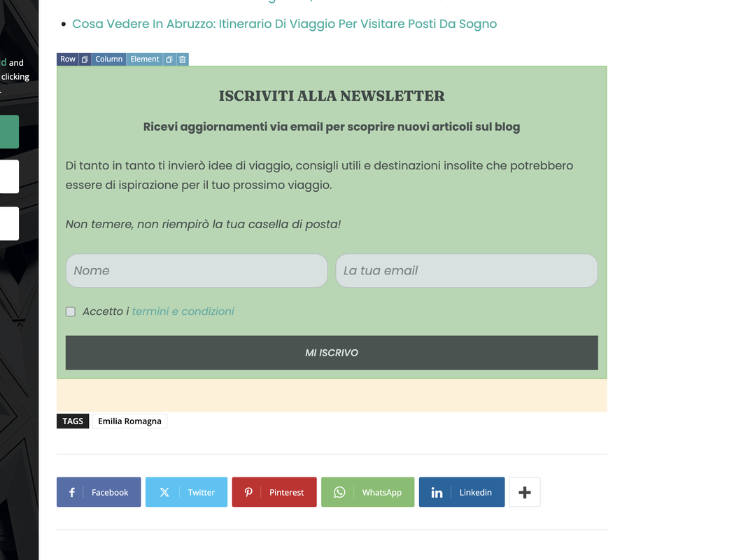
I need to put this bloc in the mobile site too, how can edit or add it inside the theme mobile plugin?
Thank you
DavidpintoHi All,
I’ve already created a template for mobile versione from the template single post that I’ve already used.
But when I visit the single post page on mobile I see the default mode page.
here the screeshot of the template for mobile that is selected.
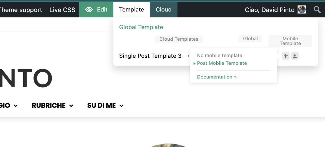
the site is: https://www.davidpinto.it
All the best
David
 JunaidTahir
 GTMetrix is loading mobile page probably, the loading time of desktop with TagDiv theme fully setup, taking upto 15 seconds sometimes.
I received your email where i cannot respond (its from noreply@tagdiv) so i cannot send you the snapshot of actual website, nor i can attach here, it seems. Please load the website using Edge or Chrome browser. Also, please run the code compiler plugin and see the results (Execution time is 18 seconds)
Regards
 Daniel Finch
Can you run me through how Header Template – Office Nexus works exactly and how to edit the mobile menu? Because it doesn’t seem to operate like a normal menu instead its got a page template which I cannot seem to edit or make work in anyway.
Anamaria Hello,
First of all, we no longer recommend AMP because it is deprecated https://developer.bigcommerce.com/docs/storefront/wordpress/platform-integration/enabling-amp
To change the logo please edit with tagDiv Composer,select the header logo and change it => https://i.imgur.com/cR7F0v4.png -> https://www.youtube.com/watch?v=HXQQygkCCJo -> https://forum.tagdiv.com/add-logo-newspaper/
For mobile please edit with tagDiv Composer, select the viewport on phone, select the header logo and change it => https://i.imgur.com/cR7F0v4.png
When the mobile theme plugin is used, you need to set for pages the page content in the mobile editor using only the options from that editor – https://i.imgur.com/p8EqE1b.png. also, there is an option to disable the mobile theme from a page/post – https://i.imgur.com/d3kTBRf.png. This option appears in the Gutenberg editor. After you disable the mobile theme on the page, you can assign the mobile page.
Please check this topic where I explained each mobile version -> https://forum.tagdiv.com/topic/mobile-version-not-working-properly-2/
You can translate them from Theme Panel -> Translations -> Translations
Thank you!
filippocataniaDear Team,
I installed AMP, but I have problems with mobile site.
how do i remove the Pulse Pro logo? https://is.gd/KOa2US (link to image)
How can I change the title in the footer? why can’t I see the content of the page? https://is.gd/ubyEu2 (link to image)
Thank you
Regards
 jatt
jatt Thanks for the tip, I moved it to the second option in wprocket instead of remove unused css option. But I deleted the mobile theme plugin already as it was not refreshing the content even after clearing cache. This is why you are seeing desktop option.
Please also let me know if the design is still showing broken on your end after changing to load CSS asynchronously option.
Thank you.



