
- TutorialsFrom WPBakery to tagDiv Composer
- TutorialsWhat is Ajax preloading?
 Anamaria
 Hi,
Usually, this happens with cache plugins. If the cache plugin does not have mobile support then the mobile version can be delivered instead.
The solution would be to use the recommended WP Super Cache plugin instead and activate these settings (especially the mobile device support): https://forum.tagdiv.com/cache-plugin-install-and-configure/
Also, you can check this https://i.imgur.com/Es7nHNh.png
Thank you!
 anastasios
Hello, we are facing a strange issue with the thumbnails in our site. In our homepage (only in mobiles and only in the homepage) the thumbnails for each article are (very often) wrong, meaning that, the picture is different from the one in the article.
Inside the article the picture is ok and, as said, in laptop/pc they are ok too – this only happens in mobiles (both android and iphone).
This started after the previous update and you can see an example in the picture below (on the left the wrong thumbnail and on the right the full post with the correct image).
Note: this is corrected when we use the Clear Used CSS option from wp-rocket plugin. Thank you!
Kind regards,
 bogdan.martiniuc
Hi, i have a situation.
It’s about the minicart of the woocommerce.
On mobile (not only), if i add to many items in the cart it goes out of the viewport.
This means, the user cannot scroll to the checkout and cart buttons so he can finish his order.
Do you have a solution for this? I mean, without writing css code because i already did this, but i cannot figure out how to always show the scroll bar on mobile devices. The problem is solved, but the scroll bar does not appear and the user may not know he needs to scroll in the minicart to reach the buttons.
This is the code:
.tdw-wmc-widget-inner {
max-height: 400px;
overflow-y: scroll;
position: relative;
-webkit-overflow-scrolling: touch;
background-color: white;
}
Waiting for your reply.
 Bettina
 Hello!
Make sure you do not have a mobile page. If you do, you need to edit it and change the logo.
You need to access your mobile viewport and add the elements there. You should change the logo on your sticky header, too. Please follow the video to see where you can find and edit/build your sticky header on mobile and desktop, too: https://www.screencast.com/t/l6v2Belt
I hope that helps you!
Thank you!
 highratech
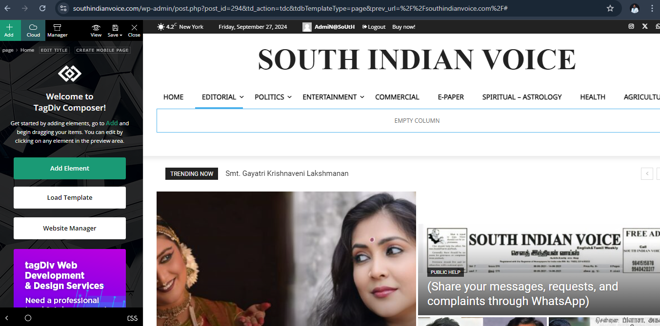
Hi.. Scrolling doesn’t work please have a look I’ll listed the where I faced the errors and please find the images too.
My website name is https://southindianvoice.com/
1. Page doesn’t scroll on edit with tagdiv composer. It works only on side scroll bar on screen scrolling doesn’t work.
2. Mobile view carousel doesn’t work.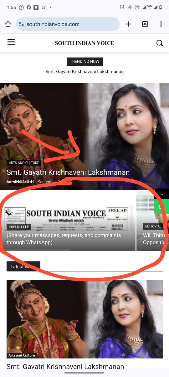
3. Mobile menu doesn’t scroll.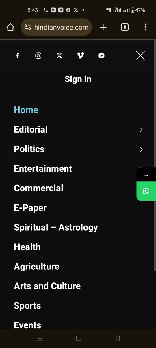
Bettina Hello!
You should identify the template you are using on your posts.
We have 3 options available for mobile versions that you can use:
1. Responsive version: A responsive version of your website looks similar to the desktop version. TagDiv Composer is used to edit the page. Click on the mobile viewport: https://www.screencast.com/t/XDQJedlggSB. There, you can see your mobile version and edit or adjust the elements to look better.
2. Mobile pages: https://tagdiv.com/newspaper-10-3-7-update-brings-customizable-and-fast-mobile-pages
3. Mobile theme plugin: The Mobile Theme is a performance-optimized theme included in the main Newspaper theme that only loads on mobile devices. It comes with its own templates and designs for pages, posts, categories, etc., so your current templates from the desktop theme will get converted to the mobile theme layout. Please see https://forum.tagdiv.com/the-mobile-theme/ and https://forum.tagdiv.com/mobile-theme-introduction/ for more information.
A full explanation is here: https://www.youtube.com/watch?v=SpGkOnJeNZY
If you need to use mobile version 1 or 2, then you need to uninstall the Mobile Theme plugin and AMP.
Please note that you need to use cloud templates to edit them with the tagDiv Composer.
We recommend using cloud/PRO templates to have the possibility to edit them with the TagDiv Composer, which contains a lot of functions and features; please check our tutorial here: https://forum.tagdiv.com/tagdiv-composer-tutorial/
More documentation about the cloud templates is here:
– https://forum.tagdiv.com/cloud-library-templates/
– https://forum.tagdiv.com/design-post-pages-using-cloud-library-templates/
– https://forum.tagdiv.com/cloud-library-category-templates/
Thank you!
 jtobler
 Thank you, Bettina. That worked! Now, I’m having a bit of trouble with the logo that shows up when responsively mobile. It has a mobile logo that I uploaded initially. However, I tried replacing it with a new image in the logo image fields, but the logo in mobile responsive is not changed. Note: the logo is showing a different image currently between desktop and mobile responsive. What do I need to do differently?
 tom_010101
 Hmmm, thanks. Unfortunately, that is not a usable option. Firstly, it doesn’t work on mobile devices and secondly, the implementation is not good.
Bettina Hello David!
You can use the modal popup shortcode with a modal page that includes the login shortcode or create a custom one using an extra plugin. Do you use the Mobile Theme plugin? https://forum.tagdiv.com/login-how-to-enable-user-registration/
Thank you!
 marcin.dobosz@frigologistics.pl
Hello..
I have a problem with the mobile version.
the home page and categories are displayed correctly.
But when I enter a post on mobile, some other template is displayed .
Additionally, on the phone the footer is also displayed from a different template.
What can I do to fix this?
 IdentidadyFuturo
Hello, I have been trying to configure the Ads on the site fiestascostumbristas.cl through Single Post Content, and I used the image provided by the theme for the test, newspaper-rec300d.jpg.webp, which is 300×250 px.
On mobile, it loads perfectly (see image).
However, on desktop, the image is displayed at 600×500 (see attached image).
I want to know what I am doing wrong or what I need to activate so that the image displays at 300×250 px.
The code I am using is this one:
<div class=”td-all-devices”>

</div>
Mobile OK:
<a href="https://ibb.co/6FNDFm5"><img src="https://i.ibb.co/pdn4dxp/Whats-App-Image-2024-09-25-at-18-53-02.jpg" alt="Whats-App-Image-2024-09-25-at-18-53-02" border="0"></a>
Desktop:

Thank you.
Bettina Hello!
1. It’s global and the code shouldn’t be found in the Custom CSS from the theme panel.
2. Uninstall the Mobile theme and AMP plugins.
3. Try to disable this option: https://app.screencast.com/uKDvHvO5wGnCh, save and check again.
Thank you!
 David Vascott
 Thank you Bettina. I am using the header login modal. As far as I’m aware, it’s not possible to view the header login modal in TD Composer. I have styled the fonts and colours of the header login modal using the Theme Panel. But the styling is only present on the desktop version, not the mobile version. Is there a way to ensure that the fonts and colours selected in the Theme Panel appear on the mobile site?
Alternatively, is there a way to create a login page that I can link to either through a button or a modal? I cannot see any way to add a login function other than the header login.
All I need is for members to be able to simply log in and log out.
Thanks,
David
 Calin
Calin Hi,
Right now your mobile version is different because you are using the tagDiv Mobile theme plugin, if you want the same layout, please disable the tagDiv Mobile theme plugin and the responsive version will be used.
Thank you!
jtoblerI have three questions (two issues):
1. Where is Live CSS stored? Is it global or unique to that page? It doesn’t appear in the Newspaper Custom CSS section.
2. When I’m in mobile and go to checkout, it tries to load the AMP or mobile theme with grey blocks, but never loads. I don’t want the AMP/Mobile version to load. I want the responsive mobile version to load.
3. On Desktop, the cart and checkout page content extends several pixels outside of the white content container. Why is this?
 rashtriyasamasya
Hello Sir
How can we make (https://rashtriyasamasya.com/) the same view as desktop and mobile?
 dscom
dscomHallo,
We are curently use the “Multicategories” template for displaying categories and tag pages. However, we are experiencing an issue where the article images are loaded as background images. This prevents the use of the image optimization tools we have in place, which leads to slower page loading, especially on mobile devices.
After searching through your Cloud Library, we couldn’t find a template that loads article images without using background images. Could you let us know if there’s a template available that addresses this issue, or suggest any other solutions to improve the image loading performance?
Bettina Hello!
Make sure this option is unchecked on mobile: https://app.screencast.com/mT5cVAwXdGGOv
Thank you!
Bettina Hello!
You should check the mobile viewport https://www.screencast.com/t/XDQJedlggSB in the tagdiv Composer and modify the modal.
https://forum.tagdiv.com/modal-popup/
Thank you!
 Ruteris
Hello.
I’m using the Newspaper theme and need help with the mobile search functionality. When a user clicks the search icon on mobile, I want the search bar (like the one in the attached image) to appear as a dropdown or overlay. Please help.
David VascottHi, I have a popup modal login for my site forwardlawreview.com. I have styled the colours and fonts in the theme panel. It looks fine on the desktop site – an orange login button and opaque white background etc – but on the mobile site the background to the popup modal login is semi-transparent (making it hard to read) and the button isn’t coloured etc. I don’t understand why the logins look different on the desktop and mobile versions. Please can you help?
Calin Hi,
Sorry for late answer!
I checked the website performance and on desktop you have 97 – https://i.imgur.com/LjCV0di.png and on mobile 82 – https://i.imgur.com/XLMWWup.png those are good performance.
Now the most common way to reduce the DOM size is to reduce the number of elements from your page (less blocks).
For the elements that do not have enough size or space, those should have at lest 10px around the element and a proper font size to can be read.
(it can be resolve by changing the font size and space around the elements that are mentioned that have those problems).
Background and foreground colors do not have a sufficient contrast ratio – this is related to the text color and background for that text, those should have enough contrast so they can be easy read – https://university.webflow.com/lesson/typography-color-contrast?topics=layout-design
The question relate to js is a good one, but this is usually handle by cache plugins or optimization plugins. How to delay JavaScript until user interaction in WordPress
I hope this will help you!
Thank you!
Calin Hi,
Yes intradevam we were connected to the site and we solved the problem related to the installation of the demos, but there was still a problem related to the amp plugin which is forced somehow. I also mentioned in the email that a large part of the site is custom/harcoded, using a lot of CPTs, taxonomy and many other options that were nowhere to be found on that installation and were most likely injected from the outside.
According to the email I sent you, the theme can be used, but without the tagDiv mobile theme plugin (and the amp plugin is active but does not exist, so it cannot be deactivated).
Thank you for your understanding!
Calin Hello,
If you are using the tagDiv mobile theme plugin, please disable it clear all cache and the responsive version will be used.
Thank you!
 paolamanciagli
Hi,
last week I reported the malfunction of NewsMag 5. In particular, the following points:
1) If I try to use any Prebuilt Websites (ex. Magazine or Clear Voice or Classic Blog) it does not display the homepage correctly. And there are no entries in the backend that allow me to modify it.
2) If I try to built a new page o try to modify a page using TagDiv Composer, a “critical error” screen appears and it’s not possible to work, even though the plugin is correctly installed and activated.
3) When I tried to install the Mobile Theme PlugIn, the entire site crashed and I had to restore to the last save, losing a lot of work done.
Yesterday the support wrote to me that they had solved the problems and that I could “install demos without any problem”. But when I tried, everything went down again.
Also, using TagDiv composer on a page gives an error.
About the Mobile Theme Plugin, the support told me that it is not possible to install it, I have to do without it…
This theme is not working, I still have the same problems and I don’t know why.
I reported to the support that the intervention was not successful, but I have not received an answer.
How is this possible?
Please, I need to know if the problems can be solved and when, to move forward with my project. I await your news as soon as possible.



