- NewsmagtagDiv Composer Tutorial
- NewsmagBlock settings tutorial
- NewsmagLogo & Favicon
- NewsmagFooter templates
- NewsmagUsing other ads
- NewsmagUsing Typekit fonts
 Seyfert
Hello Tagdiv Team,
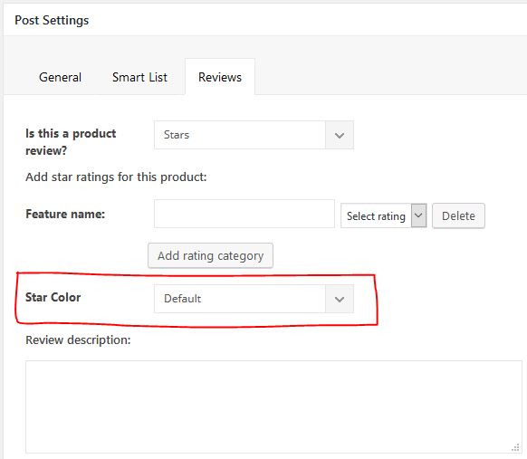
i want to add Option (on Single Post) to change the color of Stars Review. Like this:
https://i.ibb.co/k97gPg5/single-post.jpg (https://ibb.co/61MRqRr)
My Steps:
1. Added html to
“/includes/wp_booster/wp-admin/content-metaboxes/td_set_post_settings.php”
on Line 341
— — —
<div class=”td-meta-box-row”>
<span class=”td-page-o-custom-label”>Stars Color</span>
<div class=”td-select-style-overwrite td-inline-block-wrap”>
<select id=”starsColor” class=”td-panel-dropdown”>
<option value=””>Default</option>
<option value=”green_stars”>Green</option>
<option value=”red_stars”>Red</option>
</select>
</div>
</div>
— — —
2. Added CSS
— — —
.green_stars .td-icon-star {
color: green !important;
}
.red_stars .td-icon-star {
color: red !important;
}
— — —
3. and now where can i add this class to change the stars color on Frontend?
The result, that i want:
https://i.ibb.co/68dvp7m/starscolor.jpg (https://ibb.co/sCB5Dd2)
Can u help me pls?
Regards
 Catalin
 Hi,
Thank you for oyur kind words and also, I feel sorry if you are not happy with the latest version of our theme (v9.6).
The new feature of this update is the AMP+Mobile Theme packet which works well if there will be together enabled. Regarding on Ads, if you do not want to use the Mobile Theme, and just using the AMP plugin and if you want to display more Ads, you need to make some custom modification through the code in order to display them. Unfortunately, the theme does not have any support for this, if the Mobile Theme is not active, sorry! As a hint, in order to achieve as you wish, you should check the following useful tutorial which guides you in the right direction. -> https://isabelcastillo.com/google-adsense-wordpress-amp -> https://isabelcastillo.com/auto-ads-amp-wordpress Unfortunately, the Mobile Theme does not have any such an option that allows you to load your desired font, but only if you will add them such via custom CSS code.
Please notice that we are working on a new update, where we add another functionality regarding on AMP which you have possibly to use the only AMP without a mobile theme, remains the desktop layout. We try doing our best for our future updates.
Thanks for oyur understanding!
Best regards!
 Calin
Calin Hi,
If you want to change the size of that button you’ll need to add a custom css in Newspaper>Theme panel>Custom code>Advance css in phone
https://www.screencast.com/t/hBOAKujif
.comments .comment-form .submit {

    width: 60%;

}
Normally that button should look like this, but you have set to all p { text-indent: 2.1em; } so if you want to look like this you can set this code
.comments #respond p {

     text-indent: 0;

}
in Newspaper>Theme panel>Custom code>Advance css in phone
Thank you!
Calin Hi,
In order to remove that “x” between author name and date you can use a custom css
.td-post-author-name span{

  visibility: hidden

}
Set this code in theme panel>custom code>custom css and that character will disappear
Thank you!
Calin Hi,
The easiest way and fast will be to set a custom css in Newspaper>Theme panel>Custom code>Custom css and this will apply on all link from post content
-> https://www.screencast.com/t/KacZMLAqeh
.post .td-post-content  a:hover {

  color: #8B0000;

}
Thank you!
 Simion C.
 Hi,
That can be done with a cloud template – https://forum.tagdiv.com/tagdiv-cloud-library-plugin/
Here are some cloud tag templates designed by us, you can also design your own with the blank template or modify the ones created by us
– https://affiliate.tagdiv.com/#/load/Tag
So in a cloud tag template you can choose if you want to display breadcrumbs or not, display just the name of the tag without “TAG:”, there is also a description element which uses the data set here – http://prntscr.com/my6gcn – http://prntscr.com/my6gjm
Or instead of the description element use a column text.
If you do not use a cloud template, the breadcrumbs could be removed with some CSS, the “TAG:” could be removed in the theme files, and the description will be what you enter in the edit tag field in WordPress.
Let me know if you have more questions.
Thanks
Calin Hi,
Please use the display inline block option from css
-> https://www.screencast.com/t/zyVdTsRnB
-> https://www.screencast.com/t/G5eOZVPYJJ8l
Thank you!
 Ersoy B.
 Thank you Catalin.. I put the CSS codes but actually there is no difference. The mobile menu doesn’t get active until the page loading %100.
And the about page speed, yes I read all this staff. I used Super Cache and Cloud etc. before. But after I found another small problems. For example, I change a image, but it doesn’t change for a while, something like this. And every time I need the clean cache.. a lot of work for me.. Anyway I’m not so expert all this. I don’t want to mess something doing speed solutions.
Anyway thank you again..

 Media Gazelle
Hi, I’ve set all the custom fonts to “montserat”, including the Pages H1…. H5.
It looks like all the fonts HAVE changed, except the page headers, they stay “roboto”…
1) Could you PLEASE add a global default font setting, since I just clicked through about 100 hundred dropdowns to do this?
2) What’s up with the PAGE headers? It says the font it set in your style.css from the newspaper theme (So it get’s the right CSS file).
Calin Hi,
Unfortunately for the moment this is the only safe way to do it ( using custom css ).
Thank you!
 bharathadigopula
 Thank you very much.
as I tried the menu is not responsive so I will choose custom CSS
Simion C. Hi,
That mobile theme module uses this thumbnail size – http://prntscr.com/mxs6re
It is true that it is reduced like so with CSS – http://prntscr.com/mxs76x
I believe that thumbnail size was considered to be the best choice for the mobile theme to use. There is no specific thumbnail created by or for the mobile theme, it will use that one. Retina will be twice the size of the normal size (530×396).
If you have a suggestion to improve on this functionality mention it here and I can pass it along to the developer team. But I can’t promise anything unfortunately.
Thanks
Calin Hi,
Yes, there is a css that resize all Instagram images to can have the number of images set in theme panel, in order to have the normal size you’ll need to set the numbers of images on default -> https://www.screencast.com/t/rAAUrtTqd4 -> https://www.screencast.com/t/fCM0nCMBDK
Thank you for you understanding!
 csc0203
 Okay. Also, I have one more question. Could you provide me with the CSS snippet to change the title font in AMP posts?
Thanks
Simion C. Hi,
The black demo is a highly customized version of the theme in terms of design, mainly the colors. There are a lot of lines of CSS used to receive that result
– http://prntscr.com/mxrygm
Install it only if you want the website to look as the demo, what is special about the demo is the predominant black color, there are no other special elements besides this.
Thanks
 zlobica
Hi,
I want to remove the grid from the top of category pages, so I put a CSS code in Theme panel -> Mobile Theme -> Custom Code like on screenshot:
https://www.screencast.com/t/Fi0ZDi3egC6a
Is there better way to permanently disable the grid on the category pages in mobile theme?
Thank you!
Calin Hi,
You’ll need to use a custom css for that -> https://www.screencast.com/t/kbqUoZ7ts
Please add the custom css in Newspaper>Theme panel>Custom code>Custom css
.vc_tta-container .vc_tta-color-grey.vc_tta-tabs-position-top.vc_tta-style-classic .vc_tta-tabs-container .vc_tta-tab.vc_active > a,

.vc_tta-container .vc_tta-color-grey.vc_tta-tabs-position-top.vc_tta-style-classic .vc_tta-tabs-container .vc_tta-tab:hover > a  {

  color: white

}
Thank you!
Calin Hi,
If this is what you want to achieve -> https://www.screencast.com/t/RuWAmUADpyr, please make sure that you do not have set any header ads -> https://www.screencast.com/t/fIhUn9WsT and add this custom css in Newspaper?>Theme panel>Custom code>Custom css -> https://www.screencast.com/t/BYIaaIARL
.td-header-style-3 .td-header-sp-logo {

    position: unset;

}
-> https://www.screencast.com/t/mWMy04BtUiX7
Thank you!
 Ninhigan
 Hi, with the newspaper 9.5, the category description is showing up again even though I’ve put the above code in the Custom CSS
Catalin Hi,
I have checked your website and I saw that you have a delay with your loading page. You can try to remove the start transition effect using the code below and place it in Theme panel -> Custom CSS area. Also, please notice that the speed of your website depends on how well your site is optimized.
.td-js-loaded .tdc-row-divider, .td-js-loaded .td-element-style{

-webkit-transition:none;

transition:none;

}
Also, if you want to increase the page speed, you sohuld check the following useful topic from here -> https://forum.tagdiv.com/topic/slow-3/
Thanks for oyur understanding!
 spu
spuHi,
We are facing a peculiar problem in smartlist.
https://www.gadgetbridge.com/gadget-bridge-ace/10-pubg-mobile-settings-you-need-to-change-to-beat-other-players/
The whole page on desktop look warped. The side bar is showing at the bottom and the related posts have exploded. Some CSS problem, how can we solve this?
Thanks
 jaykuo
 Hi Freddy,
It has something to do with the latest Chrome update, please put below code into the CSS section. Thanks.
.td-pb-span4 .wpb_wrapper,

 .td-pb-span4 .td-ss-main-sidebar {

 perspective: unset!important;

 }
 sashos
Hello,
I am trying to reduce the font size in Big Grid 12.
The following custom CSS works fine for the desktop version:
.td_block_big_grid_12 .td_module_mx11 .td-module-title{

font-size:22px;

}
For mobile, this code doesn’t take effect:
@media only screen and (max-width: 767px) {

.td_block_big_grid_12 .td_module_mx11 .td-module-title{

font-size:22px;

}

}
Can you please suggest a solution?
Thanks
Calin Hi,
That is happen because you have install mobile theme, and the mobile theme have others settings for layout, and will not apply the responsive one from the theme; if you do not want to have the feature image on mobile theme, please add this custom css in Newspaper>Mobile theme>Custom code > css
.td-post-featured-image{

  display: none

}
Thank you!
Calin Hi,
Usually the css cams from
https://www.MYDOMAIN.com/wp-content/themes/Newspaper/style.css?ver=9.6
-> https://www.screencast.com/t/ulvWezW6sz
Please provide me a link to your website were I can take a closer look to those links.
Thank you!