
- NewspaperThe Newspaper Mobile Theme: Introduction
- NewspaperThe Mobile Theme
- NewspaperMain Menu
- NewspaperHow to Add a Logo in Newspaper
- NewspaperBig Grid Flex Settings
- NewspaperHeader Builder
- NewspaperFont Customization
- NewspaperTheme Colors Introduction
- NewspaperBackground Introduction
- NewspaperHow to Install Newspaper via FTP
- NewspaperHow to Install Newspaper via WordPress
 Vlad S
 Hello !
We are sorry for the inconvenience !
This is a bug and we are sorry for that. As a quick fix you can use this css code to display those arrow that will show the sub-categories:
.td-mobile-content .td-icon-menu-right {

display: inline-block;

}
The result will be this: https://www.screencast.com/t/n6bOnmAfi1jg
And you have to paste the code here: https://www.screencast.com/t/J1Nxw5s5
I hope this was helpfull !
Thank you !
 Simion C.
 I have added this on our to do list, but I can’t say when we will get to it however.
I forgot to check on mobile, it is the same issue there. So please enter this code as well
.td-header-mobile-wrap .tdb_mobile_horiz_menu:nth-child(3),

.tdb_mobile_horiz_menu .sub-menu {

z-index: 998!important;

}
You can keep these codes in the theme panel for the time being, they won’t cause any problems. Let me know if they work correctly as in my tests – http://prntscr.com/odgr5k
Sorry for this inconvenience.
 Rodolfo
I don’t see the sub-menus on my mobile phone … did I forget any options?
https://www.screencast.com/t/BIE1nhuqv
Thanks as always
Rodolfo
 isagachie
 But the problem of visibility priority remains on the mobile menu… as you can see now on the final address http://www.gogin.eu
 giwalola
 Hi Simion C. Then is so easy, you make me found css that you missing.
I just add this css code and it worked like a charm.
.tdb_mobile_horiz_menu.tdb-horiz-menu-singleline {
overflow-y: scroll !Important;
}
 Simion C.
 Hi,
I see you are using a cloud header template. This means that you can choose what the desktop header version displays and what the mobile version displays.
In this case I see that the header menu element appears in both desktop and mobile. Please edit the header with the tagDiv composer and select the mobile viewport
– http://prntscr.com/od4fnd
Now you can edit the mobile version of the cloud header. Remove that header menu if you don’t want it on mobile. Leave it only on desktop – http://prntscr.com/od4gft
Also be sure to customize the sticky version for both desktop and mobile
– http://prntscr.com/od4hk4
Activate the sticky mode on desktop or mobile and add elements in them
– http://prntscr.com/od4i7g
If you do not want a sticky version, remove all elements from sticky mode
– http://prntscr.com/od4isu
Please let me know if you have more questions.
Thanks
 Miriam65
Hi,
How do I remove the header menu from the mobile version without removing it in desktop. My website is wordpress.elbebe.com and this is the screenshot. http://prntscr.com/od3ow9
Best
Miriam
Simion C. Hi,
This issue will be fixed in the coming theme update. The temporary fix is to enter this code in the theme panel custom CSS section
.td-mobile-content .td-icon-menu-right {

display: inline-block;

}
Then the drop-down arrow will appear – http://prntscr.com/oczz2z
Sorry for the inconvenience, please let us know if you have more questions.
Thanks
Simion C. Hi,
I made some tests with the mobile horizontal menu, seems that on Android phones the scrolling action builds momentum, while on iOS phones the scrolling stops immediately when the finger is lifted (more like a dragging action).
I can’t provide a solution for this at the moment, but I will however make a note of it for more investigation. Sorry for the inconvenience caused.
Thanks
 Catalin
 Hi,
I have checked your mobile menu on mobile and it seems to return good results. It seems to works as expected. Also, if you want to display more ads inside your homepage you will need to use the Ad Box functionality for that. If is not what you mean, please provide more details about that, so I will be able to provide a more accurate response.
Thank you!
Vlad S Hello !
We are sorry for the inconvenience !
This is a bug and we are sorry for that. As a quick fix you can use this css code to display those arrow that will show the sub-categories:
.td-mobile-content .td-icon-menu-right {

display: inline-block;

}
The result will be this: https://www.screencast.com/t/n6bOnmAfi1jg
And you have to paste the code here: https://www.screencast.com/t/J1Nxw5s5
I hope this was helpfull !
Thank you !
 SirBrayden
On my site (https://www.mickeyviews.com/) you will notice in the menu the “Travel Tools” option has two sub entries that are clearly visible in the desktop view. If you resize the site for mobile/responsive, no drop-down caret appears next to “Travel Tools” on the responsive menu. It used to, but now it does not and I can’t figure out why. I’ve done many different combinations and switching the menu drop-downs around but still for some reason none of the sub-entries appear when you look at the responsive/mobile menu. I went so far as to disable and enable all plugins to make sure there was nothing conflicting, etc to no avail. Where did the carets go?


 getfreshtoast
Hello,
We are currently experiencing a discrepancy between our Staging and Live/Production sites involving the subcategories not showing in our menu on mobile devices. Below are links to both our Live and Stage sites:
Live: https://thefreshtoast.com
Stage: https://stage.thefreshtoast.com
In our Theme Panel, we are using the Mobile Theme and our settings are the same across both sites however you will notice that our Live site doesn’t have expanding arrows for the menu whereas our Stage site does. I reviewed the documentation on how to create MegaMenus with subcategory support but for some reason we don’t have those options available when attempting to create a new menu. The only major difference between the two sites are that our Live site has its own security and firewall system in place. Any information on why this is happening or how to resolve it is greatly appreciated.
Thank you,
Matthew Blockus
Systems Administrator
The Fresh Toast
giwalola Hi Calin,
Mobile version with Chrome inspector:
http://www.filedropper.com/mobileversioninchromedesktopinspector
Iphone version:
http://www.filedropper.com/iphone
In mobile slide is not fluid, stops if you haven’t got your finger on the screen,
if you try the same in desktop is the way it has to work, like the websites I sent to you, all have the same functionality. I think is something in javascript, but I’m not sure what it is.
If you try any of this websites in your mobile and you compare them with newspaper theme, you will see what I mean:
elconfidencial.com
menswearstyle.com
aplesfera.com
hola.com
vozpopuli.com
guineenews.org
All do the same, if you slide menu continues sliding even if you don’t have the finger on the screen (In desktop works properly). That’s why I saw that something is not working perfect, I think your theme is the best, and you want it to remain the best 🙂 .
 abdul108
Hey there,
it looks like my mobile menu is not working on my site.
Furthermore, there are way too many Ads on the homepage of the site and I have no idea why that is.
Parenthoodtimes.com
Thanks for your help!
Cheers,
Abdul
 Calin
Calin Hi,
Sorry was may mistake you was referring to the Mobile horizontal menu with single line menu option, I’ve tested this option and for me is working normally.
-> http://www.filedropper.com/whatsappvideo2019-07-09at102322
Please make sure that you do not have a plugin conflict with untested plugins, please deactivate all non theme plugins and child theme ( if you are using ), clear all cache and try again.
If there is still a problem, please provide me a link where I can inspect your menu.
Thank you!
 tabelaesportiva
Gostaria de saber como faço para tirar as informações do rodapé como “about us”.
Além disso, de modificar os posts relacionados, deixar na lingua nativa do site.
Outro ponto é que aparece, as categorias irmã dentro dos menus, eu coloquei os códigos que falaram no e-mail mas não deu certo.
isagachie Hum… my mobile menu was fine 🙂 ! But perhaps you saw it before I finished it!
But I’m affraid you didn’t answer my really main question about the first sub-menu going under the second menu (see my former screenshot that show you the problem…
I’m affraid we encounter frontend problem now… because of the server issue… so you can’t see it live.
 chakiss
 Hi, since the Mobile Theme plugin has so much you can’t customize, I had to disable it. Everything looks great now but I cannot find the way to disable the sing in / join buttons on the menu. The header manager won’t open the menu itself and provides no customization. How can I remove the sign in option?
Thank you!
giwalola Sorry Calin, but you have this option in your theme. I add same menu with your new header builder (Mobile horizontal menu). The problem is that the menu is not fluid. I doesn’t slide well.
Calin Hi,
Unfortunately our theme do not have this option for menu slide on mobile, sorry! maybe this option will be add in coming updates.
Thank you for your understanding!
giwalolaHi, is there any way to make horizontal menu in mobile slide longer?
Like un this websites (mobile version)
http://www.elconfidencial.com
http://www.hola.com
http://www.applesfera.com.
Those are some examples, and all horizontal menu slides the same, and yours stops after each item.
Any solution?
Is nicer and more useful.
Calin Hi,
If you are using the mobile theme, the mega menu will not be display, this can be display only in responsive version of the theme, if you have the responsive version, you can try this custom css
.td-mobile-content .td-icon-menu-right {

display: inline-block;

}
The code need to be set in Theme panel> Custom code> Custom css
If there is still a problem, please provide me a link to take a closer look to it.
Thank you!
 shuaybi
I created a mega menu using category and subcategories. This displays well on desktop. On mobile however it only shows the top level category (when user clicks the burger icon). How do I display subcategories as a submenu on the mobile displays?
 reddisl
Hello Tagdiv support,
I have 2 issues:
1. I would like to move the Above Post ADS (YOUR ARTICLE TOP AD )to Left a little bit because as you can see my website is RTL
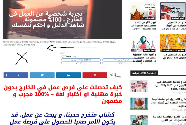
However in MOBILE, they are 1000% responsive , just in DESKTOP there is this issue.
2. Since I bought the theme, the ( YOUR ARTICLE INLINE AD ) never appears even though I set them after 2 paragraphs, In mobile AMP they appears after 2 paragraphs, but in desktop or when I visit my website via mobile they don’t appears , how can I fix this?
3. If you visit my website via mobile, you will see that the Search button is on the menu button like an error, I want to disable the button of search for mobile.
I used this CUSTOM CSS under Mobile theme in THEME PANEL but it didn’t work
#td-header-search-button-mob {
display: none;
}
.header-search-wrap {
display: none;
}
