
- NewspaperThe Newspaper Mobile Theme: Introduction
- NewspaperThe Mobile Theme
- NewspaperMain Menu
- NewspaperHow to Add a Logo in Newspaper
- NewspaperBig Grid Flex Settings
- NewspaperHeader Builder
- NewspaperFont Customization
- NewspaperTheme Colors Introduction
- NewspaperBackground Introduction
- NewspaperHow to Install Newspaper via FTP
- NewspaperHow to Install Newspaper via WordPress
 1776scoop
Your theme is the best I have ever used. I love your newspaper theme. May I implore you to please work on your mobile theme plugin. It is just not working. Without the mobile theme, the site looks fantastic on a mobile device. We lose so much with the mobile theme. Most importantly the menu does not work with and without the mobile theme. Please, please, please take care of this. The beauty of your theme is ease of use and your mobile theme is just not easy to use right now. Thank you so much for your attention to this matter.
 Catalin
 Hello coachkriswatkins,
In your link is talking about an AMP version which does not contain any menu button. So, I have checked your website on mobile devices and it seems to work as expected and the menu works fine. Try again and check the results.
Thanks for the message!
 Simion C.
 Maybe like this – https://www.screencast.com/t/0bglaoD285r
.header-search-wrap {

right: 54px;

}

#td-top-mobile-toggle {

position: absolute;

right: 0;

}

.td-main-menu-logo img {

right:auto;

left: 20px;

}
 coachkriswatkins
 So I tried to remove the mobile logo then go look and now it seems as if there is not a mobile menu button
Simion C. Hi,
But if you shift the menu to the right what about the search icon? Maybe like this
– https://forum.tagdiv.com/topic/how-to-change-mobile-icon-menu-to-the-right/
Or maybe switch them? – https://www.screencast.com/t/EWt7fDFfEWc
#td-top-mobile-toggle {

position: absolute;

right: 0;

}

.header-search-wrap {

right: auto;

}
Also with the menu to the right as you mention
– https://www.screencast.com/t/Iqp57AJP
#td-top-mobile-toggle {

position: absolute;

right: 0;

}

.header-search-wrap {

right: auto;

}

.td-main-menu-logo img {

left: auto;

right: 54px;

}
Modify the codes as you want, then enter them in the phones section in the Advanced CSS.
Thanks
 Mik3storm
Hi,
I’ve recently update to V9.0.1 but the search icon doesn’t work no more (in desktop version) and, in the mobile version of the theme, when you’re in any post, the search bar and the menù icon don’t work.
Can you pls check it?
Thanks
coachkriswatkinsHi,
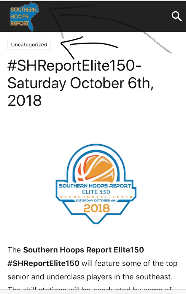
I am having some trouble with my site showing up correctly on mobile device when someone gets to it by clicking a link to the site (twitter, facebook, text message, etc) It shows the category (which I do not want) and it moves the logo over the menu button. This is not an issue if you go to the site directly on a mobile device, only when someone is directed to site via a link
 Arafat
Hello, I want to shift Mobile menu left side to right side use custom CSS. How can I do that? Also, shift mobile logo center to the right side using custom CSS.
Thanks!
Catalin Hello johnmiao,
I have checked your website on my mobile and the menu seems to work as expected. Where is the problem? Provide some useful screenshots of the problem so I can identify the problem.
Thanks for your understanding!
Simion C. Hi,
The mobile menu does not display for tablets, in general. If the table is smaller the mobile theme may display. So only on smaller devices it will be visible, most tablets will display the responsive version of the website.
This is done automatically and there are no settings to control when to display the mobile variant and menu.
If this not what you wanted to know please correct me.
Thanks
Catalin Hello xavig,
Unfortunately, all of these changes involves doing such additional customizations and we cannot provide something like this at the moment, sorry! If you want to have more options, in this case, you should implement it yourself through the code because we cannot provide custom work at the moment, sorry! Also, if you are not aware of the steps which are needed to take in this case, please consider hiring a freelancer/developer to help you! Usually, we recommend the developer from studio.envato.com
Another alternative for you would be to use a mobile theme which allows you to have two different menus for mobile and desktop.
Thanks for your understanding!
 johnmiao
I recently upgrade to version 9 but the main menu won’t expend on mobile device. Please help me to check
thanks
John
ArafatHere the Some Recommendation for Mobile device:
#Firstly, Move menu on left to right. It helps to user to use the menu. The user easily uses the menu (Try yourself). Like this:

#Secondly, Disable the popup search bar. Make search bar like this:
 .
.
#Thirdly, Make default social Floating sharing like this:

Check this site on the mobile: https://www.theodysseyonline.com/
It makes more user-friendly & Google friendly.
 Melargus
Hello!
Tell me, please, how do I configure the transition to the mobile menu for the tablet?
 xavig
xavig Hello Catalin. I did this two changes:
– https://www.screencast.com/t/sTbFYXUCbtm7
– https://www.screencast.com/t/QjYkL3EdnQE
in my child theme and it works perfect!
Now I have a specific main menu for mobile and another for desktop. In mobile it looks awesome but I lost the style in main menu for desktop.
Can you help me to fix it? Thanks very much
Simion C. Hi,
I checked the website on mobile, tested the menu for a while. I see no problem with it, works alright from what I can see
– https://www.screencast.com/t/bBagfWviMAL
Maybe you solved the problem with the menu.
xavig How is the situation of this subject after this hole and a half year? It’s still not possible to edit these files in child theme?
If not, can you suggest another solution? I don’t want to lose the changes when I update the theme, and I need this mobile menu feature.
Thanks!
 Ryansmccain
I’ve tried messing around with all of the fonts and I got 90% of them back to how they were, but for some reason, I can’t figure these out.
Can I change the font for the “More stories” thing that fades in from the right of the screen?
Where do change the font size for block 15? On my page, it’s the blocks Popular Answers and Latest Answers.
Can I change the font color of the mobile menu?
Where do I change the post excerpt for block 24? This is the featured post on my site.
My page — > https://www.InterestingAnswers.com
Thanks
 eaterphadmin
Mobile menu on my site eater.ph is suddenly not working. Freezes website.
 Bogdan B.
 You can only achieve a separate menu when using the mobile theme plugin which provides a separate menu for mobile devices. you cannot have separate menus on the standard responsive version of the theme:
https://forum.tagdiv.com/the-mobile-theme/
Thank you!
 SPAREGmbH
 Hi there Bogdan,
Thanks for your answer.
This does work wonderfully.
BUT
i would only like this to be displayed on the mobile Menu.. how could i achieve this? thank you
SPAREGmbHHi there,
i was wondering if its possible to add a Logo above the Menu on Mobile.. just below the login/register option
https://prnt.sc/kooen3
Can this be achieved somehow? Also is it possible to color the X Button on the top right?
thank you so much
Bogdan B. hello,
The amp template was implemented according to the current standards. It is the exact same implementation made by Yoast for example: https://yoast.com/wordpress-seo/amp/
As you can see there is no menu on their website as well. But we will consider implementing this into our themes as this request becomes more and more popular.
The amp plugin uses the mobile logo so please check your mobile logo in the theme panel. Make sure it is high quality. Check from your mobile device also, not from desktop as AMP i a mobile only implementation. A user cannot access it using desktop unless specifically wanting to by adding /amp after the url
The search button redirects you to the main page which is what it needs to do so the user can get to your site as well.
Your amp version works properly.
Thank you!
@dgc97
Please open a new topic and provide a link to your site and more details to what exactly is not working.
Thanks
 pinnaclecompass
 Additional information: We’re using header ‘Style 2 – Multipurpose’ for desktop view, Smart snap (mobile) sticky menu with mobile logo. Social icons are disabled.
Site in question: https://www.caymanhealth.com/
pinnaclecompassHello,
This is not a bug – I just need advice.
We had to add a lot of text to the main navigation menu. Because of this, some text goes over the logo on screen widths less than 890px wide.
I tried to search through CSS, to see which rules make the mobile menu appear (and regular disappear), but there seem to be a large number of @media . I also don’t know yet if there is an additional javascript involved.
Is there an ‘easy’ way to change the width for mobile menu to appear at 890px, instead of 767px?
I only want to change the appearance of the menu, not the entire site.
Thanks in advance.
