
No search results were found in Documentation!
 wuche
wuche Update on point 3: I checked on my desktop browser and the new background image for mobile menu/search background seems to be working properly when reducing browser width below 767, but the old image still persists when visiting on my Android smartphone on Google Chrome. Could this be some cache issue I’m overlooking?
wucheNote: I disabled the “Mobile theme” plugin because I would rather the mobile version of the website be based on responsive web design.
The website with issues:
wuche.gg
Issues with responsive web on mobile (Android, but presumably iOS as well)
1. On the front page Big Grids, the offset posts feature works on desktop browsers but does not work on mobile browsers. All Big Grids are set to sort by -Latest-.
2. I’m using custom css for the module title fonts on Big Grid Full 1 & 2 because the option to change it via module on Theme Fonts isn’t implemented yet.
.td_block_big_grid_fl_1 .td-module-title a{
font-family: ‘Source Sans Pro’, sans-serif;
font-weight: 600;
font-size: 42px;
line-height: 44px;
}
.td_block_big_grid_fl_2 .td-module-title a{
font-family: ‘Source Sans Pro’, sans-serif;
font-weight: 600;
font-size: 26px;
line-height: 28px;
}
It works perfectly, but I want it to be responsive as well and downsize the font when below a certain width. So I added this code also to Big Grid Full 1 just to test out:
@media (max-width: 767px) {
.td_block_big_grid_fl_1 .td-module-title a{
font-size:30px!important
} }
@media (max-width: 767px) {
.td_block_big_grid_fl_1 .td-module-title a{
line-height:32px!important
} }
And while it works this works perfectly on desktop, it does not work on mobile.
3. I deleted/changed the background image for mobile menu / search background, but it still persists.
Whenever I make an update, I clear the cache on Google Chrome on my Android phone. I also empty the cache via WordPress, and I also have disabled the WP Super Cache plugin just to triple check.
Any help would be greatly appreciated. Please and thank you!
 Osnak
Osnak Hello!
Unfortunately you missed my one question to answer. That is –
1.Is it possible to add 10 videos in carousel mentioning singers name below for navigation and lyrics in text in a single post? How can I do this?
In my friend’s newspaper theme HTML editor is enable for Category description. For mine there is only text. How can I enable HTML editor for Category description?
In mobile template of your site http://www.tagdiv.com the menu in the left hand side and search bar is small with out any background. How can I do this for my mobile template like yours?
Thank you!
 pablojmelian
dont show menu in mobile and i cant see header banner in mobile , how can i fix this
urgent please
 fguyaux
 Hi,
this is the website: https://www.chronicleproject.com/
Most theme switch to mobile menu on tablet vertical (or under 800px), or offer the choice
Thank you.
 Simion C.
 Hi,
Please provide a link to your website so we can inspect it, the menu should display in every situation, depending on the device. This is how the demo looks on an iPad in portrait – https://www.screencast.com/t/iamUi5zAQ and in landscape – https://www.screencast.com/t/NlltWQrYzQ0
To achieve something as to display the mobile menu in this situation it would require probably major changes to the theme files and media queries and a lot of hard work changing the design of the theme. This feature applies in certain situations based on the screen size, and there are a lot of automatic functions that are involved in the process.
Thanks
 robert
Hi, I’ve customized my social urls to have only Facebook:

While on homepage the hamburger menu is ok, on the post pages it still shows the 3 social icons with # as URL:

On the mobile theme is ok. So
– Home is OK
– Mobile theme is OK
– Post Page on Desktop is WRONG
Also the footer is in sync in the hamburger, so it’s broken on the post page as well. It seems that the post page is ignoring the settings and always displaying the 3 links = “#”
I’m using version 7.8
fguyauxHi,
in an iPad, the menu is not mobile, it is especially not working for vertical orientation, but even for the horizontal ipad, it would be nic eto have the coice to put the mobile menu.
Is that possible ? or how can I cange the code to have the mobile menu on vertical ipad ?
Thank you!
Francoise
 Catalin
 Hello harmario,
Unfortunately, I do not exactly understand what type of menus you are referring to, sorry! Notice that our theme has only one menu for desktop and table and for mobile is the same menu but optimized for this mode. Most likely, your problem happens due to your caching plugin. Try clear all your caches, server cache and use only our recommended plugins. (especially WP Super Cache plugin) If you need more assistance in this regard and if the problem is still there, please provide your website URL and also, some useful screenshots with your problem for a better understanding.
Thanks for your message!
 jmaldonad
 Hello,
Here is a screenshot with the web menu and the mobile menu
https://www.screencast.com/t/2lEtTQdY7xH
The mobile menu does not show the menu “Nosotros”, it shows a white arrow all the way to the left.
This issue is happening only to the parent menu that has subpages inside.
Please help me to solve this issue.
Thanks
 cipmweb
Hi there,
our readers are often reclaming a view error on mobile devices. The articles are impossible to see cause the default menu and search page appears, but is blocked.
the website is: http://www.ambientebio.it
Where i can send you the screeshot?
many thanks for your support.
FG
 Jose
Jose Hi @Simion C. and thanks for reply,
Yes, I found that info some ours ago thanks, and I repair the problem (fix).
But now….. I see a detail and I dont know how to do it…. I cant find info about also.
Can I add te RRSS icon in mobile menu? How?

Thanks
 MarketExpertise
The search that automatically appears on the main menu does not work.
Nor does the mobile menu – it does nothing.
Can anyone help?
Catalin Hello dhincapie,
I have tested again your website for two different mobile devices on android and I did not saw any problem with the main menu, as you can see here -> https://www.screencast.com/t/IpgD8OJtW What kind of browser is used by your customers? Please keep in mind that the theme is fully tested with these browsers -> https://www.screencast.com/t/ngcxMpD55YOz If your users use some default browsers of their’s mobile phone, it is possible that the theme does not work as expected and that why you receive bad reports. Use the theme only on tested browsers if you want to bring best results.
Thanks for your understanding!
 keyforweb
 I’ve found how to disable sidebar on mobile… i’ve also the issue on vertical allignament for submenu!

-
This reply was modified 9 years by
keyforweb.
JoseHello,
I have installed the latest version of the theme and plugins, all updated. I use your pluguin for mobiles.
I use the same menu for footer (in pc and mobile). In PC links of footer run ok, but in mobile not run.
¿Why?
My website: https://goo.gl/zFiz6M
When I click on link, no open the page, only show ads. Add image
https://fotos.subefotos.com/994eae9cc138f748eabfc1c8c8ed507bo.png
Can you help me?
Cheers
keyforwebHi to all, we had bought some hours ago this fantastic theme and we had uploaded on our staging site for some test before upload online….
We are using last version 7.8 and we have an strange issue with menu and submenu that is not perfectly aligned..
A little question: how can i disable sidebar on mobile?
Thx a lot for help
Orlando
 dhincapie
 I am assuming that this problem mayba doesnot comes from mobile menu
Simion C. Hi,
You can try this code that changes the z-index on that element, and applies only when the mobile menu is displayed – https://www.screencast.com/t/RYliJHxCmS6Q or when the mobile search screen is open – https://www.screencast.com/t/WciwI1axFKck
These are the codes used, please try and see if they are working properly for you
.td-menu-mob-open-menu

.woofc-trigger,

.woofc-inner {

z-index: auto;

}
.td-search-opened

.woofc-trigger,

.woofc-inner {

z-index: auto;

}
Thanks
Catalin Hello dhincapie,
I have inspected your website for many other mobile devices and the mobile main menu seems to work as expected, as you can see here -> https://www.screencast.com/t/5hdplQgw6p Try to clear all the caches from your mobile or try check it for other mobile and check the results.
Thanks for your understanding!
 Bogdan B.
 Hi,
Sorry but I cannot see any woo floating cart on your mobile menu. We have not tested this plugin so I cannot say for sure how you can implement it in our custom mobile menu. You can try a bit of css positioning on the button:”
https://www.w3schools.com/css/css_positioning.asp
Thank you!
 alerazak
Hi folks!
I´m a new one here. I´m wondering how can I handle the mobile version, I want to edit the menu and add the back to top arrow.
Thanks.
 Thomas
Hello
I use an extension Woo Floating Cart but it appears on the mobile menu.
To test add some products to the cart for example here:
http://www.virtualmagie.com/boutique/tours/inv3rsion-pierre-boc-yves-meret/
How I could achieve that this block cart be under the menu?
Regards

Bogdan B. Hello,
Thank you for your appreciation.
1) I have tested your site on mac but could not see the line you mention. https://www.screencast.com/t/kHdvVpdbcJUN
2) Our theme has a custom login already which can be accessed on the front-end: https://forum.tagdiv.com/login-how-to-enable-user-registration/ – https://www.screencast.com/t/D0BiMNXRTqyG
3) sorry but there is no gradient color section for the header and footer but you can add a footer background image: https://www.screencast.com/t/rKgVA4TL
For the header it can only be done with custom css.
4) Sorry but only by using the obile theme can you have a separate menu for mobile devices.
5) The quotes can be changed from the fonts option: https://www.screencast.com/t/tcwLRz4daHU
6) and 7) It is ok as there are no restrictions in this regard. It will load all of the elements, yes, but you should not experience drastic loading speed drops. It is recommended to increase your overall loading speed by using this guide: https://forum.tagdiv.com/how-to-make-the-site-faster/ and increase your system status parameters like so: https://forum.tagdiv.com/system-status-parameters-guide/
lease only use wp super cache and these settings: https://forum.tagdiv.com/cache-plugin-install-and-configure/ if you plan on using a cdn server: https://forum.tagdiv.com/cloudflare-cdn/
8) This topic explains how to use speedbooster together with other plugins: https://forum.tagdiv.com/topic/tinymce-advanced-and-other-various-disabling-speed-boster/
9) Please provide an example as the image is not working
10) The validator also provides errors for ALL of the well known sites including google, facebook, Amazon, Yahoo, etc. We have stopped trusting it 🙂
Thanks
 fenomeno0chris
Hello to the whole Newspaper/Newsmag team!
First I want to say, thank you very much for creating such great themes.
After 3 years I decided with my team to change the overall design of my homepage, by buying Newspaper7. The reaction of our readers and users are mostly positive. So thats a good sign.
Of course such a huge change is not that easy to handle and thats why I still have some problems and question, which should be solved.
All problems occur on the latest version of Newspaper 7.8
1) On my MacBook with the default Safari browser, I often get this annoying and bad looking line through the whole header section. How can I solve the problem?
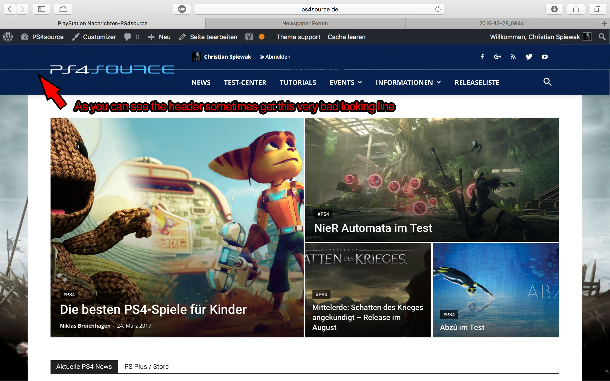
2) Which register plugin should I use? I don’t want to let new users to set a new password on the bad looking interface of WordPress. Im sure you guys know what I mean and have a good recommendation for that. Beside that, what should I use to prevent registrations from bots?
3) Is it possible to have a gradient header and footer, instead of just one color? It looks a bit boring.
4) How can I change the menu just for the mobile page, without using td-mobile-plugin?
5) How can I change the the font style and size of quotes? At default settings it looks way too big (see here)
6) Is it ok too use the responsive options, to create one site with different blocks and grids for mobile and desktop? Im asking cause I don’t know if my site will load much longer, if it has to load information even though there are not displayed. (see details here)
7) My current page speed is a disaster (see here). Why is it so bad, since Im using kraken.io image optimizer and WP Super Cache? How can I improve the score?
8) How can I use td-speed-booster, without uninstalling my plugins? (Disqus Comment System, TablePress, TotalPoll…) I really need those plugins, but I still want to have a fast homepage!
9) If I set [Template Setting->Force Full width->Header Menu] to “No Stretch”, the logo of my site is not at the correct position.

10) validator.w3.org shows, that my page has 33 errors (see here). How can I fix them?

