
- NewsmagSmart list ads
- NewsmagIntroduction
- NewsmagMain menu
- NewsmagLogo & Favicon
- NewsmagHeader ads
- NewsmagSmart sidebar
- NewsmagSharing buttons
- NewsmagCategory tag on modules/blocks
- NewsmagBackground introduction
- NewsmagTheme colors introduction
 mediagod
Hello,
I currently have the Newsweek Pro theme installed to my website but I like the layout of the mobile menu in the theme Urban Observer. How can I incorporate the mobile menu design from the Urban Observer theme into the Newsweek Pro theme? I don’t see any options to add anything to the mobile menu in terms of search boxes, horizontal menu elements, etc.
 marcusdoc
 There is still an issue:
1) mobile printing still prints the background header image … how do I hide this?
other thing for the devs to consider:
a) why did I have to invoke the !important flag; what other CSS preventing this from normally occurring without the !important flag
 jayflyer
Is it possible to place a block on different section on desktop and mobile ?
on desktop i have the email opt-in form right below flex block.
but on mobile, it’s pushed down all the way down below a category block: https://imgur.com/a/fhNvsUh
is there a way for me to place this email opt-in block right below first flex block on mobile as well?
 ALB13
ALB13 It’s HTML. Inserted via API. Changing the color per the imgur screenshot does not solve the problem.
I’m about ready to ask for a refund. Nothing is easy with this thing. I’ve also now got a situation where the title and tagline (top left of website) is different on web vs. mobile.
This is beyond clunky. This stuff shouldn’t be this hard.
-
This reply was modified 2 years by
ALB13.
 AlanDogg
Hi, I keep getting Romanian news menu, all I want is to turn it off completely, I have wasted 3 hours of my life going round in circles. I want to use a 3rd part mobile menu to create a simple default one which you would have thought would have been created by this template as default but no, that would be too easy, the current mobile menu doesn’t disable or go away even though it says it is.
I would appreciate any help thanks
marcusdoc There were still issues with the mobile page printing and I had difficulty identifying what exactly was changed so I restored the website.
In LiveCSS, I added the following code:
@media print {
.tdb-logo-text-wrap {
display: none !important;
}
body {
margin-left: auto;
margin-right: auto;
}
}
by adding the !important flag it places the CSS at a higher priority and thus it actually works !!!
Result:
Desktop printing: perfect
Mobile printing: it still wants to print the background header image … how do I hide that image (I can’t find the CSS name)?
I also tried placing the new working CSS within Newspaper’s
Theme Panel – Custom Code – Custom CSS
however, the !important flag was flagged by the panel and the end result did not work
 marcusdoc
 — email response from TagDiv Support —
Hello,
Sorry for the delay.
Indeed, after many investigations, it seems there is some issue. To provide a solution until this issue is resolved, I created mobile pages and mobile templates, so please check now.
Thank you,
Anamaria
— end of email —
 random123
 I’ve got it! You had to use a color and make the transparency as transparent as possible. Doing “clear” defaulted to black. 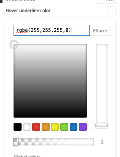
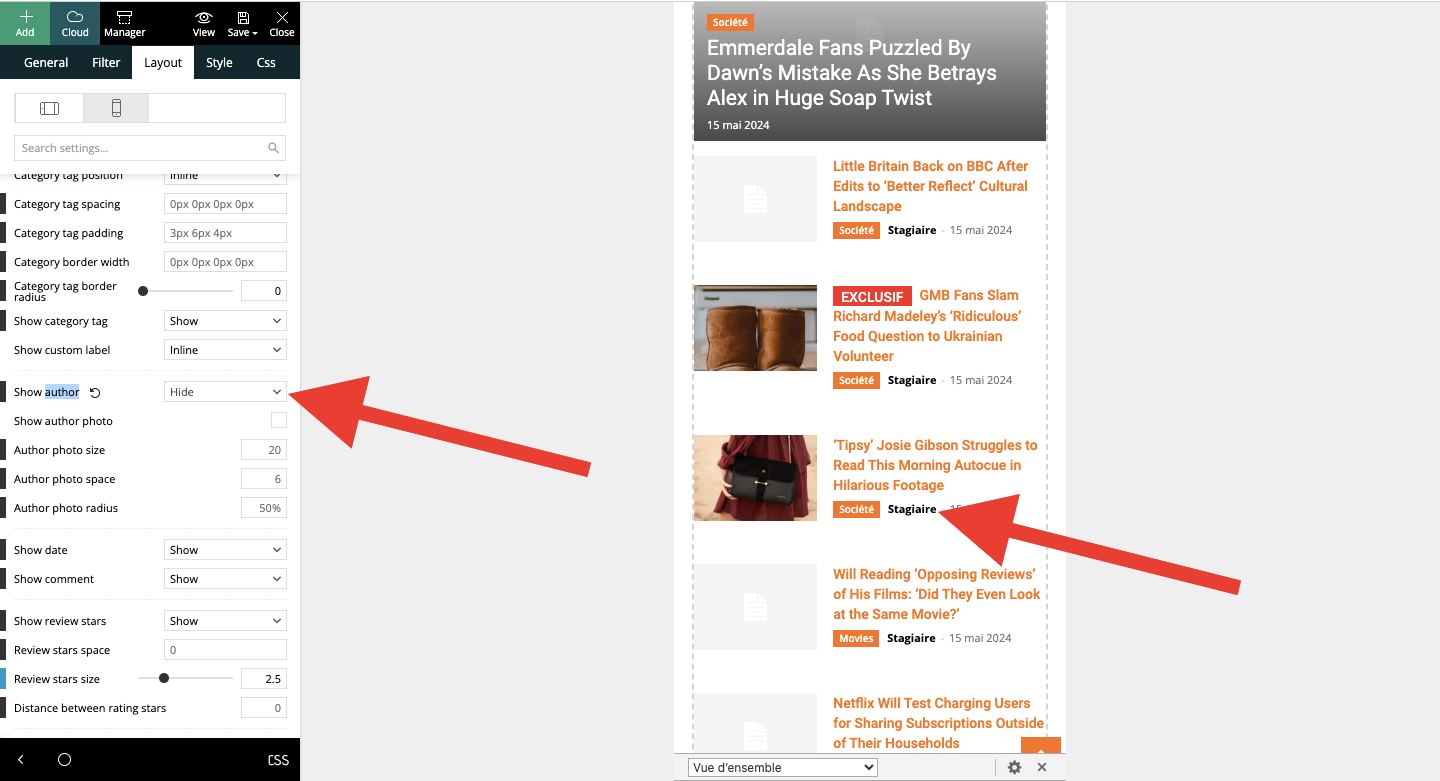
I have another question, please. On mobile, on the article template, I put “hide author’s name” in module 2 of Flex block 4. This doesn’t work. When I activate the “hide name” option, nothing happens. Same thing when I save. What can I do?
 Calin
Calin Hello,
If is used the tagDiv Mobile theme plugin, then you’ll need to edit those file
– wp-content/plugins/td-composer/mobile/single.php
– wp-content/plugins/td-composer/mobile/loop.php
Unfortunately with the code to add your custom taxonomy I can not help, if is about a css for style, this is ok, we can do it, but custom code and changes in the theme files with custom code is a bit over what our support can offer, sorry!
As a hint, this is the code that I saw as example in some articles – https://pastebin.com/DLvm1Gir
I hope this will help you!
random123 Hello Anamaria,
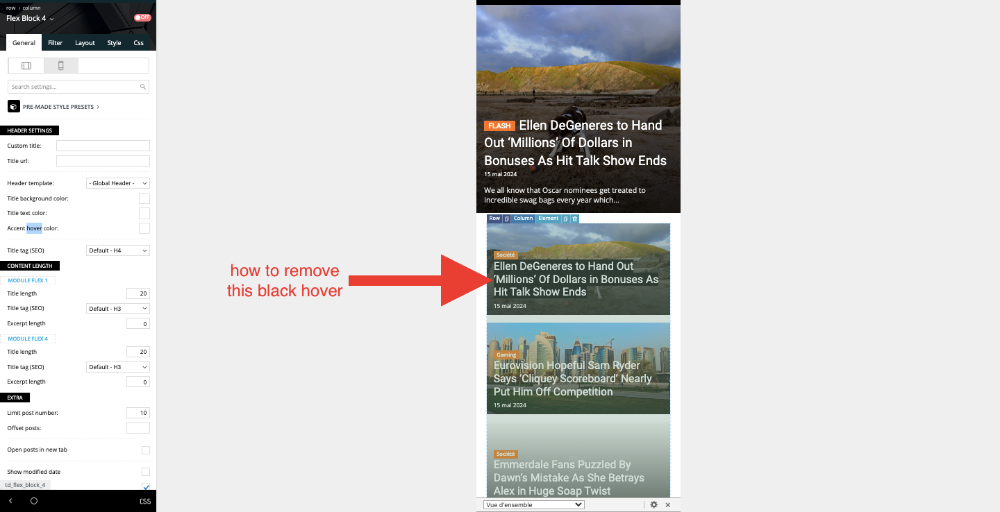
Thank you for your help. I have one more question. Can you tell me how to remove the black background that appears on the mobile template? It appears when clicked on mobile, which is not very aesthetic.
Thanks for your help!
-
This reply was modified 2 years by
random123.
 itgrcapitallink
 How can I use the modal popup on the mobile menu view?
random123 I found the setting via the manager, which didn’t appear when on mobile.
 efe97
efe97 Hello Bettina,
I think you didn’t understand me correctly, I am asking about mobile-theme.woff error. I added “font-display:swap” to style.css and style-amp.css but nothing changed.
Thanks
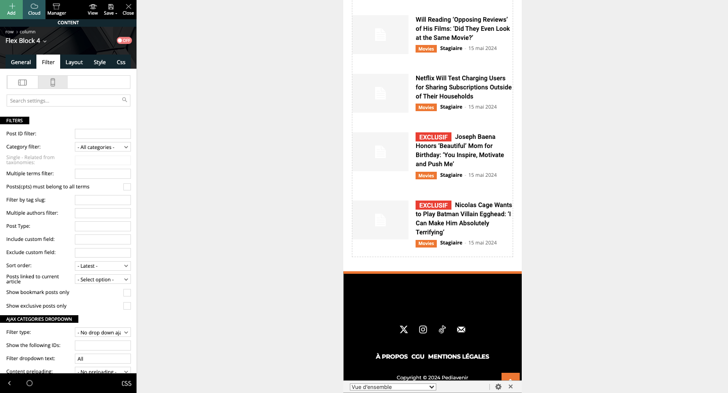
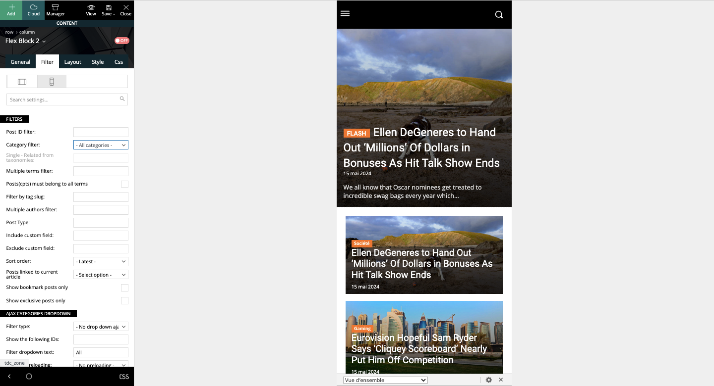
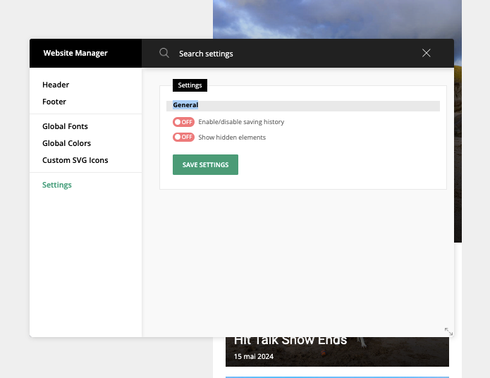
random123 I’m sorry, but I can’t figure out what to do with your screenshots. I have this behavior on both desktop and mobile articles. I’d really like to remove this loading at the bottom of the page. I don’t want other articles to be displayed when you scroll to the bottom.
 Bettina
 Hello!
The fonts settings for the Mobile theme are separated in the theme panel -> mobile theme: https://forum.tagdiv.com/the-mobile-theme/
https://forum.tagdiv.com/font-customization/
Thank you!
efe97Hello, at PageSpeed insights I have such a error in mobile amp version. I searched a lot but I couldn’t find the solution please help me

 zelatech
 Hi Calin,
thanks for reply. I know procedure to modify files due to loop used.
how to update also mobile/AMP?
I’m asking you sample code to show under “tags” with same css/style (i’ll update taxonomy name after).
thanks
-
This reply was modified 2 years by
zelatech.
itgrcapitallink Hi Annamaria,
This doesn’t work on mobile.
https://capitallinkshipping.com/
 Anamaria
 Hello,
To have a sticky header please make sure you have this option enabled https://imgur.com/VaBSIID
Please follow the video to see where you can find, build your sticky header on mobile and desktop too: https://www.screencast.com/t/l6v2Belt
Thank you!
Calin Hi,
If your mobile layout is not the responsive version, then it is used the tagDiv Mobile theme plugin. To have the responsive version, the one that can be seen in tagDiv Composer, it will be need to disable the tagDiv mobile theme plugin.
Thank you!
 ignacioribes
I have the latest version installed and everything is updated, if you access the website from a mobile browser a redirect is made to a spam website.
If I deactivate the theme this does not happen.
You can see it at checkinmag.com. I come with this problem a while ago. I had seen the increase in traffic. I had to block several countries. It seems that they redirect traffic to the website.
Any ideas?
random123 Thank you very much, it worked!
I have one more question.
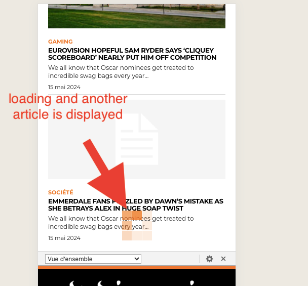
On mobile, when I click on an article, I would like the article to be displayed and at the bottom there are related articles etc then the footer. However, currently, when I go to the very bottom, it loads and another article is displayed. How can I please stop this?
Thank you!
 thalesbrandao
I need our mobile layout to be complete, covering all of our content. In the TagDiv Composer model I can view all the content but on the cell phone all our content does not appear and only the news. How to fix? thanks!]
 VQC
VQC There is no ads in the theme panel and there is no ads on pages, but the ad containers are still present on the website and since some of them have a fixed height, it breaks the layout.
For example, the header ad is empty, but you can see that the layout has a spot for it on mobile (see two screenshots: https://imgur.com/a/GMtsKmc)
Bettina Hello Lamiaa!
Sure. Edit the mobile viewport: https://app.screencast.com/TffmDPVrdAg0Z, add a new row in the header and add the menu you want too.
Thank you!
