
- NewsmagSmart list ads
- NewsmagIntroduction
- NewsmagMain menu
- NewsmagLogo & Favicon
- NewsmagHeader ads
- NewsmagSmart sidebar
- NewsmagSharing buttons
- NewsmagCategory tag on modules/blocks
- NewsmagBackground introduction
- NewsmagTheme colors introduction
 Nerves
Hello Tagdiv,
Have you got a custom css code for mobile theme to desactivate / not display / disable the “latest articles box” in the homepage ?
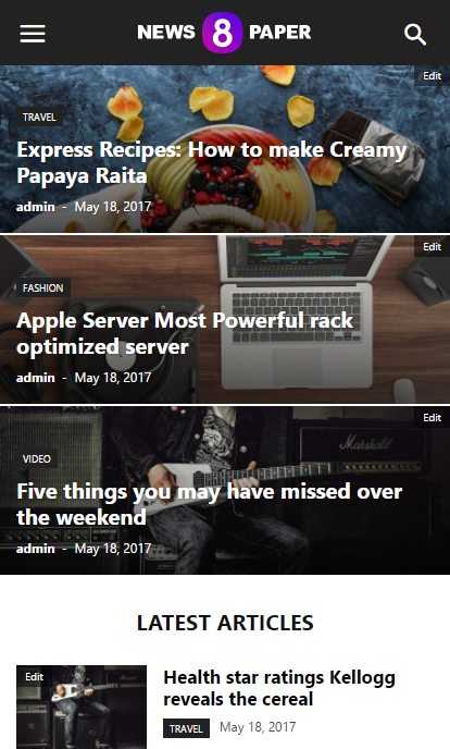
Thank you in advance.
 Simion C.
 Hi,
I am assuming it does not work fine on mobile, that is what I can see in the screenshot. On mobile try removing the float properly. Use a code like this and see if it displays properly
#ad1 {

float: none;

}
Enter it in Theme panel->Advanced CSS in the phones section. However it would be helpful if you could provide a link to your website if possible, so we can see the issue and try to give you a more accurate solution.
Thanks
Simion C. Hi,
I think this is somewhat of a misunderstanding. If you would like to display a smaller font size on mobile for the article titles in the big grid, use something like this
– https://www.screencast.com/t/V8Y2HOsw6
Please remove the previous code related to the big grid (leave the one for the block), and enter this one in Theme panel->Advanced CSS in the phones section
.td_block_big_grid_12 .entry-title a {

font-size: 12px;

}
Please let us know if this is a solution in this matter.
Thanks
 d_alinus2004
Hello,
I try to add a second ads on post content.
I have add on the custom css this code:
#ad1 {
top: 10px;
left: 10px;
float: right;}
and then on the CSS Advanced the same, for mobile display.
But the code dosen’t work line on desktop
See this photo for better understend:
https://pasteboard.co/GGPtu6y.png
Any ideea how i can solve this problem for mobile versions?
 majorfuss
 I’ve changed the 16px size but it’s still not showing. No big red x in my custom css box. In the phones css box, I see an ‘info’ icon saying “Don’t use adjoining classes.”
My custom css: https://snag.gy/DZFhuM.jpg
My phones box: https://snag.gy/KuXnOS.jpg
My mobile site: https://snag.gy/1F0dSw.jpg
Simion C. Hi,
In those posts it is not happening anymore, but there are others where it is
– https://www.screencast.com/t/PCaVCqm2
– https://www.screencast.com/t/LL7VO2hKxh
What I meant was to deactivate all plugins except theme plugins including the mobile theme, leave that active. Everything should work properly after this, usually plugins are the cause for this kind of problems. Or maybe if there have been modifications to the theme files directly.
The mobile theme plugin is optional, you could simply deactivate it as well. The main theme is fully responsive and will adapt the website for every device.
Thanks
 SheikhOvais
 Should I just uninstall mobile theme plugin? All this stuff seems complicated. By the way, the two of the pages I shared with you are now loading correctly (can you please check from your end as well). But there are still some problem pages. I can’t figure out what’s happening.
Simion C. Hi,
Please note that the mobile theme will probably not display properly or at all advanced and complex elements like that. It would be best if you would deactivate the mobile theme plugin and use the default responsiveness of the theme. This mobile plugin is optional, the main theme is fully capable of displaying properly on all devices.
Thanks
Simion C. Hi,
I see you have managed to change the background color for the menu on mobile, to white as you wanted. That can be done in the theme panel
– https://www.screencast.com/t/vuqdE4Gfs
More settings are available in the same section for the mobile menu colors.
There is no setting to make the logo display like you want, above the menu bar. The logo is part of the menu container along with the menu
– https://www.screencast.com/t/p0P3OfrujThat could only be done with custom code or modifications to the theme files.
Thanks
Simion C. Hi,
There is no option to disable the comment when using the mobile theme. However you could make a small modification in the theme and remove them from the post page on mobile. Comment or remove this line of code from this file
– https://www.screencast.com/t/o426OMatf0
– https://www.screencast.com/t/ZP0myqMNg
This will remove the comments from the post page when using the mobile theme. Or you can enter a code like this in Theme panel->Mobile theme->Custom CSS section
.single .comments {

display: none;

}
If you are not using the mobile theme plugin, this setting from the theme panel will disable the comment for the post page
– https://www.screencast.com/t/1viE3zUtK
Thanks
 Bogdan B.
 Hello,
This is probably because you use the mobile theme plugin. Please read this guide: https://forum.tagdiv.com/the-mobile-theme/
If you do not like the mobile theme implementation you can simply deactivate it from the plugins section and the theme will use the responsive version instead showing the same content as the desktop version.
Thank you!
Bogdan B. Hello,
On mobile the fonts can only be changed through css so please use this code to change them:
for the big grid:
@media (max-width: 767px){

.td-big-grid-post.td-big-thumb .td-big-grid-meta .entry-title, .td-big-grid-post.td-medium-thumb .td-big-grid-meta .entry-title {

    font-size: 16px;

}

}
for block 11:
@media (max-width: 767px){

.td_module_10 .entry-title {

    font-size: 16px;

}

}
Thank you!
Bogdan B. Hello,
You are probably using the mobile theme plugin. That is why the footer cannot be removed because it is not the same on as on desktop. In this case you can remove it with this css code:
@media(max-width:767px){

.td-mobile-footer-wrap{

display:none;

}

}
Add the code in the theme panel-> custom css box.
Thank you!
 Silverheim
 Thanks Simion. Fixed using the hotfix you provided on https://forum.tagdiv.com/topic/mobile-tabs-not-loading/
Just o let you know, the version for download still have issue. It was need to manually edit the functions to have it working.
thanks man.
 Francis
Dear Team,
Please find our website:
When it is in mobile mode, the logo will be incorporated into the mobile menu.
There are two questions.
Firstly, can I change the background colour of the mobile menu from black to while? Besides, change all stuffs on the menu from white to black?
Secondly, can I put the logo above the menu rather than in the menu?
Please kindly advise. Thank you very much.
Regards,
Nico
 ria
riaHello,
i just bought the theme, which looks amazing on desktop but horrible on mobiles. none of the images inserted in pages (featured images of posts are fine) will show up.
Actually, none of the text either.
Can you help me please? knowing half of our readers use their mobiles.
Thanks!
 tonyo
tonyoHi, how do i remove the standard wordpress comments box on mobile?
majorfussThe text in Big Grid 12 and Block 11 on various pages.
It’s fine on desktop but too big on mobile. How do I reduce it?
 bigdeal
Hi,
My site seems to take some time to load especially on mobile phone it takes a minute to load everything.
I tried pingdom to test my site it also says it takes around 60 sec to fully load. I tried uninstalling some plugins and temporarily removed ad codes same results.
Appreciate your assistance in finding a solution to speed up my site thanks.
Btw my site is hosted on godaddy which does not allow cache plugins
 ablife
Hey,
I’m just setting up the Newspaper theme on a staging domain and I’ve run into a little problem. In the settings, I chose to hide the footer and just show the sub-footer, which is working on desktop/tablet. But on mobile the footer with the logo AND sub footer is showing.
How can I hide the footer on mobile too and just show the sub footer?
Thanks
Bogdan B. Hello,
Please install the fontawesome 4 menus plugikn and then add this code in your theme panel-> custom css box:
.td-mobile-content .td-icon-menu-right:before{

    content: '\f055';

font-family: fontawesome;

}
Thank you!
 hadharm
 Most of my traffic are mobile users so i am using the loop ad for mobile users only.
@bogdan-b i tried playing around the code but no success. Help me on this i want loop ad to show after 4th and 8th post on mobile (i have 10 posts list on each page).
Simion C. Hi,
@agrajewski Form what I can see the mobile theme is not functioning correctly on your website. It is even displayed on desktop in a few cases. This can be caused by the Total cache plugin that you are using. This plugin is known to cause problems in combination with the mobile theme plugin.
You can try to use this caching plugin instead and check the results
– https://forum.tagdiv.com/cache-plugin-install-and-configure/
Please note that when you use the mobile theme, content for pages has to be created using the mobile editor
– https://forum.tagdiv.com/the-mobile-theme/
If you want to display the same content from desktop, deactivate the mobile theme plugin. The mobile theme is optional, not required. The theme is fully responsive and will adapt with the best results for all devices.
@Silverheim What you are describing sound like the problem that was present in the previous theme update. Please check this topic for more information
– https://forum.tagdiv.com/topic/mobile-tabs-not-loading/
Thanks
Simion C. Hi,
It seems the website is displaying the mobile theme on desktop. That should not happen, it could be caused by a caching plugin that you might have installed or there could be a conflict between the mobile theme and other plugins. This could cause the mobile theme stylesheet to load instead
Try to deactivate all plugins except theme plugins, clear any installed cache and check the results.
Also check any custom code you might have entered in the theme panel sections, or added directly to the theme files.
Something is affecting the theme and interfering with the functionality.
Thanks
Bogdan B. Hello,
@gvset001 I think hadharm simply used the loop ad on mobile devices: https://www.screencast.com/t/OHbi6OUb7
This is only available for the mobile theme though.
The code for this element is found here: https://www.screencast.com/t/741fTAZT
Unfortunately we have not tested multiple loop ads at once so you will have to experiment with the code a bit and see if you can duplicate the implementation or change the function to provide multiple ads.
Thank you!



